Tag Archives: painting instruction

Painting the Snake River

Final, Snake River painting. The final step is to use some pen and ink to add some details but be careful not to add too much. I suggest that you zoom in on the image so you can get a better idea of what I’ve done. It’s really just a lot of scribbling and very loose calligraphy.

I mentioned last week that I’m teaching a watercolor landscape painting class. I let the class choose which subject they wanted to paint and they selected the colorful sunset.  Well, it seemed easy but was a little more difficult than they thought.   I’ve painted that scene three times and none of them have turned out exactly the same.

So, I thought I would try to find something a little easier for the class.  One of my selections is this scene from a trip we took out West several years ago. This is the Snake River in Idaho near Palisades Reservoir.  Such beautiful country out there.

Snake River, original photo upon which the painting was based. As you can see, I eliminated many of the shrubs in the foreground to better draw attention to the river and the mountain.

This is a classic landscape valley with pretty clouds and blue sky, a nice piney mountain, a river, and some trees up front leading us into the scene.  I only used eight colors for this painting,  three brushes, and my fade-proof ink pen.  The paper is Arches, French-made of 100% cotton rag.  The painting time was about two hours.

To see a step-by-step view of the process, click here or go to Artworks and scroll down to Snake River Landscape.

Juicing up your painting colors

Bill’s Gate, Autumn, watercolor, pen and ink, Kit Miracle

I’m teaching a class in landscape painting, watercolor with pen and ink. Last week I asked the students which picture they preferred, the regular photo or the one with the juiced up colors.  They all agreed that they liked the one with the brighter, more emphasized colors.

It is often a difficult choice for artists who paint in a realistic style, of whether to paint exactly what they see or to change things to suit themselves.  I tend to change things to suit me.  Personally, I like paintings with a little extra pop in color.  Not to go garish, but to just add an extra emphasis.

Below are some comparisons between the original photos, the juiced up photos, and the final paintings.

Which do you prefer?  Would love to hear your comments.

Autumn sunset photo before enhancement.

Autumn sunset with color saturation.

Autumn Sunset, painted with the enhanced colors. Watercolor, pen and ink, Kit Miracle

East field in fall, before enhancement.

East field in fall, after enhancement. I wanted to emphasize the warm autumn colors in the trees in the distance.

East Field in Autumn, watercolor, pen and ink, Kit Miracle

Florida Keys before color correction.

Florida Keys after photo saturation.

Florida Keys painted from the color saturated photo. The water down there is actually a turquoise color but it’s a great place to spend a morning in the shade.

Wickliffe Road without color enhancement.

Wickliffe Road, Watercolor, pen and ink, Kit Miracle


Why get an art critique?

My work table in my studio, finishing up the final painting in my Intimate Spaces series. This one is called Ogling.

I recently finished a series of paintings that I’ve been working on all year.  Intimate Spaces – Beach Series, focuses on my observation that beach goers often stake out their territories – putting up tents, setting up the umbrellas and lawn chairs, bring out the coolers – and then for some reason think that they are magically invisible if they’re in their little plot of sand.  They’re not, of course.  The artist / observer can see them.  Guess I’m somewhat of a voyeur.

I planned out this set of paintings in early January and have been diligently working on them throughout the year.  The smallest is 16 x 12 and the largest is 50 x 34.  By the end, I’ll admit to being pretty tired of painting sand and sun and sea.

So, now that they’re all done, I can sit back and relax, right?  Nope, now comes the proofing process, something akin to allowing bread dough to rise. I’ve been going through them one by one, looking for mistakes and omissions.  But this is the time ask a trusted colleague to view them and give me some feedback.  To get a critique.

Lest you shudder at the thought of someone criticizing your work, let’s be clear; there is a big difference between a critique and criticism.  A critique is designed to evaluate the attributes of the artwork, not the artist.  Criticism is often much more personal and tends to evaluate the artist.  A good critic knows the difference.

So what does a good critique do?

  1. It gives the artist an outside perspective, presumably in an objective manner.
  2. We are often too close to our work and can’t see glaring mistakes. A good critique will often point out flaws.  This could be in composition, execution, unclear passages, whatever. Some critics will make helpful suggestions but it’s up to you whether you wish to incorporate them into your artwork.
  3. Or a critique will evaluate that you’re hitting what you’re aiming for. Yay, you!
  4. Did you the you accomplish what you set out to do?
  5. Finally, distance yourself. You are not your artwork, no matter how much sweat and effort you have put into it. It is still up to you to decide whether or not to take any suggestions and make changes.

Many art schools and colleges will have group critiques, usually led by the instructors or the students themselves.  However, if you are beyond this, you should seek out someone whose opinion you value. We work alone so much that it’s helpful to touch get an objective, outside opinion. The whole point is to help you improve as an artist.

Asymmetrical composition

Beach Readers, Intimate Spaces series, acrylic on linen, 24 x 30, Kit Miracle The whole attraction of this subject was the irony of the two young women who are reading and totally ignoring the beautiful day at the beach. I also love the way the red beach chairs draw the viewer’s eye into the scene.

There are many rules of painting composition which I have discussed in previous blogs (search: composition).  These are usually conventional and are designed to lead the eye through the picture.  But one of my favorites is an asymmetrical composition, that is, not even or necessarily balanced.  I liken this somewhat to whether you are a candlesticks at each end of the fireplace mantle kind of person or you feel comfortable placing both candlesticks at one end (usually balanced by some other object at the other end.)  It’s just a matter of personal preference.

The painting above, Beach Readers in the Intimate Spaces series, is a good example of asymmetrical composition. The bright red chairs on the right lead the eye into the scene to the two girls who are reading.  Most of the other action is in that quadrant of the painting.  However, the small figure playing in the surf at the far left is able to balance the scene.  If you don’t believe me, cover the figure with your hand and see what a difference that makes to the feel of the painting.

Asymmetrical composition came into vogue in the 1880s and 1890s as the Impressionist artists were influenced by the import of Japanese prints.  These prints not only led to some experimentation in composition, but to flattened colors and situational composition.  This would be similar to a photograph that is just cut off at strange places.  This could include people looking out of the picture plane, cutting off the head or legs of horses, or even figures exiting the frame.

Below are several examples of paintings by Mary Cassatt, Edgar Degas and Edouard Manet which illustrate this influence.  The first two artists collaborated for years with their printmaking but as you can see, the Japanese influence directly appeared in their work.

Mary Cassatt, Woman and Child in the Driving Seat.

Degas, more race horses running out of the picture plane. Lots of empty space but it works.

One of many Degas racing scenes. Notice how some people are only partially shown in the picture plane. This is a similar composition to my Beach Readers in that there is a big blank space in the lower left side of the painting, with the action on the right leading into the main subject.

Degas. Another very unusual composition of race horses and jockeys.

Degas, Place de la Concorde. Notice how everyone seems to be looking off in a different direction. And why are the little girls cut off at the waist?

Edouard Manet, Portrait of Gillaudin on a Horse. You can only infer the horse in this painting although the main subject is centered.

Alley View, Plein Air Painting, Jasper, Indiana

Alley View, Plein Air Painting, final, 16 x 20, acrylic, Kit Miracle. This shows the final view of the scene. I might tweak it sometime later after I live with it for awhile, but so far, I’m satisfied.

Although I do a fair amount of plein air painting, I don’t do too many competitions.  Today I participated in a local event which is always fun.  I’m familiar with the area so it’s always a challenge to find new and interesting things to paint.  Yesterday I scouted out a few locations. I don’t like to do what everyone else is doing but seek to highlight a vista that might make people see their own space in a new way.

Alley view, initial scene, very early in the morning.

So this morning found me sitting in an alley. I was drawn to this blue garage and the alternating light and shadows as I looked up the alley.  It was very peaceful on a Saturday morning at daybreak.

Alley View, 1st step. Using a red-toned canvas, I painted in the basic shadows and main shapes.

Alley View, second level. Here you can see more added colors. This is the point in a painting that everything looks like a real mess. But I’ve learned to just keep pressing on and it will come together.

As you can see, I started with a red-toned canvas, 16 x 20.  First I blocked in the main shapes and the darks.  Then I started to lay in the markers for the greens.  The last colors to go in were the lightest colors – whites, off whites, and the sky.  I don’t always work in this order but usually.

Alley View after two hours. Notice how the shadows have changed. Usually 2 – 3 hours is the most time I have for a plein air painting.

Despite the heat and humidity, my acrylic paints kept drying out quickly.  I didn’t bring a retarder with me so I kept having to spray the paint and add layer after layer.

But I enjoyed the peace of the scene.  A few dog walkers, a couple of interested passersby, the occasional bunny rabbit, and inevitably, the Saturday morning lawn mowers all created the peaceful atmosphere.

I might review the painting later to see if I need to tighten it up, but actually, I like the feel of a warm summer morning. How about you?

Alley View, Plein Air Painting, final, 16 x 20, acrylic, Kit Miracle. This shows the final view of the scene. I might tweak it sometime later after I live with it for awhile, but so far, I’m satisfied.

Stretching canvas

The current series of paintings that I’m working on calls for some unusual sizes of canvases.  I could have ordered ready-made canvases but decided to spend some time stretching my own.  I already had plenty of rolled canvas so I just ordered stretcher bars of the sizes I needed.

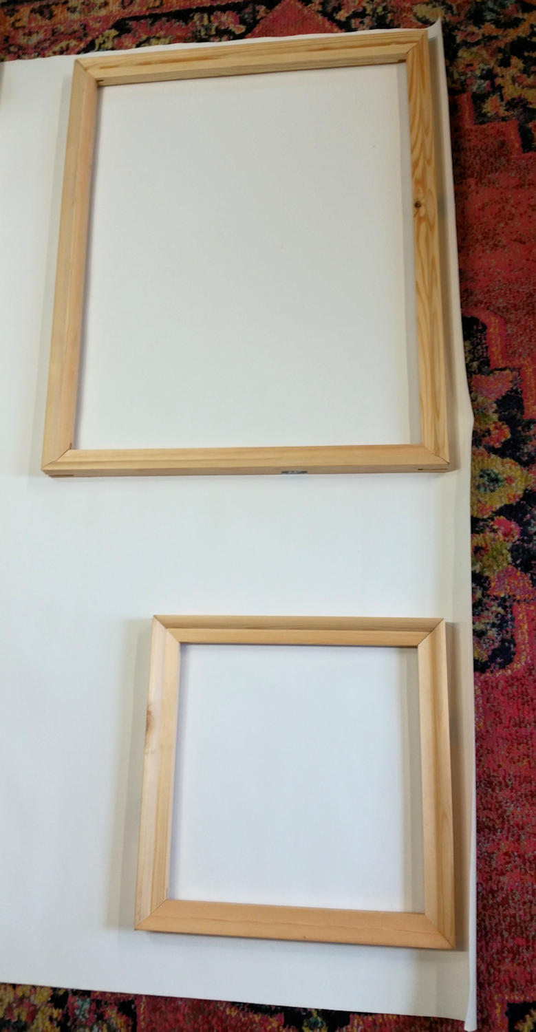
Stretcher bars awaiting assembly. You need two of each size unless you’re doing a square, then you need four the same size.

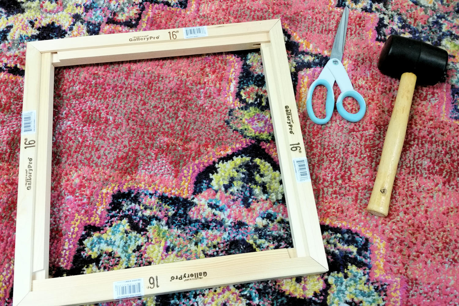
Assembled stretcher bars and tools, scissors and rubber mallet.

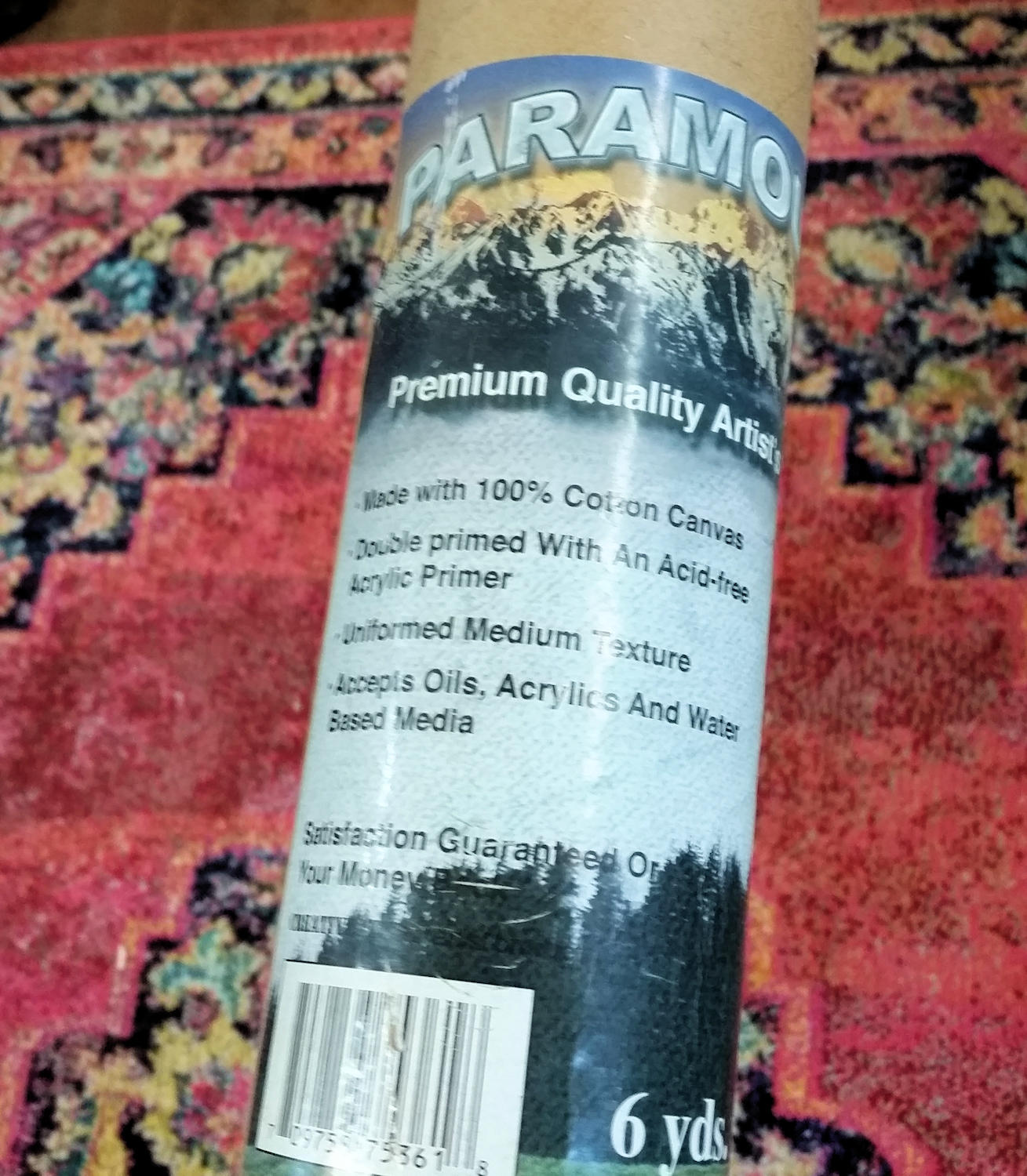
Stretcher bars can be ordered in various widths, depths and lengths.  These are 1 ½ inch bars. The canvas that I’m using is cotton duck.  I also use linen for some of the really special pieces.  This canvas is already preprimed which I would not recommend or order in the future.  I’d prefer to gesso and prime my own canvas.

The tools for stretching canvas are pretty basic.

  • Rubber mallet
  • Scissors
  • Tape measure
  • Staple gun (electric) and staples (1/2 inch)
  • Tack hammer or framing hammer
  • Canvas pliers (not shown) I don’t usually use these, just grip the canvas and pull really hard

The bars are prenotched and will fit together with a little effort.

This is what the corner should look like after assembly.

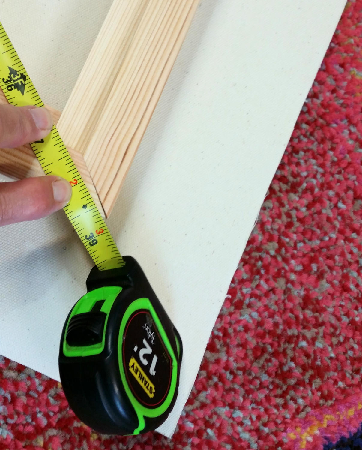
Assemble your stretcher bars by aligning the grooves and using the rubber mallet to pound them together.  This might take a little trial and error until you get the hang of it, but don’t be afraid to put some muscle into the pounding to make the bars go together.  Of course, if you’re assembling a rectangular canvas, remember to use the two short and the two longs on opposing sides.  After you’re happy that the bars are assembled, measure diagonally from corner to corner to make sure they’re pretty square.

Measure diagonal corners to ensure the canvas is square.

Lay your assembled stretcher bars on the canvas and cut around. Leave a few inches in all sides, enough to wrap around to the back of the bars.

A roll of pre-primed cotton duck canvas. I prefer the unprimed canvas but was using this up.

Lay the assembled stretcher bars on your canvas and cut around leaving enough canvas to wrap around to the back of the frame.  This depends upon the depth of the frame you are assembling.  Then, making sure that the primed side is out, lay the assembled bars on the canvas face down. Make sure the canvas has the same border all around the bars. Starting in the middle of one bar, add a staple.  Then on the opposite side, pull the canvas really tight, making sure it’s not puckering, and add another staple. Then do the two sides.

More tools for actually stretching the canvas. Electric staple gun, 1/2 inch staples, tack hammer, tape measure.

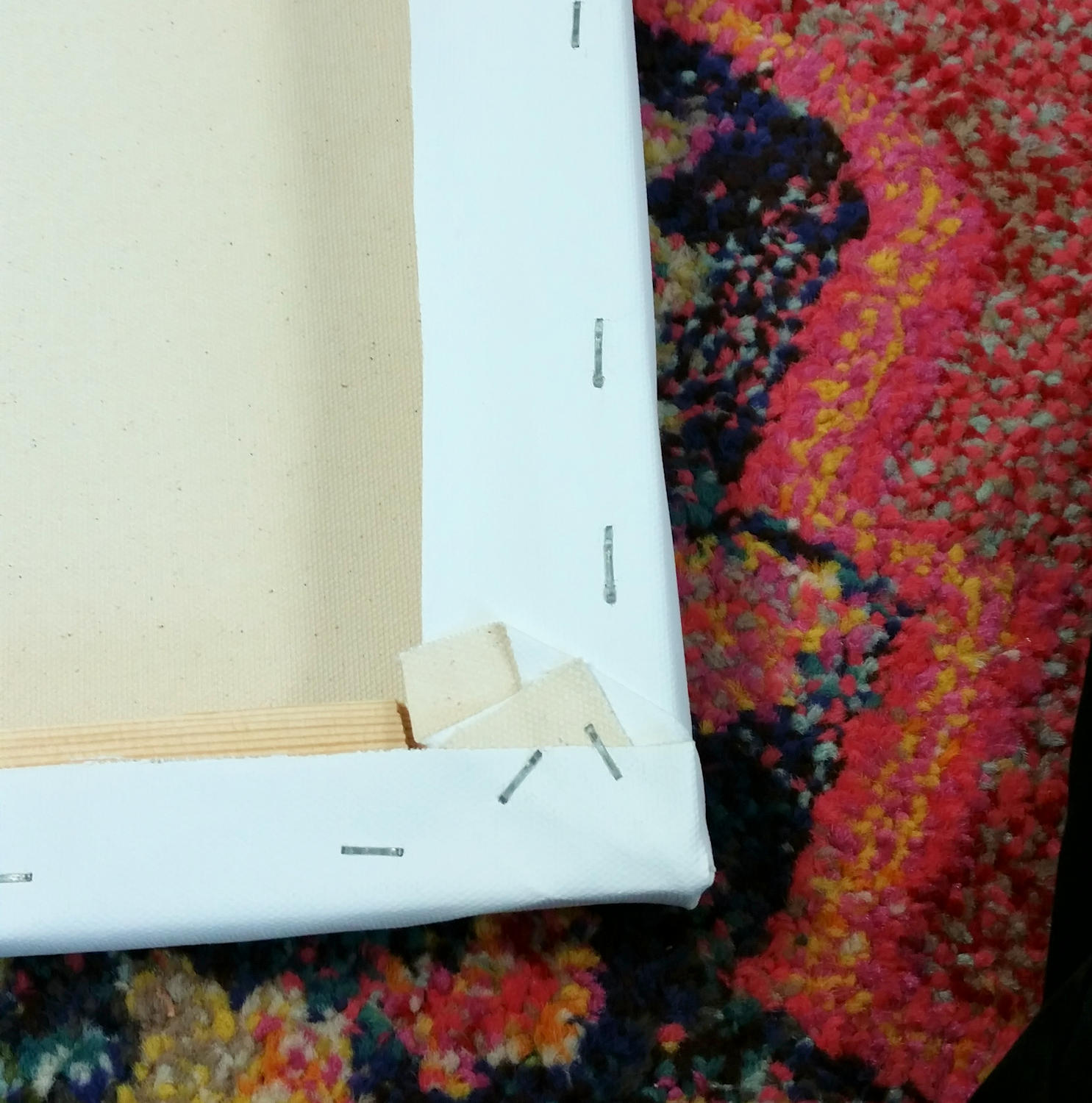
Start in the middle of one side, put a staple in. The do the opposite side, pulling tightly. Then do each end, same thing. Then go back and add a couple of staples on either side of the first staples. Keep working around the frame, always pulling tightly. When you get to the corners, neatly fold the corners in. You don’t want a bunch of canvas on the corners as that will hinder framing.

Work your way out to the edges all the way around until you get to the corners.  The corners are a little tricky but try to wrap the canvas as neatly as you can.  Then go around the canvas and set in the staples with the tack hammer.

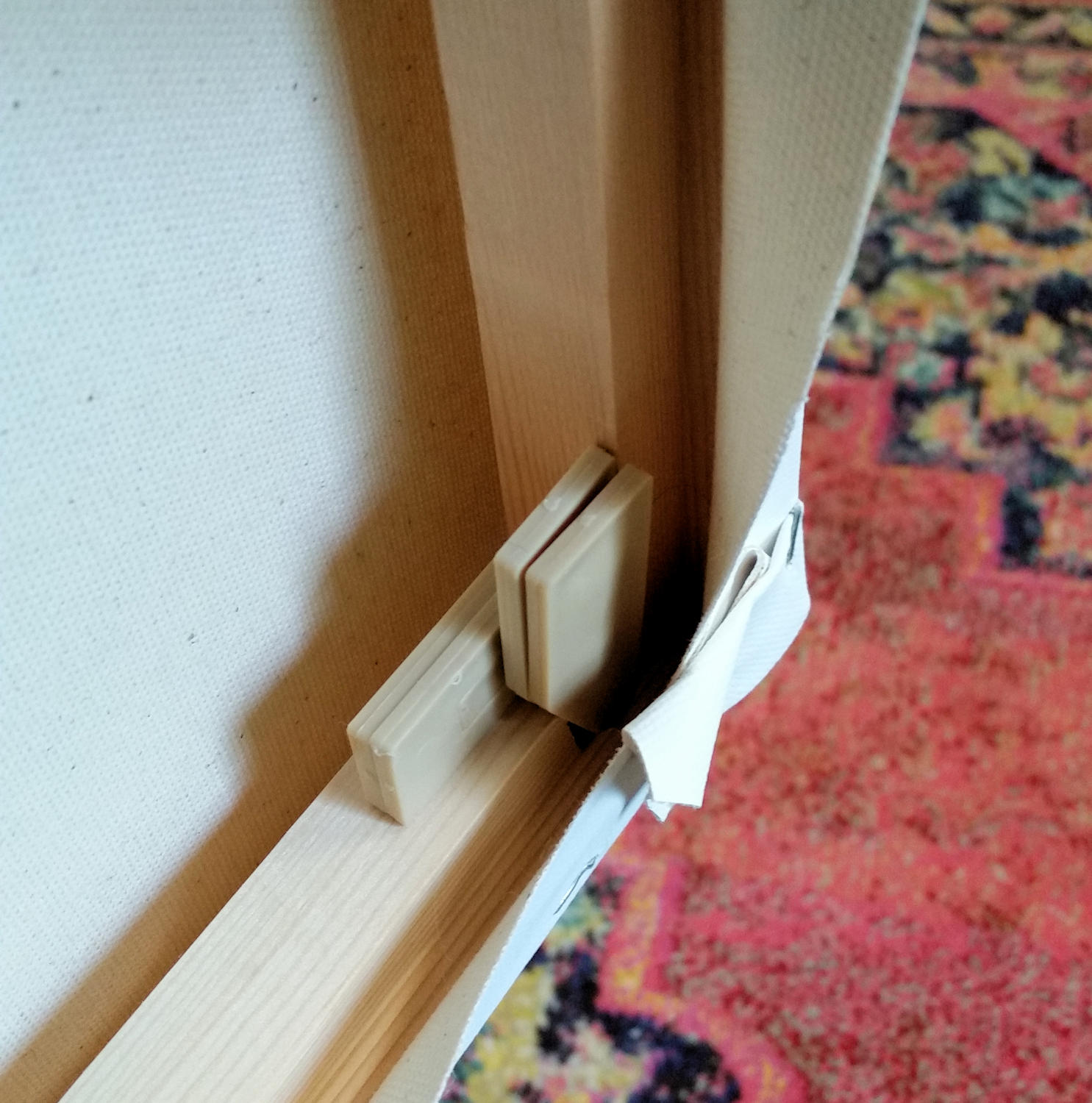
Drive the frame wedges into the slots in the corners. These are plastic wedges but they also come in wood and in various sizes. You will need to pound them in with the rubber mallet. They should be pretty tight and your canvas will be very tight.

The canvas will appear pretty tight but you need to tighten it even further by driving in the wedges into the corners with the rubber mallet.  Align the straight edge of the wedge with the corner frame as pictured.  Then put in the other one going the opposite direction.  This will really tighten the canvas.  If it should loosen over time, you can readjust the wedges or even re-stretch the canvas.  As you can see here, I am using plastic wedges but they also come in wood.  You will need eight pairs per frame.

If you have never tried stretching your own canvas, I urge you to give it a try.  It seems a little complicated at first, but you will end up with a better product and save some money in the long run.

The importance of preliminary work

Green and Yellow, 20 x 20, acrylic, Kit Miracle. Intimate Spaces series

I recently posted a step-by-step outline of my painting A Day at the Beach (4-10-2019). A critical part of creating a significant panting is the preliminary work. I sincerely believe that the more thought I put into the piece at the beginning, the more I can work out the problems ahead of time, and the better the final result will be.  Well, that’s my theory anyway.

Green and Yellow, detail.

This is another painting in my series Intimate Spaces, all about the territory that people carve out when they visit the beach.  In this painting, I was sitting behind a couple who staked out their space early in the day with two chairs and an umbrella.  They didn’t show up until mid-afternoon.

NOTAN sketches for Green and Yellow. This is where I work out basic shapes and composition. As you can see, initially I intended this to be a rectangle shape but then changed it to a square shape.

I liked the near silhouette of the couple with the contrast of the kids playing in the surf in front of them. Maybe they were grandma and grandpa.  I don’t know and never did figure it out.

Large graphite sketch of the main characters for Green and Yellow.

As with most of my paintings, I begin with a NOTAN sketch, just hard contrast of black and white to get a feel for the composition.  Then I did a large graphite sketch of the couple.  I didn’t feel a need to sketch the kids as they’re just notes really.  They were painted directly.

NOTAN sketches of past couple of paintings. Working in black and white allows me to focus on the shapes and composition.

Here are a few more examples of NOTAN sketches.  You’ll notice the one from my last post of A Day at the Beach and how I was focusing on the interlocking umbrella shapes.

More NOTAN sketches from Jump.

And the two pages of NOTAN of Jump which I created in February.  With some of the bigger pieces, I’ll also do a color sketch but not always.

The final conclusion is that no matter what style of art you create, you will often have better results if you put in more thought and work into the beginning of your work than having to correct problems later.  Indeed, sometimes you may discover that the scene or piece doesn’t merit following through.  Or you may decide to attack it from a different direction.

A Day at the Beach – Painting a Series

A Day at the Beach, final. 24 x 36, acrylic on canvas, Kit Miracle

As a working artist for over three decades, I find keeping interested in painting involves challenging myself. Sometimes this means new subject matter or new materials. Even a new location helps.  The challenges keep me inspired and allow the mental juices to flow.

My latest challenge is painting a series of paintings revolving around a day at the beach.  I love slice of life subjects, catching people going about their lives without thought of an audience. One thing I’ve noticed is that when people are at the beach, they stake out their territories, bringing the chairs and the umbrellas, the coolers and the toys.  Beach goers seem to operate under the illusion that no one can see them in their little sand kingdoms.

But the artist’s eye can.

The planned series includes vignettes of life at the beach.  Families, couples, kids playing, people just enjoying the sunshine…or totally ignoring their surroundings with their noses in books or napping.  My inspiration for these seaside paintings are John Singer Sargent, Joaquin Sorolla, and Burt Silverman.  It took a lot of effort to make their seaside paintings seem so, well, effortless.  Unstaged even though they often were. And that is the aim of this current series that I’m working on.

The painting above depicts the settling in and establishing of territory by a family.  Mom gets the lounge chairs ready while son is waiting patiently for her attention.  The composition with overlapping umbrellas and tents is like a little city, each with its own slice of life.

The beach walkers and people playing in the surf add distance and perspective to the scene.  I also chose to flatten the color of the sky (no clouds) and the foreground.  This allows the emphasis to be placed on the middle plane where all the action is.

A Day at the Beach is number six in the series.  I have sixteen planned but we’ll see.  A series is an exploration of an idea and I’ll keep at it until I don’t have anything else to say about the subject.

If you’d like to see how this painting was created, click on this link or go under the tab Artworks and click on A Day at the Beach for step-by-step photos.

Thanks for stopping by.

Afternoon Shadows – another painting beyond the photograph

Afternoon Shadows, acrylic, original painting, 14 x 18, contemporary impressionism, Kit Miracle

I thought I’d post another painting created from a photograph for my class. This photo was taken of our patio and arbor with the fire pit on sunny autumn afternoon.  I like outdoor scenes with a human element.  This will often include at least some kind of man-made item whether a building, fence post, road or path.  In this case, the setting gives the feeling of comfort and ease.  The chairs, the smoke from the fire, the dappled sun and shade all contribute to the atmosphere.  The turtle sandbox adds a touch of whimsy.

When using a photo as inspiration for a painting, it’s important to remember that it is a tool and a road map.  Take inspiration but don’t be afraid to change things.

Afternoon Shadows, detail 1. Click and enlarge the photos to see the brush strokes. Notice the background tree is just painted with a few strokes. And the smoke is just a glaze on top of the background. See the indication of the sun and shadows on the chair.

In this painting, I was trying to capture the feel of the afternoon sun. The smoke and fire indicates that there could be a chill in the air with a slight breeze.  The location and setting are inviting; it looks as if someone has just left the area.

Afternoon Shadows, detail 2. Zoom in on the vines and leaves to see just how loosely they were painted. The sandbox turtle adds a note of whimsy.

My style is not photo-realist but contemporary impressionist which works well for conveying the feeling of this scene.  The chairs beckon the viewer to sit in the sun or warm themselves by the fire.  Will a child come walking into the area to play in the sandbox? I love paintings that tell a story.

Afternoon shadows, detail 3. Zoom in on the posts and the background trees to see the brushstrokes.

As you can see by the detail images, I use loose strokes to indicate the branches and leaves.  From a distance, the painting appears to be much more detailed than it actually is.  It takes some practice and confidence to make just the right stroke to indicate a branch.  Or, if you make a mistake, just scrape it off and try again.

Afternoon Shadows, original photo. If you compare this photo to the painting, you can see areas that I have emphasized, changed or deemphasized.

Normally I would have painted a scene like this in plein air but I was busy that afternoon and only had time to capture the view with my camera.  That is one of the benefits of using photographs as inspiration.

Afternoon Shadows for sale

Peace is the beauty of life.  It is sunshine. It is the smile of a child, the love of a mother, the joy of a father, the togetherness of a family. It is the advancement of man, the victory of a just cause, the triumph of truth.  Menachem Begin

Painting beyond the scene

West Wind Blows, original painting, 12 x 16, impressionistic, Kit Miracle

Artists are known for traveling over the world seeking new things to paint.  I have done so myself and have captured many scenes of my travels over the years.

I don’t know why travel is so inspiring but maybe it makes us see the world with new eyes.  We return home refreshed and look at our surroundings in a new way.

However, we don’t need to go away to appreciate what we have.  It is often right there before us.  A new light, a different angle, maybe the same scene in a different season.

This is a scene that I have passed thousands of times. I’ve always liked this valley with the hills but on this particular day, it really pulled at my attention.  Maybe it was the backlit clouds scudding across the sky.  Maybe it was the farm in the valley.  I even found the shadows of the trees across the pasture interesting.

West Wind Blows, detail, painting, Kit Miracle

Of course, I took some artistic license….like I need a license…and edited the landscape to suit myself. But compare the original photo to the scene that I captured. A little editing maybe but any local person would recognize this place.

West Wind Blows, original photo for painting

I’m teaching a class on painting from photographs.  One of the points that I’ve been trying to get across to my students is to use a photograph as a tool, a place to start, but you don’t have to be religious to the exact photo.  It is up to you, the artist, to change it to suit your needs and desires.

It’s a warm wind, the west wind, filled with bird cries.

John Masefield

West Wind Blows