

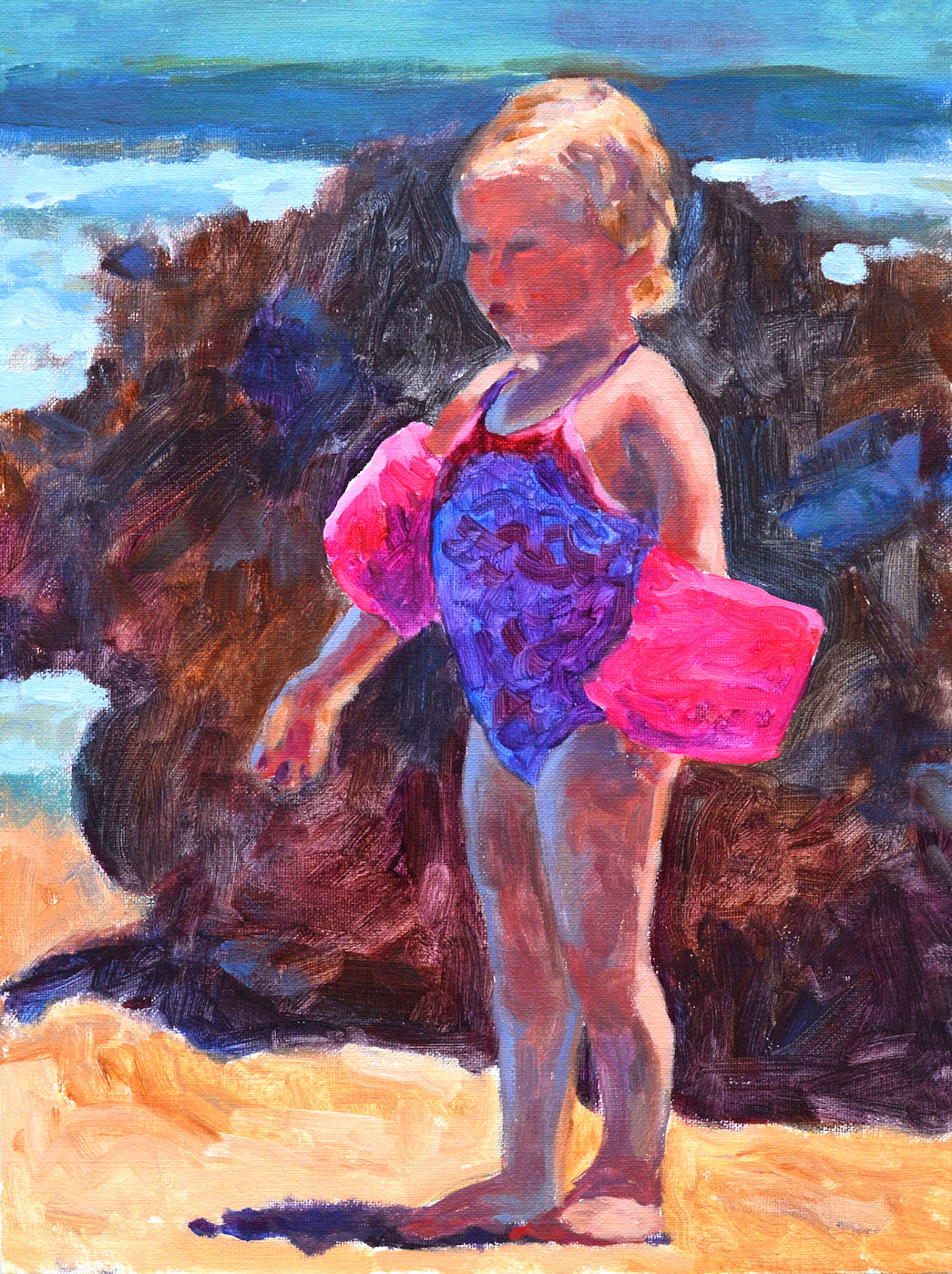
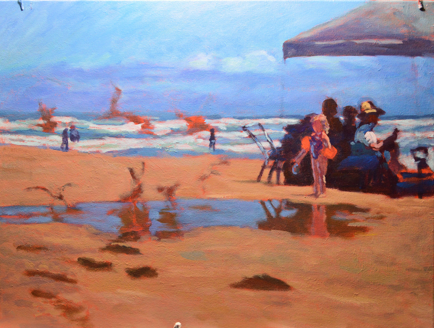
Wings – final, acrylic on canvas, 18 x 24. Kit Miracle
I was looking through some old photographs for subjects to paint which I haven’t visited for awhile and came across the inspiration for this painting. Sometimes the subject doesn’t grab me for several years until I revisit the pictures but this was only from last summer. I love the beach scenes by Sargent, Sorolla and Zorn, particularly the ones involving children.
For this painting, I decided to work slowly and do plenty of preliminary work. This included several sketches, some Notan studies, and one painting study of the central figure. The latter is actually larger than the figure in the final painting. Maybe I’ll make a bigger painting of the subject someday.
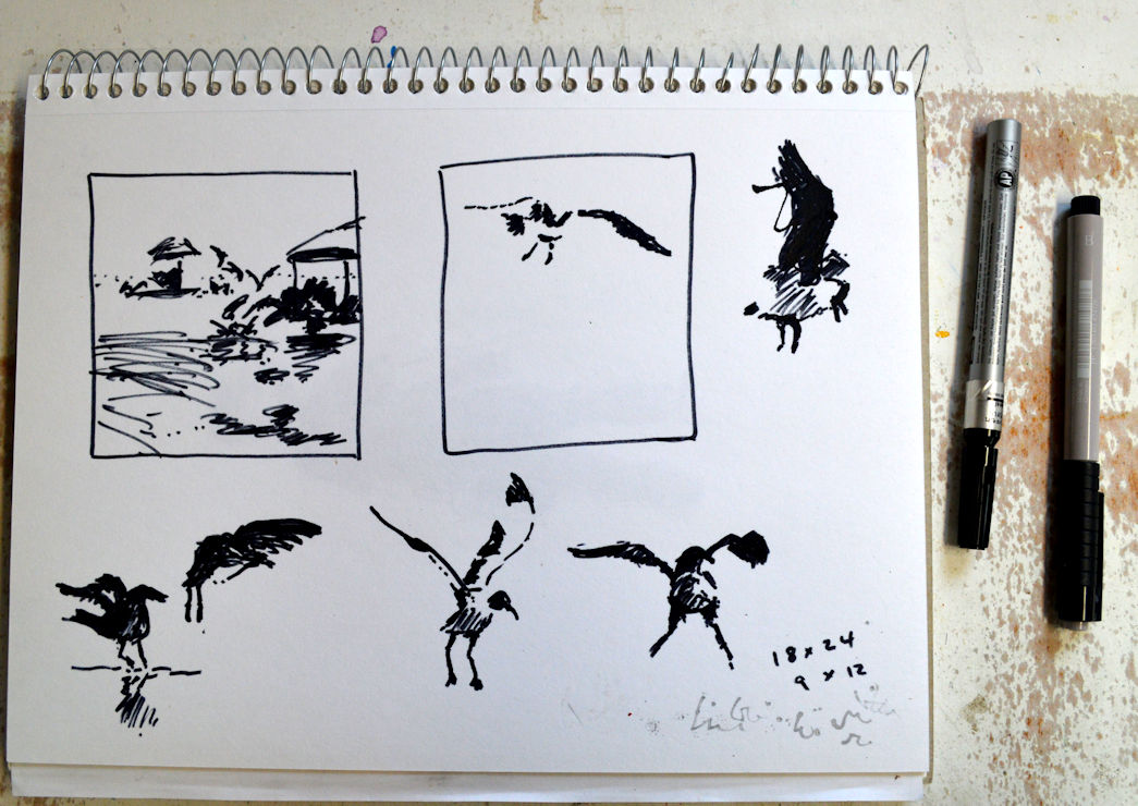
Notan sketches for beach painting.
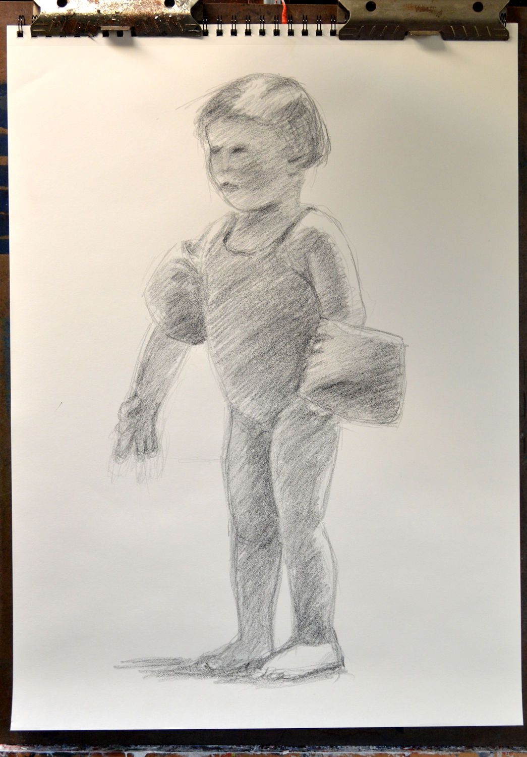
Beach girl, pencil sketch. 18 x 24, Kit Miracle
Initially my sketches for the full size painting included more figures, a grouping with an umbrella on the left side, and some figures in the water and walking along the beach. (More on that later.) One of the challenges with any landscape painting is determining the central subject of attraction. I kept scaling back, cutting out the grouping on the left, then most of the figures along the beach. Finally, you’ll see, that I even simplified the figures under the tent; you can tell that they’re people but aren’t distracted by details.
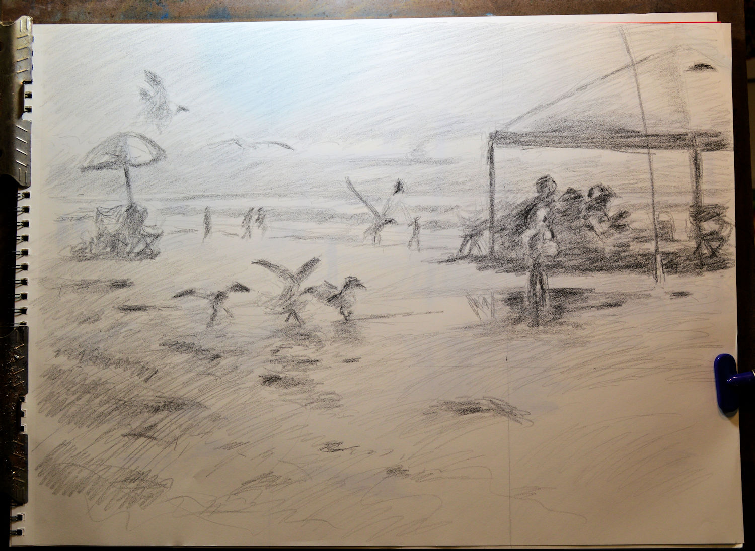
Wings – first preliminary sketch. This shows a grouping on the left and many figures on the beach.
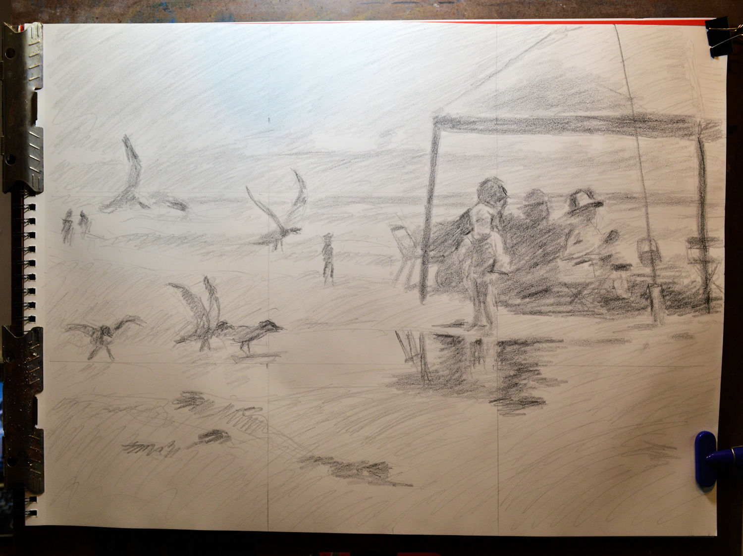
Wings – preliminary sketch #2. Here I cut out the grouping on the left that is shown in the first sketch.
Beach girl, color sketch. 16 x 12, acrylic. Kit Miracle
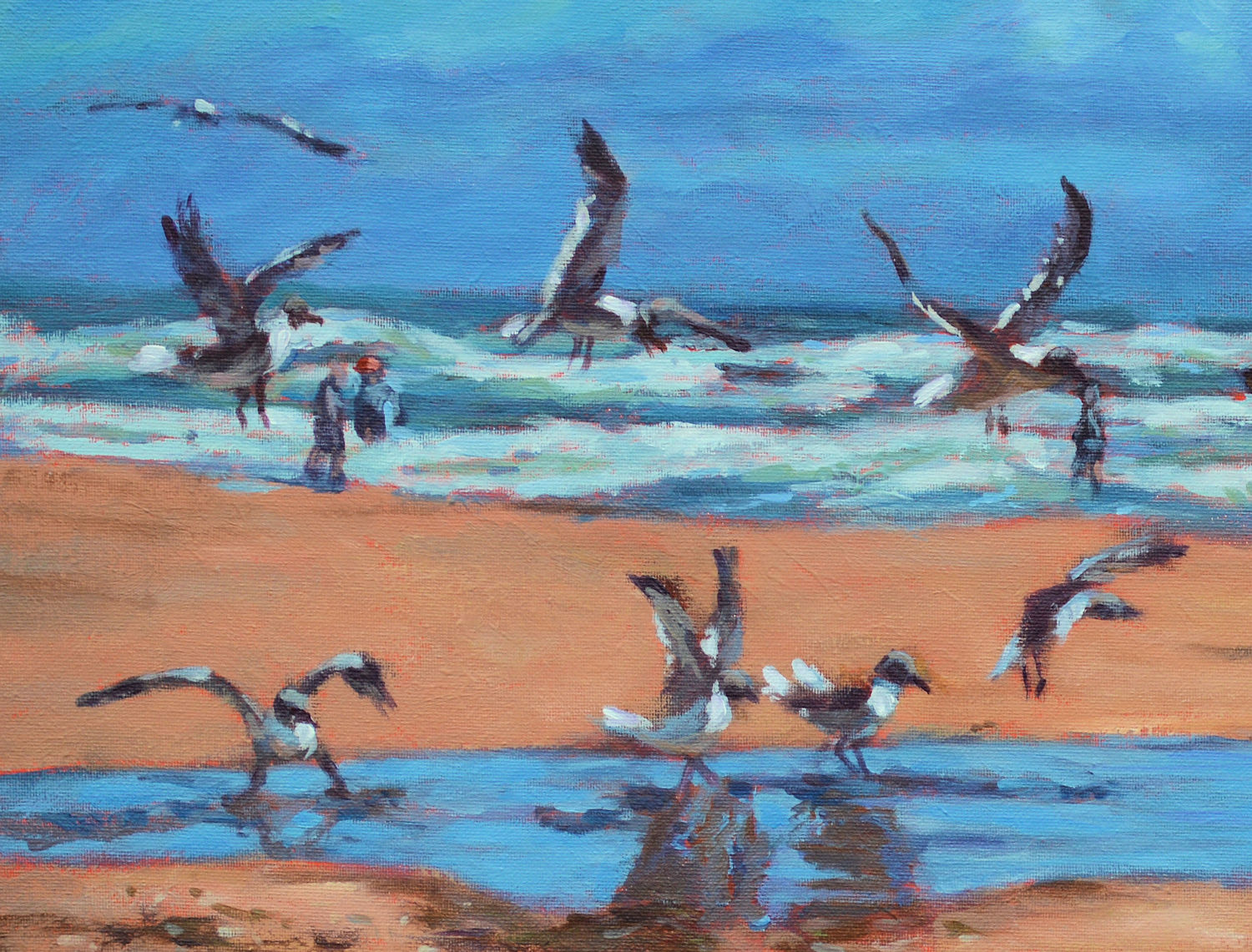
The core focus of the painting is the little girl wearing the fluorescent pink water wings facing the landing flotilla of seagulls. Thus, the title Wings.
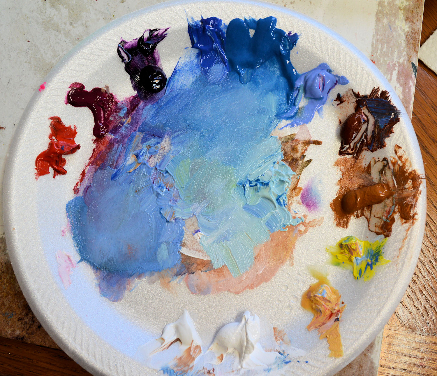
Painting with a limited palette. These are both Golden and Liquitex acrylics, clockwise starting at the left. Cadmium red medium, quinacridone magenta, prism violet, cobalt blue, cerulean, light ultramarine blue, burnt sienna, raw sienna, cadmium yellow medium, Naples yellow, titanium white, flexible modeling paste to add texture. As you can see, my palette is a Styrofoam plate. I hate cleaning my palettes and these are disposable. Not shown here is a fluorescent pink.
The canvas was gessoed and textured. Then it was primed with an orangey color. This warm color adds to the beach effect when small bits show through in the painting.
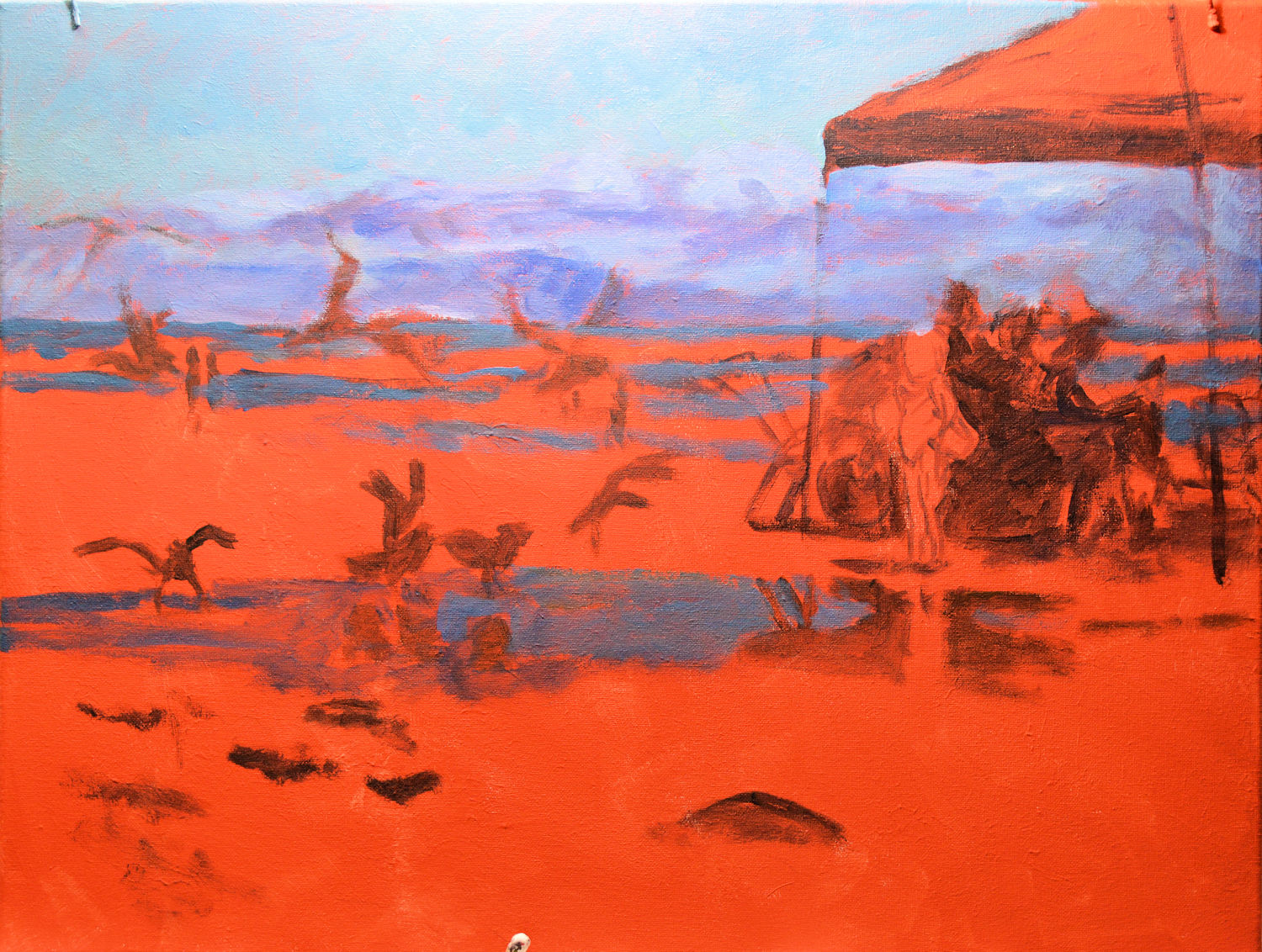
Wings – Step 1. Initial brush drawing on canvas with orange primer. As you can see, I began with covering the larger areas and gradually worked my way down to the smaller, more detailed parts. I usually (not always) begin with the sky or background.
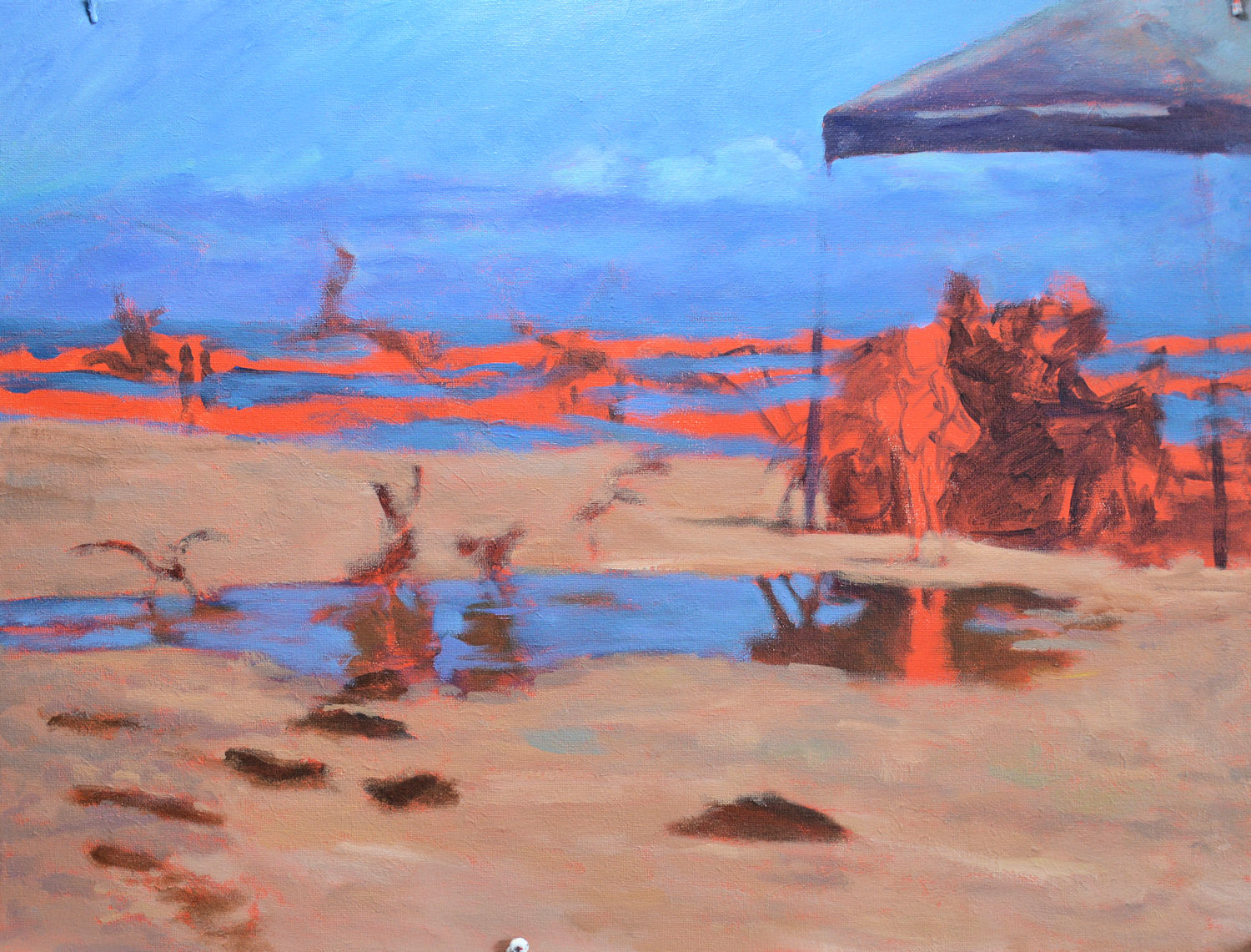
Wings, step 2. Here I have laid in the beach and foreground clumps of seaweed, as well as some of the waves on the sea.
Wings, step 3. Now I’ve added the shapes under the tent. This makes the figure of the girl stand out but doesn’t distract from the central figure.
Wings, step 4. Refining the main shapes with only some details remaining for the birds, tent, and background.
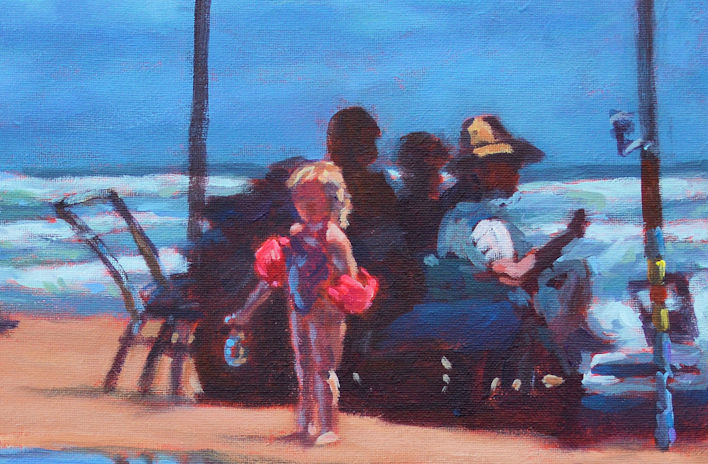
Detail of the small girl with the figure grouping behind and in shadow.
As you can see in the step-by-step, I started with the larger shapes of the sky, sea and beach. Then added the darks and smaller shapes, finally ending up with the details.
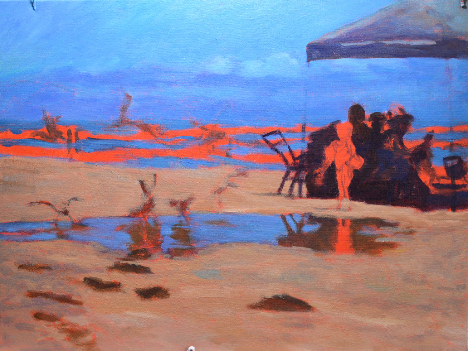
Help! Attack of the giant seagulls! After I completed the painting, I realized that placement and size of the people on the beach and the seagulls looked like something from a sci-fi movie, Attack of the seagulls. So I first tried to push the people back with more muted colors, move them, and then finally wiped them out entirely. It was just too confusing for the viewer and the final painting is much stronger.
But….no matter how much planning may be done, there are always surprises for the artist and changes to be made. After I had finished the painting, even including my signature, I examined it the next day and it was very obvious something was wrong. I invited my son to comment and he smiled a sly smile. We both laughed. The placement of the beach figures made it look as if they were being attacked by giant seagulls! Ha ha. Those were painted out which helped focus the subject back on the girl and birds.
Overall, I’m pleased with the final results and only wish I had made it larger. However, I’m working on another beach scene which is much larger so will put that up here soon.
