
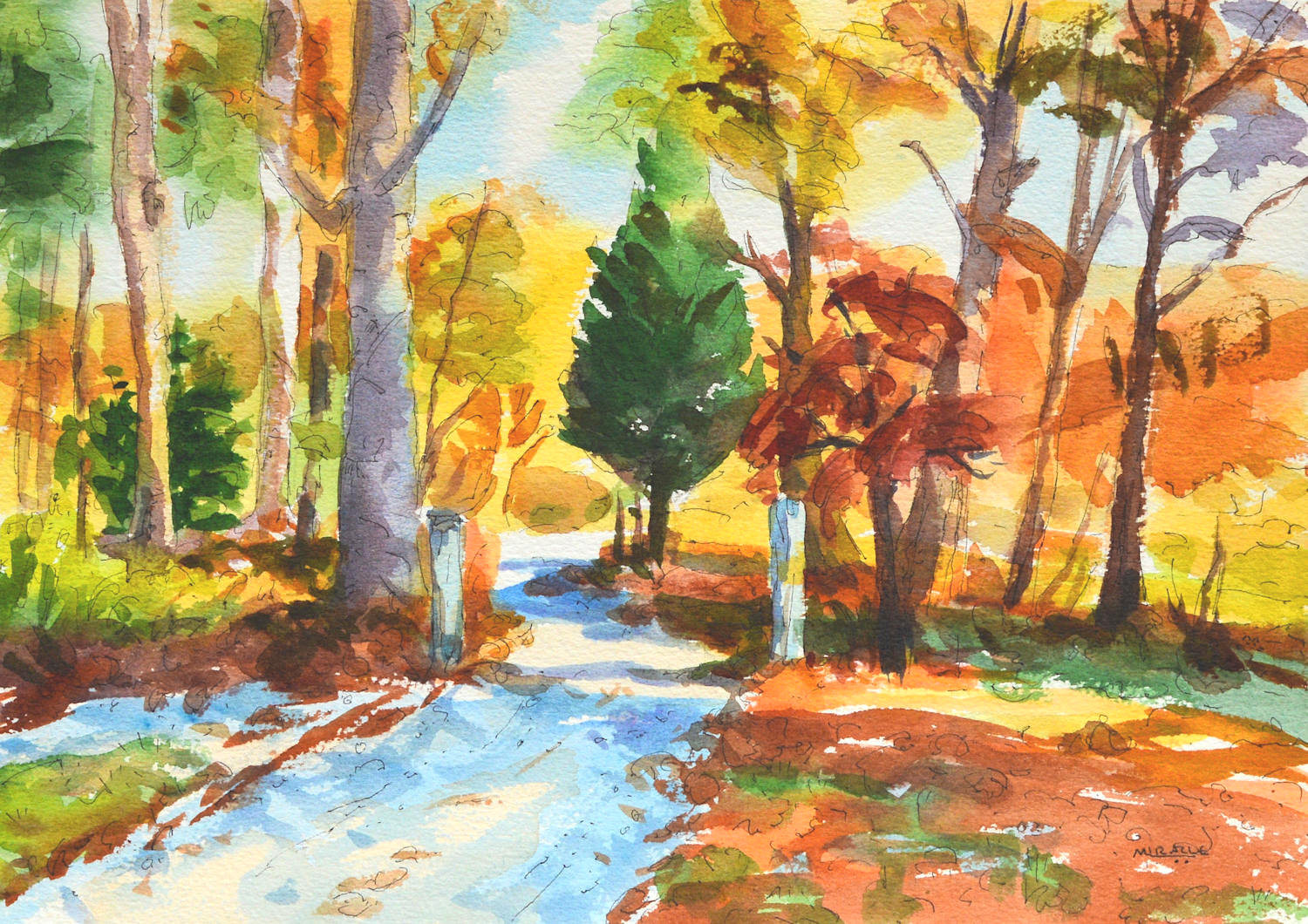
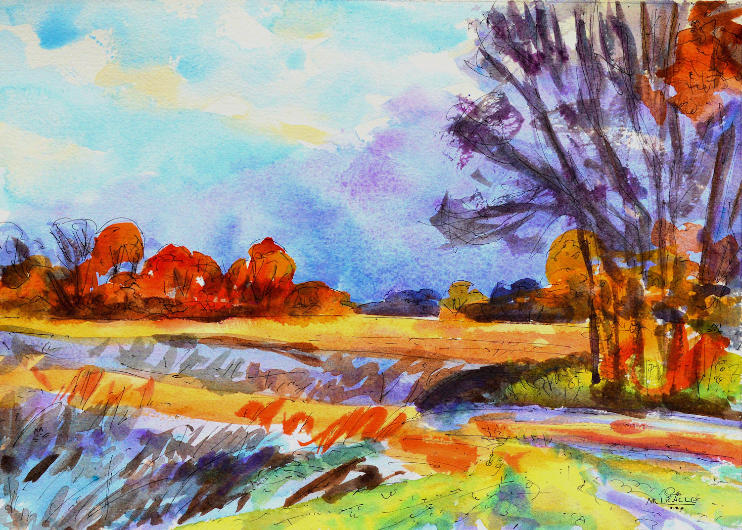
Bill’s Gate, Autumn, watercolor, pen and ink, Kit Miracle
I’m teaching a class in landscape painting, watercolor with pen and ink. Last week I asked the students which picture they preferred, the regular photo or the one with the juiced up colors. They all agreed that they liked the one with the brighter, more emphasized colors.
It is often a difficult choice for artists who paint in a realistic style, of whether to paint exactly what they see or to change things to suit themselves. I tend to change things to suit me. Personally, I like paintings with a little extra pop in color. Not to go garish, but to just add an extra emphasis.
Below are some comparisons between the original photos, the juiced up photos, and the final paintings.
Which do you prefer? Would love to hear your comments.
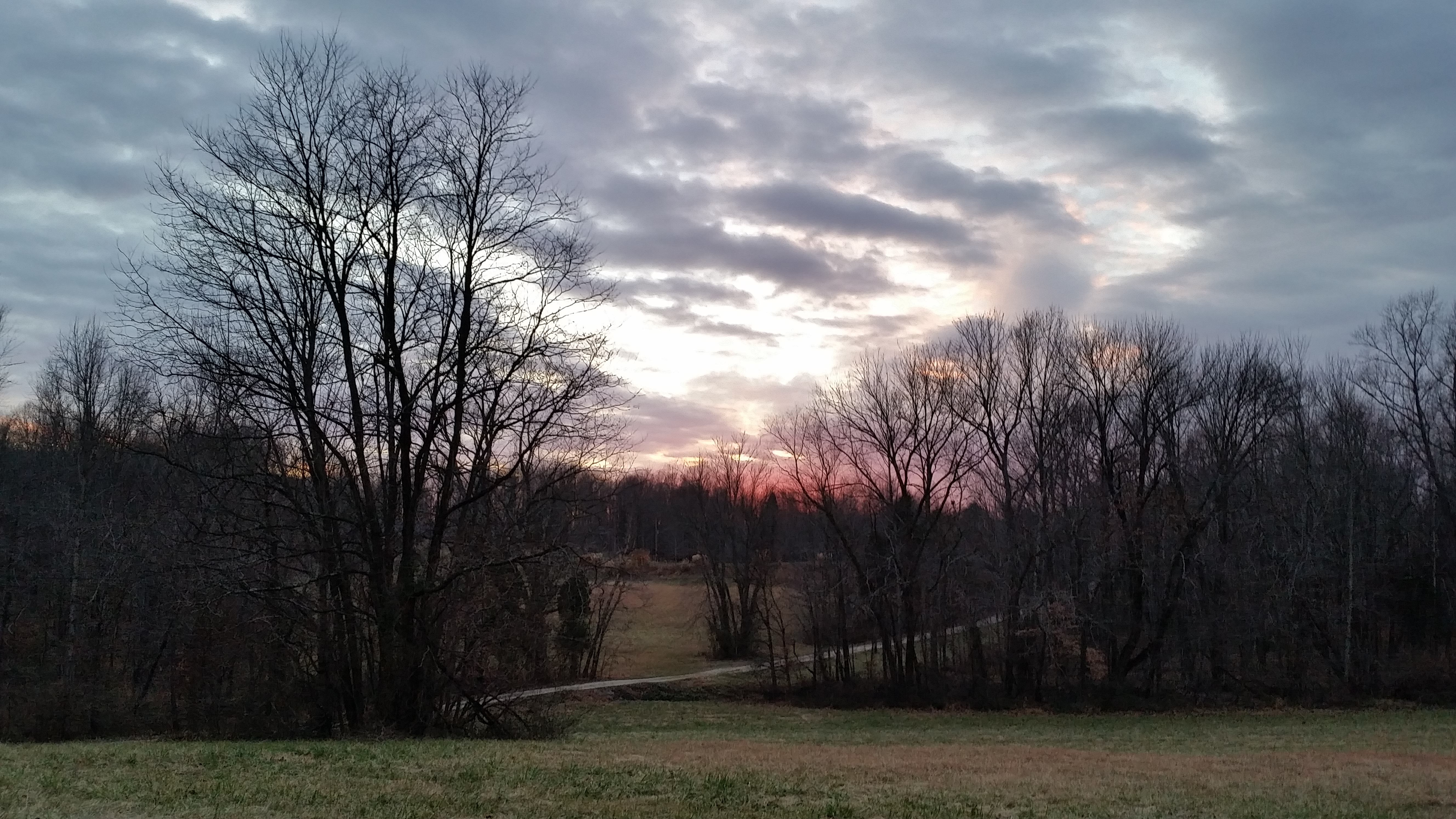
Autumn sunset photo before enhancement.

Autumn sunset with color saturation.

Autumn Sunset, painted with the enhanced colors. Watercolor, pen and ink, Kit Miracle
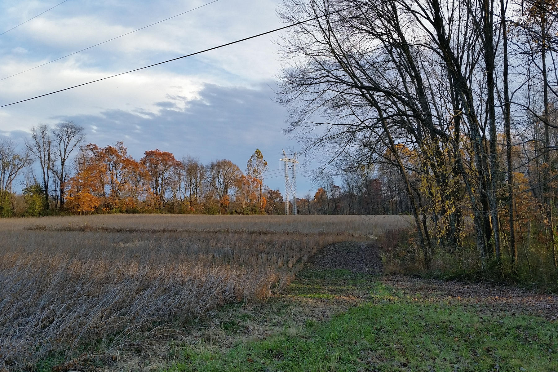
East field in fall, before enhancement.
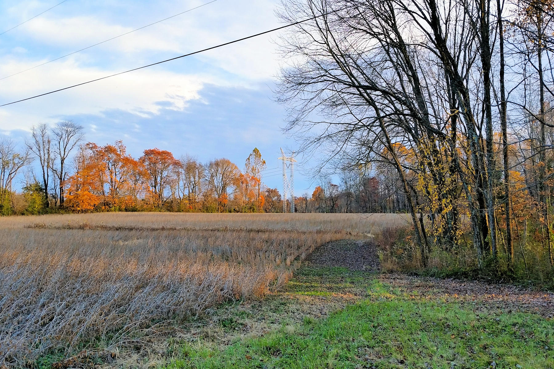
East field in fall, after enhancement. I wanted to emphasize the warm autumn colors in the trees in the distance.
East Field in Autumn, watercolor, pen and ink, Kit Miracle
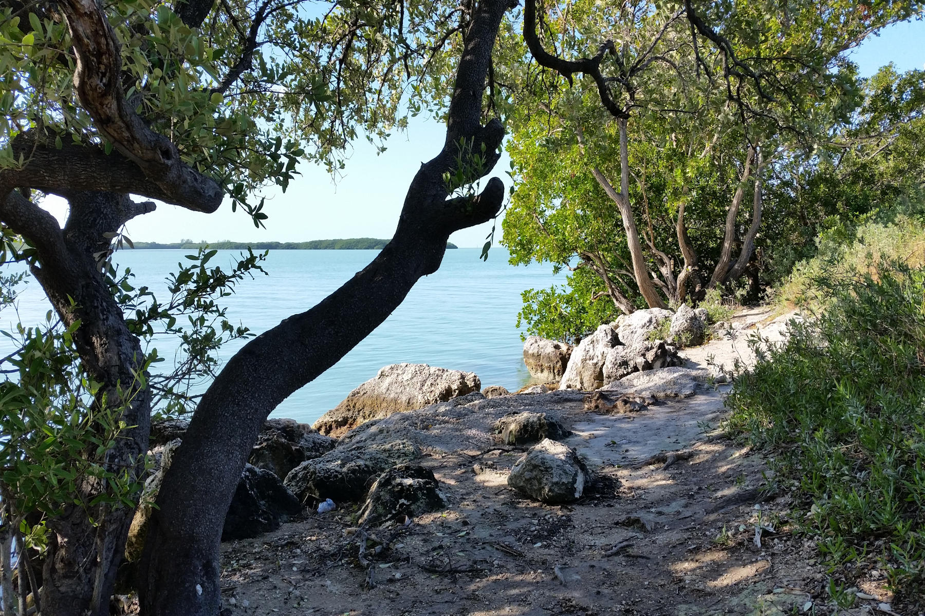
Florida Keys before color correction.
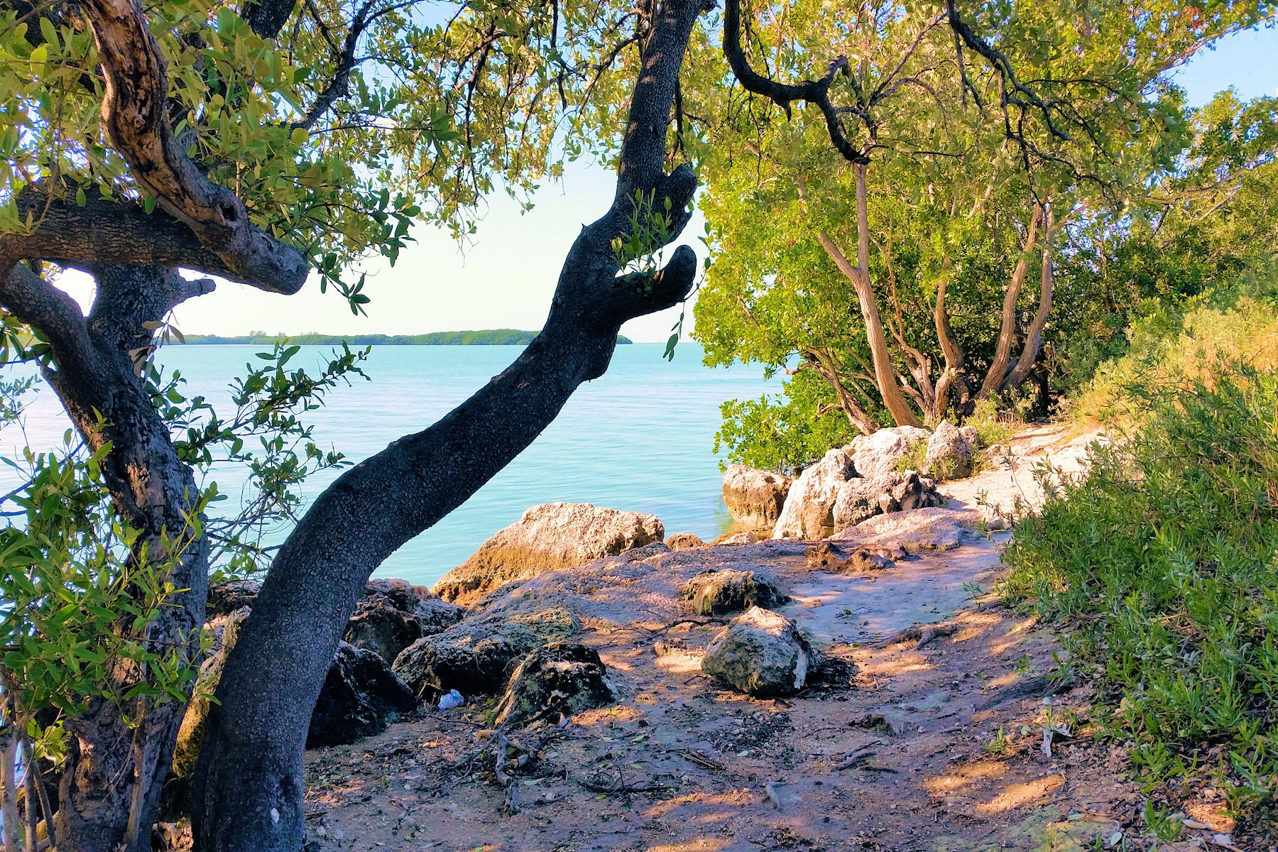
Florida Keys after photo saturation.

Florida Keys painted from the color saturated photo. The water down there is actually a turquoise color but it’s a great place to spend a morning in the shade.
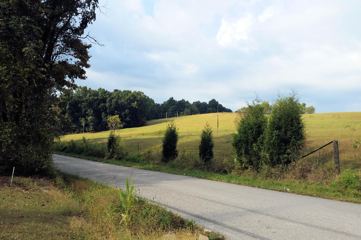
Wickliffe Road without color enhancement.

Wickliffe Road, Watercolor, pen and ink, Kit Miracle
