Category Archives: watercolor

Painting small

Tulips, four color schemes, 4.5 x 6.5.

Let’s face it.  There are few people who are not inspired when they walk into a museum or cathedral and face a giant painting depicting a well-known scene.  I have been brought to tears when I’ve been overwhelmed with some exhibits. 

But that is not always the case.  Most people cannot accommodate a wall-size painting or afford one.  But that doesn’t mean that we don’t like real art nonetheless.

A typical variety of colorful flowers, 4.5 x 6.5 to be matted to 8 x 10

Over the years I have created and sold paintings of many sizes.  Some pretty large ones but most have been medium size.  And I’ve sold a whole lot of small pieces.

There are pros and cons with creating small paintings.  On one hand, larger paintings are immensely fun to create, taking that large brush and swishing it across a wall-size canvas.  But they are also much more difficult to sell due to the size. 

Landscape and harbor scene, 4.5 x 6.5

Small painting have many advantages, too. They are a good way to try out new ideas, materials and techniques.  They are very portable. You can just pick them up and move them around your home, or transport them easily.  They are also economical to create since they use less materials.

Vertical tulips in various colors, to be matted to 8 x 10.

I’ve used small paintings to make preliminary compositions and try out various mediums.  Some of the mediums that I’ve used are drawing, watercolor, pen and ink, acrylic, oil, etching, collage and prints.  The most common has been watercolor with pen and ink overlay for the details. These are usually on medium weight (140 pound) imported watercolor paper.

Small paintings were also my bread and butter when I used to travel the country for art show, earning back the booth fees and traveling expenses.  At one time, I painted a series of over forty different fruits, vegetables and flowers, each hand-painted and individually matted.  These were all 4 x 6, matted to 8 x 10, and either framed or inserted into glassine envelopes. I initially hand-cut the mats but eventually found sources for ready-cut mats, backs and the envelopes.  This made the whole process so much more efficient. 

These days, the primary size of the small paintings are 4.5 x 6.5 plus a border for matting.  Very easy to assemble. BUT…I also create 4 x 6 size painted postcards.  These are so fun.  I cut out a bunch, maybe 100 of that size.  I take them with me on my travels, make quick original sketches, and then mail them back to friends.  Surprisingly, all of the postcards have arrived safely at their destinations and my friends are so surprised.

Daffodil postcards, 4 x 6, originals

Some of the tiniest paintings that I have created are 2 x 2 and 2 x 3.  These are cute and fun but I have to specially cut the mats.  Unless I want to order a bunch of ready-mades, I just don’t do that too often anymore. 

A variety of teen-tiny, 2 x 2 and 2 x 3.

One thing that I would like to point out is that all of my small paintings are originals, not prints.  If you are buying these on the market, make sure what you are getting.  Many small paintings are digitally reproduced, either on paper or printed on canvas.  The artist may add a swipe of paint in order to call them original but they’re not really.  Just pay attention

I still enjoy making larger paintings, mostly for the challenge.  But I would certainly recommend that you give small paintings a try.  They’re great for experimenting with new ideas and compositions without having to put an excessive amount of time into them.  And they can be attractively priced if you’re planning to sell them. 

Good luck and let me know how they turn out if you experiment with this option.

Painting in the deep freeze

This little English robin is looking right at the viewer. Watercolor on Arches paper.

After a very balmy December, we have been experiencing some single digit temperatures this week.  Too cold for plein air painting, at least for me. Fortunately, most of the snow has missed us. So I mostly trekked between my house and the studio, a commute of only about thirty feet.

If I haven’t mentioned it before, my studio is an old summer kitchen.  This is where cooking and canning was done during the worst of the summer heat, when cookstoves burned wood.  The whole point was to keep the heat out of the house.  Well, what that really means is that there is no insulation in the building and most of the windows are single pane.  It is pretty dang cold out there.  I have a wall propane heater but keep it turned pretty low when I’m not there.  Sometimes, too low.  The water for my work will freeze and it takes awhile for the building to heat up.

However, this is a perfect time of year to create some smalls, i.e., small topical paintings.  I’ve been thinking spring, or at least wishing for it.  I’ve been painting flowers and bunnies, robins and a cute little mouse.  I get on a roll and don’t know when to stop.  Well, usually after a couple of weeks, I’m ready for something more challenging.

These little paintings are popular in the local shops and in my Etsy shops.  Although they make great gifts, sometimes it’s nice to just buy something for yourself.

Much warmer in the summer.

Waiting for spring

We had a little over an inch of snow last night.  The sight that greeted us this morning was so pretty.  Every branch and plant was covered.  Actually, it seems as if we haven’t had a heavy snow of several inches for a few years.  Even though winter has been relatively mild – so far, I am already sick of the season.  News exhaustion, tired of restrictions, worried about COVID.  Missing my family.

The past few weeks since the holiday crush, I have been concentrating on finishing up my Breaking Bread series of paintings.  These are middling to large, 24 x 30 paintings expressing my thoughts and observations of people eating together, or not as the case may be.  A few are humorous but most are thought-provoking. Scenes we see every day or used to at least.  But they are also mentally or emotionally draining. 

I decided to take a little respite this week and paint something lighter.  Think spring.  Back to some small watercolors with pen and ink, even colored pencil added. Some florals and landscapes.  Promises of things to come in a few months.

Landscape with spring daffodils. Watercolor, pen and ink, colored pencil on Arches paper. 10.5 x 13.5 Kit Miracle These naturalized daffodils are a delight to look at every spring. I didn’t plant them but always send thanks to the person who did.

The first one that I tackled was Spring Daffodils.  This is a landscape of the naturalized daffodils in my yard.  Sometimes they come up as early as mid-February but usually they’re not out in full force until March and April.  It’s just such a peaceful scene with spring colors.

Purple Irises. Watercolor, pen and ink, colored pencil on Arches paper. 10.5 x 13.5 Kit Miracle

Another scene is of some of the purple irises out by the woodshed.  I know that I planted these shortly after we moved here many years ago but can’t remember the name.  It doesn’t really matter.  I have many varieties of irises from light purple to deep purple, peach and white, and some more that I’ve forgotten.  It’s always a pleasant surprise to see them explode in color in some out of the way place. 

I’ll take another week “off” to paint some of these spring scenes.  They have lightened my mood and inspired me during these dismal times.  Then I’ll get back to the more serious series.  I have four more paintings to complete before the big show in May and June. 

I hope you have some activity to inspire you during these difficult times, too.  Take care of yourselves.

Plein air painting in watercolor – tips and tricks, part II

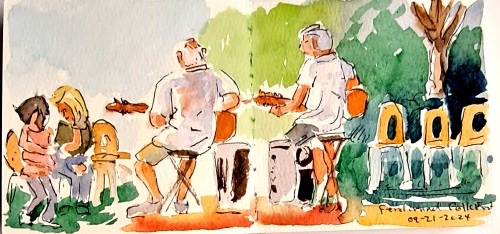
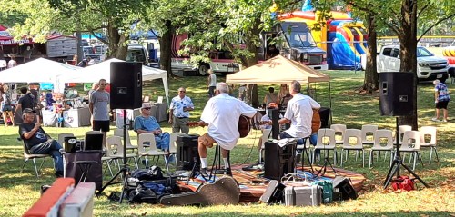
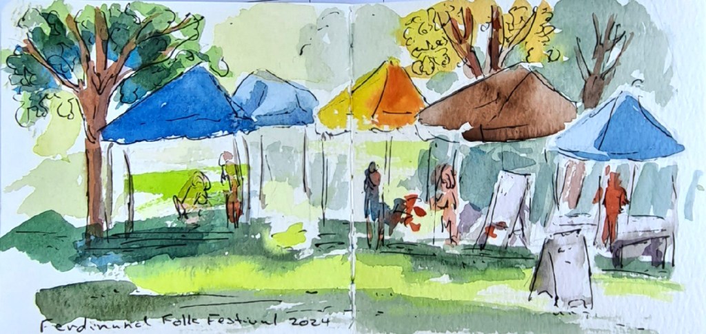
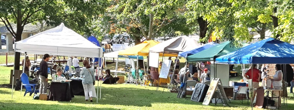
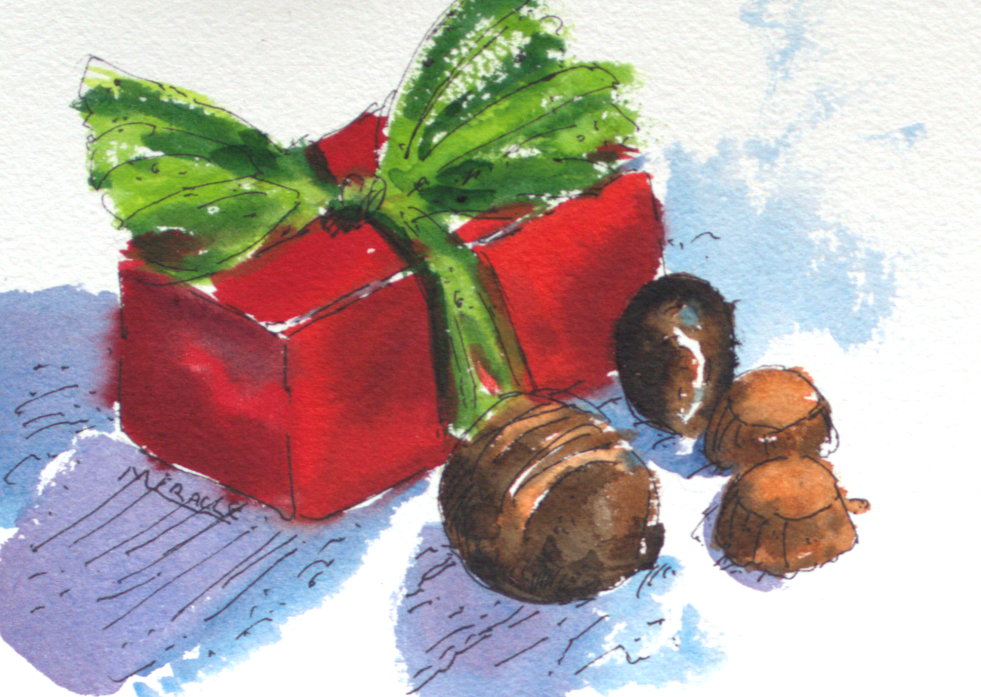
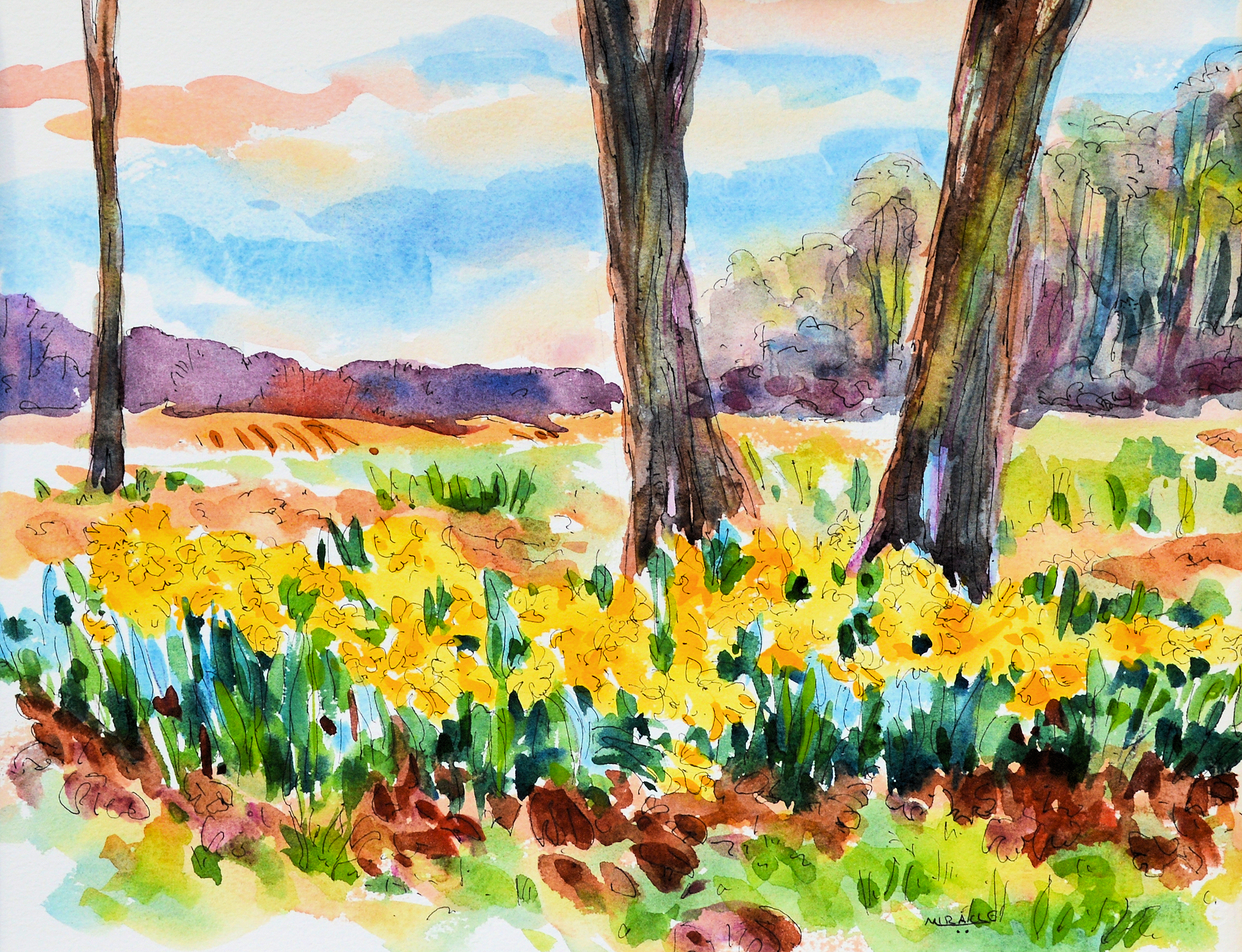
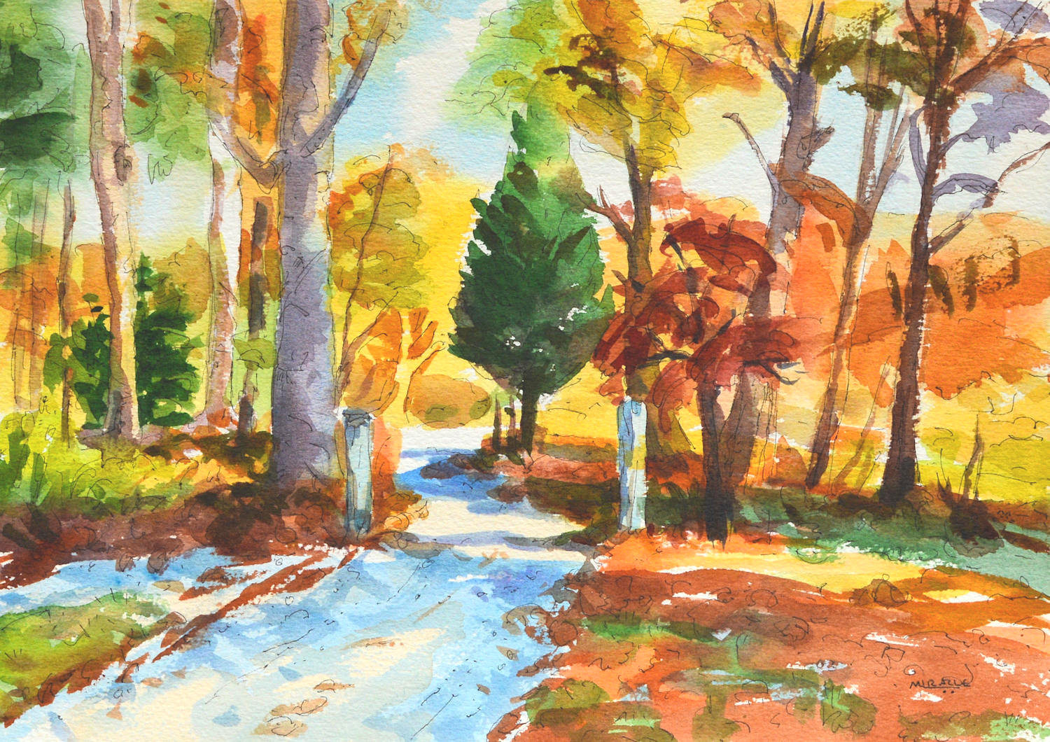
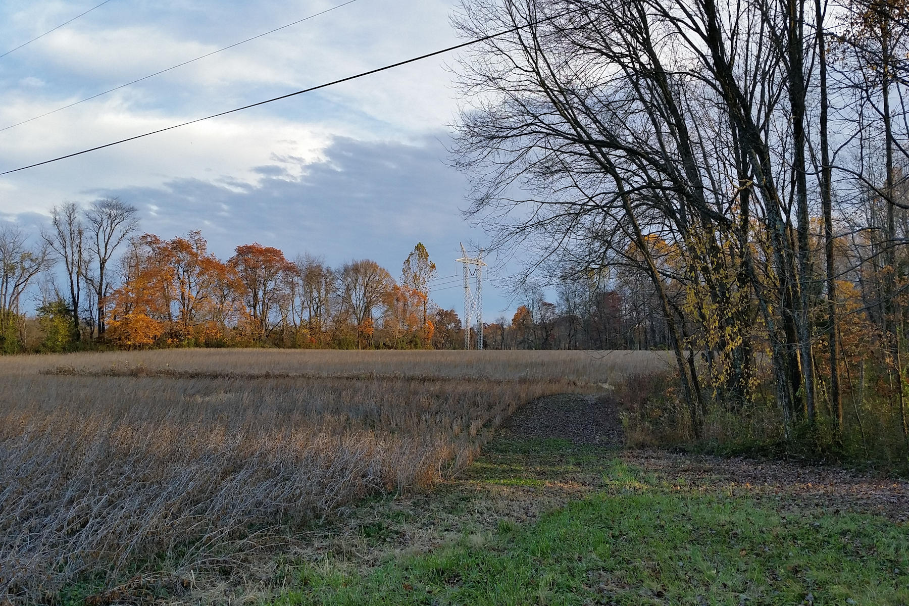
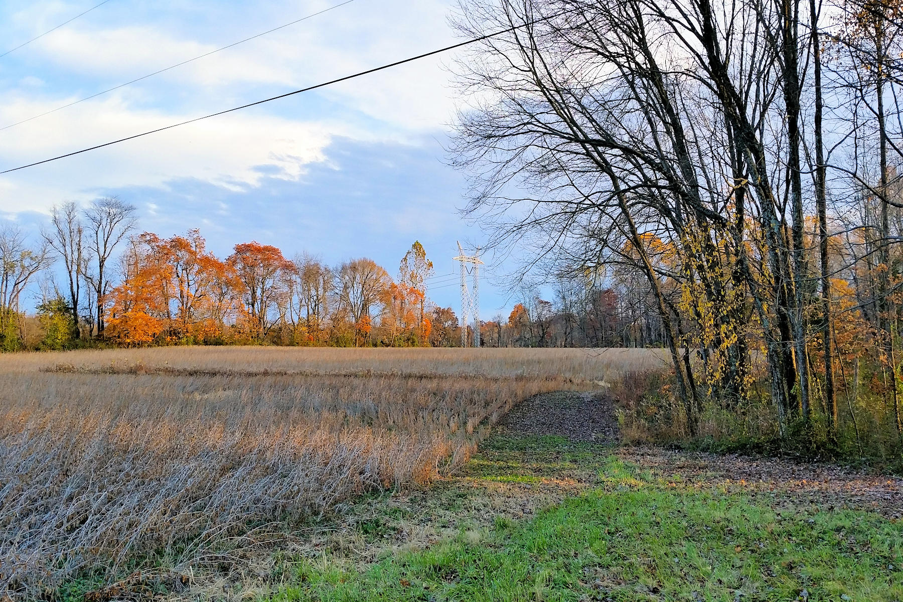
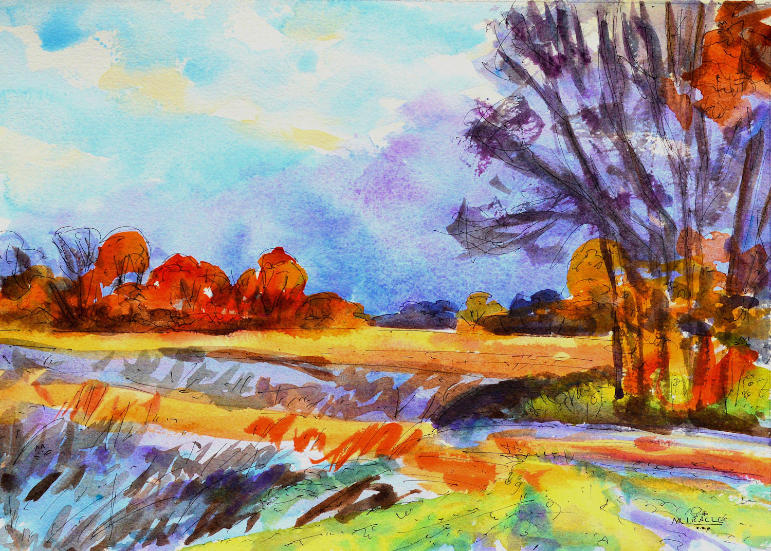
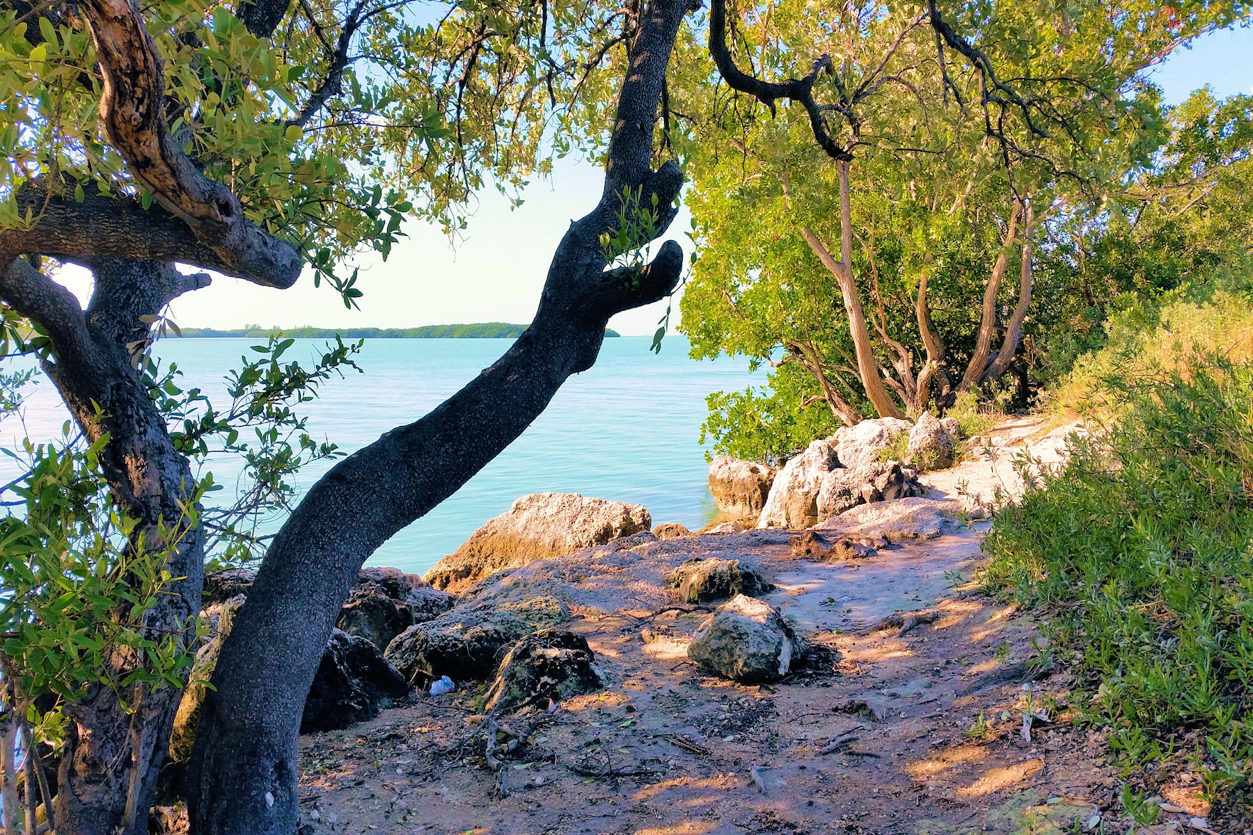
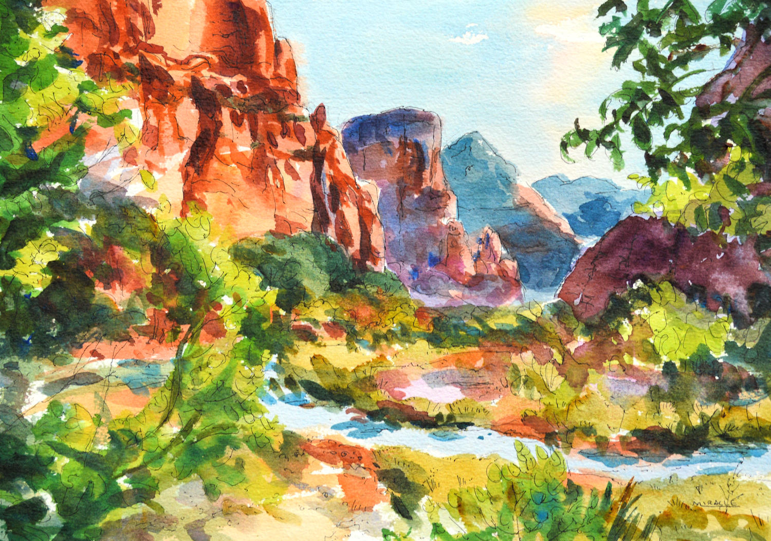
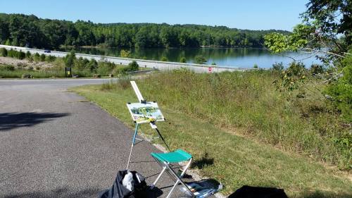
Plein air at Patoka Lake.

It’s a great time to get outside and do a little plein air painting as the season turns from spring to summer here in the Northern hemisphere.  It’s also a great way to socialize while keeping socially distant in this challenging time.  Not to mention getting some fresh air and just enjoying the great outdoors.

In my last post, I discussed some of the background of plein air painting and some general tips.  Today I’m going to elaborate on how to do plein air painting in watercolor.

This is my old Stanrite watercolor easel. The legs are adjustable and it will collapse to a pretty small package. The top tilts which is handy for watercolor since most painting is done horizontally. And it has two adjustable clips to secure your board. I’m not sure if this is made any more but grab one if you see it. This one is at least twenty years old and has proven to be very sturdy and reliable. Stanrite No 5, Watercolor

Plein air painting equipment can be as elaborate or as simple as you wish to make it.  I tend to lean toward simple and light weight.  Instead of using a French easel (which I find heavy and cumbersome), I like to use an aluminum watercolor easel (by Stanright).  The easel has legs which expand to various heights and a top section which tilts to many angles.  The top also has two clips for securing my watercolor board.

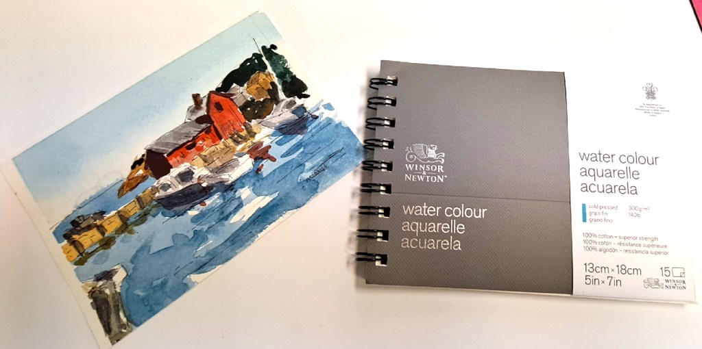
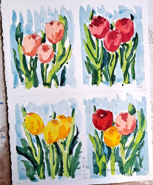
My favorite watercolor paper is d’Arches 140 pound cold press.  For ease of transport, I cut the 22 x 30 inch sheets into quarters and attach them to a luan board which is a little larger.  I find trying to paint outdoors on full size sheets of paper to be awkward but that is just my preference.  Since the smaller paper is only about 11 x 15, it can easily be attached to the board by painter’s tape or clips and does not need to be stretched to prevent buckling.

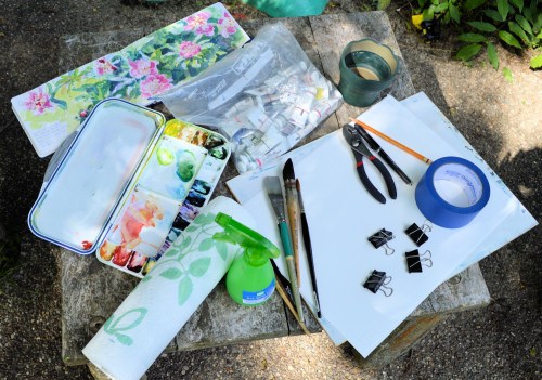
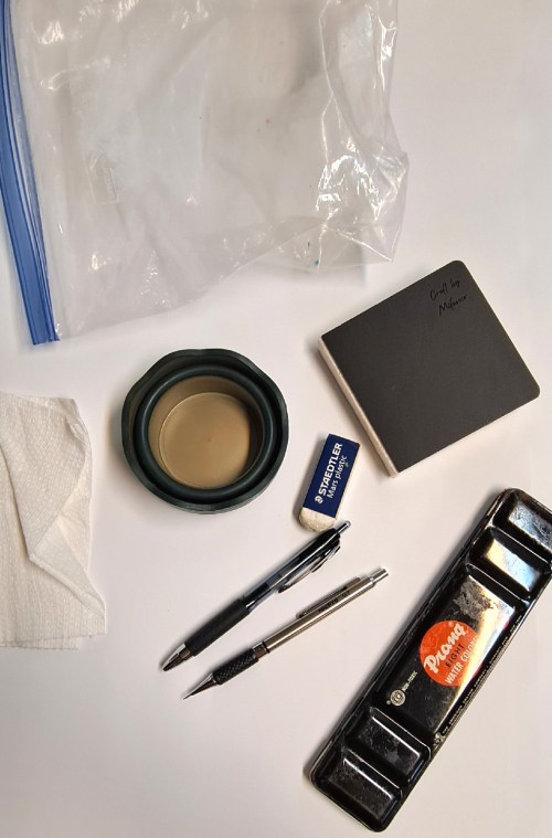
Plein air watercolor equipment that I keep in my bag. See the list in the body of the post.

I usually keep a bag packed with items just for watercolor painting.  I find this helps speed up the process of packing when I’m ready to get out of the house.  The bag I use is a multi-pocket computer bag which I bought for $5 at a resale shop.  It has a nice shoulder strap which is very comfortable and plenty of zippered compartments. I removed the extra padding.

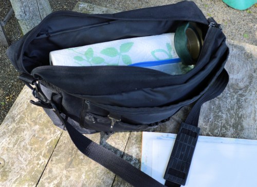
The used computer bag that I use as a plein air bag for watercolor. I love the many zippered pockets and the comfortable, adjustable strap. I paid $5 for this at a resale shop. Then removed the foam padding.

A very big help to me is that I have color-coded index cards for each type of plein air painting that I do.  This helps to remind me what I need to take just in case I have removed something from my bag.

My list of items to take in my watercolor bag are:

Easel

Chair / stool

Umbrella / bungees

Bag

Paper

Support

Clips

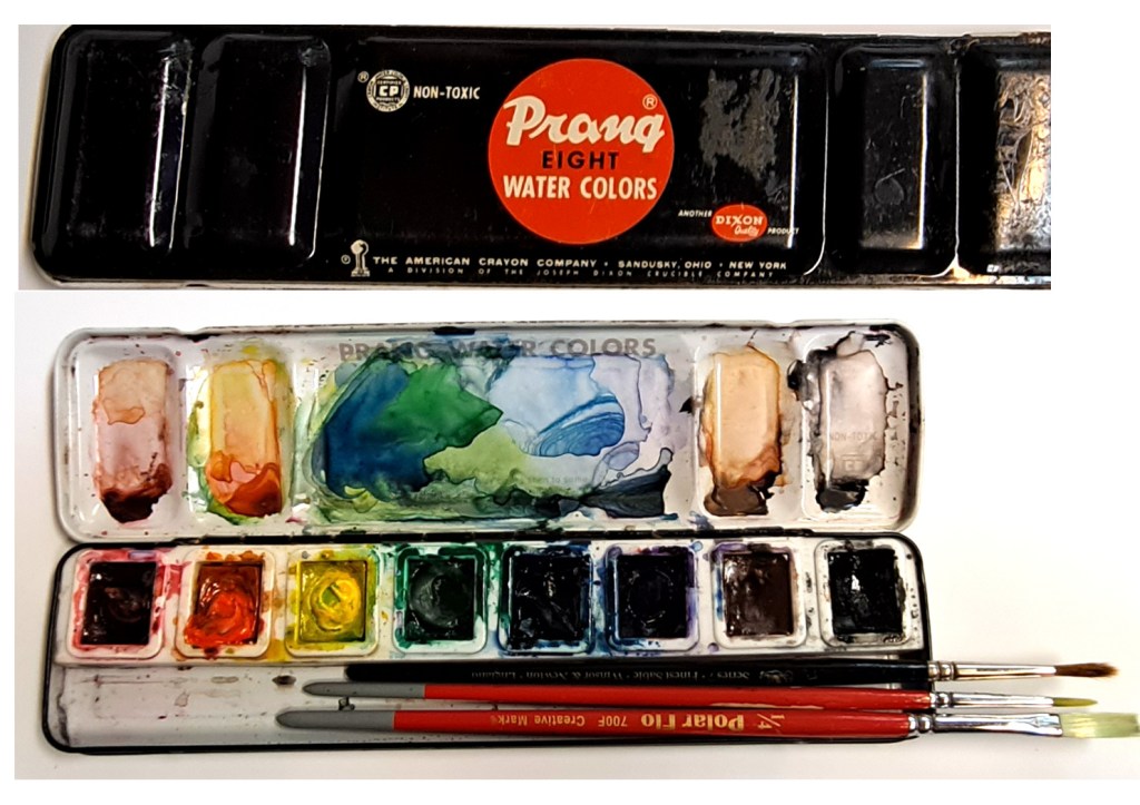
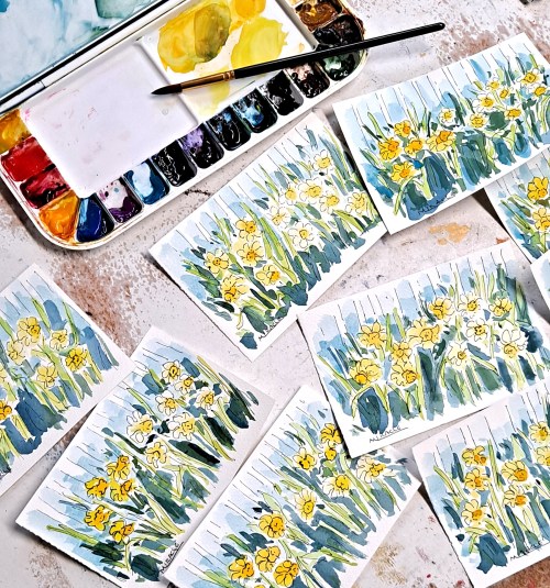
Watercolor travel palette (Mijello)

Brushes -assorted

Paints – assorted

Water and collapsible  cup

Spray bottle

Pencils/pens

Sketch book

Tape / clips

Multi-tool / pliers

Paper towels / cloth rags

Sponge

Bug spray

Sunscreen

Hat

Camera / cell phone

Apron

Scissors / knife

Snacks

Business cards

Some folding green stuff (money)

Band-aids


Even with my list, I have forgotten items before.  Once I forgot my collapsible water cup so I cut a spare water bottle in half.  The bug spray will be really welcome if the mosquitoes or flies find you.

Various layers of clothing might be warranted if the weather is likely to change, as is a poncho, etc.  I always keep a travel blanket in the car which I have found handy to wrap up in on particularly windy or chilly days.  The bungees can be attached to your bag and easel to prevent it from flying away, or used to secure your umbrella to your chair for shade.

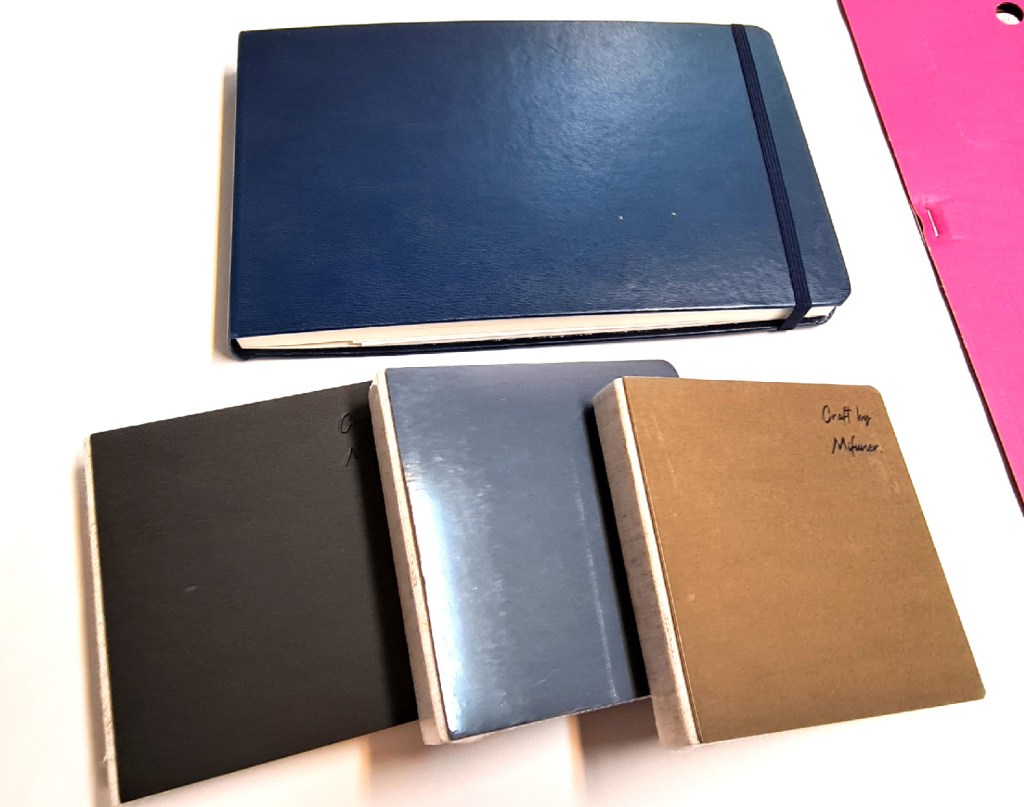
I usually use a small sketchbook to make thumbnail sketches but sometimes I’ll paint in a watercolor notebook.  It’s important to be flexible and not get bummed out if you forget something.  I have a friend who paints with sticks (and the results are amazing).

Depending upon where I’m painting, I might even take my Square-card reader…just in case a passerby decides that they must have that painting right then and there.  Be prepared, I always say.

All in all, the whole kit – bag, easel, chair, etc., weighs about twenty pounds or less.  Although I’ll throw some things into the car, I don’t always  lug everything out.  For instance, a rock, bench, log or wall might be the perfect seat so I can leave the chair.  Maybe it’s too windy for an umbrella so that stays in the car, too.  But I do like to have these things with me, just in case.

I have even been able to organize all my equipment into a couple of panniers for my bicycle.  Then I can really tool around without even looking for a place to park.

Bike with panniers and equipment for plein air painting. I don’t do much of this anymore but I put thousands of miles on my bikes. With the distraction of cell phone usage now, it’s a little too scary to bike regular roads.

https://www.jerrysartarama.com/mijello-fusion-air-tight-watercolor-palettes

https://www.jerrysartarama.com/faber-castell-clic-and-go-cups-brushes

I can’t find the Stanrite No.5 Watercolor easel anywhere but there are some other makes available.  I would opt for the light-weight aluminum over the wood.  You might also be able to find a used one on Ebay.

Juicing up your painting colors

Bill’s Gate, Autumn, watercolor, pen and ink, Kit Miracle

I’m teaching a class in landscape painting, watercolor with pen and ink. Last week I asked the students which picture they preferred, the regular photo or the one with the juiced up colors.  They all agreed that they liked the one with the brighter, more emphasized colors.

It is often a difficult choice for artists who paint in a realistic style, of whether to paint exactly what they see or to change things to suit themselves.  I tend to change things to suit me.  Personally, I like paintings with a little extra pop in color.  Not to go garish, but to just add an extra emphasis.

Below are some comparisons between the original photos, the juiced up photos, and the final paintings.

Which do you prefer?  Would love to hear your comments.

Autumn sunset photo before enhancement.

Autumn sunset with color saturation.

Autumn Sunset, painted with the enhanced colors. Watercolor, pen and ink, Kit Miracle

East field in fall, before enhancement.

East field in fall, after enhancement. I wanted to emphasize the warm autumn colors in the trees in the distance.

East Field in Autumn, watercolor, pen and ink, Kit Miracle

Florida Keys before color correction.

Florida Keys after photo saturation.

Florida Keys painted from the color saturated photo. The water down there is actually a turquoise color but it’s a great place to spend a morning in the shade.

Wickliffe Road without color enhancement.

Wickliffe Road, Watercolor, pen and ink, Kit Miracle


Creating a painting from a sketch

West Texas Big Sky, watercolor, pen and ink, 13.5 x 9.5, Kit Miracle

A few weeks ago I posted several sketches from my recent vacation.  I’ve been working with those and some 1500 photos to create some fresh and lively watercolor / pen and ink paintings.

This is an example of a painting of the Big Sky country of West Texas.  There is just something about the terrain and the brilliant blue sky with the white fluffy clouds that draws me.  I’m not sure I quite captured the fluffy clouds receding into the distance but I like the colors.

Driving west on 87, sketch, Kit Miracle

Western Landscape Paintings

Arches Vista II, watercolor, pen and ink, 13.5 x 9.5 inches, Kit Miracle

Since we returned from our big adventure out west a few weeks ago, I have been taking a break from the beach series of paintings that I’ve been working on.  It has been fun painting several landscape impressions in watercolor with pen and ink overlay.  I just can’t get away from this subject.

These paintings are very loose with bright colors.  I have probably done more paintings in this medium than any other over my artistic lifetime.  And I still find them fun as well as challenging.  Of course, they’re all for sale in my Etsy shop.

Arches Vista I, watercolor, pen and ink, 13.5 x 9.5 inches, Kit Miracle

Zion Vista II, watercolor, pen and ink, 13.5 x 9.5 inches, Kit Miracle

Zion Vista I, watercolor, pen and ink, 13.5 x 9.5 inches, Kit Miracle

Grand Canyon Vista III, watercolor, pen and ink, 13.5 x 9.5, Kit Miracle

Zion Vista III with Virgin River, watercolor, pen and ink, 13.5 x 9.5 inches, Kit Miracle

Flowers from the garden

Here you see Beebalm, onion, and a beautiful Magnolia. Watercolor, pen and ink, Kit Miracle

After the painting blitz of landscapes the past few weeks, I jumped back to painting flowers again.  I’m teaching a flower painting class in October, watercolor / pen and ink, so I wanted to have some more work for the class.

All of the flowers I depict pretty much come from my own property.  Even though they’re seasonal, it seems as if we always have something in bloom, either cultivated plants or wildflowers.  One has to be pretty quick sometimes because the blooming season passes quickly and some plants I’ve missed.

Zinnias and red day lilies, watercolor, pen and ink, Kit Miracle

I needed to catch up on photographing paintings today.  In the old days of film cameras, I used to have to order special film from New York, special lights and filters, then set everything up in my studio with total black-out curtains.  The lights were hot and it was a real pain.

These days, with digital cameras, I just hang the paintings on the side of my studio, either on overcast days, in the shade, or on the north side.  As long as it’s in focus and square to the camera plane, photo editing programs will take care of the rest.

For the flower paintings, I divide a full sheet of watercolor paper (22 x 30) into quarters.  Each quarter is then divided into smaller sections, either four, three or two.  I tape these down to a board and work on them that way from the actual flowers.

Orange cosmos and a mixed bunch of purple and lavender cosmos. Watercolor, pen and ink, Kit Miracle. The orange cosmos is topping seven feet now! Can’t believe it.

The style is a very loose, not botanical studies, but lively, colorful depictions of the flowers. My whole aim is to capture the spirit of the flower, its uniqueness and what makes it special and different.

I’ll have some of these up on my Etsy shops soon so if you’re interested, check them out.

Etsy:  my90acres for the small paintings and KitMiracleArt for the larger ones.

Calla Lilies and Other Garden Musings

Happy Independence day, everyone!  Celebrating here in the United States. Family, friends, plenty of good things to eat.  And maybe a beautiful tour through the garden.

Calla Lily, Picasso variety, watercolor, pen and ink, 14.5 x 10.5, Kit Miracle

The calla lily is in bloom.  This is the standard Picasso variety. It seems to require no care at all except to weed around it once in awhile. Unfortunately, Japanese beetles, slugs and snails love to munch on these lovely blossoms.

I love these tall, elegant blooms. They’re somewhat waxy in texture and will last a few days.

Calla lilies seemed to be a common motif in the art deco period, maybe for their simple lines and shapes.  I also like their speckled leaves.

Calla Lily plant in the garden

Fair as a lily, and not only the pride of life, but the desire of his eyes.

Charlotte Bronte

Trusty Guard Dog, Mikey

On another front, the first planting of sweet corn is nearly ready; only a couple of days left.  This time last year, the raccoons came one night and decimated the crop.  Thus, our trusty guard dog is being posted out by the garden. Based on his enthusiastic barking last night, I think his presence was effective.  A couple of more days before we can harvest.  Mikey says he’s tired and needs some sleep.

Postcards from Texas

South Padre Island, panorama from the balcony, watercolor, pen and ink, Kit Miracle

We recently drove to Texas to pick up our granddaughter and take her to the beach.  It was wonderful being able to introduce an eight year old to the ocean for the first time.  We went down to South Padre Island which my husband and I first visited forty years ago.  Needless to say, it has changed quite a bit.  When we initially visited, it had one Holiday Inn, a couple of mom and pop hotels, a few ramshackle houses and a few restaurants.  Of course, most people go there for the ocean and the beautiful beaches.

South Padre Island, postcard #1, watercolor, pen and ink, Kit Miracle

Everything has changed except the beaches.  Still beautiful.  Gorgeous sunrises and sunsets.  But the Gulf side is now lined with high rises and there are now many, many eateries and other things to do. We took an Eco and Dolphin watch tour, visited the Sea Turtle Sanctuary, and went to the light house.

South Padre Island, postcard #2, watercolor, pen and ink, Kit Miracle

I usually take some painting materials on my trips but this time I restricted myself to just watercolors.  One thing I love to do is paint postcards and mail them to friends.  I’m not sure where I came up with this idea but I think it was when I read about a guy who financed his trip to Europe by preselling postcards.

South Padre Island, postcard #3, watercolor, pen and ink, Kit Miracle

Amazingly, they come through the mail just fine.  Yes, mailing original art.  With a stamp.  I make the cards from heavy watercolor stock of at least 140 lb.

South Padre Island, Dolphin Watch, postcard #4, watercolor, pen and ink, Kit Miracle

South Padre Island, Seagull, postcard #5, watercolor, pen and ink, Kit Miracle