Tag Archives: composition

Compositional framing

There are many rules and ideas for composition.  No one idea is perfect for all situations.  You may have your favorites or you may like to try new ideas frequently.  Today I’m going to discuss the idea of framing.  I’m not talking about the frame of the painting but using framing as a composition device.

Plein Air Painting, Birdseye, Indiana

I most often use framing in landscapes, cityscapes, and sometimes interiors.  This means that I’ll often place a large tree or bush near the front of the picture frame, usually on one side or another, with the main view in the middle distance.  This leads the viewer’s eye into the painting and directs its focus.

Sometimes in cityscapes, the view might be between two buildings or down an alley. 

In a recent couple of paintings of the same subject – a child flying a toy airplane at the park – I first explored just the child and the plane.  In the second painting, I used the framing composition to lead the eye from the near subject matter, to the large tree on the left, to the child and plane in the background.

In another couple of paintings, I painted a straight view of a Grand Canyon vista.  The second landscape shows the Grand Canyon framed by tree in the front.

Here is an interior view using compositional framing.  The doorway, chair and plant, lead the eye through the doorway to the desk in the distance.

There are no hard rules on when to use compositional framing.  It’s mostly a matter of what you feel comfortable with, what helps your painting.  I’ll often do several thumbnails or even larger charcoal drawings to test the feel of the subject. 

Asymmetrical composition

Beach Readers, Intimate Spaces series, acrylic on linen, 24 x 30, Kit Miracle The whole attraction of this subject was the irony of the two young women who are reading and totally ignoring the beautiful day at the beach. I also love the way the red beach chairs draw the viewer’s eye into the scene.

There are many rules of painting composition which I have discussed in previous blogs (search: composition).  These are usually conventional and are designed to lead the eye through the picture.  But one of my favorites is an asymmetrical composition, that is, not even or necessarily balanced.  I liken this somewhat to whether you are a candlesticks at each end of the fireplace mantle kind of person or you feel comfortable placing both candlesticks at one end (usually balanced by some other object at the other end.)  It’s just a matter of personal preference.

The painting above, Beach Readers in the Intimate Spaces series, is a good example of asymmetrical composition. The bright red chairs on the right lead the eye into the scene to the two girls who are reading.  Most of the other action is in that quadrant of the painting.  However, the small figure playing in the surf at the far left is able to balance the scene.  If you don’t believe me, cover the figure with your hand and see what a difference that makes to the feel of the painting.

Asymmetrical composition came into vogue in the 1880s and 1890s as the Impressionist artists were influenced by the import of Japanese prints.  These prints not only led to some experimentation in composition, but to flattened colors and situational composition.  This would be similar to a photograph that is just cut off at strange places.  This could include people looking out of the picture plane, cutting off the head or legs of horses, or even figures exiting the frame.

Below are several examples of paintings by Mary Cassatt, Edgar Degas and Edouard Manet which illustrate this influence.  The first two artists collaborated for years with their printmaking but as you can see, the Japanese influence directly appeared in their work.

Mary Cassatt, Woman and Child in the Driving Seat.

Degas, more race horses running out of the picture plane. Lots of empty space but it works.

One of many Degas racing scenes. Notice how some people are only partially shown in the picture plane. This is a similar composition to my Beach Readers in that there is a big blank space in the lower left side of the painting, with the action on the right leading into the main subject.

Degas. Another very unusual composition of race horses and jockeys.

Degas, Place de la Concorde. Notice how everyone seems to be looking off in a different direction. And why are the little girls cut off at the waist?

Edouard Manet, Portrait of Gillaudin on a Horse. You can only infer the horse in this painting although the main subject is centered.

Little Stone Church, Provence – demonstration painting from photographs

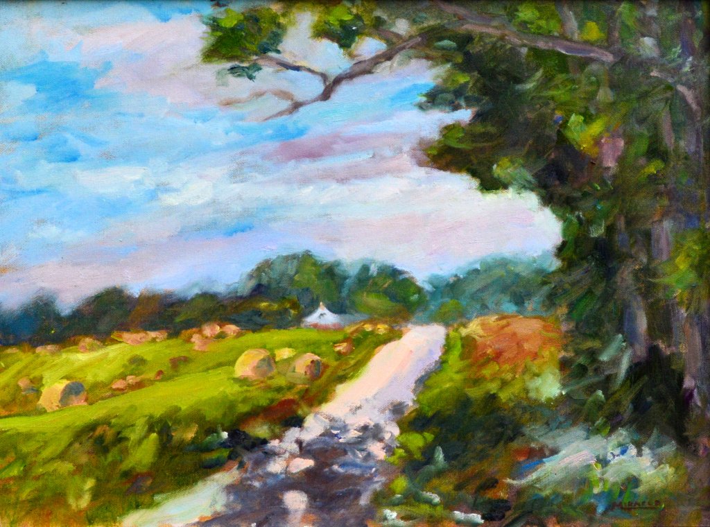
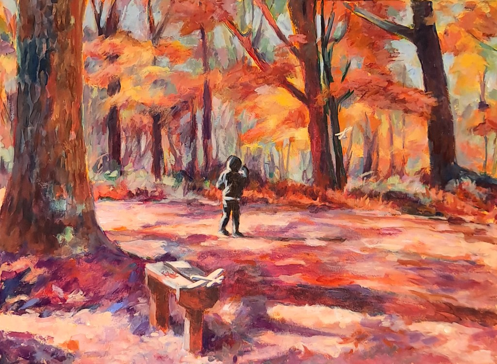
Little Stone Church, Provence, France – final. Acrylic, 12 x 16. As you can see, I made the sky more interesting and edited the road a bit, too.

I thought I’d share another lesson from the class that I’m teaching about painting from photographs.  Frankly, this process can be as complicated or as simple as you want to make it.

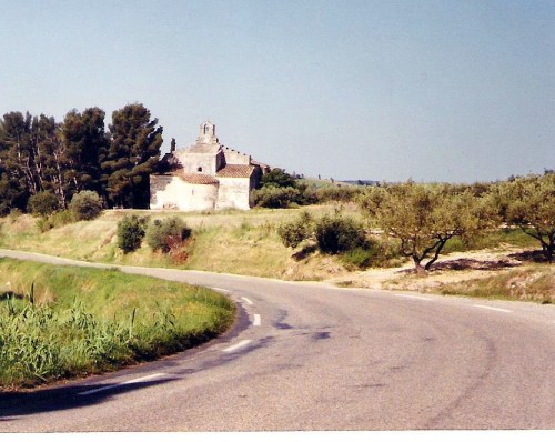
Little Stone Church, Provence – original photo

In this example, I have a real photo – you know, the printed kind – from a biking trip that I took through Provence, France many years ago.  I like to browse through the old photos and inevitably I see a new subject that I overlooked before.  In this case, I remember exactly how I felt cruising through the olive groves when I passed this old stone church one morning.

Little Stone Church cropped.

The original photo included more subject matter than I wished to include in my painting so I cropped it to fit my canvas size.  This is easy to do if it is a digital photo, but in this case with a real picture, I used paper L-shaped pieces to manipulate the photo (not shown here.)  I don’t usually need to do this anymore since I’ve been painting for so many years but it’s a good hack for new painters.

For the purpose of the class, I actually scanned the photo and used these images to demonstrate.

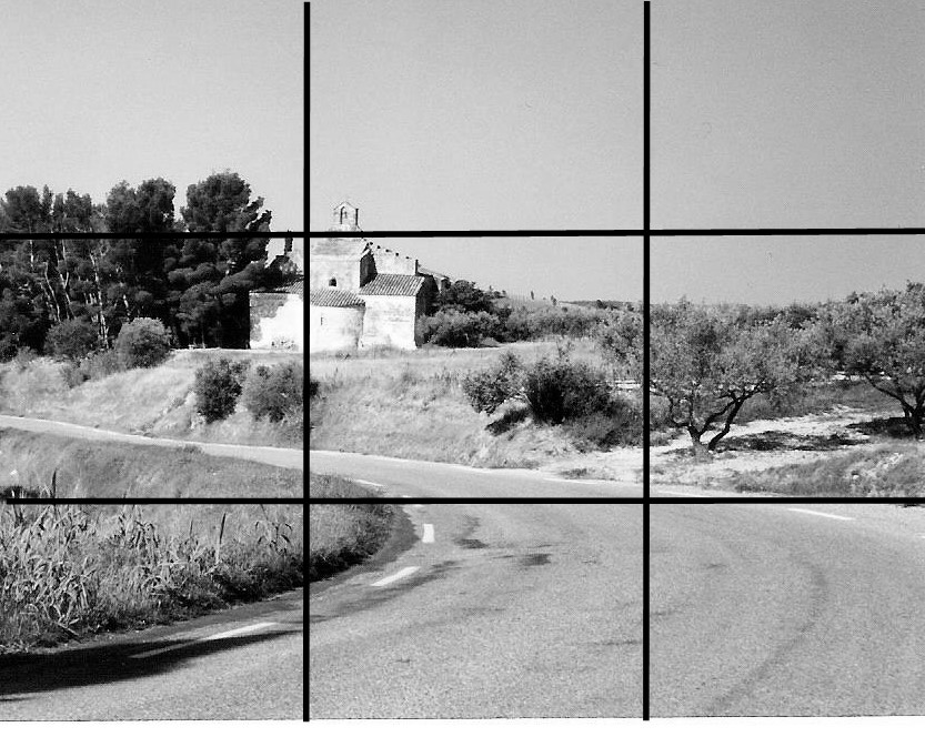
Little Stone Church – photo divided into thirds. The center of interest – the church – is at the intersection of one of the thirds. Also, notice how the road leads the eye into the painting and points towards the church.

I divided the selected picture area into thirds each way and then placed the church on one of the intersections.  This generally makes a nicely balanced composition.

NOTAN Here I changed the photo to black and white, then pushed the contrast to the extreme. This helps one get a better idea of the basic shapes. Notice how the stone church (center of interest) also has the greatest contrast with the trees framing it.

The prior week we had discussed NOTAN – the theory of making your image extreme black and white in order to seek balance in the composition.  Here, I manipulated the image by computer to show a high contrast in black and white which is essentially NOTAN.  Here is a link to a very good explanation of NOTAN by artist Mitchell Albala.

A black and white image of the same photograph. This helps the artist gain a better handle on values, lightest to darkest. The same effect can be achieved by viewing the color photograph through a piece of red gel. See a prior post on the subject at the link.

I then showed a regular black and white photo to the class so they could get an idea of the values.  Again, you can use the trick of a piece of red gel to get the same effect.  (Click here to see an earlier post about using red gel.)

The next step was to demonstrate to the class my procedure for painting the scene in color.  In oil or acrylic, one usually starts with the darks and works towards the light.  Watercolor usually proceeds the opposite way with laying in the lights (or reserving the lights) and adding more and darker color as the painting progresses.  There are several demonstrations of both of these methods under the tab Artworks at the top of the page.

The takeaway here is that composition can be enhanced for using old photos as painting materials by manipulating the size and shape of the photos, taking care of the placement of the center of interest, and selecting pleasing balance and contrasts of lights and darks.

Little Stone Church, Provence