

Onions and Garlic, 12 x 16, oil on canvas, final- Kit Miracle
Onions and garlic are such common household items but that is what makes the subject relateable to most people. The beauty of the golden skins of the onions almost has an iridescent glow. And these giant garlic bulbs hold promise for many meals. I decided to use a small birch bark and wicker basket that I had in my greenhouse for this still life set up. After playing with it for awhile, this is what the final arrangement looked like. I had a direct view from my easel a little below eye level.
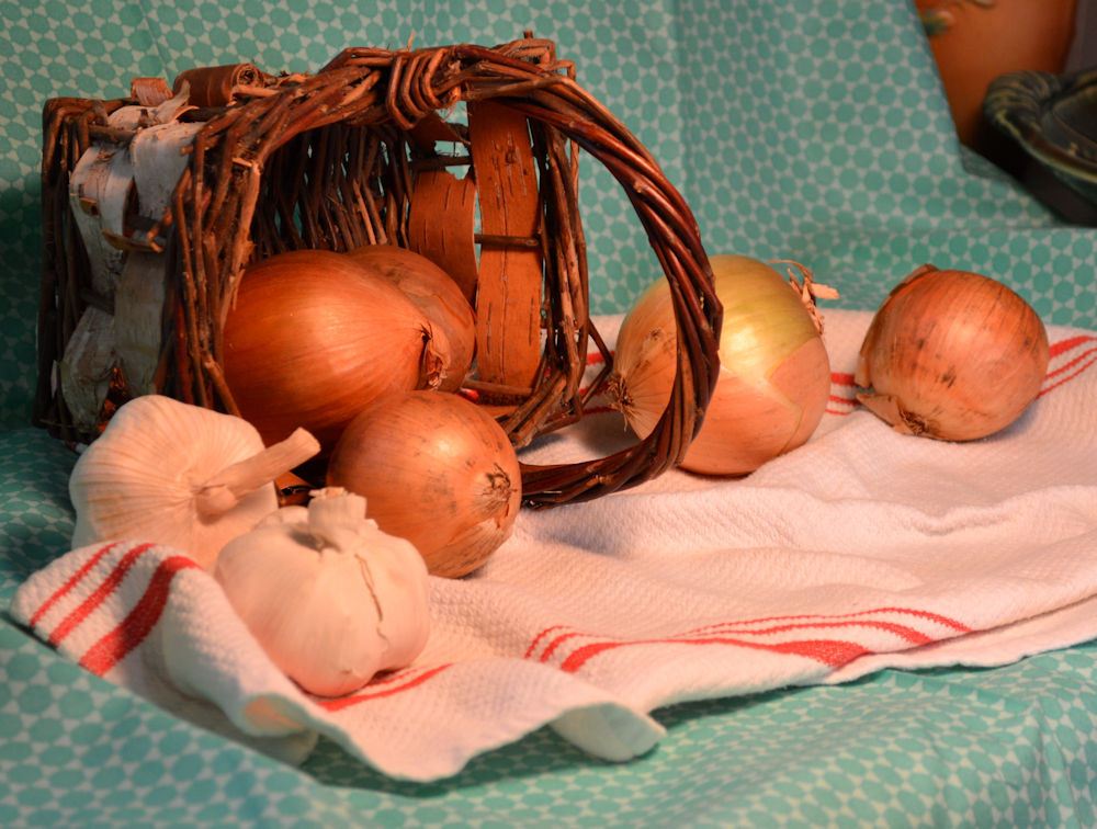
Onions and Garlic, still life set up
The canvas I chose is a gallery wrapped (no staples appearing on the sides) of 12 x 16 inches. Not large but not real small. I started by painting the edges a complementary blue tone. This allows the painting to just be hung directly on the wall or placed on a shelf without the dribs and drabs of paint along the sides. I should have taped the sides to keep a really clean edge but it worked pretty well.
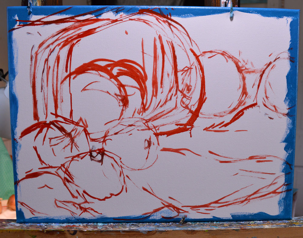
Onions and Garlic, step 1, painted blue edges and outline in red
My first step after painting the edge was to make a loose outline directly on the canvas in red. (The canvas was plain white and was not toned.) I like using red as little bit of color shows through in the final painting. Cezanne often used blue for his outlines. I guess it’s personal preference.

Onions and Garlic, step 2, blocking in major shadows and shapes
The next step was to block in the darks. This allowed me to give some volume to the subject matter. I generally paint from dark to light and all over the canvas, but not always.

Onions and Garlic, step 3, more major blocking in medium tones.
After I had the major darks blocked in, I then added more medium tones. I tend to work all over the canvas at first but again, not always. In this case, I think I painted the onions too dark to begin with and had to spend extra time later to work on the highlights. Perhaps a lighter mid-tone would have worked better. I also worked on the shadows of the folds of the dishcloth.
I took a break here to let some of the paint dry and came back the next day. And I always spend a lot of time just looking, comparing and planning. It’s all good.

Onions and Garlic, step 4, before final tweaks.
Here I began shaping and adding more highlights, as well as emphasizing some of the darker tones. This was a tricky area as I didn’t want to get bogged down in too many details. It’s an impression, not an exact duplicate of the scene before me. This is my interpretation. Too many details can make a painting look overworked. Definitely not what I’m aiming for.
Towards the end of a painting, I tend to slow down. This was where I did more looking than painting. I noticed that the birch bark of the basket on the left side was too similar in tone to the background. It made the basket look clear or see-through. And I debated a long time whether or not to put in the red stripes of the dishcloth. In the end, I decided to paint them in and I think they really added to emphasizing the contours of the fabric folds, as well as bringing out some more of the red tones of the onions and basket.
Onions and Garlic, 12 x 16, oil on canvas, final- Kit Miracle
Overall, I’m pretty pleased with the final result. Definitely hints of Cezanne and Renoir here, but that wasn’t the aim. We can’t help but be influenced by those who have gone before us but I’m not out to copy anyone else’s style.
Oil colors used: titanium white, cad yellow medium, burnt sienna, cad yellow deep, cad red, cobalt violet, cobalt blue and turquoise (cerulean would have worked here, too).
