Posted onOctober 27, 2024|Comments Off on Dancing Shadows, Revisiting the Southwest
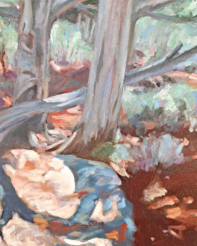
Dancing Shadows, Junipers trees at the Grand Canyon, south rim, near the eastern side. I love the shadows and the southwestern colors. 24 x 30, framed.
The Grand Canyon in Arizona is one of my favorite places to visit. When I first went out there about a decade ago, as with most visitors, I was astounded by the beauty of the place, not to mention the size. It’s overwhelming.
That first visit gave me plenty of subject matter for painting. I love the colors, just the sheer beauty of the place. I know I’m not alone in this feeling. I’ve been back a few times and never get tired of the scenery.
Dancing Shadows, detail. Notice the impressionistic variations in the paint.
This painting focuses on the shadows of the juniper trees on the south rim of the Canyon, towards the eastern side. I loved the play of light and shadow, the colors of the earth, shadows and plants. I could probably paint there a hundred years and never run out of something interesting to see.
Posted onOctober 15, 2024|Comments Off on Picasso visits Birdseye library
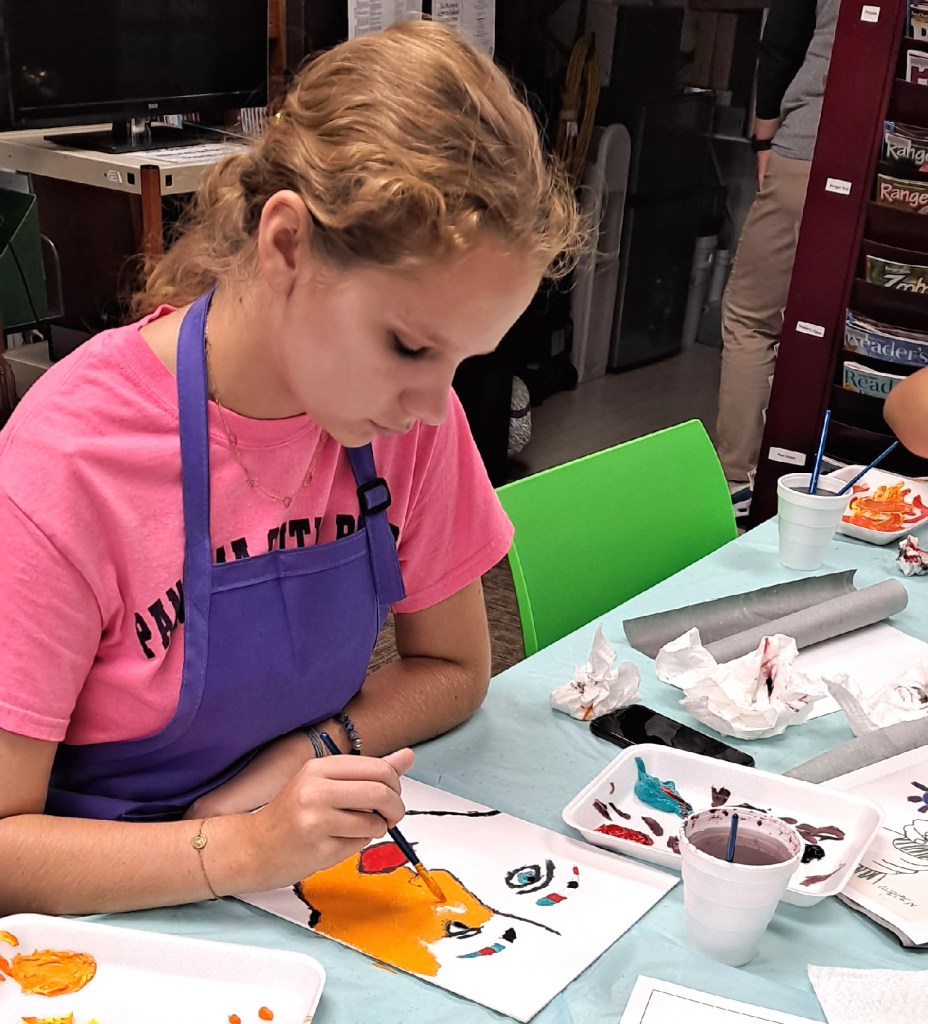
Autumn is here and we were introduced to a new artist, Pablo Picasso. I recently taught a free children’s art class at the little Birdseye library. Picasso was so famous and painted in such a variety of styles over the decades that I thought there would be something for everyone. And there was.
Always getting in the spirit of the class with Picasso stripes and beret.Me giving a very brief discussion of Picasso’s styles over the decades.
These free children’s art classes are designed for kids ages 8 to 14 but we actually had a four year old (with grandma) up to a sixteen year old. It’s 25 miles to town so the idea is to offer some fun art activities for this rural area.
Beginning stages of work.Picasso’s peace flowers
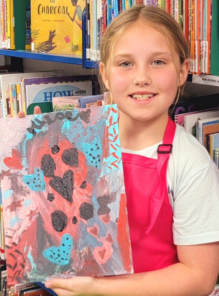
In this case, I always enjoy trying to channel the featured artist, at least in dress. I gave a brief introduction to Picasso, why he was important, and some discussion of his changing styles over the years. The kids were very receptive. Although I offered a few projects which focused on emulating the artist, they were actually free to create their own paintings. I love the variety of work they came up with.
Capturing the cubist idea of viewing a face from both front and sideLet’s copy a Picasso self-portraitHummm….the northern lights with hearts. I think Picasso would have loved this.This artist was fascinated with the harlequin squares.
We’ll do some self-portraits at the next class in November. I’ll look forward to what the kids come up with. All materials are included. Call the library to register as the class size is limited. https://jdcpl.us/birdseye-library/
Well, this looks like Pikachu but we love it anyway.
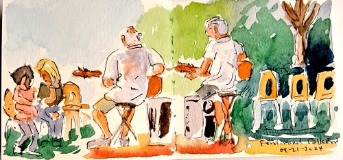
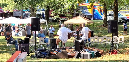
My rendition of the musicians. You don’t have to include every detail, just make hints of many items.Musicians at the music festival.
Being an artist means that you continue to view the world through an artist’s eyes. You’re always looking around you with an intention of expressing your views through whatever means with which you are most comfortable. For me, it’s capturing my views through quick sketches. These are not finished drawings or paintings, but quick translations of what catches my attention.
Many of these sketches end up as finished paintings. Most do not. They are just recordings of my thoughts and viewpoints. There is something about sketching which makes me look more closely. As opposed to photographs., which do not always. The sketches dig into my consciousness, impressing certain details that I would normally overlook with a quick photo.
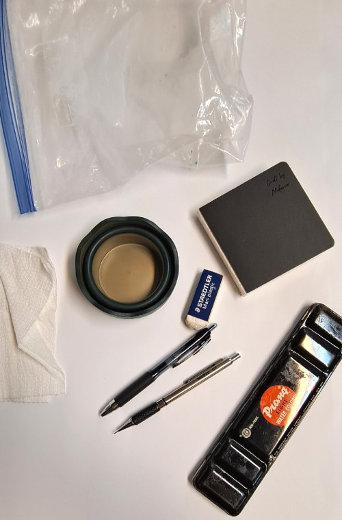
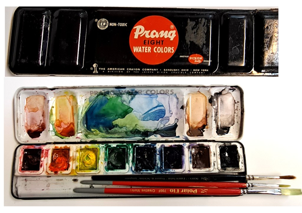
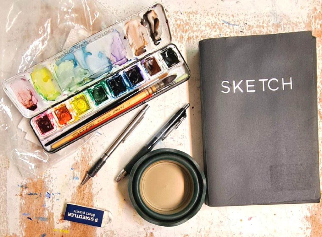
The full quick sketch kit – plastic bag, sketchbook, collapsible water container, paper towel, plastic eraser, pen, mechanical pen and paint box.
I keep a quick sketch bag at the ready. Since my favorite tool is watercolor, paper, and pen, this is what I keep in my bag.
A one gallon ziplock bag
A small sketch book, probably for watercolor or at least pen and ink, sometimes precut watercolor postcard sizes
A mechanical pencil
A pen, usually a commercial fade-proof and waterproof ink, nothing fancy
A plastic eraser
A folding water container
An old-fashioned metal PRANG watercolor box, filled with my good paints, only eight colors
Two or three good brushes, small enough to fit in the color box
A paper towel or cloth rag
A bottle of water
This is it.
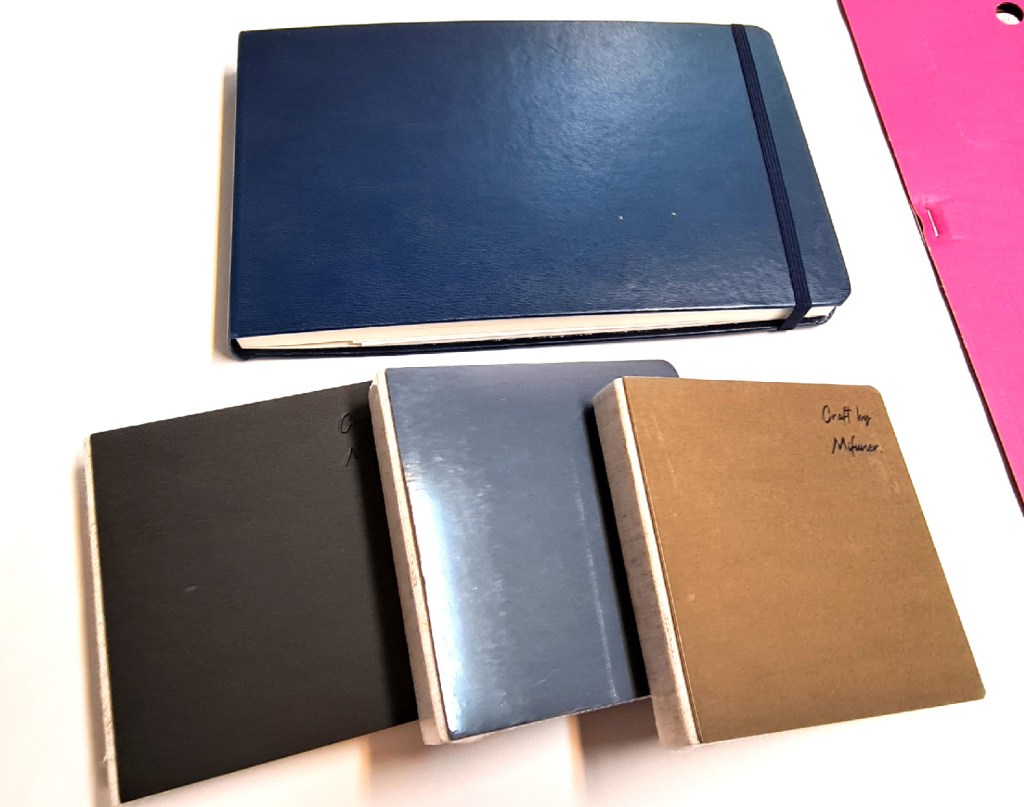
A few samples of small sketchbooks I keep on hand.A homemade postcard from watercolor paper, and another sketchbook with tear-out pages.
This is light weight. Always packed. Ready to grab at an instance and get out of Dodge.
My old metal Prang watercolor box, filled with the good watercolor paint and a few brushes. I let it stay open overnight until the paints have dried out so it travels without making a mess.
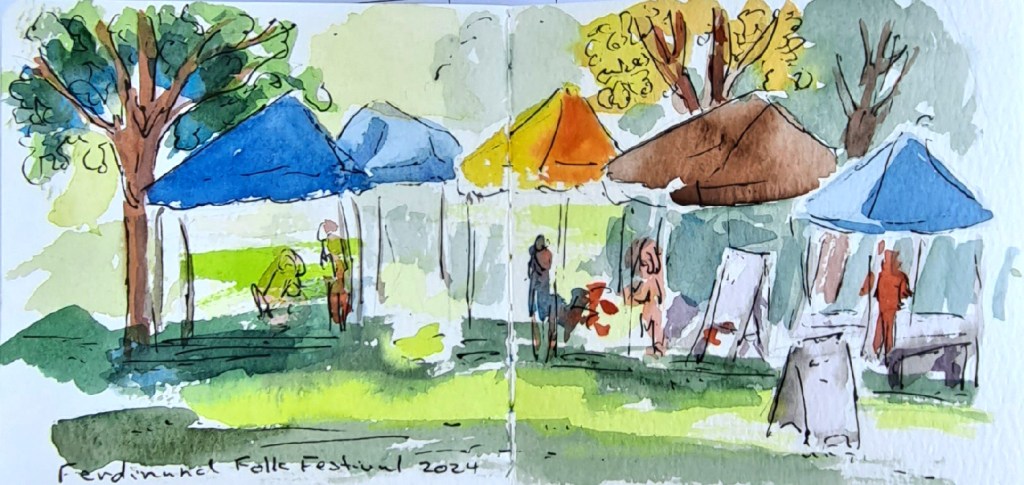
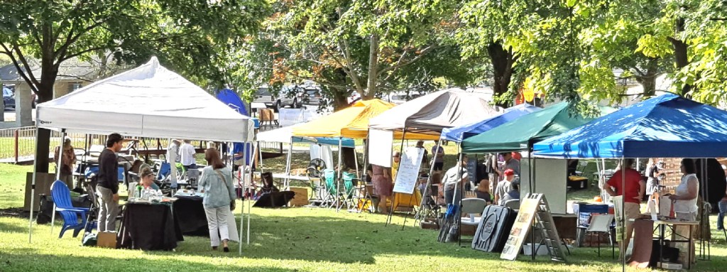
This past weekend I participated at a small local arts and music festival. I haven’t done art fairs for thirty years so it was a good opportunity to renew my experience. And to discover why I don’t really want to do it any more.
Capturing the tents of the vendors.Vendor tent at the festival.
But it also afforded me a few hours to sketch the people and entertainers at the festival. Fun to experience that. But also fun to know that I don’t have to do this any more. And I had a good opportunity to people watch. With my quick sketch tools.
Are you ready to get out in the world with some quick art tools? The better prepared you are to go, the more likely you will be to do so. Be prepared.
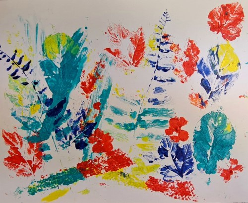
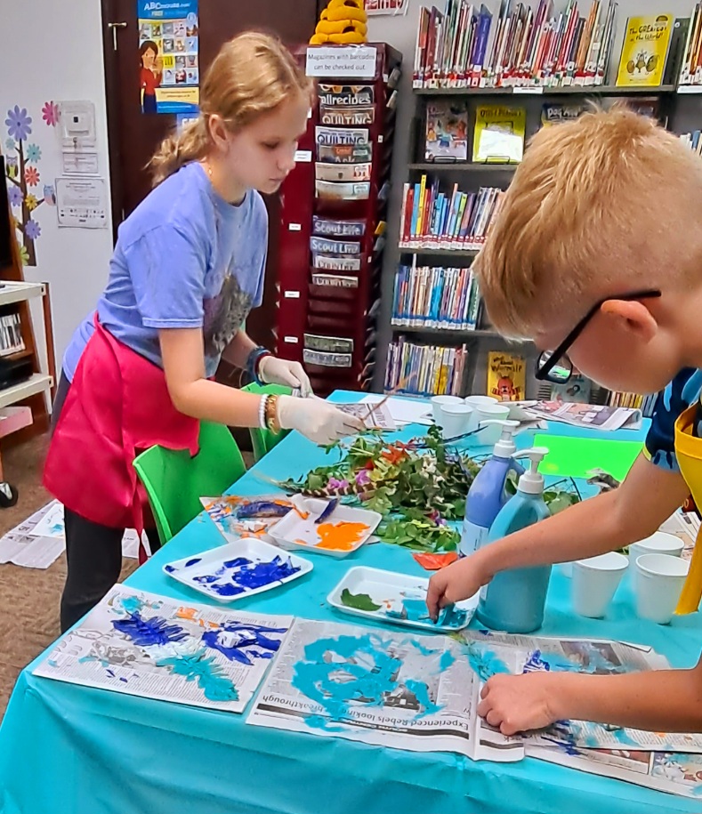
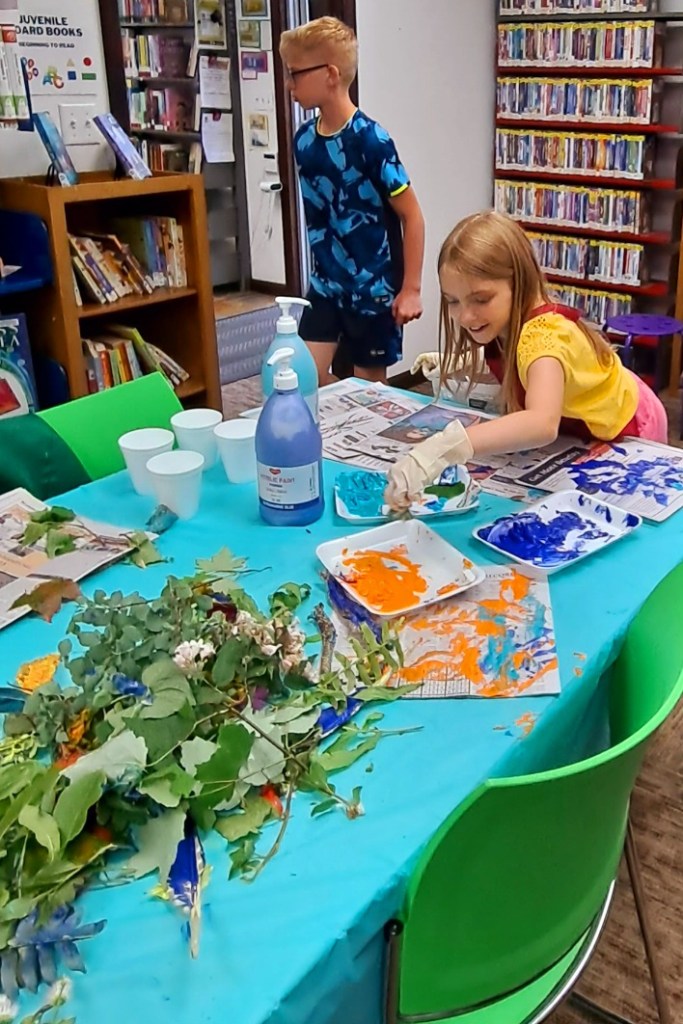
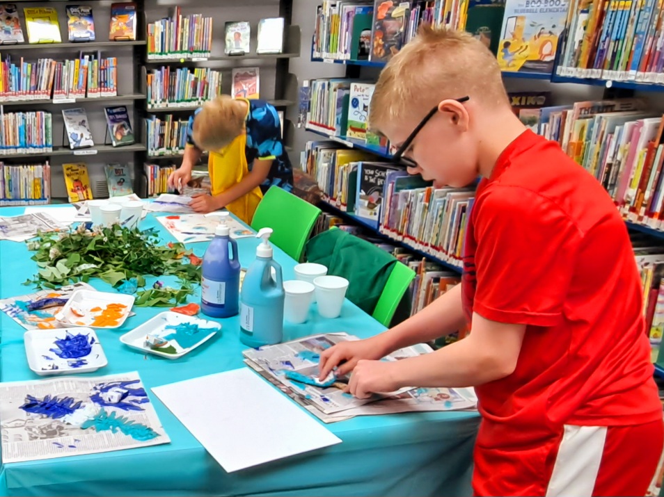
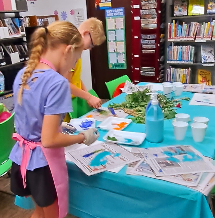
Creating prints from natural materials can be a whole lot of fun for you or your kids. I had an opportunity to conduct another free class at the little library a couple of weeks ago. This was the last of a series of free kids art classes this spring.
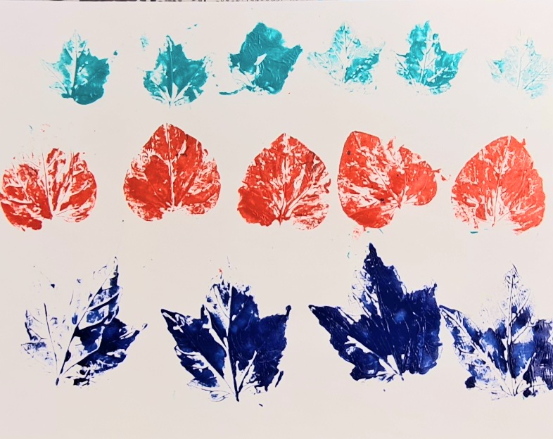
The idea was to collect some interesting natural materials, cover them in paint, and use them to make prints. The materials I used were just collected from my yard. Ferns, leaves, flowers, weeds. I also added some feathers and even a snake skin for texture. Maybe you can take a nature walk with your kids to collect the materials.
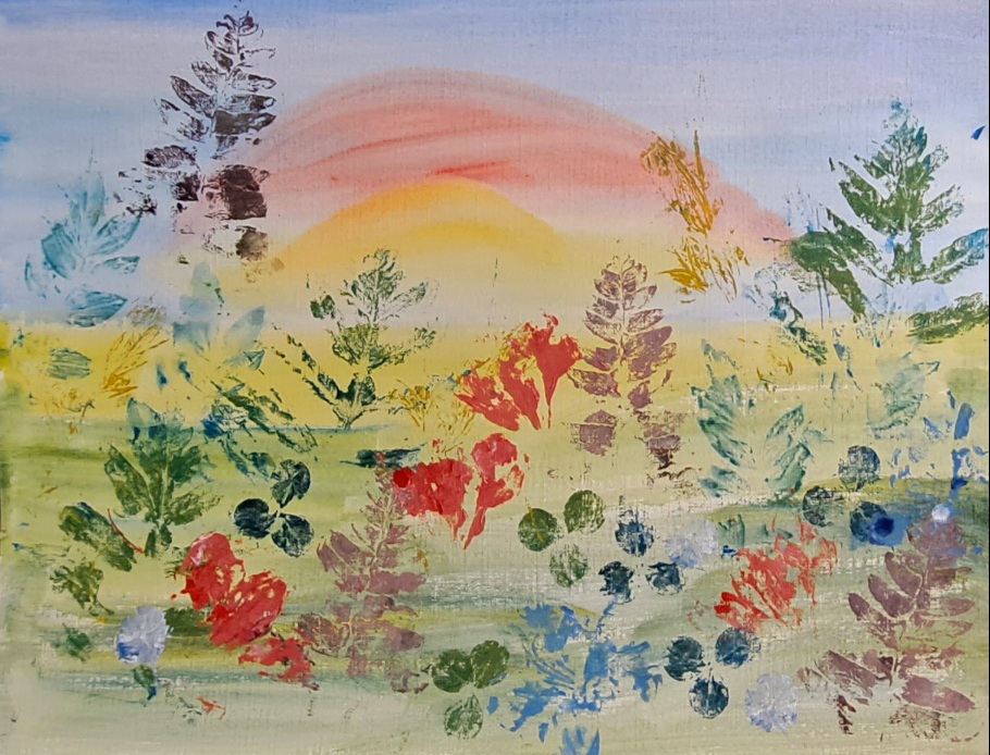
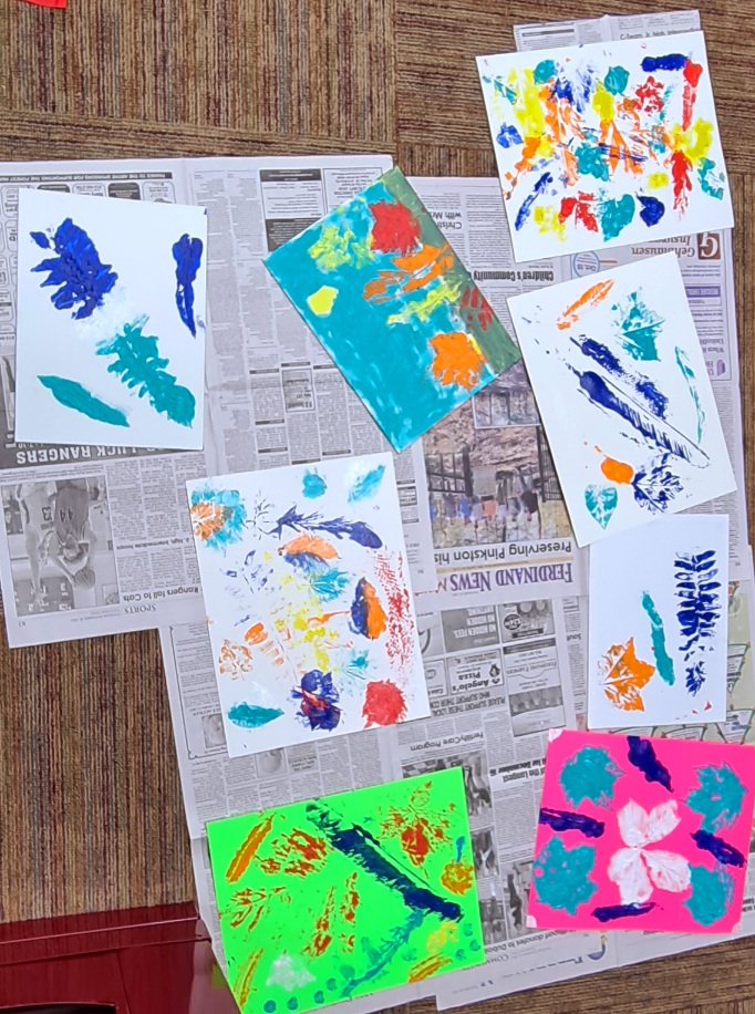
One of my demonstration sample print pieces on top of a painted sunrise.Repetition leaves in a pattern
Some of the kids used artist canvas boards, but we found that paper or cardboard works best as supports for the prints. The paper can be plain white or colored, or even textured. Some of the kids did a pre-print drawing or rainbow on their papers. There are just so many ideas.
This was a pretty messy project so as before, I recommend a disposable table cloth, lots of newspapers, disposable plates for palettes, and disposable cups for water. Actually, after our class was done, nearly everything got wrapped up in the tablecloth and tossed. Easy cleanup.
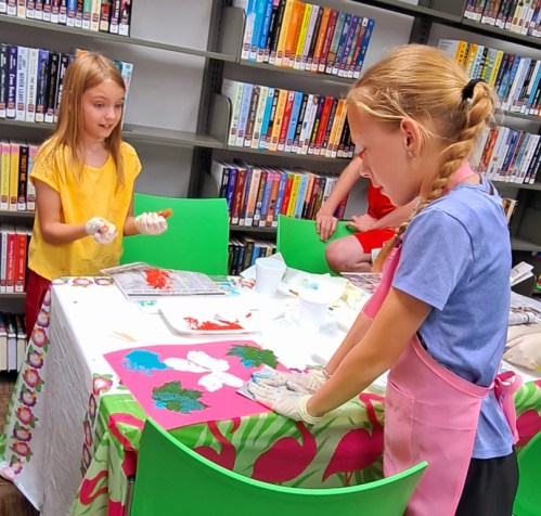
I also recommend that you AND the kids wear some protective clothing or aprons. An old shirt turned backwards works great, too. Things may (WILL) get messy.
Some of the kids wore gloves but others opted not to.Once they got into it, the prints were flying like mad.
The paint we used was acrylic but tempera or poster paints work pretty good, too. And we used cheap makeup sponges instead of brushes.
Before we started, I showed the kids some of the sheets where I had practiced with some of the materials. Then I demonstrated the process. Afterwards, they painted their leaves or whatever, pressed it into their papers, and used some newspapers to really rub in in. Then they needed to gently lift the leaf or natural materials off. The most difficult part was to judge how much paint was enough and not too much or too little. They caught on very quickly.
The kids selected from a big pile of natural materials. They had about six colors to select from.
This would be a great project to do outdoors on a summer day. The kids didn’t sit down as they kept moving around, trying new materials. I was so happy to see them having so much fun.
Printing light colors on a darker color paper worked well, too.Just a sample of some of the results of our class.
If you try this out, please let me know how your project turns out.
Summer is nearly upon us and people everywhere are getting ready to do a little traveling. Maybe for vacation or maybe just to visit some friends and family in distant places. Most of us capture our visits with dozens if not hundreds of photos in our phones, or as I like to call them, our personal entertainment devices. But how many of you actually go back and look at all the photos you’ve taken? Probably not too many.
I want to encourage you to develop the habit of recording your trips and making small sketches in a travel journal. This doesn’t have to be complicated or involve carting around tons of equipment. And you surely do not need to record details of every minute of your trip. But a travel journal is often helpful to prompt your recall of that marvelous chocolate shop in the Marais District of Paris, or the intriguing rock shop at Zion National Park. A note now will save much time trying to recall those lost memories.
I recently had the very great pleasure to visit relatives in California, both northern and southern. Although I have traveled to California before, this visit was pure pleasure and exposed me to many beautiful sights. Plus, I dined on all kinds of delicious food. Yum.
Since I was traveling very light, I only took the barest of art equipment and a journal in which I’ve recorded many other trips over the years. I make brief notes of daily activities, plus some essential facts about the details of my travels. My greatest pleasure is to capture some scenes through sketches and small watercolors. The best part of my recordings is that they help me to concentrate on the scenes and set them firmly in my memory. Obviously I can’t capture every scene, but am happy with the ones that I do. They mean so much to me when I review my travel journals at a later time.
Small sketch kit. Prang watercolor kit with my added professional paints, book, mechanical pencil, permanent ink pen, collapsible water container.
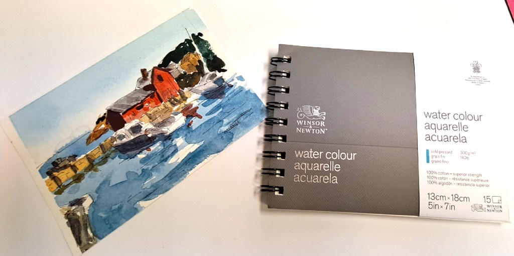
These are some of the sketches from my recent journal. My metal Prang watercolor set has been refilled with professional watercolors. It is so old that it’s a collector’s item now. I only carry three or four small brushes, a mechanical pencil (no sharpener required), a pen with permanent ink, a folding water container, all in a resealable bag. The notebook is only 5 x 7 inches. I have smaller sketchbooks and larger ones but this size fit in my backpack and was easy to carry.
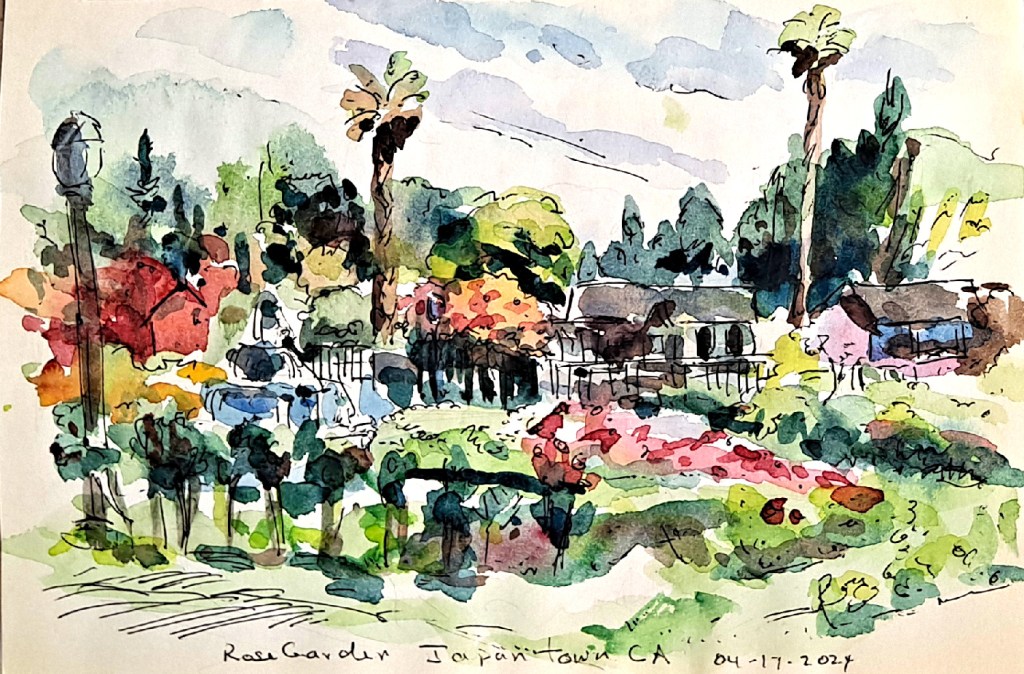
Municipal Rose Garden, San Jose
The first day we visited the beautiful Municipal Rose Garden in San Jose. I could smell the scent before I even entered the gardens. People of all ages were strolling or lounging in the shade of some magnificent redwoods. We sat in the shade and caught up with life while I made this sketch. You do not have to include every detail when you are sketching but may take liberties to change things to suit your needs. You’re trying to catch the spirit of the scene, not necessarily the exact replica.
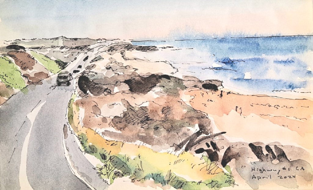
Pillar Point Harbor at Half Moon BayDriving down California Highway #1
Another day we drove out to Half Moon Bay and walked out to Pillar Point to see the surf. Later, we drove down the iconic California Highway #1 to Santa Cruz for dinner on the pier. I even spotted a plein air painter on a bluff above the ocean.
The Palace of Fine Arts, San Francisco
One day we took the train up to San Francisco for a day of sight-seeing. Starting at the Palace of Fine Arts, we walked to Crissy Field, down the shore to Copper’s Corner. I sketched the Golden Gate Bridge from this vantage point. Fortunately my son took pity for my knees and respect for the hills of SF to hire cars to take us to various spots. We ended our outing having lunch at the famous Sam Wo’s restaurant. I was exhausted by the time we took the train back to San Jose.
Later, I flew down to LA where I reunited with my sister and nephew and niece whom I haven’t seen in many years. They were the best hosts and tour guides. We visited the outstanding Aquarium of the Pacific in Long Beach. Another day we went to the Getty Museum atop the hills. The collection was beautiful as was the museum and the views. One day was spent at the wonderful Hilbert Museum viewing its impressive collection of California art. Special kudos for my nephew’s husband and his navigation of the LA traffic, all without a hint of impatience.
Did I sketch everything that I saw or visited? Of course not! But I captured some significant to me places and events. Plenty of food for thought and future paintings. Meanwhile, I can refresh my memories with my sketchbook and notes.
So while you’re planning your next trip or vacation, don’t forget to pack your sketchbook and some drawing materials. Happy traveling!
Here are a couple of links to previous postings about travel sketching.
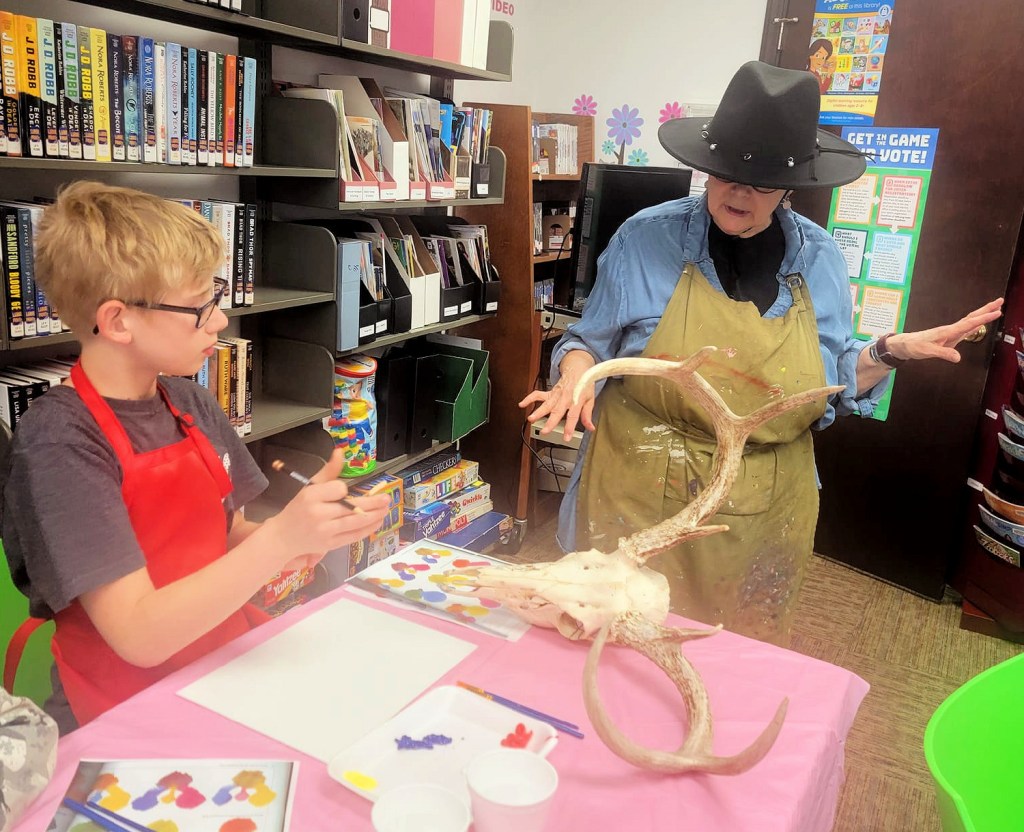
Posted onMarch 24, 2024|Comments Off on Georgia O’Keeffe visits Birdseye this month
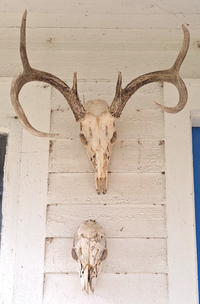
Cow skull. This is the largest one in my collection.The outside of my studio is decorated year round with my found collection of skulls.
Another famous artist visited our little library this month. After the exciting visit by Van Gogh last month, Georgia O’Keeffe thought she would pay a visit. She brought several of the skulls from her collection for the kids to use as subject matter. These included a cow skull, a fully-antlered buck skull, two antlerless deer skulls, and a bird skeleton. One of the boys in the class pointed out that the small deer skull was probably a baby as it had no teeth.
Two brothers working on their paintings. One is using the large deer skull with antlers and the other is referring to some O’Keeffe paintings in an art book.Discussing the branching of the antlers.
I thought the “ick” factor of the skulls would attract the kids…and it did although probably not as much as I anticipated. In this rural area, hunting is part of the culture and most kids are used to seeing or being around hunting and fishing. In fact, my sons both were required to take a hunting and boating class in seventh grade which makes sense.
Sketching your subject before you paint helps you to become familiar with all the shapes and shadows.
I showed the kids how the skulls were alike and different. They were allowed to examine them closely (they’d been cleaned with bleach water several times and were pretty old. I also suggested that they practice by making drawings of the subjects before they try to paint.
Discussing brush sizes. Each girl has selected the skull she wants to work from.Each child is encouraged to choose his or her own composition.Someone was interested in layers of fossils, and added a whole flock of crows later.
We discussed why O’Keeffe was attracted to bones and skulls when she lived in the desert southwest. And we also viewed some of her paintings, how she changed them or added to them. The kids were allowed to choose the the bones they wanted to work from and create their own compositions. One child chose to create an archeological dig of bones and fossils in layers.
The next class will be in early May and is open to ages 8 through 14. Contact the library to sign up for this free class. We will be making nature prints from real materials that we’ve gathered.
As I’ve mentioned in a previous post, this little library plays an important role in the community. As small as it is, it hosts a number of activities for patrons of all ages. All of these activities are FREE to attend although attendance may be limited due to space.
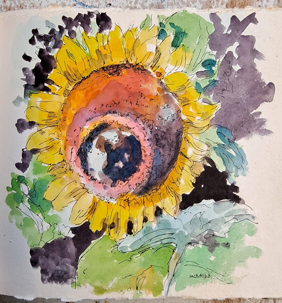
I brought in a few of my own sunflower paintings for some inspiration.
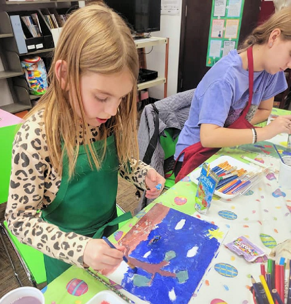
Recently I volunteered to teach a few children’s painting classes. The first of these classes was to learn about Vincent Van Gogh and to paint a picture in his style.
Although the class was limited, we had a nice turnout this week. I explained to the children a little about Vincent Van Gogh, who he was and why he was important. Also, they learned about his painting methods. Each table had several vases of sunflowers (faux) which the children were encouraged to choose what and how they wanted to paint. The library supplied all the art materials and even had little aprons just their size. They learned about mixing colors and how Van Gogh was known for his bold brush strokes.
Each child composed his or her own painting.Disposable palettes and tablecloths made clean up a snap.
All in all, it was a great group. I hope the kids had as much fun as I did.
Next month, we’re going to learn about Georgia O’Keeffe and her skull paintings. I’m bringing in a collection of real skulls (cow and deer) for them to use as subject matter.
Many thanks to AmyJo, the library branch manager, and other patrons who make programs like this possible. Public libraries are the best bargain around. What’s happening at your library?
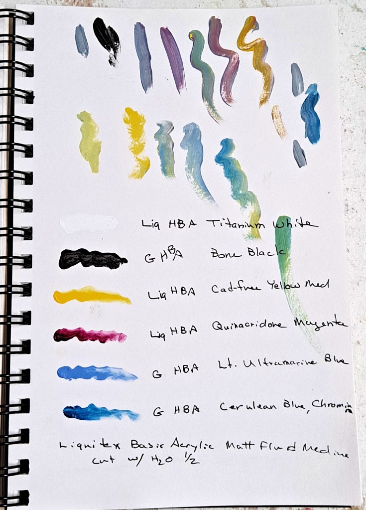
The most recent paintings that I’ve done have been with using a very limited palette which I’ve posted about previously. I’ve now cut the number back to four colors plus black and white. I like the challenge to see if I can adapt the most colors from just a few options. Actually, it works very well.
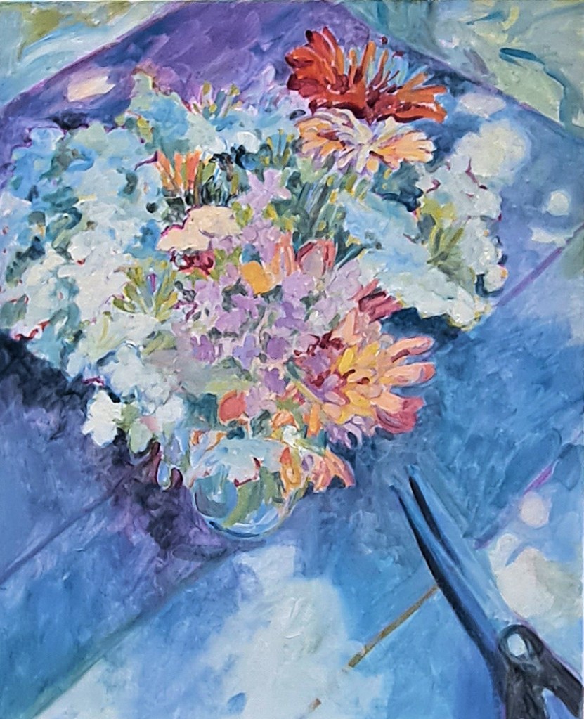
The original reference photo. I like the dappled light.
This painting is based on some photos that I took of summer flowers several years ago. Called August Bouquet, it showcases some zinnias and Queen Ann’s lace, plus others. The vase is sitting in the shade on an old wooden table, with dappled sunlight showing through. I’ve added some scissors as a foil for the flowers.
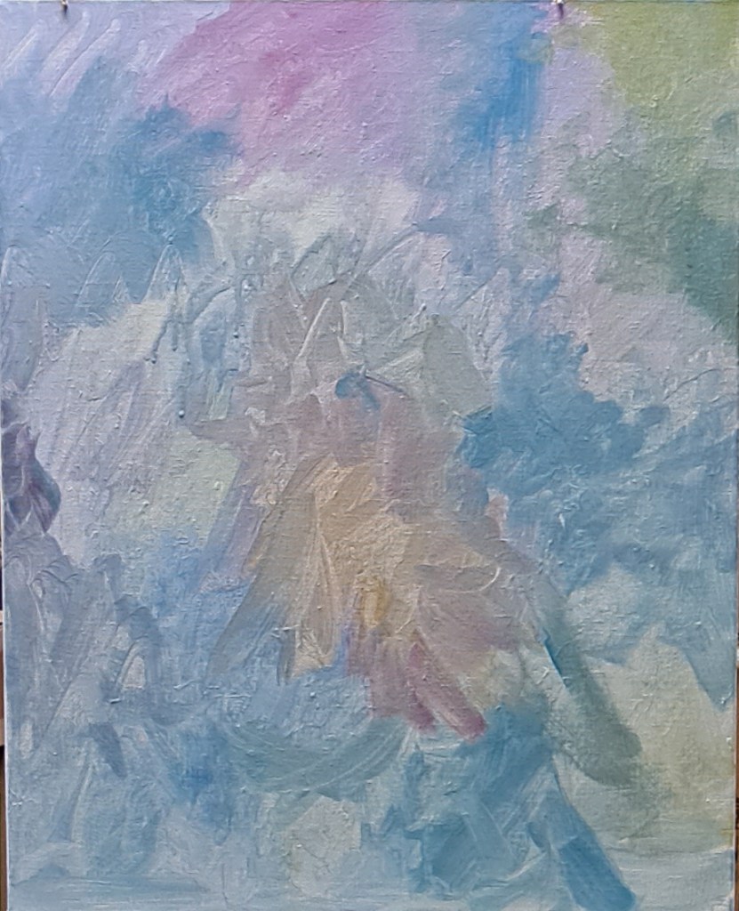
Vertical canvas prepared with thin color washesCanvas with sketches, and colored outlines
The canvas is a 20 x 16 vertical, 1.5 inches deep. I’ve already sanded and gessoed it and added a little texture. Then I added a thin wash of colors approximately where I anticipated locating the main shapes. After this coat dried (working with acrylics that only takes about twenty minutes), I then made a loose pencil outline of the flowers and other shapes.
The next step was to add color to the outline. I don’t try to make the outline colors match the subject, in this case, flowers. In fact, I often choose what I anticipate are contrasting colors to the final painting.
Middle stage with some fill-in color, loosely painted. I actually like this stage best. I think it would look nice in a larger size.August Bouquet, almost finished. I did not stick with the dark brown of the wooden table but kept to a lighter tone. I will tweak it a bit and add some gold or silver leaf details. Maybe.
Then the main shapes began to get filled in. I hesitate to call this the tedious part, but it is much more involved than the previous steps. I just have to stick with it until I’m done. I zone out, listening to music or a recorded book. Sometimes I fill in the background first; sometimes I start with the main subject. There are no hard rules here.
Canvas on my easel. I’ve turned off the painting light to get a better idea of values and colors. You will also notice a couple of shed snakeskins hanging on my easel. Actually, this is ONE snakeskin (about five ft) which my son found in the woodshed. He thought it would be fun to leave it for me in my studio…spread out on the floor. Big joker, eh?
I step away from the canvas often at this point to compare values, colors, shapes. The painting light above my easel can cast light which is too harsh so it’s best to turn it off while I compare values. This is a good point to take a break, perhaps overnight. I’ll often run out to my studio in the morning to see if the painting looks as I thought I left it or what glaring changes I need to make.
Although August Bouquet will be finished with a few more details, plus probably some addition of gold or silver leaf, I actually like one of the middle, less-finished stages best. One doesn’t actually need to put in every detail; in fact, it’s often distracting and doesn’t help convey the message of the painting.
Maybe I’ll paint it again with a less-finished look. What do you think?
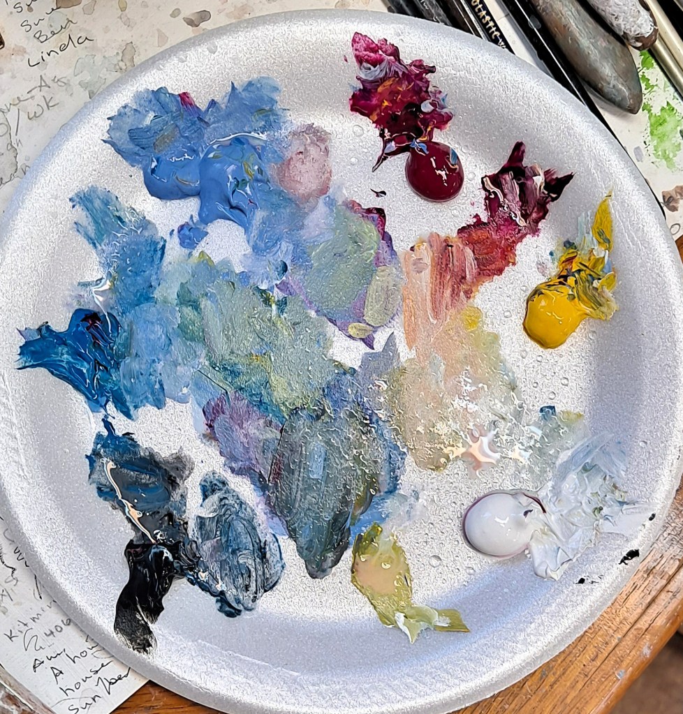
My notes with a list of the colors I’ve used. All Liquitex or Golden Heavy Body Acrylics. These paints are high quality and thicker than standard paints. I can get more texture with them. My disposable palette with the four colors plus black and white.
I was tinkering around in my studio this week in between starting some new work when I pulled out a sketchbook. Well, one of many. I have sketchbooks of all kinds and sizes. Some fit in a pocket or purse, others are what I call vacation sketchbooks where I record scenes, thoughts and ideas while traveling. There may be more than one vacation in a book. Some I will start and finish completely, while others I pick up as needed. One of my favorite sketchbooks is a handmade Japanese book with thick deckle-edged paper. I don’t remember where I got it but it is so beautiful that I choose carefully what I put in it. Most other books, I write in the back the maker and particulars. And my name and contact info in the front.
Found objects, present from my son. Praying mantis egg casing and three blue jay feathers.A posy of violets, large four leaf clover, and a pretty leaf.
I find sketching to be very relaxing but I’m not obsessed with it. I try out new ideas. Make notes of the materials I’ve used. Or I might write the name of a book that I heard about while listening to NPR. They’re my sketchbooks and I can do what I want. There really aren’t any rules. I might cut swatches from a favorite article of clothing before I put it in the rag bag, or add a post card. Or how about that sticker from that wonderful chocolate shop I visited in Paris. I would never remember the name of that again.
If you looked through my books, you might find some pressed flowers or leaves, lots of four leaf clovers (artists are good at finding those). A favorite quote from a Chinese fortune cookie.
Typical found birds nest waiting to be captured in my sketchbook.Basket of feathers, mostly turkey, and a small nest composed of dog hair and lichen.
Many of my sketchbooks are devoted to nature or natural elements. I have plenty of subject matter out here on the 90 acres. Plus, one of my sons would (and still does) leave interesting things on my drawing table. A birds nest, some feathers, a praying mantis case. I’ll hang onto these items until they become too ratty and disgusting to have around. But the drawing will last much longer.
A messy robin’s nest. See if you can spot the secret code in the drawing. Notice the thumbtack shadows.
One of my oldest sketches (not in a book but just loose paper) was of a very scruffy robin’s nest which my son brought me one day. I did a fairly large drawing, added some (imaginary) eggs, and scanned it electronically. I’ve used that drawing for many years. I’ve even printed it off on watercolor paper and painted it so I have two versions. Unfortunately, I have seen my drawing pop up on the web elsewhere under someone else’s name. Ha ha. What they don’t know, is that I added a secret code to the drawing so I know it’s mine. I kept the original drawing on my bulletin board in my studio for years until the paper yellowed but you can see the thumbtack marks in the corners. Yeah, those artists are violating copyright laws but I have neither the time, interest nor resources to pursue the matter.
Box of found objects. Birds nests, acorns, chestnuts, magnolia seedpods, etc.
Back to the point. I highly recommend keeping a sketchbook or two or four. They’re so great to relax, record your life, your thoughts. I’ve used pencil, pen and ink, watercolor, colored pencils and markers. I don’t use charcoal much as it tends to be messy and it smears but you can use what you want to in your book.
A dead bird. Anything can end up in the sketch book.
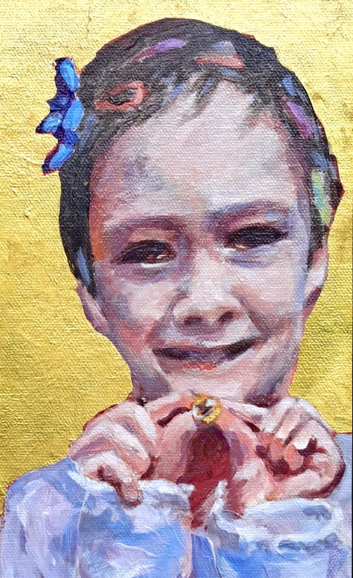
Posted onSeptember 17, 2023|Comments Off on The Golden Marble – More Gold and Silver Leaf
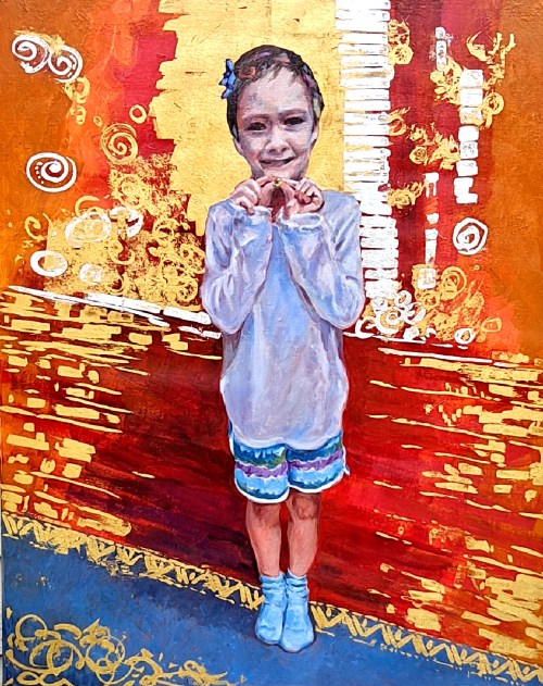
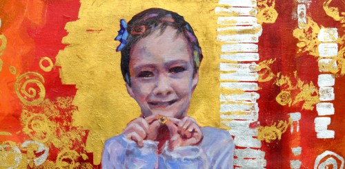
The Golden Marble, acrylic on canvas, 30 x 24. 23K gold leaf and sterling silver leaf. Kit Miracle
This is another painting in the gold and silver leaf series that I’ve been exploring. At 30 x 24, it’s the largest one so far. I also completed this one before Leo’s Muse which I posted last week.
The subject is a young boy who has been playing dress-up with his sister. In a spirit of silliness, she has adorned him with ribbons and hair clips. His smile engages the viewer as he shows off The Golden Marble which is a prized possession.
Although I usually plan my paintings very carefully, I’ll admit that I really wasn’t sure where I was going with this one. I liked the subject. I knew that I wanted some gold and silver. Other than that….well…
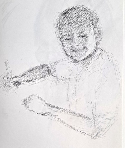
A preliminary sketch of the subject of The Golden Marble
As usual, I did some preliminary drawings of the child. These are just to familiarize myself with the subject. I then sketched him on the canvas, a straight-on shot. Then I began playing with background colors. I elected to use some very bright and warm colors, radiating out of the figure.
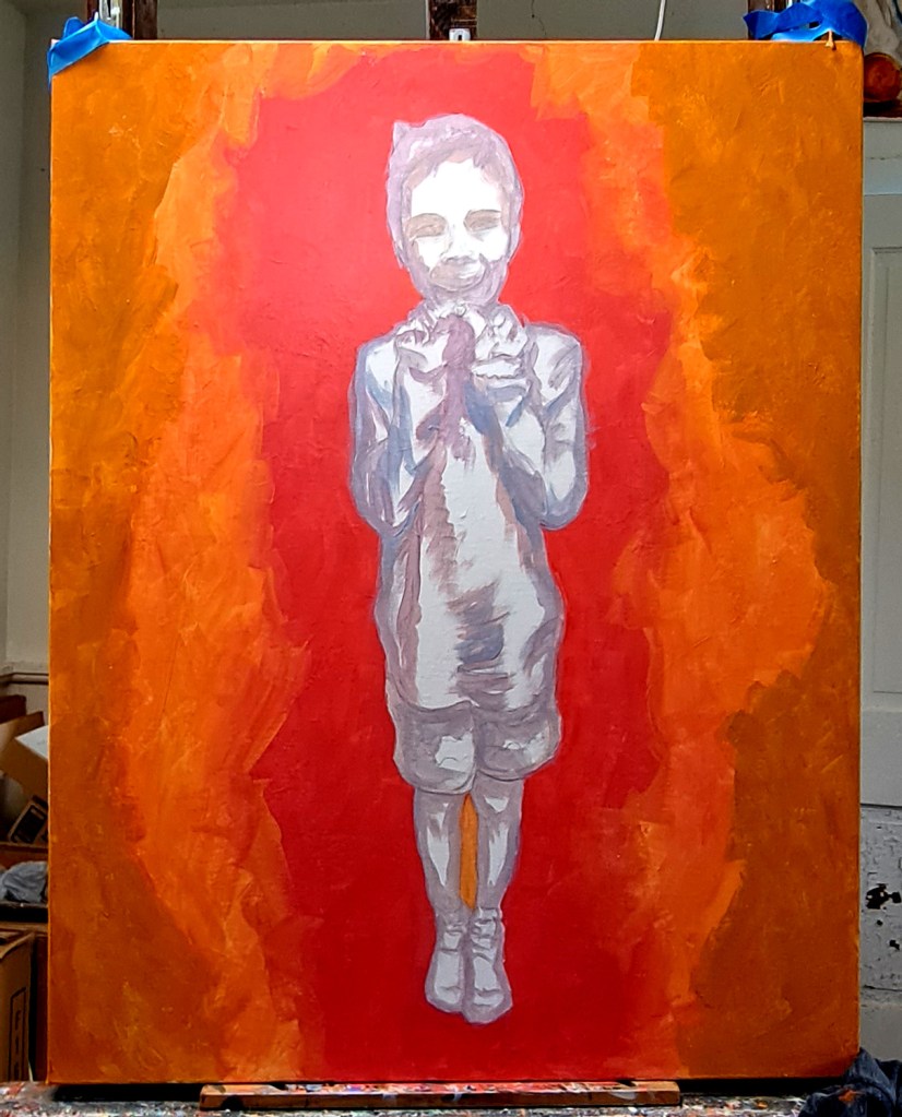
Initial lay-in of colors. I did the background warm/hot colors first. The began a grisaille of the figure.Now laying in flesh tones, plus adding some detail to the background.
I then painted the figure in grisaille, those greyish tones. Later working overall with adding some detail to the background. More paint on the primary figure. Although I had some reference photos to work from, this doesn’t really represent the situation. I painted very loosely, adding more to both the figure and the background until I was satisfied.
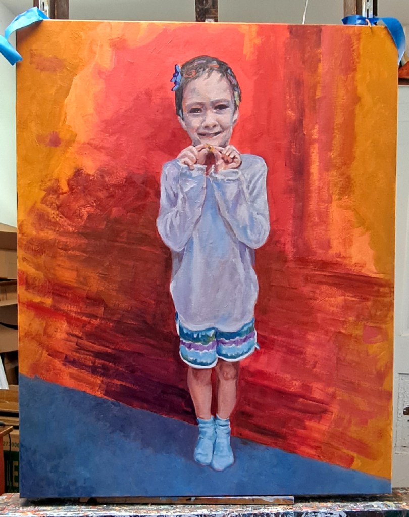
The figure is pretty complete. I decided to add a carpet to part of the floor, leaving the rest as hinting at wood flooring.Applying the gold and silver leaf while working on the floor
Because the canvas is so large, I had to place it on the floor of my studio to work on adding the gold leaf. Again, no fans or air conditioning blowing as the metal leaf is so fragile and blows everywhere. It was pretty challenging to decide where I wanted to place the metal leaf, plus I kept switching back and forth during the process. Sometimes the gold would be on top; other times the silver would be. The fixative is clear so I had to carefully judge where I wanted to place it, and estimate the right amount of tackiness for the metal leaf to stick. Overall, I’m pretty pleased with the result.
The Golden Marble, detail 1. I left plenty of the warm background colors show through. As you can see, I alternated placing the gold leaf on top of the silver, and the silver on top of the gold. Abstract shapes alternate with more organic circle or bubble shapes. No real planning, just in the flow.The Golden Marble – detail 2 showing the texture of the canvas and close-ups of the hair decorations
The final steps were to go back and touch up the figure here and there. I have learned that it’s difficult to touch up or make changes in the gold and silver leaf as it just doesn’t look the same as when first applied. I may find some way to eventually meet this challenge, but haven’t yet.
The very final step is to spray a protective coat of clear acrylic over the entire painting. This keeps the silver leaf from tarnishing and the gold leaf from flaking off.
Overall, it’s a very striking piece. I want to explore my next subject in this medium.
I'm a professional artist, retired director of a performing arts center, bona fide book addict, and enjoy the quiet life...most of the time. I'd love to hear from you or get your ideas for future posts. Come back soon!