Monthly Archives: January 2018

Lunar eclipse

Blue Moon, January 31, 2018 Early morning waiting for the eclipse.

The lunar eclipse begins in about an hour around here.  Check out this website which follows it live.  Also, you can enter your location to find out if/when it will begin in your area.  https://www.timeanddate.com/eclipse/lunar/2018-january-31 

Or just go outside and LOOK UP!  It’s a beautiful moon.

Painting on a toned surface

50 Cents, farmers market still life with contre jour lighting (back lighting). Acrylic on canvas board, 20 x 16, Kit Miracle

My studio is an old summer kitchen about 30 feet from the back door.  It was built to keep heat out of the house, therefore it is not insulated.  In the winter I often work with a hat, two pairs of socks and multiple layers of clothes.  Despite the old leaky building, I worry about breathing paint fumes from the oil paints.  Even though odorless turpentine is supposed to be, well, odorless, it isn’t.  And even if it were, I would still be exposed to the fumes.  Not good.

So when a friend recently gave me several canvas panels, I decided it was time to try something new.  These panels are all 16 x 20.  I don’t usually use canvas panels this large but why not?

I decided to work on my acrylic painting skills and toned several of the panels in red. (See the links at the end of this post for other pages about using toned canvasses.) I like using red as little bits peek out, adding a lot more life.

At the Flea Market, acrylic on canvas board, 16 x 20, Grafton, MA Kit Miracle

Acrylic paint has some of the best and worst properties of watercolor and oil paint.  It is water-based and dries quickly.  It is also has the opacity of oil paint along with texture.  But it requires a lot of planning and forethought before you can even begin the painting process.

Farmers’ Market Bounty – in process. Notice the loosely drawn vegetables. The actual painting is much more vibrant than the photo shows.

Farmers Market Bounty, acrylic on canvas board, 16 x 20, Kit Miracle

These four paintings were created relatively quickly.  I deliberately used larger brushes and aimed for the feel of the subjects rather than fussing over too many details.  The subjects were from photos that I took at some farmer’s markets and flea markets last year.  I also thought it would be interesting to paint some crowd scenes.  Anyway, I’m pretty pleased with the results.

Check them out below. Check out my Etsy site for more details photos.  Yes, they are for sale.

I always welcome feedback.

Saturday Morning at the Farmers Market, acrylic, 16 x 20, Kit Miracle

Other links.  Painting on a Toned Canvas – Step-by-step. 

Also, search for toned canvas for several other posts about the subject.

Resolutions

So how are you doing with your New Year’s resolutions?

I don’t really make resolutions; I make plans and goals.  Maybe there isn’t much real difference but to me there is.  A plan and a goal sets a direction.  A resolution is just a wish.

One of my favorite blogs is Raptitude by David Cain.  He has tried a number of experiments which he discusses here.  These are often in the form of mini resolutions.

Books, my not-so-secret addiction

But this year he suggests not starting any new project or buying new toys or books,  but using what you’ve got.  I don’t know about you, but I’m a real sucker for the next new book, the new tool, what have you.  But if you’re anything like me, you know deep in your soul that you have “enough.”  Really!

This past summer I cleaned out our big chest freezer before we started storing all of the summer’s produce.  It is now full to the brim…again.  I have had many talks with my husband about using what we have before we buy more stuff, even if it’s on sale!  We’re only two people.  We can’t possibly use all the produce and store specials that we have already.

So check out David’s blog Raptitude. I shared this post on my Facebook but apparently so did a lot of other people.  David was astounded that that he got 19K hits on this post alone.  Must have hit a nerve with a whole bunch of folks.

Watercolor with Pen and Ink – Part 2

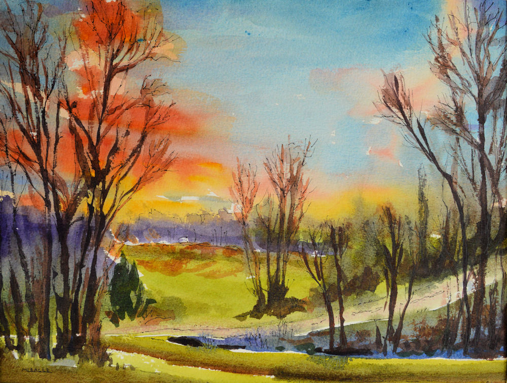
Sunset in watercolor with pen and ink. This is a quarter sheet of Arches 140 pound cold press paper, I juiced up the colors a bit. Click on the painting to see more detail.

Last week I discussed some of the intricacies of creating paintings with watercolor and pen and ink.  This week I will go into more detail.

Support

I always use top quality watercolor paper. This is at least 140 pound pure rag paper.  I like Cold Press which has a little tooth.  Some people like the Hot Press which is very smooth.  Rough has a very rough texture and is a little difficult to draw on with a pen.  Of course, heavier paper is fine.  Lighter weight paper tends to buckle and is not so good for water media.

The paper is usually divided into quarter sheets (a full sheet is 20 x 30 inches) and is taped to a board.  You can use a drawing board, heavy plywood, or some other heavy support.  If I use a full sheet of paper, I “stretch” the paper and staple it to the board.  It actually bends the ½ inch finish grade plywood that I use!

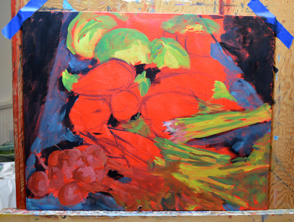
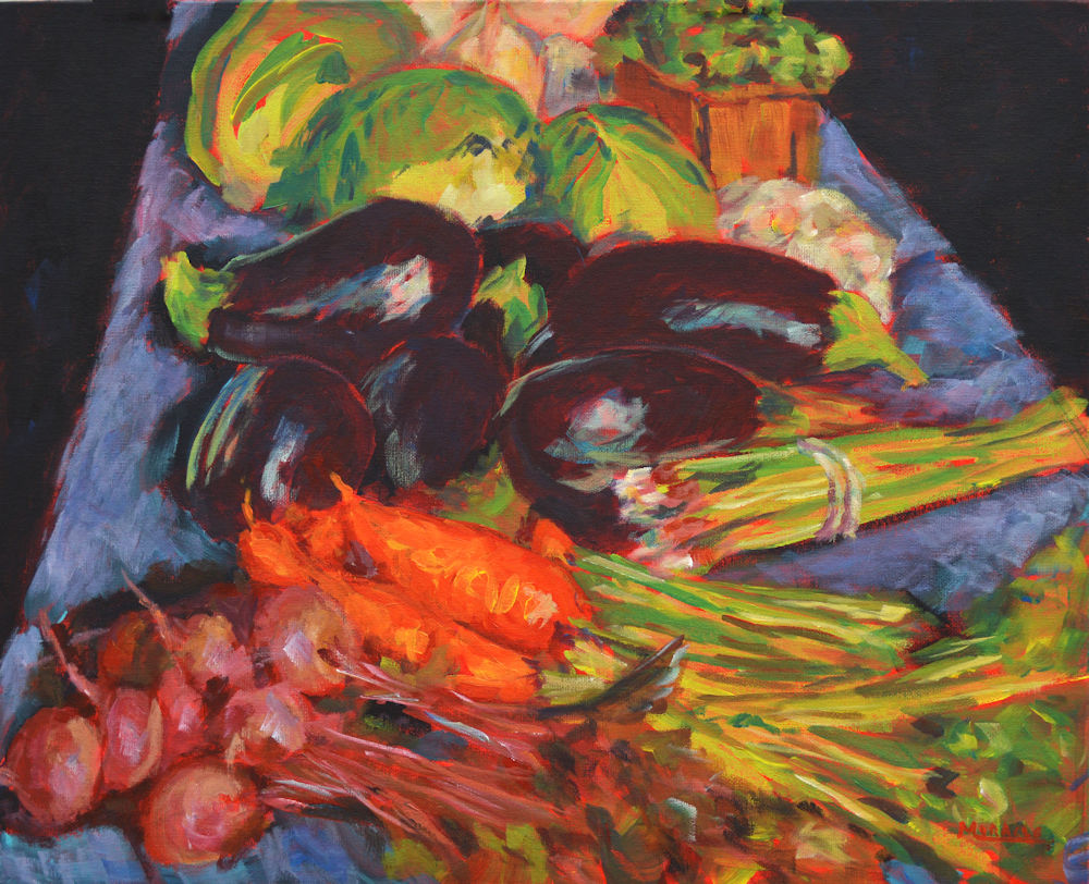
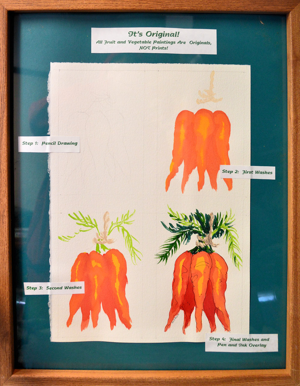
This is a demonstration of the steps I take for creating a small watercolor with pen and ink. I use this method for most of the fruits and vegetables which appear on my Etsy shop, my90acres. I divide this quarter sheet of watercolor paper into four rectangles of a little more than 4 x 6 inches with some space left between the squares.

Drawing

I start out with a rough pencil sketch done with a #2 pencil.  In the case of architectural elements, you may wish to add more detail but generally keep the sketch loose.  You don’t want to get to the point of coloring in the sketch.  Also, beware of erasing too much or of bruising your paper.  This will mark you paper so that when you apply the watercolor, it will soak into the paper, leaving dark marks.

This is the painting of the Falls in plain watercolor before the pen and ink is applied. As you can see, it is a very nice painting and stands on its own merits. Reminds me somewhat of Winslow Homer.

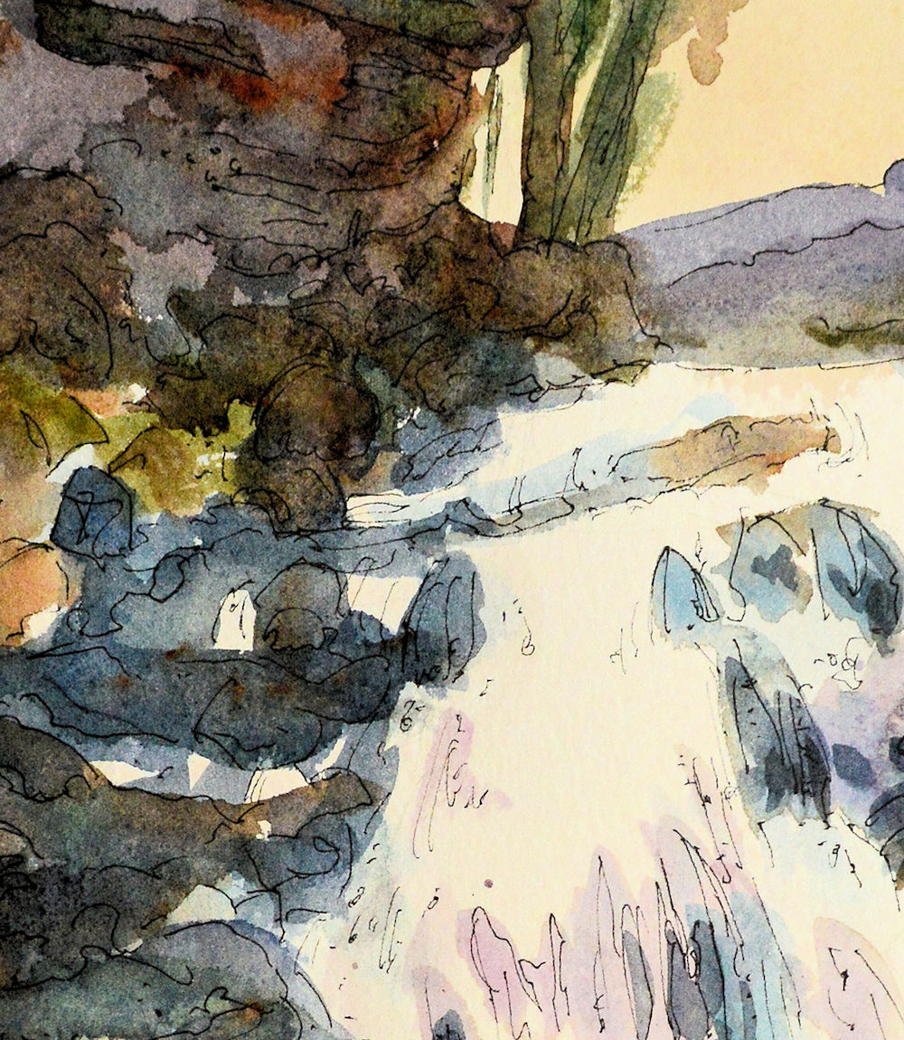
Painting of the falls at Bald Mountain Tennessee. This watercolor has had the pen and ink applied to it. Check out the detail to see how loosely the ink part is done.

Close up view of the painting Falls at Bald Mountain. See how loosely the ink lines are drawn.

Painting

I always use Winsor Newton artist grade watercolors. I apply the paint starting from light to dark, making sure to keep the white areas free.  I do not use any masking fluids.  Try to paint in bigger strokes and not get too fussy.  You may need to let the paint dry between layers.

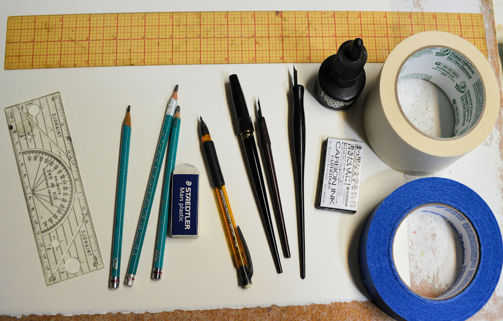
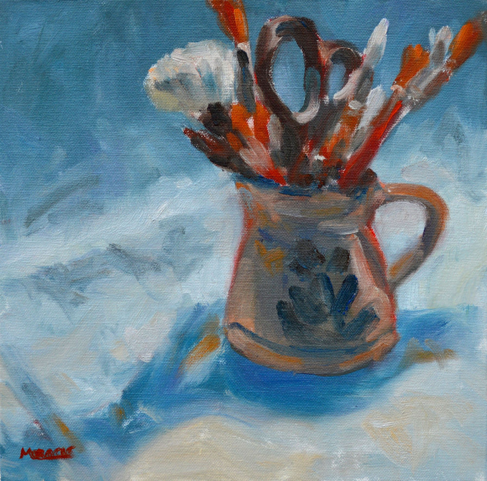
These are the general tools that I use for my watercolor and pen and ink paintings. The large ruler (actually a quilting ruler) is what I use to lay out the painting squares. The small ruler is sometimes used where I need a straight line. Pencils and a plastic eraser, the platinum pen and two dip pens, India ink, carbon ink cartridges for the platinum pen, tape, either regular masking tape or painter’s tape.

Sketching with ink

At this point, you may decide not to apply any pen and ink.  See the samples of the waterfall.

If I decide to apply some details with pen and ink, I do so very loosely.  Do not try to add every detail.  Let the viewer’s eye add the details.

For many years I used a dip quill pen #3 and plain old India ink.  I like the bounce and variance of the lines.  I would also buy the nibs in bulk because I like a sharp point.

Then I moved to some commercial pens.  I like the Lamy Safari.

My current favorite is the Platinum Carbon Ink pen.  It has great flow and the carbon ink is light-fast.  It is also permanent and doesn’t seem to smear if you have to apply some more water media on top.

The real key is to draw with your whole arm, not just your fingers.  Keep it very loose.

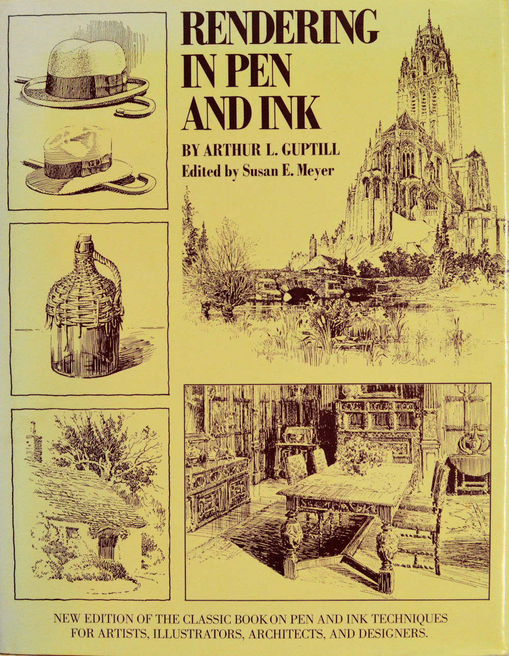
Arthur L. Guptill’s book Rendering in Pen and Ink. This is an old book but probably has the most extensive demonstrations for pen and ink.

One of the most beneficial books about Pen and Ink instruction is Arthur Guptill’s Rendering in Pen and Ink.  Although a little dated, the information is very useful for technique.

So, this is my method of using watercolor with pen and ink.  Please feel free to contact me if you have any questions or need more clarifications.

Also, check out some of my previous postings on this subject.  Links listed below. Also, search for pen and ink for more demonstrations.

How to Combine Watercolor and Pen and Ink

Painting Wildflowers

Sage Cottage

Peonies en Plein Air

Watercolor with Pen and Ink – part 1

Rockport, MA. Watercolor, pen and ink, 10.5 x 14, Kit Miracle

There are many styles of watercolor with pen and ink overlay.  Some artists do the pen and ink drawing first and then add the watercolor washes on top.  If you use this method, you must be sure that the ink is totally waterproof and won’t smear once the watercolor hits it.

In my case, I draw a pencil sketch first before adding the watercolor washes.  After it is totally dry, I then go back and add the pen and ink details.  I have used this method for twenty-five years but I suggest that you experiment with several methods to find what works best for you.

All of the small paintings shown on my Etsy shop My90Acres are created this way.  I like the looseness that this method allows me.  If I were to draw the object first in pen, I would have a tendency to get too bogged down in the details. Then adding the the watercolor would feel more as if I were “coloring in” the painting.  This seems to make the painting more static without much life, good for medical illustration but not the look I’m after.

I always begin a new wc/pi painting by marking off the outside edge of the painting (adding an extra ¼ to ½ inch) and then taping it down to a drawing board.  I use at least 140 pound watercolor paper.  Sometimes I’ll use painter’s tape but actually, regular old masking tape will work just fine if you’re not going to keep it on the board for months.  A few weeks will be fine but you’ll probably be done with the painting before then.  Taping the painting to the board will help reduce any buckling when the watercolor is applied.

The next step I take is to make a loose sketch on the paper.  Be sure not to press too hard with your pencil or to do too many erasures as it will bruise the paper.  Bruised paper will create dark splotches when the watercolor hits it; not an attractive sight unless that is the look you’re going for.

After the sketch, I apply layers of watercolor, usually working from light to dark. A hairdryer will speed up drying time between layers of paint.  After the paint is totally dry, then I begin to add the ink drawing.  I always start with the more complex parts of the painting, such as, the buildings.  I might even carefully use a ruler for the straight lines, but the painting will look fresher if you just freehand it.  The ink is just used to loosely add details; you don’t need to put in every brick and board, every blade of grass or leaf.  Simplify the shapes and let the viewer’s eye fill in the rest.

Finally, after your painting and the ink is totally dry, you can use a plastic eraser to remove some of your pencil lines if they are still showing.  Really!  I don’t know how this works, but it does.

Take a look at these three paintings of Rockport, Massachusettes. Click on the paintings to examine some of the details.

Part 2 of this post will explore some of the materials and other techniques.

Main Street, Rockport,Massachusetts. Watercolor with pen and ink. 6.5 x 9.5 Kit Miracle

Beach at Rockport. 6.5 x 9.5 Watercolor, pen and ink. Kit Miracle


Jack Frost Visits

Jack Frost on my windowpane in the studio.

After a balmy winter holiday, the temperatures in the Midwest plummeted.  We recorded minus 4 degrees (F) this week.  Needless to say, I’m a wuss and am not spending much time outdoors.  However, even working in my studio has challenges.

As I have mentioned before, my studio is an old summer kitchen about 30 feet from the back door.  It was designed when cooking was done on wood-fired cook stoves (which it actually had when we moved here.)  This was to keep the heat out of the house in the summer.  You’ll find one of these buildings on many old farms in southern Indiana and throughout the Midwest and South.  I am lucky that ours is about 15 x 25’, which is pretty large for a summer kitchen.  In this case, the family and field hands actually ate in the building.  It is a perfect size for a studio.

Unfortunately, the whole purpose of the design was to keep the heat out of the house so they didn’t really care about insulating the building.  Thus, it’s very drafty.  Although I have a gas heater, unless I want to go broke, I keep it turned down.  This week I was wearing a hat, many layers of clothing, two pairs of socks (the cold comes up through the floor), and I was still chilly.

I snapped this photo of the beautiful patterns of the frost on the windowpanes.  It looks like giant feathers.  With all of our insulated windows and super-heated houses, window frost has become more and more uncommon.

The beauty of nature is all around us, even in the most unlikely places.

Since I was confined to studio painting, here are a couple of my recent works.  Plus, I tweaked the still life with red cabbage and artichokes that I posted on here a few weeks ago.  Artists are never quite satisfied with their finished work. Renoir was known to bring his paints to gallery exhibits even after his paintings were hung, just so he could make changes.  I’m not quite that bad but I might fiddle around with a painting which doesn’t quite suit me.

Here’s hoping that the weather is better where you are and that warmer days will be here soon.

Artist Still Life, oil on canvas board, 10 x 10, Kit Miracle

Down by the Creek, oil on canvas, 20 x 16, Kit Miracle

Red Cabbage and Artichoke, 18 x 24, oil on canvas, Kit Miracle. Still Life revised from previous version.

Other art forms

Although I am primarily a visual artist, I appreciate many other art forms.  After spending many years in the performing arts (as Director, not performer), my heart was opened to so many other areas of self-expression.  This is a beautiful video which combines poetry, music, and amazing film photography.  Check it out.  The blog is called Words in the Light.

Night Skies