
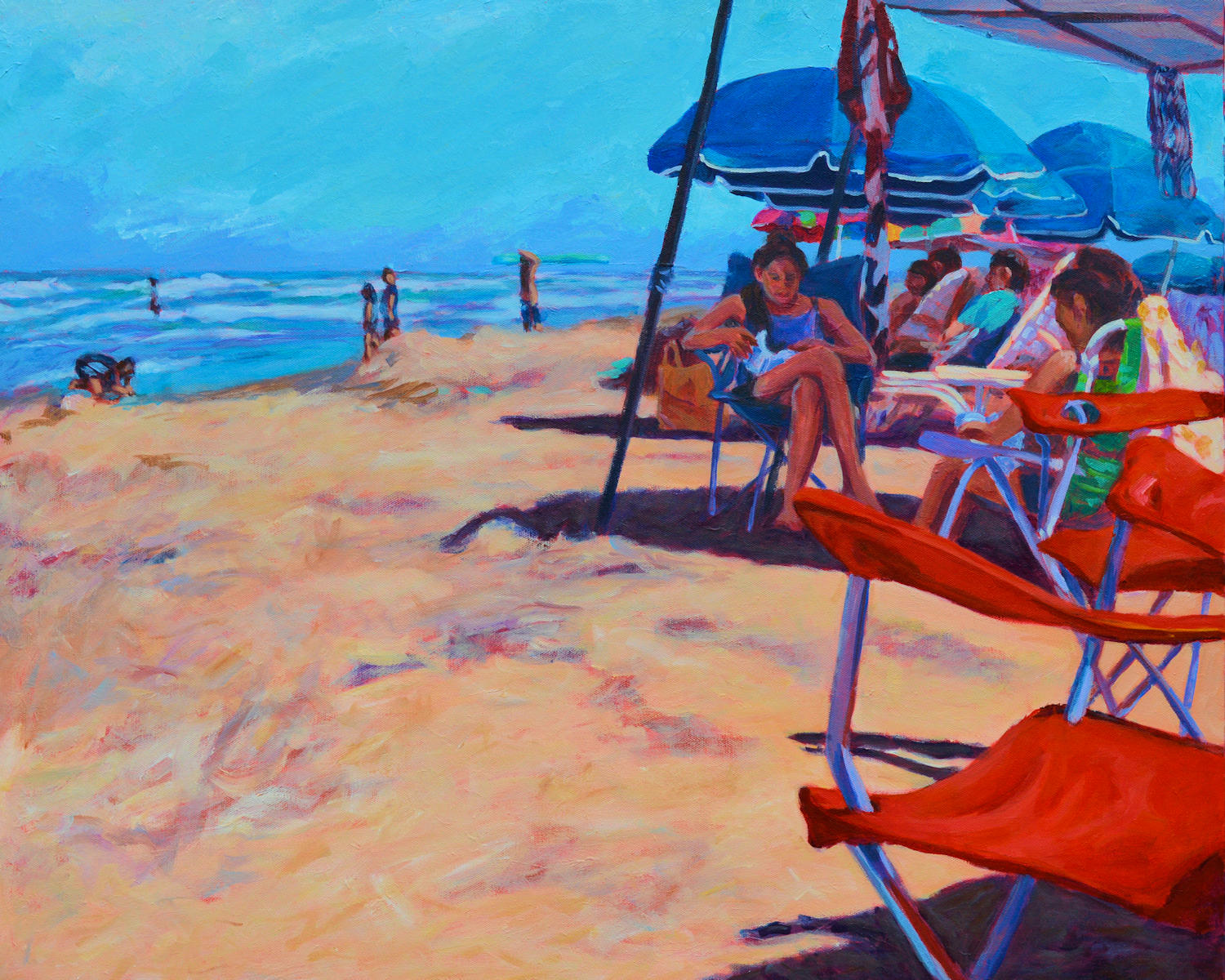
Beach Readers, Intimate Spaces series, acrylic on linen, 24 x 30, Kit Miracle The whole attraction of this subject was the irony of the two young women who are reading and totally ignoring the beautiful day at the beach. I also love the way the red beach chairs draw the viewer’s eye into the scene.
There are many rules of painting composition which I have discussed in previous blogs (search: composition). These are usually conventional and are designed to lead the eye through the picture. But one of my favorites is an asymmetrical composition, that is, not even or necessarily balanced. I liken this somewhat to whether you are a candlesticks at each end of the fireplace mantle kind of person or you feel comfortable placing both candlesticks at one end (usually balanced by some other object at the other end.) It’s just a matter of personal preference.
The painting above, Beach Readers in the Intimate Spaces series, is a good example of asymmetrical composition. The bright red chairs on the right lead the eye into the scene to the two girls who are reading. Most of the other action is in that quadrant of the painting. However, the small figure playing in the surf at the far left is able to balance the scene. If you don’t believe me, cover the figure with your hand and see what a difference that makes to the feel of the painting.
Asymmetrical composition came into vogue in the 1880s and 1890s as the Impressionist artists were influenced by the import of Japanese prints. These prints not only led to some experimentation in composition, but to flattened colors and situational composition. This would be similar to a photograph that is just cut off at strange places. This could include people looking out of the picture plane, cutting off the head or legs of horses, or even figures exiting the frame.
Below are several examples of paintings by Mary Cassatt, Edgar Degas and Edouard Manet which illustrate this influence. The first two artists collaborated for years with their printmaking but as you can see, the Japanese influence directly appeared in their work.
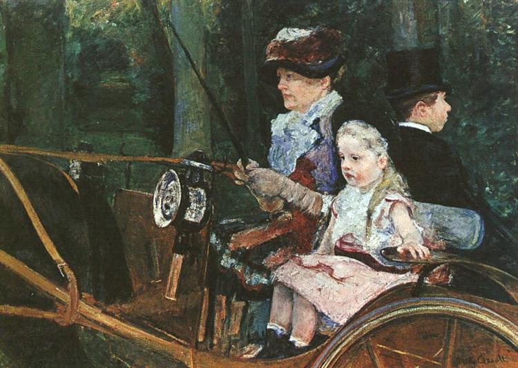
Mary Cassatt, Woman and Child in the Driving Seat.
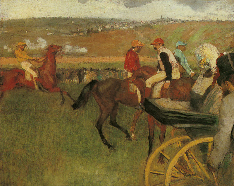
Degas, more race horses running out of the picture plane. Lots of empty space but it works.
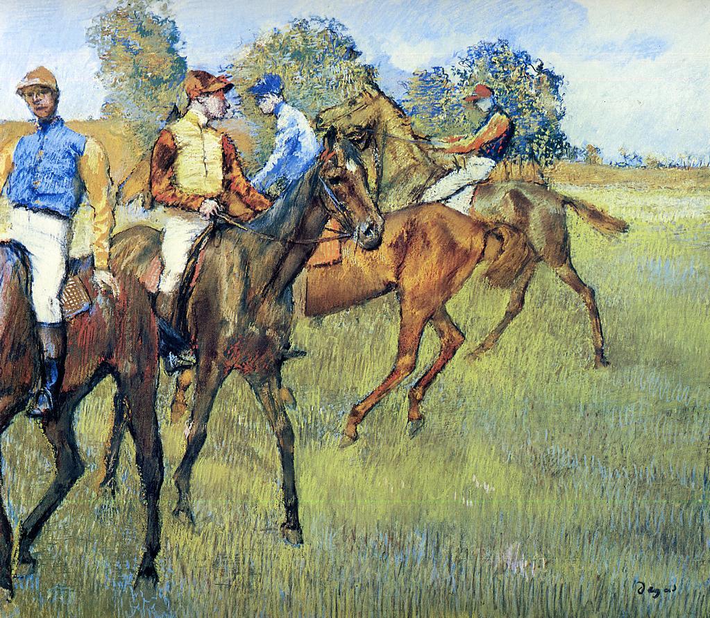
One of many Degas racing scenes. Notice how some people are only partially shown in the picture plane. This is a similar composition to my Beach Readers in that there is a big blank space in the lower left side of the painting, with the action on the right leading into the main subject.
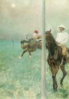
Degas. Another very unusual composition of race horses and jockeys.
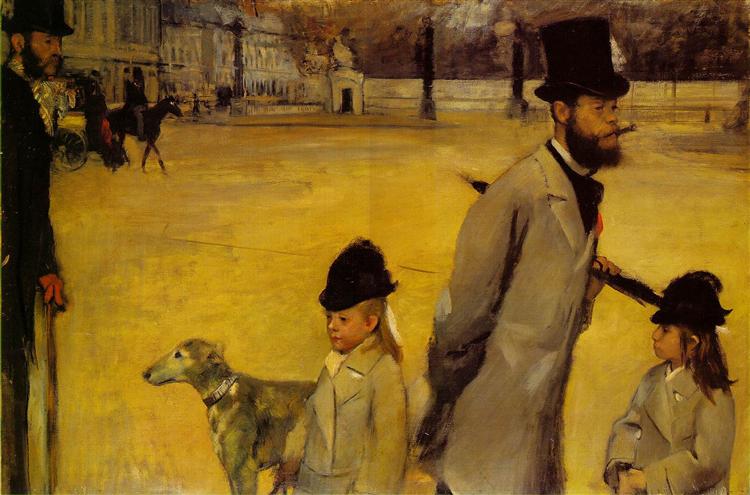
Degas, Place de la Concorde. Notice how everyone seems to be looking off in a different direction. And why are the little girls cut off at the waist?
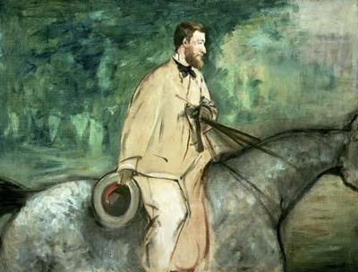
Edouard Manet, Portrait of Gillaudin on a Horse. You can only infer the horse in this painting although the main subject is centered.
