Tag Archives: toned canvas

Something a little different

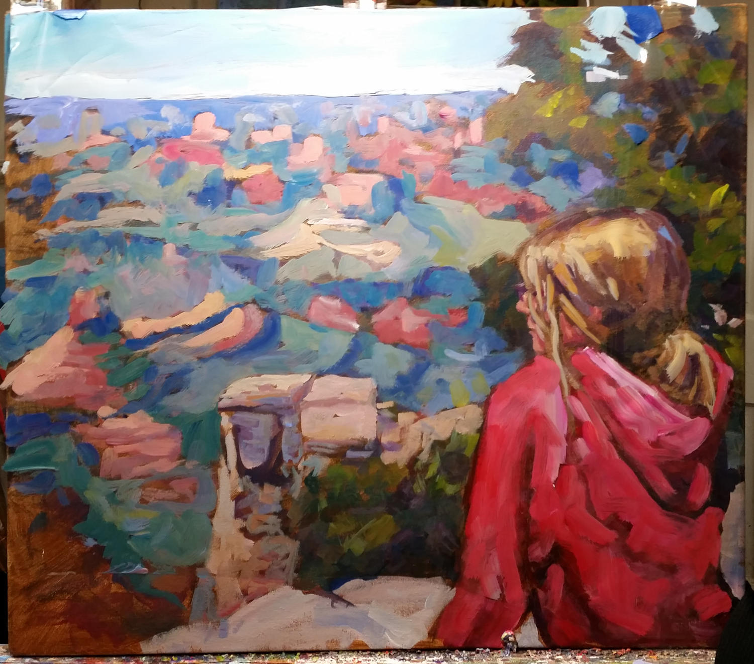
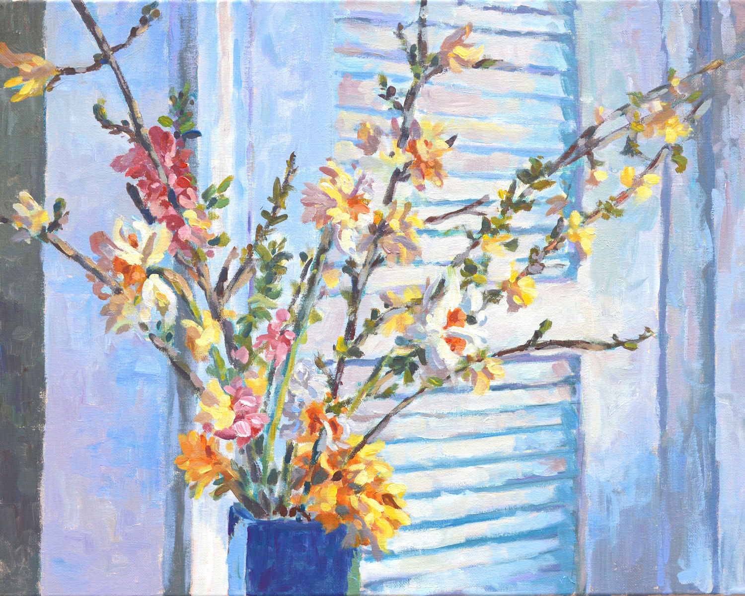
I’ve been taking a break for the past several weeks from working on my current series of paintings Intimate Spaces: Breaking Bread.  Although I tend to be pretty disciplined when I’m working on a big project, sometimes I need a respite.  Recently I’ve returned to some old themes, particularly western scenes and my travels.  Culling through a couple of decades’ worth of old photos, scenes that I may have skipped previously, now draw me in.  It doesn’t always have to be the entire picture, just a small portion of it.  And I always feel free to change things around.

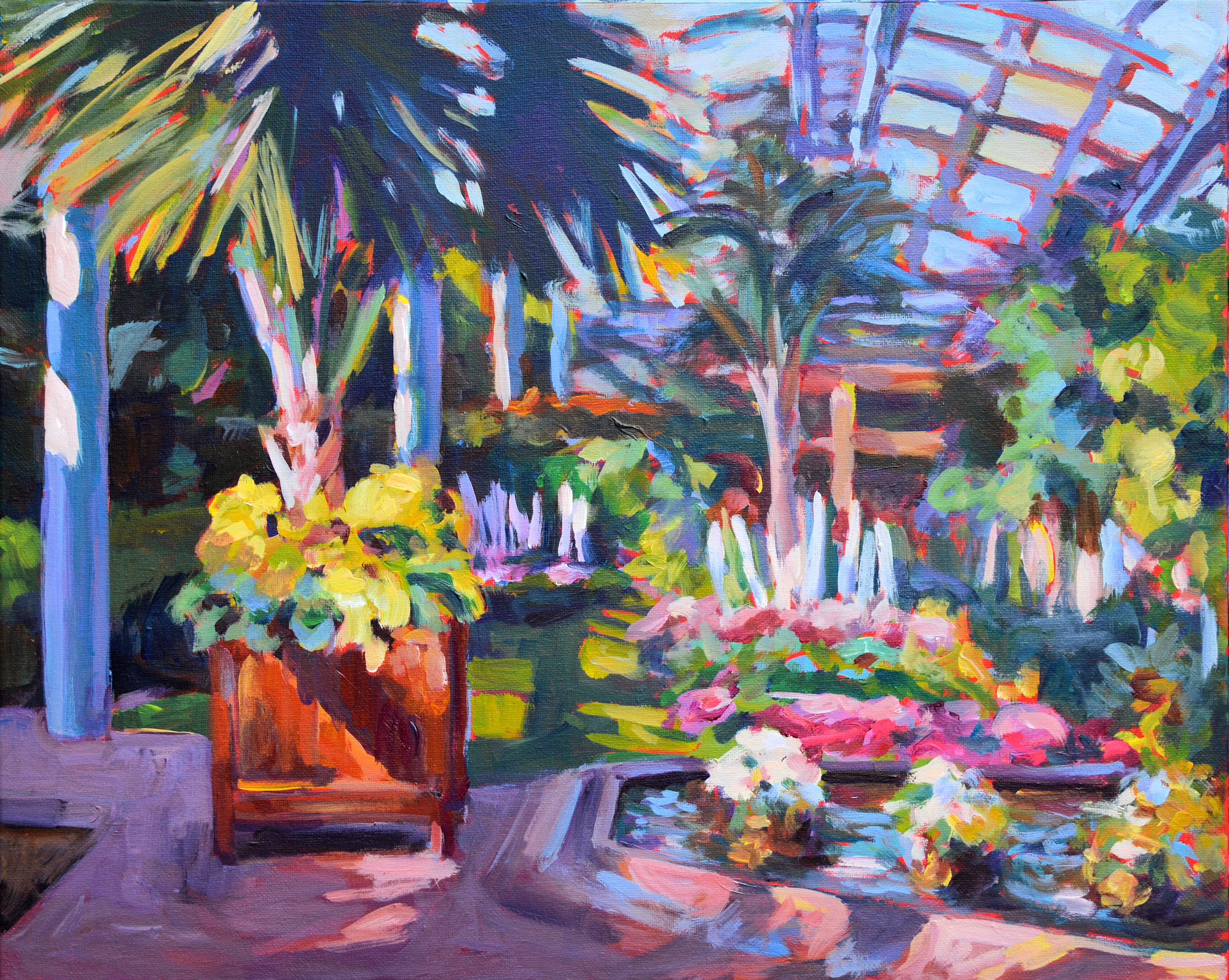
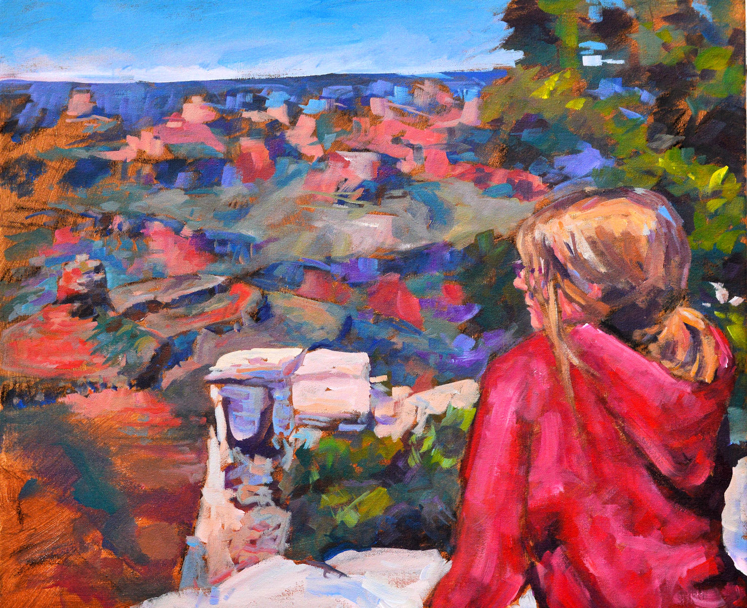
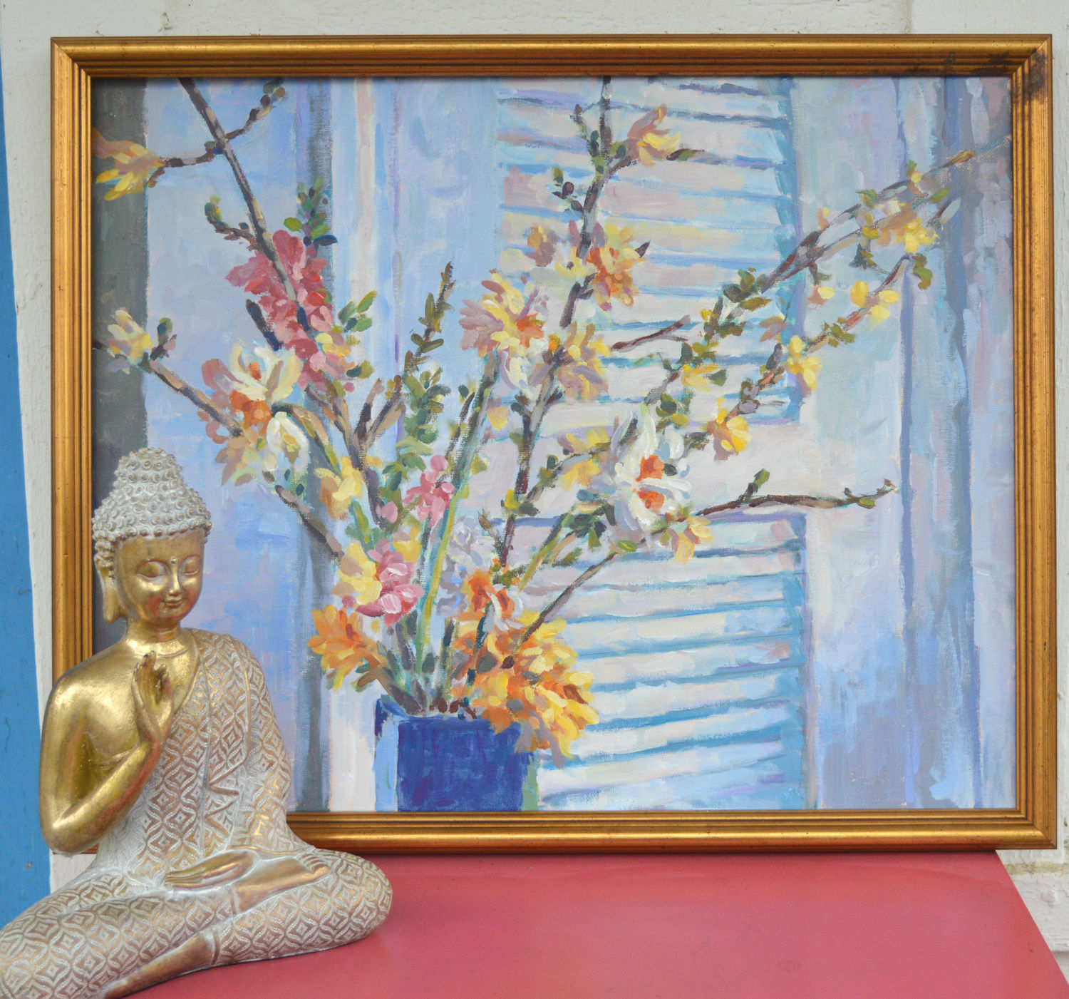
Atrium at Longwood Gardens, du Pont estate, Pennsylvania. Acrylic on canvas, 16 x 20, impressionistic style, Kit Miracle

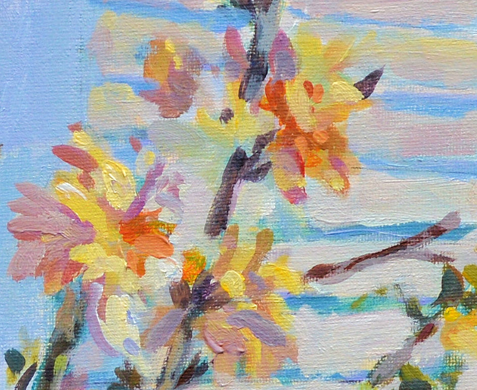
Here are a couple of my most recent paintings from my travels.  The first one is of the Atrium at Longwood Gardens on the du Pont estate in Pennsylvania.  Although I visited in March of that year, it was still beautiful.  The gardens under glass were particularly impressive. Touted as the most beautiful garden in America, I couldn’t disagree.

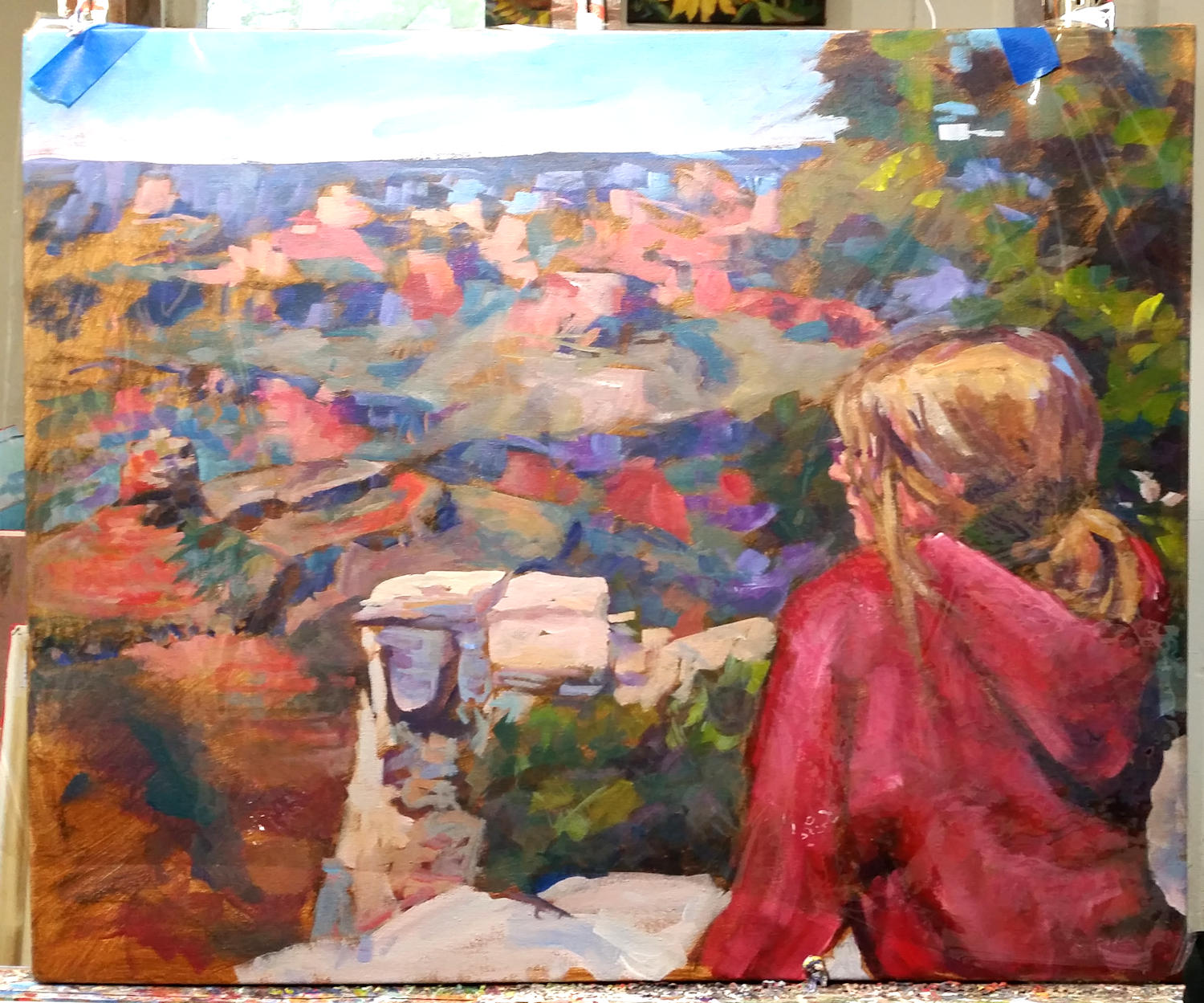
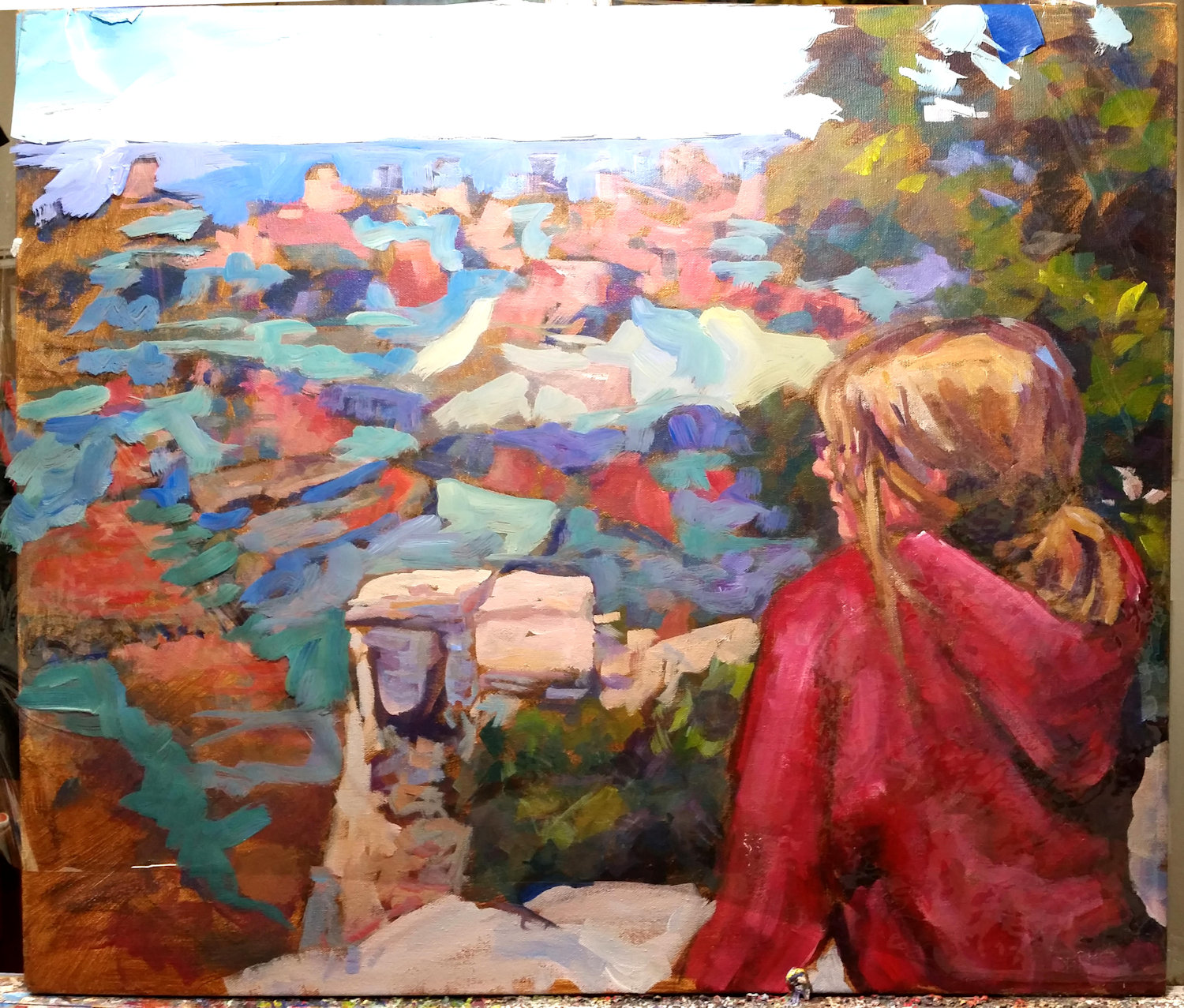
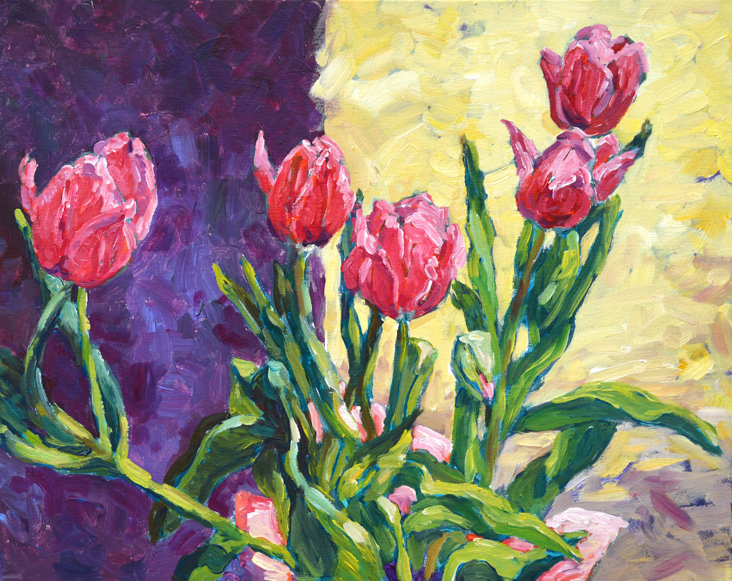
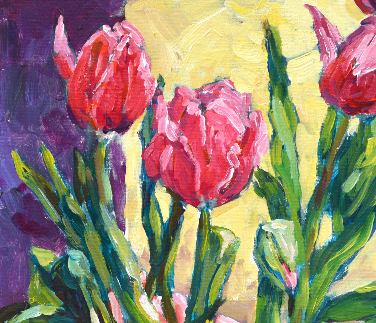
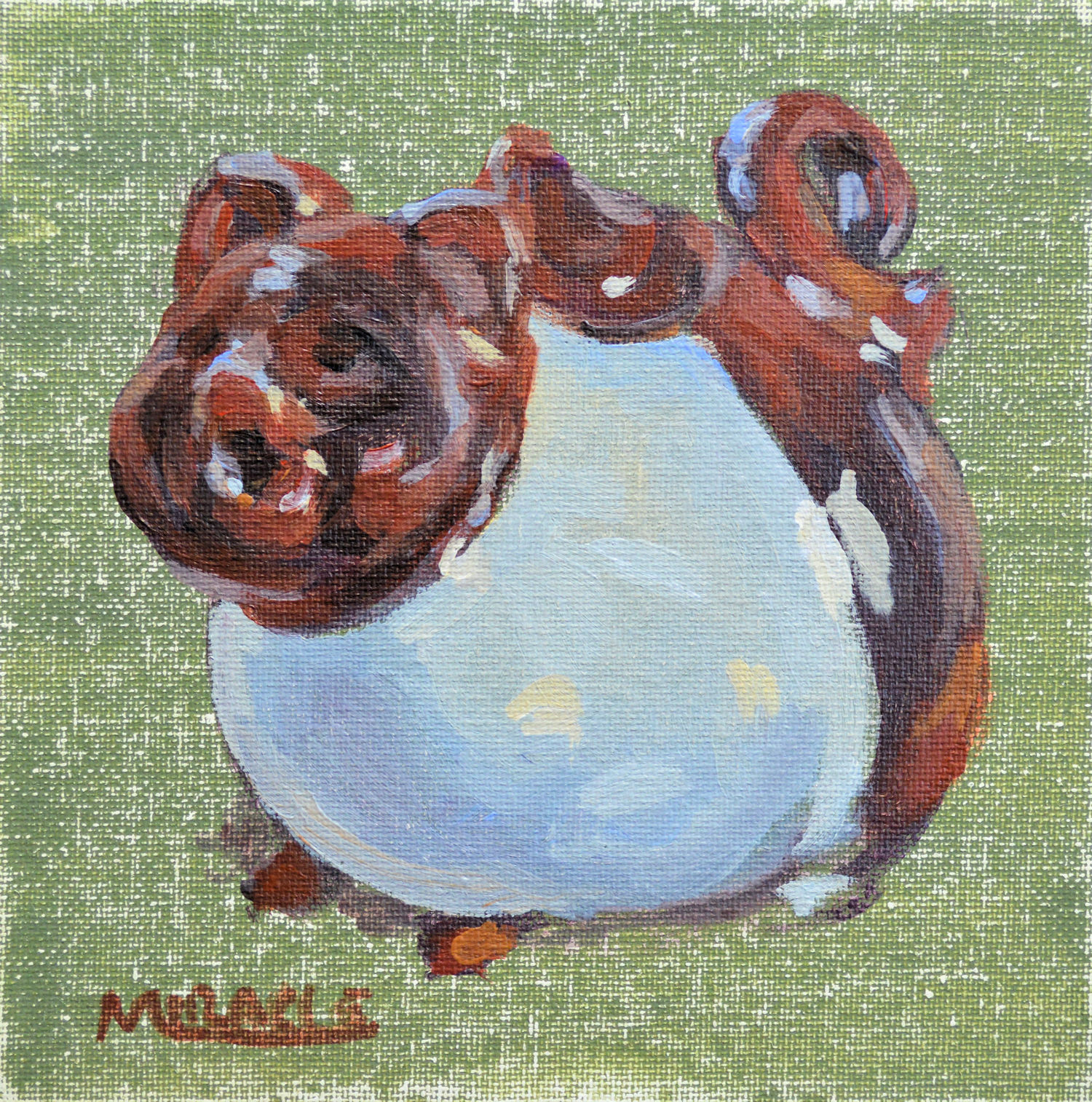
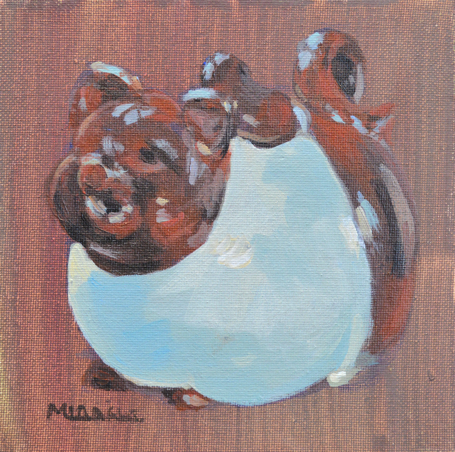
Garden Cherub, acrylic on canvas, 20 x 16. Pittsburgh, PA Kit Miracle

The second painting is from a different trip to Pennsylvania, Pittsburgh to be exact.  One of our favorite places to visit is The Strip District, a multi-block area of food shops and restaurants, fish markets and collectibles.  This particular shop had some very enticing items in the front of the shop, but as I walked through the store to the back, they had a garden shop with rusty gates and ironwork, birdbaths and outdoor trellises.  I loved this little garden cherub.  Now I wish I had purchased him but at least I could capture him in paint.

Both of these paintings are painted on red-toned canvases which peeks through, adding another layer of liveliness to the scenes.

In case you are interested, these are both available in my Etsy shop KitMiracleArt.  AND….I’m having a 20% off Labor Day sale through Monday.  Free shipping, too.

Lunch at the Museum

Lunch at the Museum, Kit Miracle, acrylic on canvas, 30 x 24.

This is the seventh painting in my Intimate Spaces: Breaking Bread series.  A bold, vertical portrait, this painting certainly grabs attention.  I’ve been noticing that in addition to telling a story, my portraits often include a wry sense of irony.  Yeah, I just now figured that out but looking back at much of my work, I can see what often attracted me to the scenes initially.  Maybe it’s my quirky sense of humor but hey, it’s my work and I can do what I want.

Anyway, this scene was when I took my granddaughter to the Carnegie Museum complex in Pittsburgh a few years ago.  All that walking around to see dinosaurs and artwork and more is hard work.  We stopped for lunch in the museum restaurant.

I guess that the first thing that strikes the viewer is, “What are those things coming out of her head?”  This, of course, as any photographer will tell you is a definite no no in composition.  You don’t want trees sprouting from your subject’s head.  But here with those globe-shaped lights, it works.  Some rules are made to be broken.

Lunch – detail 1. A sweet portrait but not saccharine.

There is a lot of vertical in this painting.  Not only the canvas but the stripes, the lights, the straw for the girl, the wood on the table.  The head is not quite in the center but everything leads to the face.

Lunch detail 5. Those squiggles become chairs and tables on the outdoor patio, viewed through the window of the restaurant.

Lunch detail 4. Up close, the people in the background look like beans, but again, from a distance, they come together.

I particularly like the balance between the warm and cool colors.  Even within the cool areas, you can see quite a bit of color if you look closely.  It’s about one third to two thirds ratio of warm to cool.

Lunch, detail 2. I captured this little still life even in a portrait.

Another little still life. The loosely painted silverware and napkin come together when viewed at a distance.

Some people like to see a photo realistic finish on paintings but that is not my style. (Been there, done that.)  As a contemporary impressionist, I look to convey the message with as few strokes as possible.  Looking at my paintings up close often reveals a jumble of bold brush strokes.  But stepping back about six to eight feet, it all comes together.  This is done to deliberately allow the viewer to become a participant in the experience by filling in the details with their own eyes where there may actually be none.

Canvas prep and under painting. This abstract painting doesn’t necessarily follow the composition of the painting but is designed to give a little guidance. Look closely to see my initial sketch of the subject before I begin to paint.

I also like to paint on a toned canvas, often with a rough gesso base to add texture.  One of my favorite colors is a reddish tone which adds sparkle where it peeks between the brush strokes.  This is particularly good for landscapes that have lots of green.  However, the tones on this series of paintings are more somber, greys with some splashes of color.  The subject is then drawn on top before I start painting.  When my husband saw all the prepped canvasses in my studio, he thought I was switching to abstract painting.  Well….not yet.

Intimate Spaces – Breaking Bread. A new series.

Alone. Intimate Spaces – Breaking Bread series. Acrylic on canvas. 30 x 24. Kit Miracle

A few weeks ago I showed some of the NOTAN studies for my next series of paintings.  If you recall, this is where the artist breaks the composition down to black and white abstract shapes.  This is the first painting in that new series.

Intimate Spaces, Breaking Bread is a rather ironic title for the series considering the times we are currently living in.  However, this series was planned out in December, long before we knew what the pandemic would do to our socializing.  No more public meals, family gatherings, etc.

So it only appropriate that the first painting is titled Alone.  The lone figure, distanced in the deserted restaurant.  The hard back lighting and reflections on the tables and chairs.  The even more ironic title of the sign inviting him to “Join” the team.  The painting evokes the feeling of loneliness, being alone, as in Hopper’s Nighthawks and some of his other paintings of solitary figures.  Even though there are some quite bright colors in the painting, the main palette is subdued, echoing the feeling of being alone.

Alone, NOTAN study. Although I don’t usually add middle tones to the NOTAN study, I did here to add more body to the image.

Alone. Charcoal sketch 24 x 18, Kit Miracle. Here I have added middle tones but it still keeps true to the basic NOTAN study.

Making temporary fixes to a painting

Far Horizons, original painting, acrylic on toned canvas, 20 x 24, Kit Miracle This is the original painting with portions of the toned canvas (raw sienna mostly) showing through as well as the original charcoal sketch on the canvas.

A few weeks ago I posted about changing the background of a painting.  I took a standard flower painting from a traditional dark background to a colorful reddish-orange background to a mixed background.  Someone asked me if I made the changes on the actual painting.  Yes, I did.  I like the painting but I’ve long passed the point of where every one is precious to me.  As the artiste, I feel it is my right to paint how I wish and what I wish.

However, I’m going to show you a neat little trick which will allow you to make temporary changes to a painting.  Here you can try out new ideas, new approaches without making permanent changes.

I have a large roll of acetate film which I used to use for wrapping large matted but not framed paintings, particularly watercolors.  This kept the paintings clean and protected them from fingerprint smudges and other dirt.  Great to use in art bins or wherever you want to display your work in public. You can buy acetate in rolls or sheets.

The painting that I’m demonstrating with is titled Far Horizons.  It shows my granddaughter looking out over the Grand Canyon. Not only does the painting depict the distant views of the Grand Canyon, but the deeper meaning of a young girl looking out to the future.

Although I love the composition of the painting, it somehow didn’t seem to give the impression of really far horizons, as anyone who has visited the great canyon can attest.  So I wanted to try to lighten the background as a test.

Far Horizons, 1st step. A clear acetate sheet has been taped over the canvas. No painting has been done on the acetate yet.

First, I cut a large piece of acetate and taped it to the painting.  Then just started loosely painting over the acetate with acrylic.  I lightened both the distant sky, and made many changes to the rocks with lighter colors.  I even added some more highlights to the girl’s hair and jacket.

Far Horizons, 2nd step. Here you see that I started with the sky and have been painting directly on the acetate sheet. The whole idea is to test out some lighter background colors in order to push it back.

Detail of step 2 showing some loose strokes of lighter colors.

Far Horizons, final step of the acetate painting over the original painting. I even touched up the highlights of the girl’s hair and jacket.

This is the actual painting on the acetate. I’ve put a plain piece of toned paper behind it to better show you the actual painting.

I plan to set the painting aside in order to evaluate whether I want to make any of these changes permanent.  If not, I haven’t done any damage to the original painting and can leave it just the way it is.

This technique works well for both acrylic and oil painting.

Evolution of a painting

Barry, portrait in acrylic on linen, 28 x 34. Kit Miracle

Except for plein air painting and sketching, it’s pretty rare that I create a painting by just diving in and slapping some paint on canvas.  Yes, I know, movies and biopics of artists give that impression.  But really, it’s hard work and, for me at least, requires a lot of preliminary work.

When I’m doing a portrait, which is to me the most difficult to achieve, I always begin with some preliminary sketches.  Generally I begin with some charcoal sketches.  Sometimes one is enough but more often it’s several.

Barry, preliminary charcoal sketch. Kit Miracle

After that, I may try some color sketches on canvas paper or panels.

In this case, I had recently been gifted with some art supplies by a friend who was moving so I proceeded to a conte crayon study on pastel paper.

Barry, conte crayon. on pastel paper.

The next step was to do a larger oil stick pastel, also on pastel paper.

Barry, oil stick pastel on pastel paper. Kit Miracle

The final painting was created on a large stretched linen canvas 28 x 34.  I had already primed it some time ago with a dark neutral background and some splashes of color in the center.

I sketched in the main figure with charcoal.  Then, sanded the primary area and gessoed it again.  Then sketched over that again with charcoal.  A little spray fixative set the charcoal so the painting process would not pick it up.  I decided to leave the background unfinished with just the initial undercoats of paint.

The figure is painted in acrylic very loosely but with attention to detail in the face and hand.  The primary difference with painting a human portrait as opposed to painting a building or landscape is that if you’re off a brick or leaf in the landscape, no one will know. But if you’re off a quarter of an inch on a nose, you have totally missed the mark in capturing a portrait.   At least in my opinion.

What do you think?

Asymmetrical composition

Beach Readers, Intimate Spaces series, acrylic on linen, 24 x 30, Kit Miracle The whole attraction of this subject was the irony of the two young women who are reading and totally ignoring the beautiful day at the beach. I also love the way the red beach chairs draw the viewer’s eye into the scene.

There are many rules of painting composition which I have discussed in previous blogs (search: composition).  These are usually conventional and are designed to lead the eye through the picture.  But one of my favorites is an asymmetrical composition, that is, not even or necessarily balanced.  I liken this somewhat to whether you are a candlesticks at each end of the fireplace mantle kind of person or you feel comfortable placing both candlesticks at one end (usually balanced by some other object at the other end.)  It’s just a matter of personal preference.

The painting above, Beach Readers in the Intimate Spaces series, is a good example of asymmetrical composition. The bright red chairs on the right lead the eye into the scene to the two girls who are reading.  Most of the other action is in that quadrant of the painting.  However, the small figure playing in the surf at the far left is able to balance the scene.  If you don’t believe me, cover the figure with your hand and see what a difference that makes to the feel of the painting.

Asymmetrical composition came into vogue in the 1880s and 1890s as the Impressionist artists were influenced by the import of Japanese prints.  These prints not only led to some experimentation in composition, but to flattened colors and situational composition.  This would be similar to a photograph that is just cut off at strange places.  This could include people looking out of the picture plane, cutting off the head or legs of horses, or even figures exiting the frame.

Below are several examples of paintings by Mary Cassatt, Edgar Degas and Edouard Manet which illustrate this influence.  The first two artists collaborated for years with their printmaking but as you can see, the Japanese influence directly appeared in their work.

Mary Cassatt, Woman and Child in the Driving Seat.

Degas, more race horses running out of the picture plane. Lots of empty space but it works.

One of many Degas racing scenes. Notice how some people are only partially shown in the picture plane. This is a similar composition to my Beach Readers in that there is a big blank space in the lower left side of the painting, with the action on the right leading into the main subject.

Degas. Another very unusual composition of race horses and jockeys.

Degas, Place de la Concorde. Notice how everyone seems to be looking off in a different direction. And why are the little girls cut off at the waist?

Edouard Manet, Portrait of Gillaudin on a Horse. You can only infer the horse in this painting although the main subject is centered.

Alley View, Plein Air Painting, Jasper, Indiana

Alley View, Plein Air Painting, final, 16 x 20, acrylic, Kit Miracle. This shows the final view of the scene. I might tweak it sometime later after I live with it for awhile, but so far, I’m satisfied.

Although I do a fair amount of plein air painting, I don’t do too many competitions.  Today I participated in a local event which is always fun.  I’m familiar with the area so it’s always a challenge to find new and interesting things to paint.  Yesterday I scouted out a few locations. I don’t like to do what everyone else is doing but seek to highlight a vista that might make people see their own space in a new way.

Alley view, initial scene, very early in the morning.

So this morning found me sitting in an alley. I was drawn to this blue garage and the alternating light and shadows as I looked up the alley.  It was very peaceful on a Saturday morning at daybreak.

Alley View, 1st step. Using a red-toned canvas, I painted in the basic shadows and main shapes.

Alley View, second level. Here you can see more added colors. This is the point in a painting that everything looks like a real mess. But I’ve learned to just keep pressing on and it will come together.

As you can see, I started with a red-toned canvas, 16 x 20.  First I blocked in the main shapes and the darks.  Then I started to lay in the markers for the greens.  The last colors to go in were the lightest colors – whites, off whites, and the sky.  I don’t always work in this order but usually.

Alley View after two hours. Notice how the shadows have changed. Usually 2 – 3 hours is the most time I have for a plein air painting.

Despite the heat and humidity, my acrylic paints kept drying out quickly.  I didn’t bring a retarder with me so I kept having to spray the paint and add layer after layer.

But I enjoyed the peace of the scene.  A few dog walkers, a couple of interested passersby, the occasional bunny rabbit, and inevitably, the Saturday morning lawn mowers all created the peaceful atmosphere.

I might review the painting later to see if I need to tighten it up, but actually, I like the feel of a warm summer morning. How about you?

Alley View, Plein Air Painting, final, 16 x 20, acrylic, Kit Miracle. This shows the final view of the scene. I might tweak it sometime later after I live with it for awhile, but so far, I’m satisfied.

A Day at the Beach – Painting a Series

A Day at the Beach, final. 24 x 36, acrylic on canvas, Kit Miracle

As a working artist for over three decades, I find keeping interested in painting involves challenging myself. Sometimes this means new subject matter or new materials. Even a new location helps.  The challenges keep me inspired and allow the mental juices to flow.

My latest challenge is painting a series of paintings revolving around a day at the beach.  I love slice of life subjects, catching people going about their lives without thought of an audience. One thing I’ve noticed is that when people are at the beach, they stake out their territories, bringing the chairs and the umbrellas, the coolers and the toys.  Beach goers seem to operate under the illusion that no one can see them in their little sand kingdoms.

But the artist’s eye can.

The planned series includes vignettes of life at the beach.  Families, couples, kids playing, people just enjoying the sunshine…or totally ignoring their surroundings with their noses in books or napping.  My inspiration for these seaside paintings are John Singer Sargent, Joaquin Sorolla, and Burt Silverman.  It took a lot of effort to make their seaside paintings seem so, well, effortless.  Unstaged even though they often were. And that is the aim of this current series that I’m working on.

The painting above depicts the settling in and establishing of territory by a family.  Mom gets the lounge chairs ready while son is waiting patiently for her attention.  The composition with overlapping umbrellas and tents is like a little city, each with its own slice of life.

The beach walkers and people playing in the surf add distance and perspective to the scene.  I also chose to flatten the color of the sky (no clouds) and the foreground.  This allows the emphasis to be placed on the middle plane where all the action is.

A Day at the Beach is number six in the series.  I have sixteen planned but we’ll see.  A series is an exploration of an idea and I’ll keep at it until I don’t have anything else to say about the subject.

If you’d like to see how this painting was created, click on this link or go under the tab Artworks and click on A Day at the Beach for step-by-step photos.

Thanks for stopping by.

Yearning for Spring

Yearning for Spring, framed, 16 x 20, acrylic on canvas, Kit Miracle, contemporary impressionist

I am just so ready for spring.  Living here in southern Indiana, the winters are usually rather mild, at least compared to my years in Michigan.  We will often get a little snow but not much to worry about.  I think winter here is really like a long fall.

However, this year Mother Nature seems to have taken a fit.  Warm one week just enough to tease the early bulbs out of the ground.  Then the next week, temperatures diving for the bottom of the thermometer.  Last week we saw lows of 10 degrees which meant our wood furnace (The Beast) was doing its best to keep up.  Yesterday we saw a high of 62 with some 70s predicted for next week.  Last evening the peepers could be heard in chorus in the bottoms.  Did I mention that I am really ready for spring?

I felt an irresistible urge to paint some spring flowers. With few early flowers out yet except a couple of bedraggled crocuses and some hardy daffodils, I turned to my photos of some spring bouquets.  And to step outside my usual style.  Same old, same old, gets boring in my opinion.

Yearning for Spring, acrylic on canvas, 16 x 20, contemporary impressionist, Kit Miracle

The first bouquet consists of forsythia, double fancy daffodils and some branches of flowering quince.  I like the subtle colors here and aimed at coordinating the background to the flowers but to subjugate it to the foreground.

Dancing Tulips, acrylic on canvas, 16 x 20, contemporary impressionist, Kit Miracle

The second flower painting took me in a different direction.  I aimed for bold colors and lively strokes.  This painting certainly accomplished that.  It almost looks as if the tulips are dancing.  To see the step by step for this painting, click here or go the Artworks tab and click on Dancing Tulips.

With the warming temps coming this week, my real tulips might be blooming. They’re already up several inches and it will just need old Sol to entice them out.  I’m ready!

Of course, both paintings are for sale at my Etsy shop.

Thanks for stopping by.

Spring is Nature’s way of saying, “Let’s Party!”       Robin Williams

Yearning for Spring, detail 1

Yearning for Spring, detail 2

Dancing Tulips, detail 1, Kit Miracle

Dancing Tulips, framed, acrylic on canvas, 16 x 20, Kit Miracle

Year of the Pig

Year of the Pig, green background, original painting, 6 x 6, Kit Miracle

The Chinese Year of the Pig begins on Tuesday, February 5th.  I had this cute little pig teapot and decided to paint it for a close family friend who is Chinese and whose birth year is the Pig.  Actually, I painted two versions.

The painting is a very simple portrayal in acrylic on a canvas panel.  Although the teapot is small, the pig is big on character.  It was very fun to do after some of the more complex paintings that I’ve been doing lately as I don’t usually paint on this small scale except for watercolors.

The Year of the Pig (birth years 1935, 1947, 1959, 1971, 1983, 1995, 2007, 2019) portends good luck for the people born in this year.  They are hard workers, energetic and enthusiastic.

So, to my friends of Chinese background, and to everyone else, Happy New Year!

One version of this painting will be listed in my Etsy shop.

Year of the Pig, brown background, acrylic on panel, original painting, 6 x 6, Kit Miracle