Tag Archives: notan

NOTAN studies

Like nearly everyone else, my mind has been distracted with the current state of affairs in our nation, indeed, in our world. But I’ve cut back listening to the endless stream of news broadcasts which has helped bring some peace to my mental world.  This has allowed me to get back to my next series of paintings.  The theme of the series, which I planned out late last year, is Breaking Bread.  A bit ironic since we can’t go out right now, and only share meals with our own families or pets.  In this case I searched through hundreds (thousands?) of my photos from the past decade or more.

Italian Eating Italian. Charcoal sketch 18 x 24. Kit Miracle Again, the strong lighting is emphasized based on the NOTAN study but some middle tones have been included.

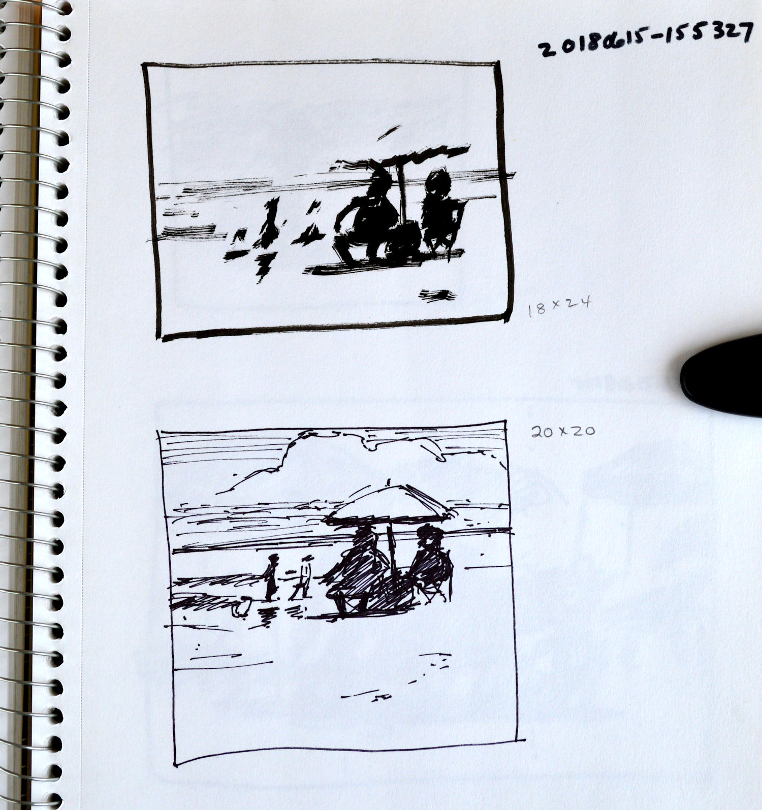
Italian Eating Italian, NOTAN study. As you can see, I’m playing around with the size and shape of the composition, square or rectangle?

The photos are taken in color but to distill them to their essence, I convert them to black and white, and then push the contrast of the black and white.  You can do this in person by squinting at your subject or using the red gel trick that I have discussed before.  I usually make quick NOTAN sketches when I’m out doing some plein air painting.

Alone, NOTAN study. Although I don’t usually add middle tones to the NOTAN study, I did here to add more body to the image.

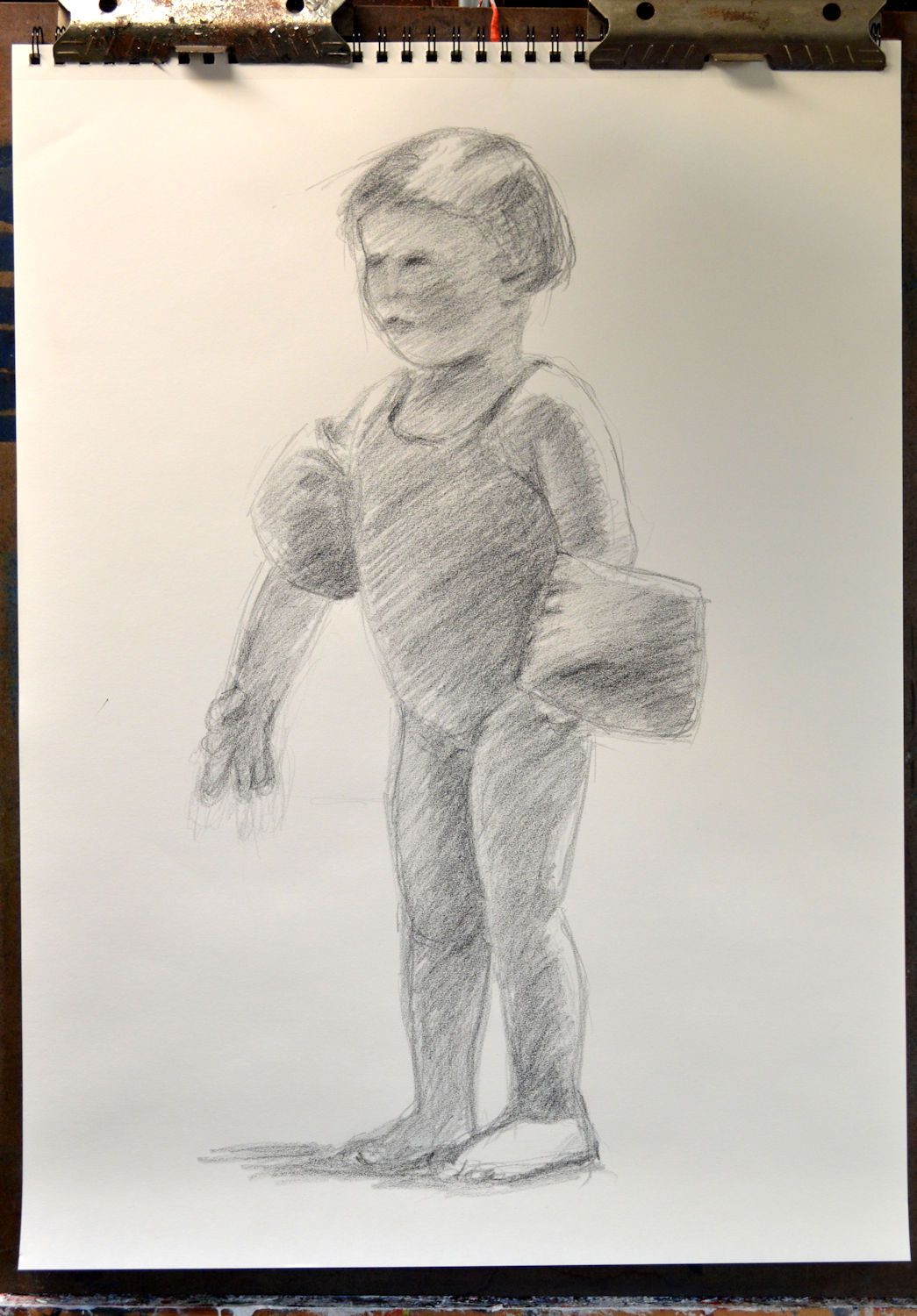
Alone. Charcoal sketch 24 x 18, Kit Miracle. Here I have added middle tones but it still keeps true to the basic NOTAN study.

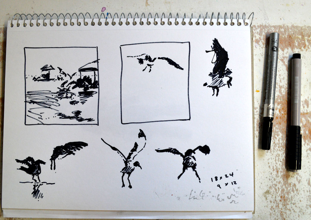
The whole idea of the NOTAN sketch is to find the best pattern for your subject.  Definitely not meant for every style of painting but very helpful to establish the overall effect.  As a rule, you will not want to have exactly the same amount of black and white areas in the NOTAN subject.  Also, look for pleasing patterns.  Don’t worry about details at this stage.  As you can see, the NOTAN subjects that I’ve created here are about 5 x 7 inches, made with a Flair pen and a black art marker.

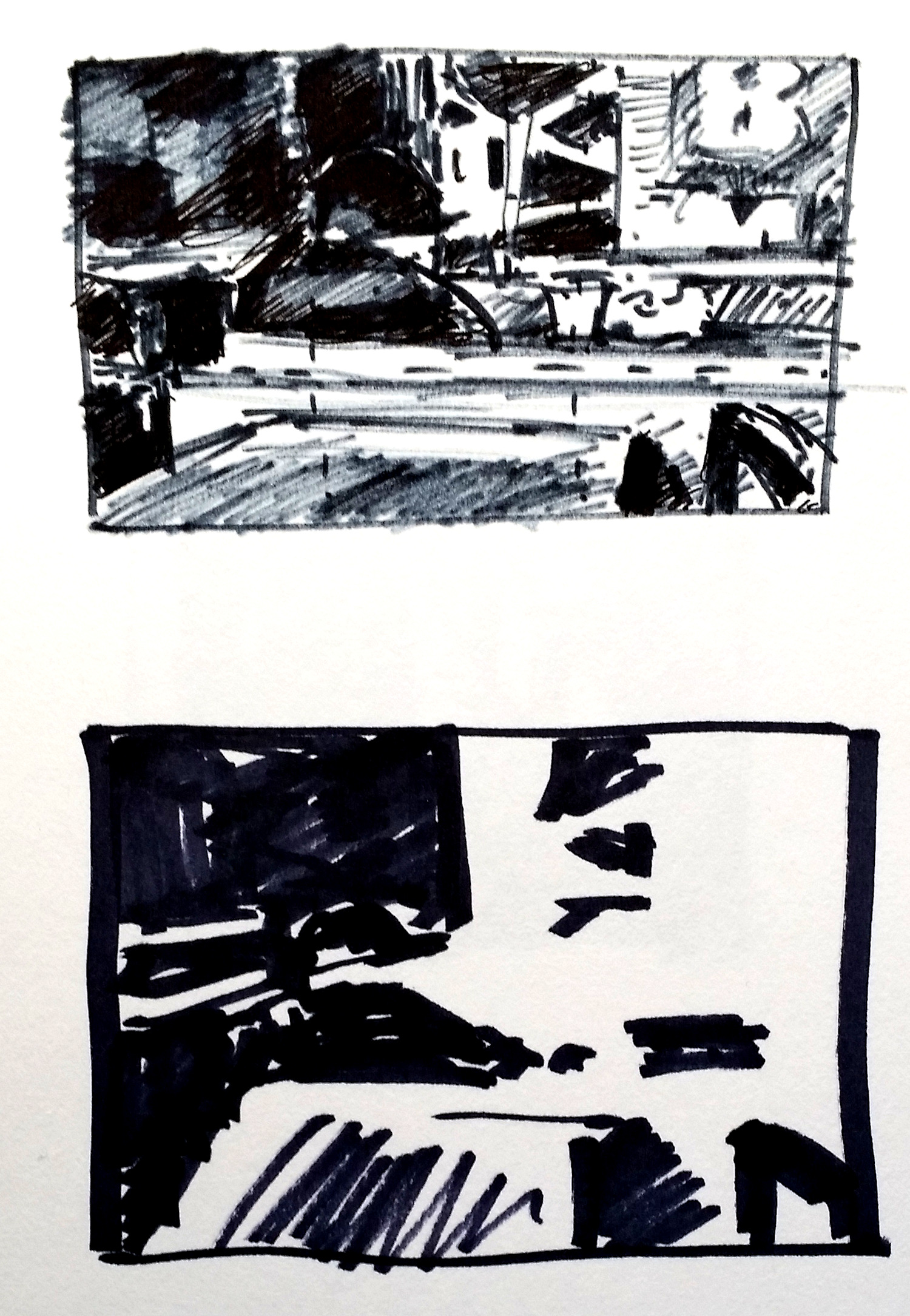
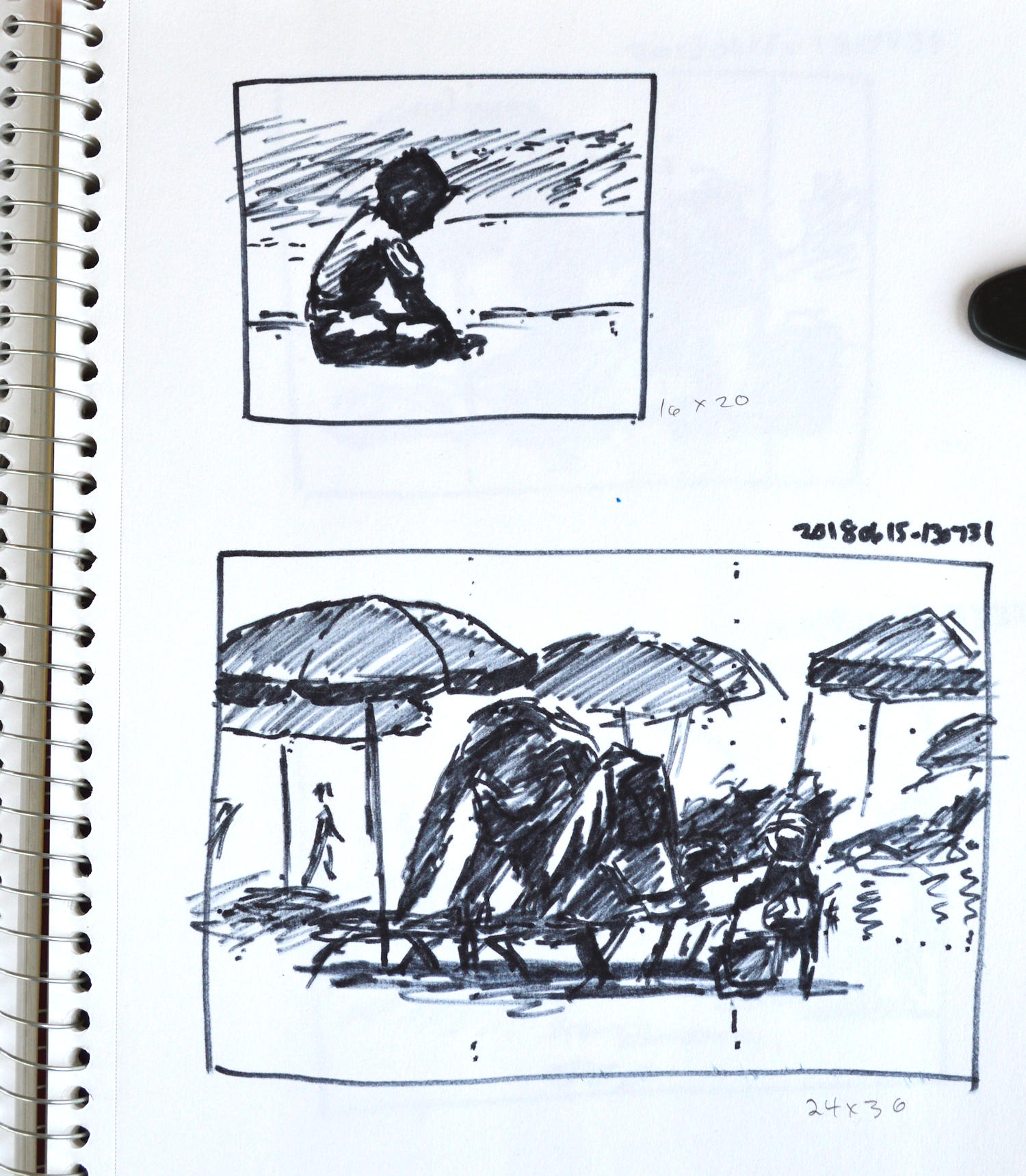
Old Man, NOTAN studies. I did two studies of this subject. The top one is more detailed with three tones – white, black, and middle. The bottom image is a more traditional NOTAN study and is very abstract.

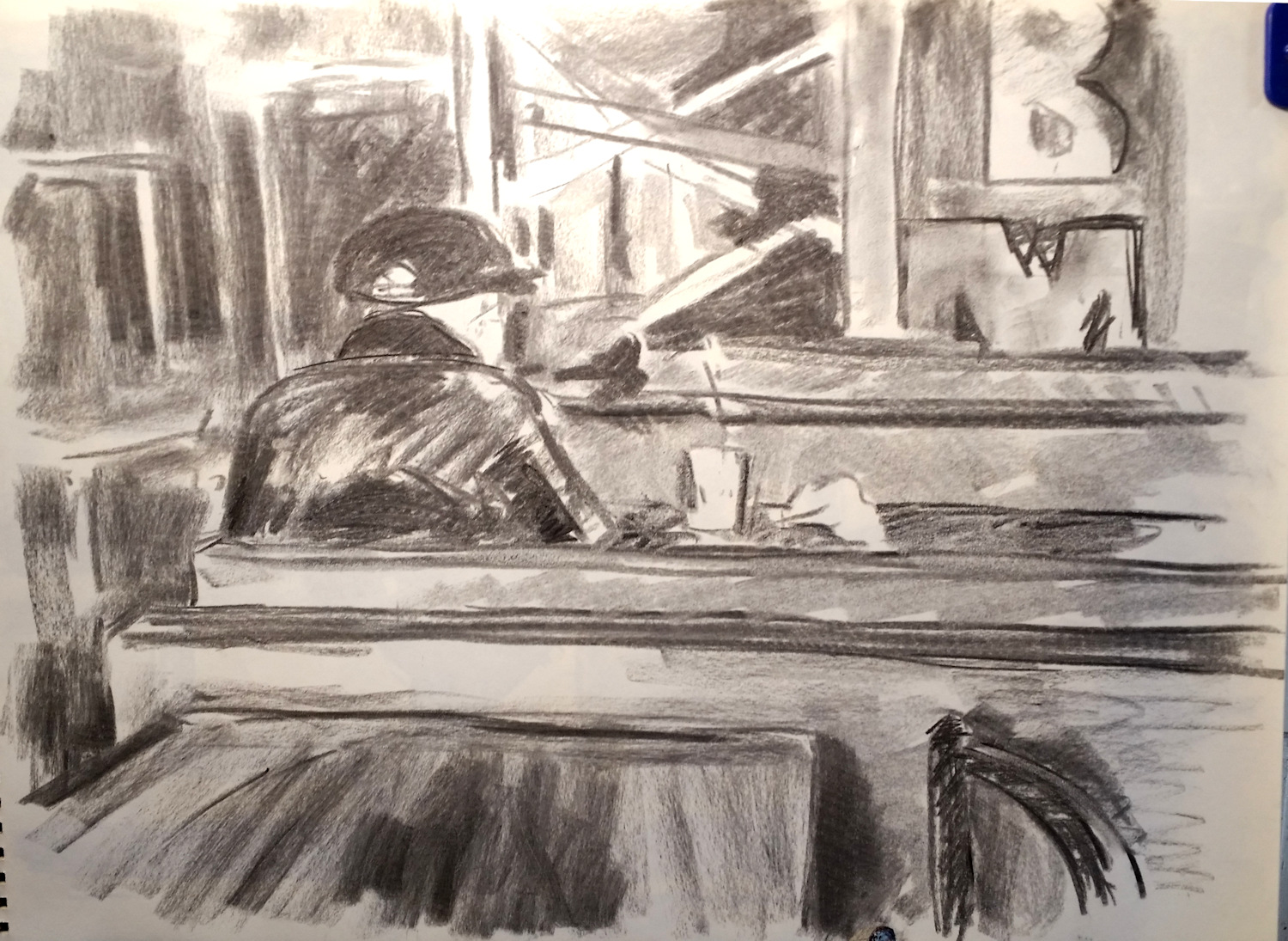
Old Man, charcoal, 18 x 24. I will probably simplify the background of this painting to match the NOTAN study. There’s a lot going on but I like the contrast of the horizontal and vertical shapes.

After I have created the NOTAN sketches, I then do a larger (18 x 24) charcoal sketch of the subject.  The NOTAN study helps keep me on track for the composition, but the charcoal sketch allows me to add some middle tones. Most of the NOTAN sketches only take about five minutes or less.  The charcoal sketches usually take 30 to 60 minutes.  I sometimes do more charcoal sketches of details or to try different compositions.

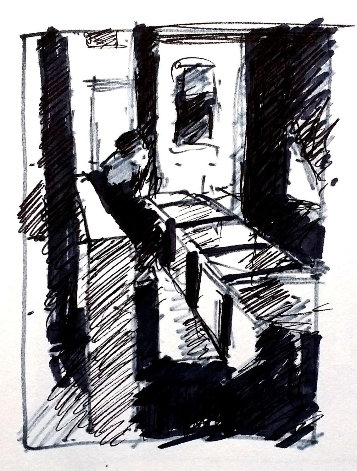
Late Night NOTAN. This is an example of extreme abstract shapes created by the NOTAN drawing. There’s a rhythm of ovals and rectangles within the picture plane.

Late Night, charcoal sketch 18 x 24. Kit Miracle. Although the oval shape in the foreground (back of a chair) captures the eye first, it is then directed to the group of teens in the right rear of the picture plane. The dark window provides a perfect foil for their shapes.

After these steps, I may do some color sketches but I always keep referring back to these black and white pieces when I’m working on the final painting.

Here are some links to previous postings about using NOTAN sketches for your work.

https://my90acres.com/artwork/wings-beach-painting-step-by-step/

https://my90acres.com/2019/02/17/little-stone-church-provence-demonstration-painting-from-photographs/

https://my90acres.com/2019/04/14/the-importance-of-preliminary-work/

The importance of preliminary work

Green and Yellow, 20 x 20, acrylic, Kit Miracle. Intimate Spaces series

I recently posted a step-by-step outline of my painting A Day at the Beach (4-10-2019). A critical part of creating a significant panting is the preliminary work. I sincerely believe that the more thought I put into the piece at the beginning, the more I can work out the problems ahead of time, and the better the final result will be.  Well, that’s my theory anyway.

Green and Yellow, detail.

This is another painting in my series Intimate Spaces, all about the territory that people carve out when they visit the beach.  In this painting, I was sitting behind a couple who staked out their space early in the day with two chairs and an umbrella.  They didn’t show up until mid-afternoon.

NOTAN sketches for Green and Yellow. This is where I work out basic shapes and composition. As you can see, initially I intended this to be a rectangle shape but then changed it to a square shape.

I liked the near silhouette of the couple with the contrast of the kids playing in the surf in front of them. Maybe they were grandma and grandpa.  I don’t know and never did figure it out.

Large graphite sketch of the main characters for Green and Yellow.

As with most of my paintings, I begin with a NOTAN sketch, just hard contrast of black and white to get a feel for the composition.  Then I did a large graphite sketch of the couple.  I didn’t feel a need to sketch the kids as they’re just notes really.  They were painted directly.

NOTAN sketches of past couple of paintings. Working in black and white allows me to focus on the shapes and composition.

Here are a few more examples of NOTAN sketches.  You’ll notice the one from my last post of A Day at the Beach and how I was focusing on the interlocking umbrella shapes.

More NOTAN sketches from Jump.

And the two pages of NOTAN of Jump which I created in February.  With some of the bigger pieces, I’ll also do a color sketch but not always.

The final conclusion is that no matter what style of art you create, you will often have better results if you put in more thought and work into the beginning of your work than having to correct problems later.  Indeed, sometimes you may discover that the scene or piece doesn’t merit following through.  Or you may decide to attack it from a different direction.

Little Stone Church, Provence – demonstration painting from photographs

Little Stone Church, Provence, France – final. Acrylic, 12 x 16. As you can see, I made the sky more interesting and edited the road a bit, too.

I thought I’d share another lesson from the class that I’m teaching about painting from photographs.  Frankly, this process can be as complicated or as simple as you want to make it.

Little Stone Church, Provence – original photo

In this example, I have a real photo – you know, the printed kind – from a biking trip that I took through Provence, France many years ago.  I like to browse through the old photos and inevitably I see a new subject that I overlooked before.  In this case, I remember exactly how I felt cruising through the olive groves when I passed this old stone church one morning.

Little Stone Church cropped.

The original photo included more subject matter than I wished to include in my painting so I cropped it to fit my canvas size.  This is easy to do if it is a digital photo, but in this case with a real picture, I used paper L-shaped pieces to manipulate the photo (not shown here.)  I don’t usually need to do this anymore since I’ve been painting for so many years but it’s a good hack for new painters.

For the purpose of the class, I actually scanned the photo and used these images to demonstrate.

Little Stone Church – photo divided into thirds. The center of interest – the church – is at the intersection of one of the thirds. Also, notice how the road leads the eye into the painting and points towards the church.

I divided the selected picture area into thirds each way and then placed the church on one of the intersections.  This generally makes a nicely balanced composition.

NOTAN Here I changed the photo to black and white, then pushed the contrast to the extreme. This helps one get a better idea of the basic shapes. Notice how the stone church (center of interest) also has the greatest contrast with the trees framing it.

The prior week we had discussed NOTAN – the theory of making your image extreme black and white in order to seek balance in the composition.  Here, I manipulated the image by computer to show a high contrast in black and white which is essentially NOTAN.  Here is a link to a very good explanation of NOTAN by artist Mitchell Albala.

A black and white image of the same photograph. This helps the artist gain a better handle on values, lightest to darkest. The same effect can be achieved by viewing the color photograph through a piece of red gel. See a prior post on the subject at the link.

I then showed a regular black and white photo to the class so they could get an idea of the values.  Again, you can use the trick of a piece of red gel to get the same effect.  (Click here to see an earlier post about using red gel.)

The next step was to demonstrate to the class my procedure for painting the scene in color.  In oil or acrylic, one usually starts with the darks and works towards the light.  Watercolor usually proceeds the opposite way with laying in the lights (or reserving the lights) and adding more and darker color as the painting progresses.  There are several demonstrations of both of these methods under the tab Artworks at the top of the page.

The takeaway here is that composition can be enhanced for using old photos as painting materials by manipulating the size and shape of the photos, taking care of the placement of the center of interest, and selecting pleasing balance and contrasts of lights and darks.

Little Stone Church, Provence

Preliminary work

Beach girl, color sketch. 16 x 12, acrylic. Kit Miracle

I often have mixed feelings about the importance of creating preliminary sketches and paintings.  Sometimes I just want to grab the brush and dive right into a painting.  This is especially true of my plein air painting although, usually I at least do a few value sketches before I put any paint to the canvas.  Usually.

Beach girl, pencil sketch. 18 x 24, Kit Miracle

On the other hand, I know from experience that when I want to create a large piece, results will normally be better with more planning.  Preliminary sketches and paintings basically create a road map for a painting or work of art.  If you think about it, you wouldn’t build a house without a plan.  Probably wouldn’t take a vacation without a map.  So it makes sense to do some support work before you begin a major piece of work.

Notan sketches for beach painting.

I’ve been working on a large beach scene lately.  First I started with some sketches for the layout or composition.  Then I did a few Notan sketches in black and white.  Sometimes I’ll add a middle grey value but usually not.  Next I did a large pencil sketch of the main figure.  This helps me to address any problems and get to know the scene.  Finally, I did a fairly quick color sketch (acrylic) of the little girl.  This was, in fact, much larger than the final figure in the painting which is not necessarily how most people would work.

I’ll post the final painting and more sketches next Sunday.  I really like this preliminary color sketch but I’ll let you be the judge.

As an aside, most famous artists of the past spent quite a bit of time and effort to create their masterpieces, including numerous sketches.  This is still quite common for artists who practice classical education in ateliers.

To learn more, check out the work of John Singer Sargent, Joaquin Sorolla y Batista, Anders Zorn, Cesar Santos, Norman Rockwell, or Juliette Aristides.