
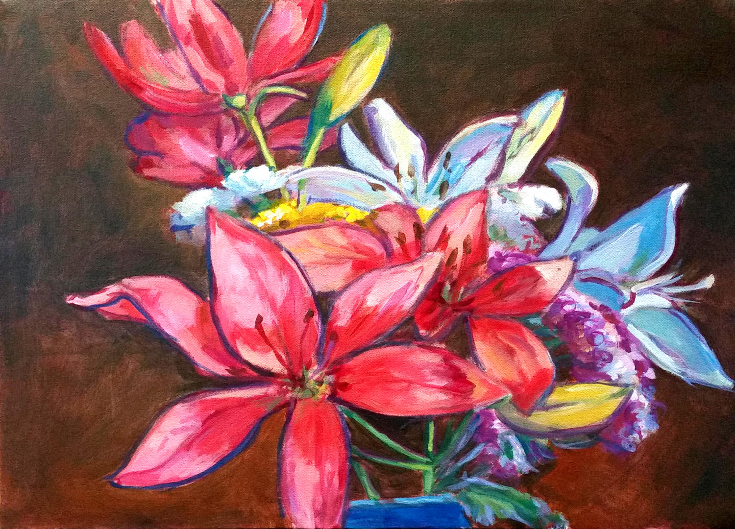
Lilies with brown background. Acrylic on canvas, 16 x 20. Kit Miracle
I often treat myself to a bouquet of fresh flowers when I’m at the grocery. They just make me feel good and remind me that spring will be here soon (another three months). This week’s selection included some beautiful lilies and other flowers. Of course, everything becomes a subject for painting to an artist.
I started this painting yesterday and worked on it some more today. Although the first image with the dark background is pretty classic, it was nice but didn’t move me.

Lilies with orange background. Acrylic on canvas, 16 x 20. Kit Miracle (Apologies for the glare from my easel light.)
So…..I decided to try some different backgrounds. First I painted a bright, orangey-red background. This really added some pop to the painting. But it seemed very flat to me which is probably what I didn’t like about the first painting background.

Lilies with blue and orange background. Acrylic on canvas, 16 x 20. Kit Miracle
Then I added some variegated shades of blue to the background, leaving the orange at the bottom. Much better and it ties in with the blue vase. (I have many cobalt blue vases of various shapes and sizes which I’ve collected over the years. This is why you see them in so many paintings.)
The flowers are essentially the same although I may have touched them up here and there. So, which background do you like best? Dark brown, orangey-red, or blue and orange? They each bring something different to the painting.
Hummmm….I wonder what a lime yellow-green would look like?

I like the contrast of the bright flowers on the dark background.
LikeLike
Thank you.
LikeLiked by 1 person
The blue background. The flowers look so vibrant!
LikeLike
Thank you. It’s all a matter of taste.
LikeLike
Pingback: Making temporary fixes to a painting | my90acres