Category Archives: painting instruction

Adding pizazz to a painting with gold and silver leaf

Leo’s Muse, final, acrylic on canvas, 23K gold leaf, sterling silver leaf, 16 x 16, Kit Miracle

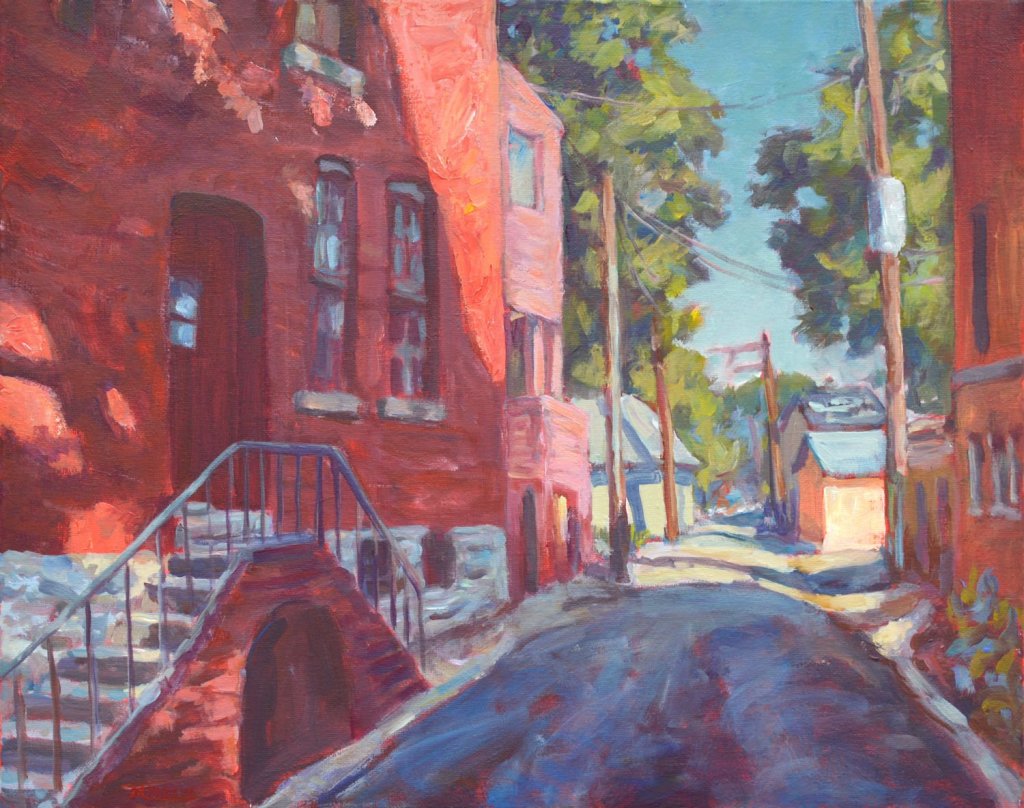
For the past several months, I’ve been experimenting with adding gold and silver leaf to some of my paintings. I don’t know why I decided that this was a path for me, but as with most artists, we get inspired with new ideas and techniques. I posted on here earlier about some glam cat paintings and some others, but the most recent sparkly paintings have been both challenging and rewarding.

Leo’s Muse, several sample preliminary sketches

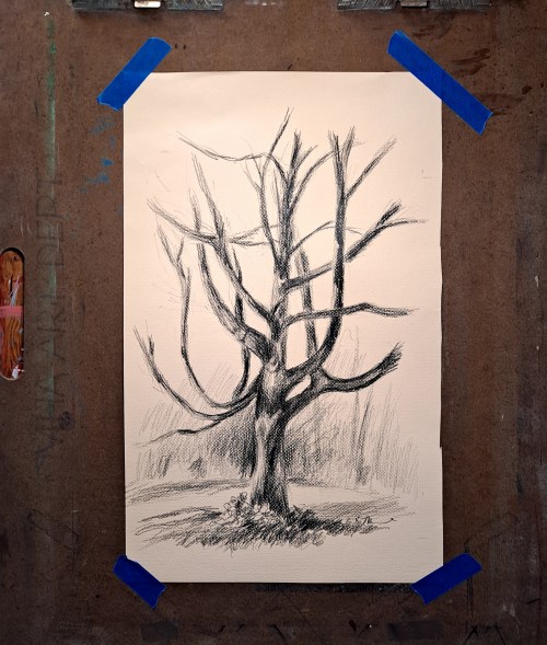
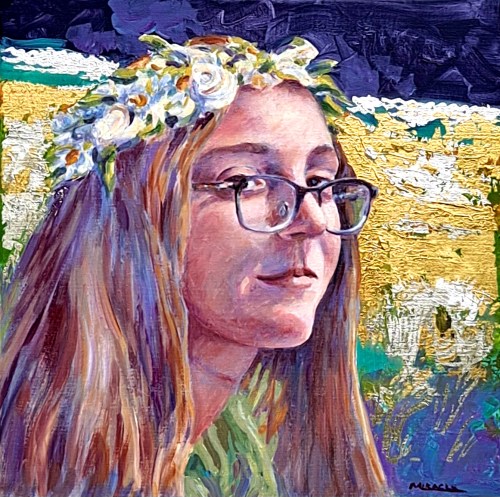
In Leo’s Muse, I began with some ideas rolling around. I took a few dozen photos of my model in different lighting and poses. Then began the difficult part of winnowing down all my options to a few good poses. It may seem like an unnecessary step, but I have found that it helps to do a number of sketches even before I get to the final idea. This allows me to familiarize myself with the model and the lighting until I reach my final idea.

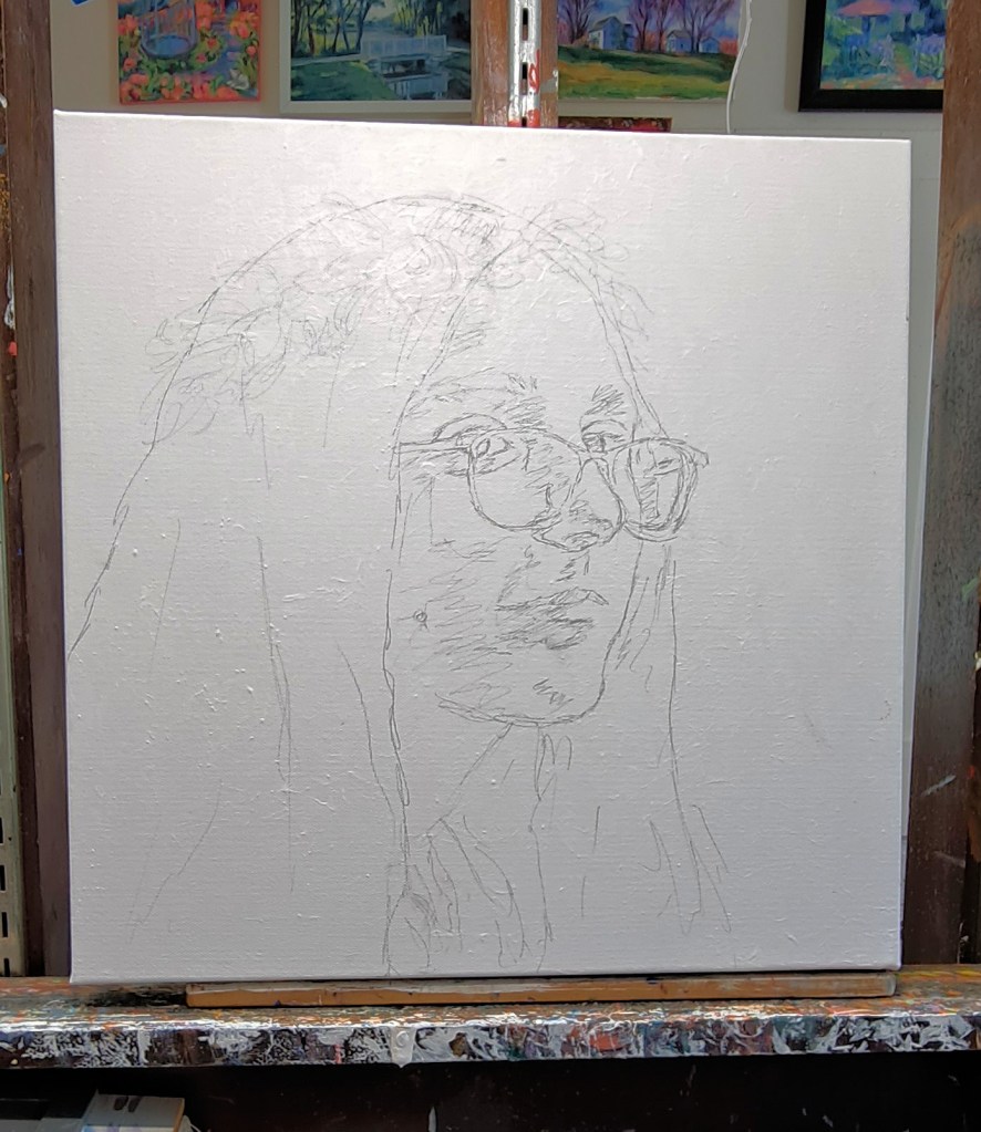
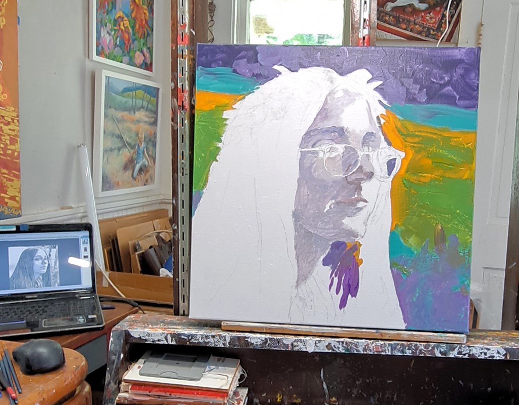
I then sketched the outline of the pose on a prepared canvas (gesso and a couple of coats of acrylic paint.) Then I basically start…somewhere. For a portrait, it will be with the head or body. Then I lay in some loose background colors. In this particular painting, I painted the flesh in grisaille (grey undertones) before I began adding color to the face. After I have the basic face laid in, I just keep working on the painting as I would a normal painting until I reach a point where I am satisfied.

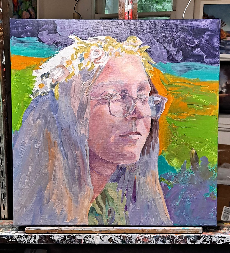
Another challenge with this painting is the added wreath of flowers. That is entirely imaginary as I didn’t really think of it while I was planning the painting. That is often the way of the creative process. Surprises pop up.

Leo’s Muse, nearly finished. Last step before gold and silver leaf is added

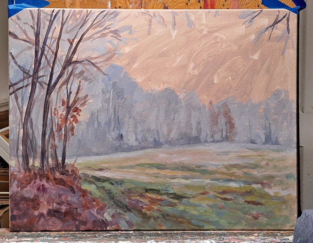
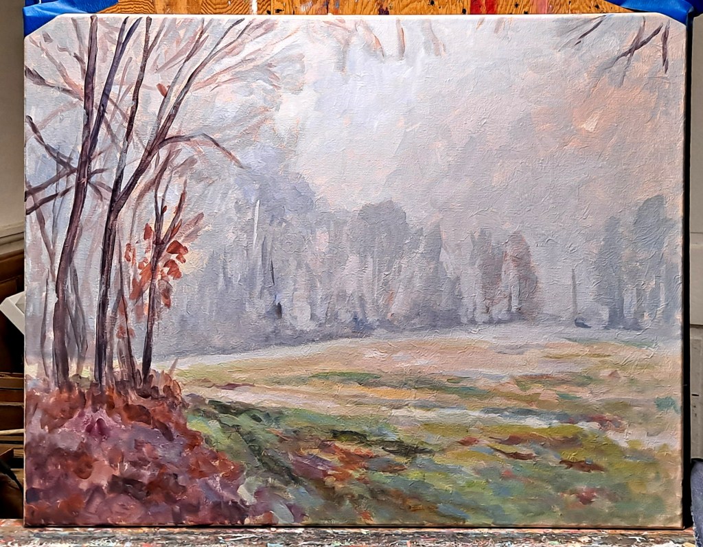
The canvas is two inches deep so the painting is carried around the sides.

Leo’s Muse, adding the metal leaf

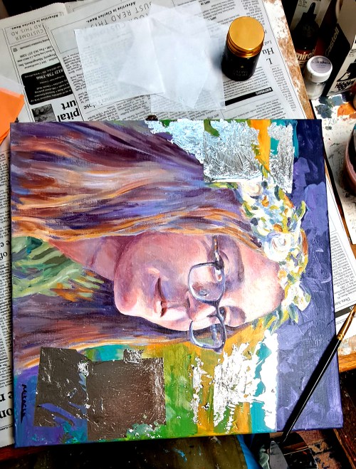
After letting the painting dry for awhile, I then began to add the gold and silver leaf. I was a bit conflicted about this step as I really liked the painting without the added touch. But the design in my head called for it so, what the heck? I took the leap.

If you have never used gold or silver leaf, let me tell you, it is challenging. This is not a paint but actual sheets of real 23K gold and real sterling silver which have to be applied to the painting. The sheets of precious metal are so thin (.003 microns, whatever that is), that I can’t have a breath of air in the studio. No fan. No air conditioner. Hold my own breath while I’m applying the metal. And the little flakes get everywhere! On me, my clothes, other parts of the painting, all around my studio.

A fixative must first be applied to the surface that you wish to apply the metal. Then you have to wait until it has the right amount of tackiness. Then gently apply the metal, transferring from the tissue paper leaves to the painting, then gently press it into the fixative, and then remove the tissue paper all the while praying that the gold will actually adhere to where you have placed it. The fixative is clear as it dries, so that’s another dimension of challenge. Where did you paint it? Ha!

After I’ve let it dry, then I can take a somewhat stiffer clean brush and brush it off the rest of the painting. More challenges with flying gold and silver flakes. If you’ve never tried this before, you might want to experiment with the fake gold until you get the hang of it. When possible, I collect the extra flakes and put them in labeled jars for use on backgrounds or other areas.

After the paintings have had time to “set”, I will spray them with a clear coat of acrylic. This prevents the sterling silver from tarnishing, and the gold from flaking more or rubbing off. Or so I am told. I haven’t used it enough to be absolutely certain but we’ll see.

Leo’s Muse, final, acrylic on canvas, 23K gold leaf, sterling silver leaf, 16 x 16, Kit Miracle

By the way, the title of the painting, “Leo’s Muse” is actually short for Leonardo’s Muse. The model’s direct gaze and Mona Lisa smile of that other famous lady with the knowing look.

Sense of smell in photography

Sun-ripened tomatoes

In the photography class that I’m taking, we were asked this week to convey a sense of smell that means something to us.  Some people composed photos of favorite lotions or perfumes, others of special cleaning products.  (Lemon Pledge still brings back memories of my mother.)  It was actually a more difficult assignment than you would guess.

I chose a rather eclectic group of images.  Sun-ripened tomatoes on the windowsill.  The scent of old books will take me back to every library I’ve ever been in.  Irises to every house I’ve ever lived in.  Homemade bread and pizza.  Dusty old barns and outbuildings.

What smells trigger your memories?

Painting small

Tulips, four color schemes, 4.5 x 6.5.

Let’s face it.  There are few people who are not inspired when they walk into a museum or cathedral and face a giant painting depicting a well-known scene.  I have been brought to tears when I’ve been overwhelmed with some exhibits. 

But that is not always the case.  Most people cannot accommodate a wall-size painting or afford one.  But that doesn’t mean that we don’t like real art nonetheless.

A typical variety of colorful flowers, 4.5 x 6.5 to be matted to 8 x 10

Over the years I have created and sold paintings of many sizes.  Some pretty large ones but most have been medium size.  And I’ve sold a whole lot of small pieces.

There are pros and cons with creating small paintings.  On one hand, larger paintings are immensely fun to create, taking that large brush and swishing it across a wall-size canvas.  But they are also much more difficult to sell due to the size. 

Landscape and harbor scene, 4.5 x 6.5

Small painting have many advantages, too. They are a good way to try out new ideas, materials and techniques.  They are very portable. You can just pick them up and move them around your home, or transport them easily.  They are also economical to create since they use less materials.

Vertical tulips in various colors, to be matted to 8 x 10.

I’ve used small paintings to make preliminary compositions and try out various mediums.  Some of the mediums that I’ve used are drawing, watercolor, pen and ink, acrylic, oil, etching, collage and prints.  The most common has been watercolor with pen and ink overlay for the details. These are usually on medium weight (140 pound) imported watercolor paper.

Small paintings were also my bread and butter when I used to travel the country for art show, earning back the booth fees and traveling expenses.  At one time, I painted a series of over forty different fruits, vegetables and flowers, each hand-painted and individually matted.  These were all 4 x 6, matted to 8 x 10, and either framed or inserted into glassine envelopes. I initially hand-cut the mats but eventually found sources for ready-cut mats, backs and the envelopes.  This made the whole process so much more efficient. 

These days, the primary size of the small paintings are 4.5 x 6.5 plus a border for matting.  Very easy to assemble. BUT…I also create 4 x 6 size painted postcards.  These are so fun.  I cut out a bunch, maybe 100 of that size.  I take them with me on my travels, make quick original sketches, and then mail them back to friends.  Surprisingly, all of the postcards have arrived safely at their destinations and my friends are so surprised.

Daffodil postcards, 4 x 6, originals

Some of the tiniest paintings that I have created are 2 x 2 and 2 x 3.  These are cute and fun but I have to specially cut the mats.  Unless I want to order a bunch of ready-mades, I just don’t do that too often anymore. 

A variety of teen-tiny, 2 x 2 and 2 x 3.

One thing that I would like to point out is that all of my small paintings are originals, not prints.  If you are buying these on the market, make sure what you are getting.  Many small paintings are digitally reproduced, either on paper or printed on canvas.  The artist may add a swipe of paint in order to call them original but they’re not really.  Just pay attention

I still enjoy making larger paintings, mostly for the challenge.  But I would certainly recommend that you give small paintings a try.  They’re great for experimenting with new ideas and compositions without having to put an excessive amount of time into them.  And they can be attractively priced if you’re planning to sell them. 

Good luck and let me know how they turn out if you experiment with this option.

Foggy Morning, East Field – a painting how-to

Initial sketch and color notes. Notice that I trimmed back my initial sketch to eliminate some of the trees on the left.

Recently I posted some photos that I took of a very foggy morning out here on the farm.  The atmosphere of the scene has been nagging at me so I’ve been wrestling with some ideas.  I’ve done several sketches, including some color sketches in both watercolor and acrylic.  It seems the most challenging part to me is to tone back the color as I like to use bright colors so much.  Fog is basically various shades of grey. I’ve cut back the color in the foreground and added more grey tones.

One of several preliminary paintings testing the color scheme of Foggy Morning.

First I prepared the canvas which was already gessoed.  In this case, I sanded it, added another coat of gesso which I texturized with a soft cloth.  After this dried, I gave it a wash of a very pale but slightly warm tone.  This would be my underpainting.  Then I drew the image on the canvas. 

I don’t usually use a wide variety of paint colors as you can see in the image above.  I rarely use a commercial green, instead preferring to mix my own shades of green from the limited palette.  There are only seven colors plus white.  I also use an acrylic modeling paste which adds more texture.  A matt medium cut with water is my mixing medium.

First I mixed several shades of grey and started with the trees, then worked my way down through the field, adding more color as I reached the foreground.  I really had to keep reminding myself to focus on the foggy grey tones and not add too much color.  Then I added some more notes in the tree line.  The sky was painted with a very pale grey leaving some of the warm undertone showing through.  The hint of the rising sun through the fog was actually an accident but I liked it so I left it in.

Toned canvas with first layers of paint.

Then it was just a matter of adding the trees, darker in front, lighter in the distance.  Not too many details but enough. 

I’m not sure if I’m done yet so I think I’ll let the painting rest for awhile.  I’m working on a companion piece so we’ll see how well that one comes out and if I’ll need to make adjustments.

Foggy Morning, East Field 18 x 24, acrylic on canvas. Kit Miracle

I guess the lesson here is to learn restraint.  For me it’s with color, also perhaps too much detail which can be a hazard for many artists. I’ll probably do some more tweaking before I call this finished.  I’m always interested in feedback so let me know what you think.

Blind Painting – or Painting from Memory

Blind painting – Sunrise before the Storm 1, 8 x 10, Kit Miracle

I’ve been clearing out a lot of junk from one of our attics lately.  A few weeks ago, my husband and I were taking several large bags to the dump one morning.  A big storm was moving in from the west so we put the rush on to get it delivered before the skies opened. 

The dark clouds were rolling up behind us.  As I was hustling along the road, I made a note of how beautiful the early morning skies were, especially the dramatic contrast between the rising sun and the storm clouds.  I wished I could take some photos but kept my hands on the steering wheel.  I decided to use an old trick which I haven’t practiced in quite some time.  This is to memorize the scene.

Blind painting – Sunrise before the Storm 2, 8×10, KitMiracle

Landscape and plein air painters often use this device.  That is, to set their easels up facing away from the scene, then study the scene for a bit and try to commit it to memory.  The point is to try not to capture every detail, but to make note of the key aspects.  Then turn around and, facing your easel, begin to paint what you remember.  It sounds difficult but you get better as you practice. 

We made our deposit at the dump and scurried home.  By this time, the skies had opened and a torrential rain was beating the car. 

As soon as I got home, I went to my studio and did two quick pencil studies of what I had seen.  Of course, I couldn’t remember every detail, but I think I got the jist of it.  Noting the main colors which had attracted me in the first place, plus some primary shapes.  I fired up these two small paintings (8 x 10) and am pretty pleased with the results.

I think the best part about using this technique is that it forces the artist to focus on the main shapes and not get lost in the weeds of details.  Certainly worth a try if you have never done so before.

Sketches from memory

Water themes as a painting subject

Waterlilies at the Spillway, acrylic, 12 x 12

Many lists of the most popular painting subjects include landscapes and seascapes.  I must admit that I’ve painted quite a few pieces with these subjects.  Although I live in the Midwest, many of my landscapes include some water feature – streams, rivers, ponds, lakes.  And my travels have taken me to the ocean in various places.  There is something very primal and soothing about hearing ocean waves…most of the time.

Fishing at Patoka Lake, acrylic, 12 x 16

Recently I painted a couple of paintings based on the very large lake nearby.  Lake Patoka is 8,800 acres and is a major water and recreation source for the area.

Leaving the Cove, Cape Breton, NS, acrylic, 9 x 12

But I also cruised through old photos of places we have visited, particularly Nova Scotia, Cape Breton, and New England.  Such beautiful scenery that it was difficult to choose.  Many more subjects for future paintings.

White Wharf, Rockport, MA, acrylic, 12 x 16
Fishing Shack (or Motif #1), Rockport, MA, acrylic, 8 x 10

And, of course, I did an entire series of beach paintings but those are mostly about people and children with the ocean being a common denominator for each painting.

Beach Readers, Intimate Spaces series, acrylic on linen, 24 x 30, Kit Miracle The whole attraction of this subject with the irony of the two young women who are reading and totally ignoring the beautiful day at the beach. I also love the way the red beach chairs draw the viewer’s eye into the scene.
Wet Reflections, acrylic, acrylic, 24 x 30

This is not to say that painting water features is the only subject that I tackle, but it is one of my favorites.  So many opportunities if I take my time to look for them.  

Ritter Creek, oil, 24 x 30
French Lick Creek, oil, 24 x 30

What are your favorite subjects to paint?

See more paintings at my Etsy shop KitMiracleArt or my main website ContemporaryImpressionism

Series Paintings

Tire Swing, Park Series. Kit Miracle, acrylic on canvas, 24 x 30.

I have introduced several series of paintings over the years here on my blog.  It seems that I’ve started another one, the Park Series.  This will focus on, what else, scenes from the park.  A park.  Many parks.  Parks are usually filled with scenic landscapes and people doing activities, two of my favorite things.

Most of the series paintings are a little larger than some of my other pieces.  They also tend to concentrate on the same color palette.  In fact, I’ll often make a schematic of the colors I plan to use.  Using the same color family adds a cohesive theme to a series of paintings.

Some of the series paintings I’ve created over the years include Westerns, particularly The Grand Canyon, Intimate Spaces – Beach Series, Intimate Spaces – Breaking Bread Series, The Food We Eat, Lucky Red and Alley Views.

I might have an idea for a series of paintings at the beginning but more often I just cruise through my extensive batch of snapshots until something catches my attention.  I’ll write about using photos as an art subject in a future post. 

I’ve created a step-by-step page for the painting above, Tire Swing for those who are interested.  Click here for more detailed information.

Compositional framing

There are many rules and ideas for composition.  No one idea is perfect for all situations.  You may have your favorites or you may like to try new ideas frequently.  Today I’m going to discuss the idea of framing.  I’m not talking about the frame of the painting but using framing as a composition device.

Plein Air Painting, Birdseye, Indiana

I most often use framing in landscapes, cityscapes, and sometimes interiors.  This means that I’ll often place a large tree or bush near the front of the picture frame, usually on one side or another, with the main view in the middle distance.  This leads the viewer’s eye into the painting and directs its focus.

Sometimes in cityscapes, the view might be between two buildings or down an alley. 

In a recent couple of paintings of the same subject – a child flying a toy airplane at the park – I first explored just the child and the plane.  In the second painting, I used the framing composition to lead the eye from the near subject matter, to the large tree on the left, to the child and plane in the background.

In another couple of paintings, I painted a straight view of a Grand Canyon vista.  The second landscape shows the Grand Canyon framed by tree in the front.

Here is an interior view using compositional framing.  The doorway, chair and plant, lead the eye through the doorway to the desk in the distance.

There are no hard rules on when to use compositional framing.  It’s mostly a matter of what you feel comfortable with, what helps your painting.  I’ll often do several thumbnails or even larger charcoal drawings to test the feel of the subject. 

Drawing trees

I’ve been busy since the holidays so haven’t spent much time in the studio. I have a show which opens later this week so much of my time has been spent sorting and rounding up artwork for the show. We’ve also had some pretty chilly weather with temps in the single digits but only a couple of inches of snow.

So I decided to take a break from new painting work to practicing drawing some trees. Winter is a great time to capture the skeletons of the trees as the leaves are long gone. I didn’t have to go far, actually just my own front yard.

The sketch of the hackberry tree is charcoal on pastel paper. Approximately 13.5 inches by 11.5. Winter is a great time to draw tree skeletons.

The first tree is a large hackberry. I had never heard of this tree before we moved here but it’s a very nicely shaped tree, tall with up-reaching branches, medium-size leaves (so no raking) and small dark berries which are popular with the birds. It also is distinguished by its incredibly knobby bark.

The hackberry has a striking limb structure with large limbs reaching for the sky.

The other tree that I recently drew is a giant sugar maple near our woodshed. It has been home to several treehouses over the years, supported by it’s wide-spreading branches. I just love the beautiful scarlet foliage in the autumn. We don’t sugar the tree but there is/was a whole double row of them when we moved here. Unfortunately, they tend to die off at about eighty years. This one has a large hollow on the other side but I’m going to enjoy it while I can.

Sugar Maple charcoal sketch, approximately 13.5 inches by 11.5. The late afternoon shadows emphasize the limb structure.
Sugar maple, detail. This poor old maple by the wood shed is huge and has been host to many tree houses. I’m not certain how many more years it has in it as there is a hollow on the other side, but we still enjoy the brilliant orangey-red foliage in autumn.

It’s nice to challenge myself with some drawing. I think drawing is great for building that important eye-hand coordination. I should do more of it, but brandishing a brush is even more alluring.

Useful art tools

Five useful art tools. 1, Composition aid. 2. Proportion scale. 3. Red gel. 4. View catcher. 5 Painting bridges.

It seems hardly a day goes by that I don’t get a catalogue or an e-mail trying to sell me art supplies and gadgets.  Oh, look, newer, better, scientific!  You’ve got to have this latest gizmo!  This will ensure your success and you’ll be the best in your field.

This is true not only for artists, but golfers, automobile enthusiasts, bikers, campers, what have you.  It seems as if the only people getting rich are the ones who keep trying to sell you things. 

But as an artist, I always like the challenge of trying to do things myself.  I guess that’s why I’m in a creative field. Here are five very simple tools that I use in my studio or outside.  Three I made myself and the other two can be purchased for less than ten dollars each.

1. The first tool is a simple composition aid made from a small 4 x 6 frame with the glass taped in.  On the back side, I’ve divided it into nine sections with a permanent marker.  I got the idea from an old drawing (Durer) of an artist who had created a standing frame divided into squares by threads.  He then divided his paper into squares, and then transferred what he saw in each square as he was viewing an object, into the respective square on his paper.  This same technique is used today for blowing up drawings. 

Woodcut of Durer’s perspective drawing tool.

In this case, I take the little frame and hold it up in front of a landscape, and draw with a felt pen on the front side.  This can be used for still lifes, figurative works, street scenes, whatever.  The trick is to keep the frame and my eye at the same level for the few minutes that I need to sketch on the glass.  Then I transfer the image to my paper or canvas.  Sometimes it’s amazing how different the actual drawing looks from the way my eye wanted to read it.  I’ve used this technique in teaching third graders up to adults.  Now, of course, you can buy a similar ready-made frame but these were not available when I first made mine.

Proportion Scale with several 20 x 16 equivalents marked by red arrows.

2. Proportion scale.  I’ve had this little plastic tool for so many years that I forgot where I bought it.  It is so easy to use for both reducing and increasing sizes proportionally.  Just line up the numbers of say, a 20 x 16 and then everything else on the scale will be proportional to that, 10 x 8, 5 x 4, 40 x 32, 80 x 64 and everything in between.  Or maybe you have a canvas of a certain size but you need to make adjustments in your drawing to fit; the proportion scale can help you do this.  Less than $10 online.

3. Red gel sheet.  I used to have access to colored gels (used for lights) when I worked in the theatre business.  These scraps are useful, particularly this red gel.  Hold it up in front of a green landscape, and it immediately grays everything out so you’re only left with values.  Commercial products are available now but you can probably get gel scraps from your local theatre or playhouse for free. See previous post here.

4.  The View Catcher has been around for a long time.  Made of grey plastic, the little slide opens the window to a variety of sizes from square to rectangles.  Marks on the plastic indicate the scale of the window (8 x 10, 11 x 14, etc.)  Less than $10.  We used to use old film slide windows but no one knows what those are anymore. 

5.  Painting bridges.  When I painted a lot of watercolor, particularly architectural images, it was helpful to have a steady hand when drawing the lines.  I made these two bridges from some wood scraps.  They kept my hand off the paper and from smearing the paint or ink.  Also, they were very helpful for guiding my pen when drawing lines.  My cost was nothing but now you can buy plastic ones for about $35.  I like free.

I hope these useful art tools will inspire you in your quest to be more creative.  And don’t be afraid to make something of your own invention, too.