I don’t know quite why I started this painting but it’s something that has been rolling around in my head for awhile. Sometimes I’ll think about a work for years before I get around to painting it.
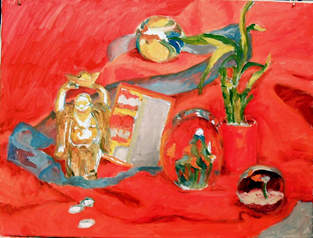
Lucky Red is a challenge of red on red on red. Shiny and soft. Clear objects, reflective, see-through. Some of the symbols are pretty obvious. The lucky Buddha, three Chinese coins, a WINNING lottery ticket. Some are less obvious. The lucky bamboo plant. Two of the glass paperweights have fish swimming in them. Fish are a lucky Chinese symbol. And swirling throughout the still life is a lucky blue ribbon that I won at a holiday party. (Thank you, Joan!) Topping the set up off is another glass paperweight called Mediterranean which celebrated the completion of a bike ride through France several years ago.
We all have lucky symbols in our lives. What are yours?

Lucky Red – the initial still life set up
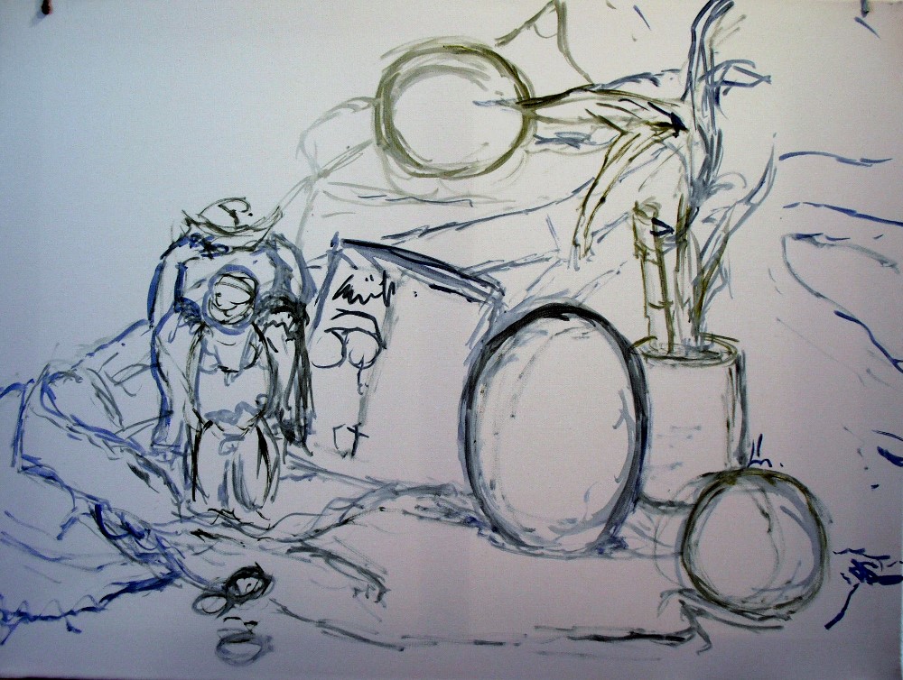
First step, drawing on the canvas
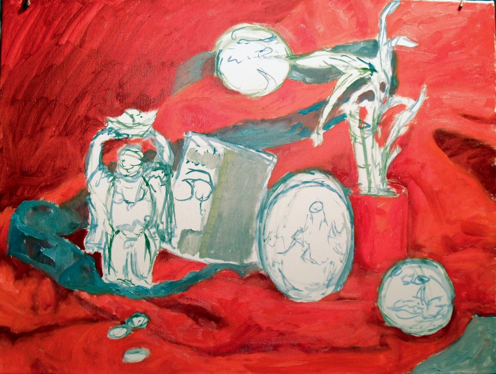
Second stage, blocking in major shapes
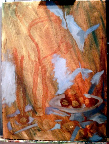
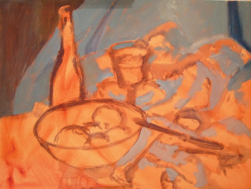
Third step, laying in base colors of the objects

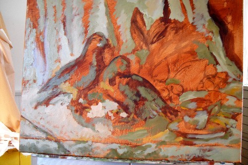
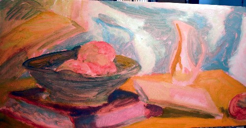
Fourth stage. Almost finished.

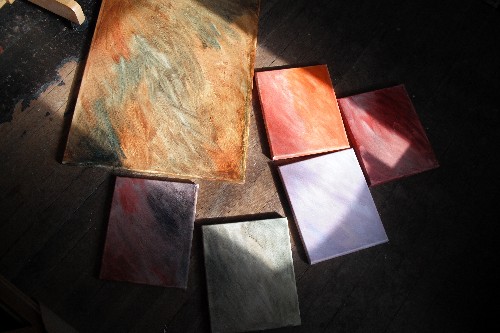
What my palette looks like with a variety of reds. Using black to tone some of them down.
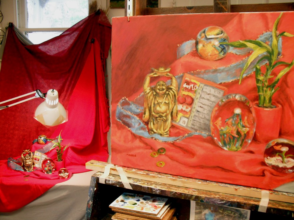
The painting compared with the still life. Notice the gel I have taped over the light.
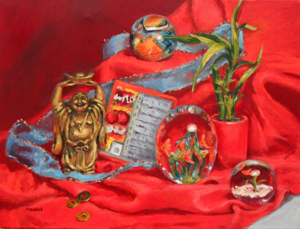
Lucky Red, final. Oil on canvas, 18 x 24, Kit Miracle