Tag Archives: contemporary impressionist

Plein air painting at the Parklands

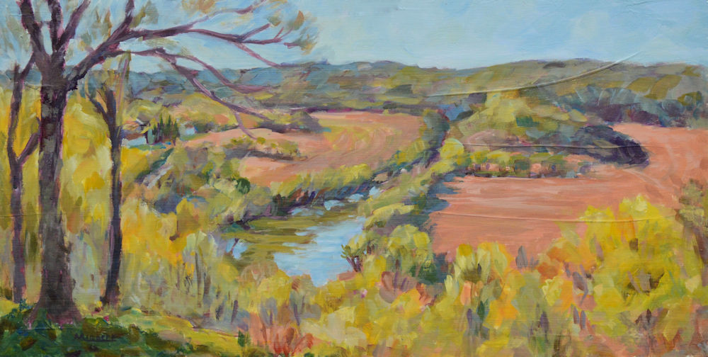
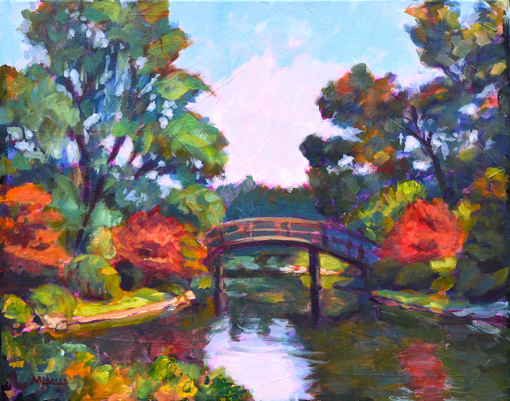
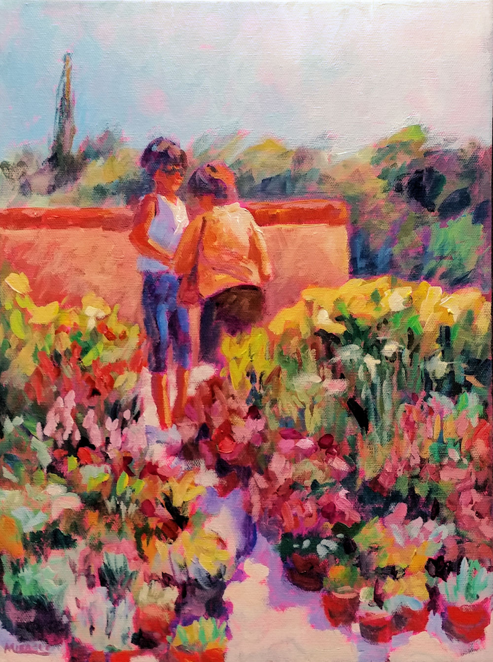
Bridge at Parklands, plein air, acrylic, 16 x 20, Kit Miracle

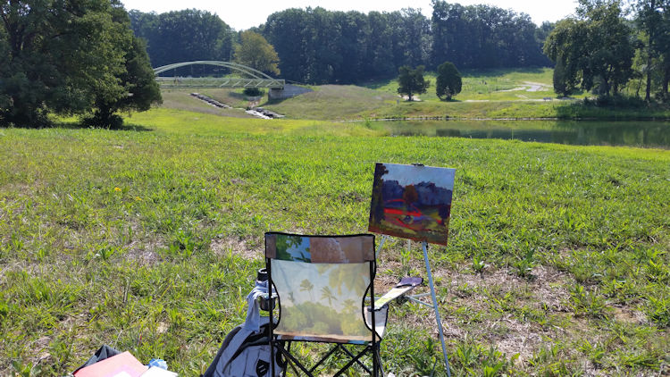
I attended a plein air painting event today at the Parklands.  This is a new park in the area which just opened last month.  Already, it has become a popular destination for dog walkers, bicyclists, moms pushing strollers, just about anyone of any age.  Created from a former golf course, it features three lakes/ponds, several water features, an outdoor musical instruments area, exercise equipment activities, a pavilion for special events, a splash park for kids, and many other features.

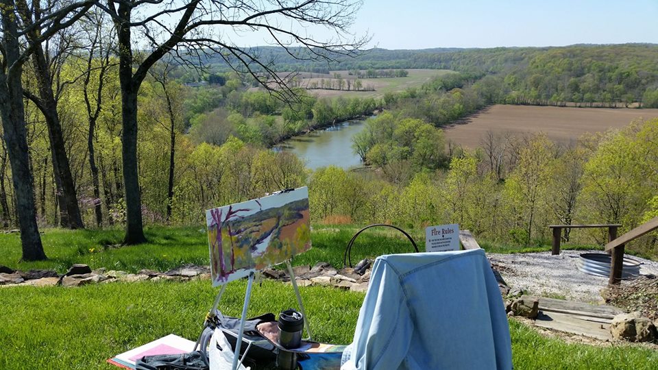
Although the day was promising to be exceedingly hot with temperatures in the 90s, I elected my first painting should be of a new bridge over a waterfall.  Usually one only has about two hours to make a plein air painting before the sun and the shadows move too much.

I always start with a small black and white Notan sketch before I begin to paint. Then on a toned canvas, I lay in the darks.  Since I was working in acrylic, it didn’t take long for the paint to dry.  In fact, I had to use an acrylic retarder to slow down the  drying.

This is the view I selected. I liked the shape of the new bridge and the contre jour light (backlight). As you can see, I began painting in the darks on a red-toned canvas.

I start with a one inch brush which will get 85% of the painting done.  The bigger the brush, the less fussy I am.  Sometimes I begin laying in the sky.  In this case, I laid in some of the other darks and midtones and just kept working away.  The bridge was critical as any mistakes could really make the painting ….well, not good.

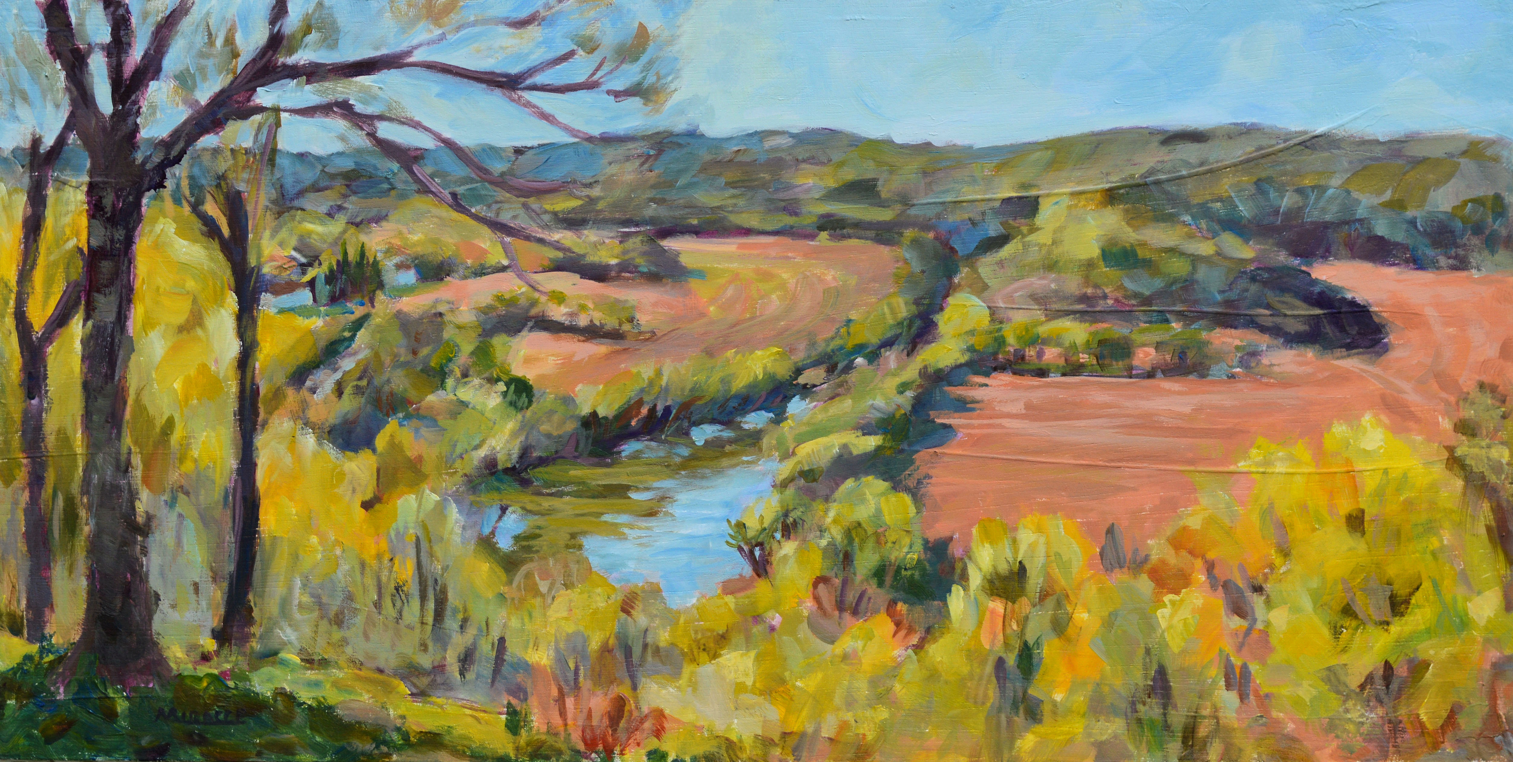
About 85% finished. Leaving the bridge for last, I concentrated on the landscape first.

The final touches are to add the lightest colors, the highlights, the sky holes in the trees, most with smaller brushes.  I really like the peeps of red showing through the painting.  I think it adds a little bit of liveliness.

A friendly little butterfly who kept me company quite a while. I think it’s a Painted Lady butterfly. Very appropriate.

One interesting thing happened to me while I was painting.  I had a little butterfly who just kept hanging around.  She walked along the top of the painting, then the sides, not even moving as I painted closer to her.  If I shooed her away, she quickly came back.  If my identification is correct, this was a Painted Lady butterfly. How appropriate.

After I finished this painting, I moved to the shade where I completed another one of a different scene.  Fortunately, there was a nice breeze all day but it was still pretty dang hot.

To my surprise at final judging, I was awarded first prize.  So it was worth the melting conditions.  Maybe the Painted Lady brought me a little luck.

Gallery exhibit – behind the scenes

Yesterday I delivered fifty paintings to Oakland City University for a solo exhibit.  It’s been several years since I’ve had the time to build enough work for a solo show so this has been a bit of a challenge.

Car number one, packed with dolly. A dolly is invaluable if you have to schlep work any great distance. Always choose wheels. I have a much bigger dolly but this small one is compact and travels well.

Car number 2. Make sure everything is tight. I used to have a full-size van and could have gotten everything into one vehicle, so it’s a bit more challenging now.

Car number 2. Again, make sure everything is packed tight so there isn’t any slipping. This can damage your artwork.

Before I was director of the arts center, I was the visual arts director responsible for lining up and implementing the exhibits.  There is a lot more to it than it would appear.  Contracts, designing and ordering gallery announcement cards, press releases, unpacking, hanging, receptions, repacking, etc.  However, this only built on two decades of schlepping my work around the country to art fairs and festivals.  Those were the gypsy days, for sure.

But yesterday I was on familiar territory with meeting my old friend Roger Willis at OCU.  This was the culmination of spending the past few weeks deciding what to take, ordering frames and framing artwork, packing and delivering, then unpacking.  Fortunately, Roger didn’t require that I stay to help hang the exhibit as some galleries do. So it will be a surprise to see which paintings he places next to each other.

Gallery shot number 1. Unpacked paintings waiting for hanging.

Gallery shot 2. More paintings waiting.

Gallery shot 3. Even more paintings waiting. These smaller pieces (16 x 20) can be double hung to save space.

If you’re interested in viewing the exhibit, it will be held from August 6th through September 24th.  The reception is Sunday, September 9th from 2 to 5 pm.  The address is on the Oakland City University campus at the J. Michael Dunn gallery, Cornwell-Reed Fine Arts Building, 138 N Lucretia Street, Oakland City, IN 47660.  They’re open M-F from 10 a.m. to 5 p.m.   And weekends by appointment.

I’ll post more photos of the exhibit later.

Memories of Paris

Memories of Paris, 24 x 36, acrylic on canvas, Kit Miracle

I completed this large painting this past week.  Well, I may not be finished as I keep tweaking it. You would think that a painting of the sky through some tree branches would be easy but I’ve worked on it for some weeks.

Memories of Paris, detail 1, acrylic on canvas, Kit Miracle

I’m not quite sure why I was attracted to this subject.  Maybe the cool spring colors.  It seems to exude a feeling of peace.

Memories of Paris, detail 2, acrylic on canvas, Kit Miracle

It was my intention to just give an impression of the sky view, not to paint every detail.  In fact, I think that is boring. I like the viewer to bring something to the scene.  If you look closely at the detail images, you’ll see many variegated colors, both in the foliage, the flowers, and on the tree limbs.  But also, look at the blank sections of the painting.  You’ll spot a vapor trail and some wispy clouds.

Memories of Paris, detail 3, acrylic on canvas, Kit Miracle

And, do you see the surprise that I hid here?  It is a pair of birds.  Maybe they’re getting ready to build a nest in one of the trees. Not overly obvious, just a sweet sign of spring.

Plein air painting on a lovely spring day

I went plein air painting with my friend Bill Whorrall this week up in beautiful Martin County, Indiana.  There is just a small window between the dreariest of winter and the veredant summer.  This time of year the landscape sports so many different shades of greens, as well as the beautiful red-bud, dogwood and other spring flowers. I wanted to capture the scene before it was gone.

Plein air painting in Martin County, Indiana. The Overlook in Shoals.

This day we painted at The Overlook in Shoals, Indiana.  The scenery is gorgeous any time of year but especially now with the freshly tilled fields.  The river you see there is the White River which can sometimes be pretty angry.  Now you can see it as the peaceful water highway it once was.

The painting is acrylic on hardwood which has been gessoed and sanded.  I chose the longer format as it seemed to fit the landscape.

I only had a couple of hours to get most of the painting down before the sun had moved.  A few final tweaks were done in the studio.  Unfortunately, I accidentally deleted all of my photos for the day so this is the only one available from my Facebook page.

Yes, the painting is for sale on my Etsy shop, KitMiracleArt.

The Overlook in Shoals, Indiana. Martin County. Acrylic on wood panel,12 x 24, Kit Miracle, Spring landscape.

Wyoming Landscape

Wyoming Landscape, original painting, acrylic on canvas, near the Shoshone River, impressionistic style, Kit Miracle

If you have never visited the western United States, you really must do so someday.  I particularly love Wyoming, Yellowstone and the Grand Tetons.  However, when my husband and I visited a few years ago, we took the northern route across the Big Horn mountain range, (a nail-biter for sure).  After we crossed the mountains and were heading to Cody for the night, we drove along this river valley.

The scenery is just so beautiful.  Peaceful and with the bluest sky you’ve ever seen.  I imagine it’s a different story in the winter but this was summer.  As I searched through old photos earlier this week, this subject caught my eye.  Of course, much editing as usual, but the landscape just called to me.  Oh, how I want to visit again.

This is painted in acrylic on stretched canvas.  I’ve painted the edges black so the painting doesn’t necessarily need a frame.  Such a peaceful painting.  Enjoy!

A Week of Painting

A question that I often receive is, “Are you still painting?”  This puzzles me.  Do we ask musicians if they still make music?  Or writers if they still write?

The answer is, Yes, I paint nearly every day for several hours.  This is what I do.  I can’t seem to help myself.  I often do some inside work or gardening in the early part of the day, then head out to the studio and paint. And paint. And paint.

These are three paintings that I completed last week.

Chinese Bridge at Missouri Botanical Gardens, St. Louis, acrylic on canvas, 24 x 30, Kit Miracle

This large one is acrylic on canvas 24 x 30 inches. The scene is from the Missouri Botanical Gardens in St. Louis.  As it’s only a few hours away, my husband and I like to visit for a quick trip.  The gardens are beautiful in nearly any season.  The scene depicted here is from the Chinese garden area.  I was attracted to the bridge, of course, but also the back lighting.  It has some echoes of Monet but is pure American impressionism.

Windy Day at the Lake, acrylic on canvas board, 12 x 16, Kit Miracle

The next painting is called Windy Day at the Lake.  I painted this en plein air on Friday. My husband and I went over to the Lake (Patoka); him to fish, me to paint.  We found a nice sheltered  area and had a wonderful morning at the lake.  The acrylic sketch is 12 x 16 on canvas board.

Japanese Bridge at Missouri Botanical Gardens, acrylic on canvas, 16 x 20, Kit Miracle

The final painting that I completed last week is of the bridge in the Japanese area of the Missouri Botanical Gardens in St. Louis.  I was attracted to the early autumn colors, the shape of the bridge, and the reflections in the lake.  Painted in acrylic on canvas, it has the edges painted black so it wouldn’t necessarily need a frame but could be hung as is.  It just gives such a feeling of peace.

So, as an artist, this is what I do.

When is a painting finished?

Grand Canyon from the South Rim. Cloud shadows on the rocks. Painted in impressionistic style in acrylic, 20 x 20. Kit Miracle

Sometimes when I’m working on a painting, it just seems to paint itself.  I have a clear vision of what I want and it all comes together.

Other times, not.  I may think I’m finished, then when I go back into the studio, I see a glaring mistake.  Or something I was attempting didn’t quite turn out the way I wanted.

This is a painting of the Grand Canyon from the South Rim.  I was particularly attracted to the play of the cloud shadows across the scene.  The Canyon has such beautiful colors which change constantly throughout the day and the seasons, that it’s difficult to catch just the right time and color.  Sometimes I get some part of the painting which becomes “too precious”, meaning that I like it and tend to paint around it, but it throws off the rest of the composition.

This particular painting was created with the limited palette that I mentioned in my last post but took me far longer than some of my other recent paintings.  In fact, I painted some other paintings and then came back to this one.  Still not sure it’s finished.  What are your thoughts?

Painting with A Limited Palette

Abiquiqui, Georgia O’Keeffe’s home, Ghost Ranch, New Mexico, acrylic on canvas panel, 12 x 16, Kit Miracle

How many colors do you actually need on your palette to create a painting?

In truth, you probably need far less than you think. Some time ago, I marveled at a young artist who bragged about using 37 different colors.  My first thought then, and still, is, “Don’t you know how to mix colors?”  Maybe he does now.

My current color palette consists of six colors plus white.  This isn’t a hard and fast rule because I’m a sucker for a new color just like anyone else.  But this seems to work for me.

Acrylic palette currently in use

The hues that I currently use are:

  • Titanium White
  • Cobalt Blue
  • Cerulean Blue
  • Prism Violet
  • Quinacridone Magenta
  • Cadmium Red Medium
  • Cadmium Yellow Medium

I seemed to have weaned myself off of Burnt Sienna, Raw Umber and Sap Green.  But really, this is enough.

I like bright colors and can mix pretty much anything from this small group.  It also makes it very easy to transport for plein air painting rather than dragging along a whole sackful of paint tubes.

The paints displayed are all acrylics.  I’m leaning toward heavy body (thicker paint) and plan to replace the next selections with them.  When I initially tried acrylics, I wasn’t too pleased with the quick drying properties and the fact that I couldn’t “sculpt” the paintings.  However, I have adjusted my working procedures.  Textures are easily obtained if one can wait just a little while before applying new layers.

Acrylic palette in use. Disposable plate.

As you can see, I’m using disposable plates for my palette.  (I hate to clean palettes!)  I can spritz them with water and cover them up for the night.  It works for me.

And cleaning brushes used for acrylics is a must.  Immediately.  They do dry quickly and you don’t want crusty brushes the next day.

So, this is the color palette that I’m using these days.  This may change.  What do you use?

Abiquiqui – Framed, Georgia O’Keeffe’s home, New Mexico, 12 x 16, acrylic on canvas panel, Kit Miracle

By the way, one is not allowed to take photos inside Georgia O’Keeffe’s house and studio.  After touring the home, I had to drive back just to take these photos from the outside.  Love the adobe buildings and brilliant blue sky.

TABAC, Paris Street Scene

TABAC, Paris Street Scene, framed, 12 x 16, Kit Miracle

This is a painting of the view from my hotel window in the Marais district in Paris.  I loved the bright colors and was particularly attracted to the figure of the child and his nurse.  He seemed to be pointing to the TABAC store which sells not only tobacco products but sweets and newspapers.

TABAC, detail of child with nanny, original painting, Kit miracle

The restaurant next to it serves not only regular fare but Middle Eastern entrees.  I ate there several times.

But basically I just love to people watch from my hotel room.  Early in the morning, the green men (street sweepers in green uniforms) are out cleaning the streets while the shopkeepers spray down the sidewalks, preparing for the day ahead.

TABAC, Paris Street Scene, original painting, 12 x 16, Kit Miracle

Click on the images for a closer view. Painted in acrylic with impasto style on a canvas toned with green.  I thought it would balance all the blues and purples but it was a bit difficult to work with.

Flower Market – Provence, France

Flower Market, Jardin du Sur, Uzes, Provence, France. 16 x 20 on red-toned canvas panel. Kit Miracle This shows the final painting. I have sharpened some of the details and added more. I deliberately did not concentrate on the white labels for the flower pots as I thought they would be too distracting. Overall, I like the painting but it seems a bit busy.

Small Flower Market, Uzes, Provence, France. 16 x 12. Kit Miracle Final painting. I like the way the path leads the eye to the main figures. Plenty of color but it works for the subject.

Several years ago I had the opportunity to bike through Provence, France.  It was the opportunity of a lifetime.  I fell in love with the area.

One of our stops was in Uzes at the Jardin du Sur.  This was wonderful open air flower market on a very hot Sunday.  I spent quite some time there, sketching, taking photos, writing postcards, and, of course, buying a souvenir or two.  The flowers and the people were so inspiring.

A few weeks ago, I was going through the old photos and my journal when I came across these references to the flower market.  I decided to create the larger painting first which is on a red-toned canvas panel.  After I was finished with it, it seemed a bit too busy even though I had cut out many details.

Then I decided to do another painting of the same scene but just a close-up of the two main figures. This was on a canvas which I had toned fuchsia!  Yes, really!  I think I like the second canvas better but what do you think?

Anyway, if you’d like to see a step-by-step, visit this page where you can follow along on both of the paintings.