Tag Archives: art

Plein air painting with acrylics

First of all I will admit that I am not an expert in acrylic painting.  Yes, I’ve painted watercolors for over 30 years and have tackled oil painting for about ten years.  But I’m pretty new to acrylic painting.

I got into acrylics painting artwork last year when I had some commissions which needed to be completed quickly.  Mainly I was looking for something durable but which dries more quickly than oils.  And after my last foray at a multi-day plein air event last month where I seemed to get Titanium white all over everything, I thought acrylics might be a good idea to try.

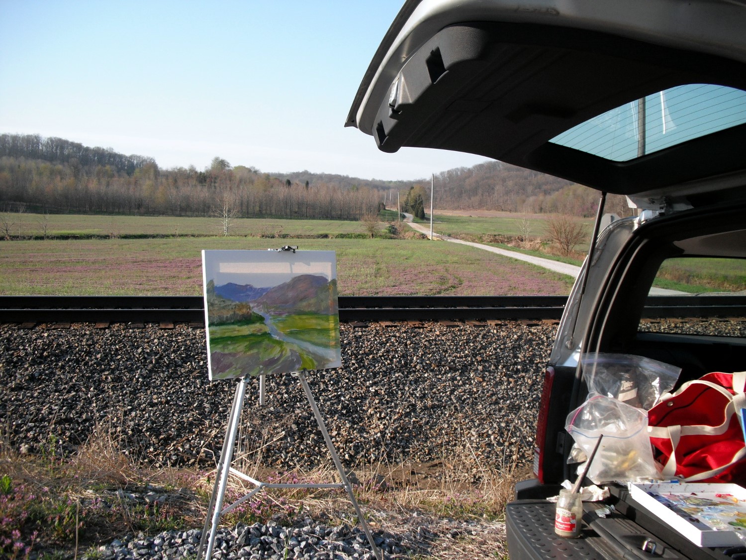
I have a beautiful little pochade box which I purchased last year but have never used so this was to be my designated acrylic box.  (For now.)  I loaded it up yesterday morning and drove out to a place down the road that I’ve been eyeing for a future painting site.  It was so peaceful and I arrived just before the sun arose.  I will say that the hardest part was attaching the quick release to my tripod, but after several attempts, I finally got it.  Not too thrilled as it wiggled a bit but otherwise it worked.  Then I unfortunately sat on my only plastic water container and smashed it.  Humph!  Artist ingenuity jumped up and I cut the bottom off a bottle of water.  Worked perfectly.

The next test was the new mini Stay Wet palette that I added too much water to the sponge.  The paper palette wrinkled a bit but I could work with it.  Lesson here:  try new equipment at home before you hit the road.

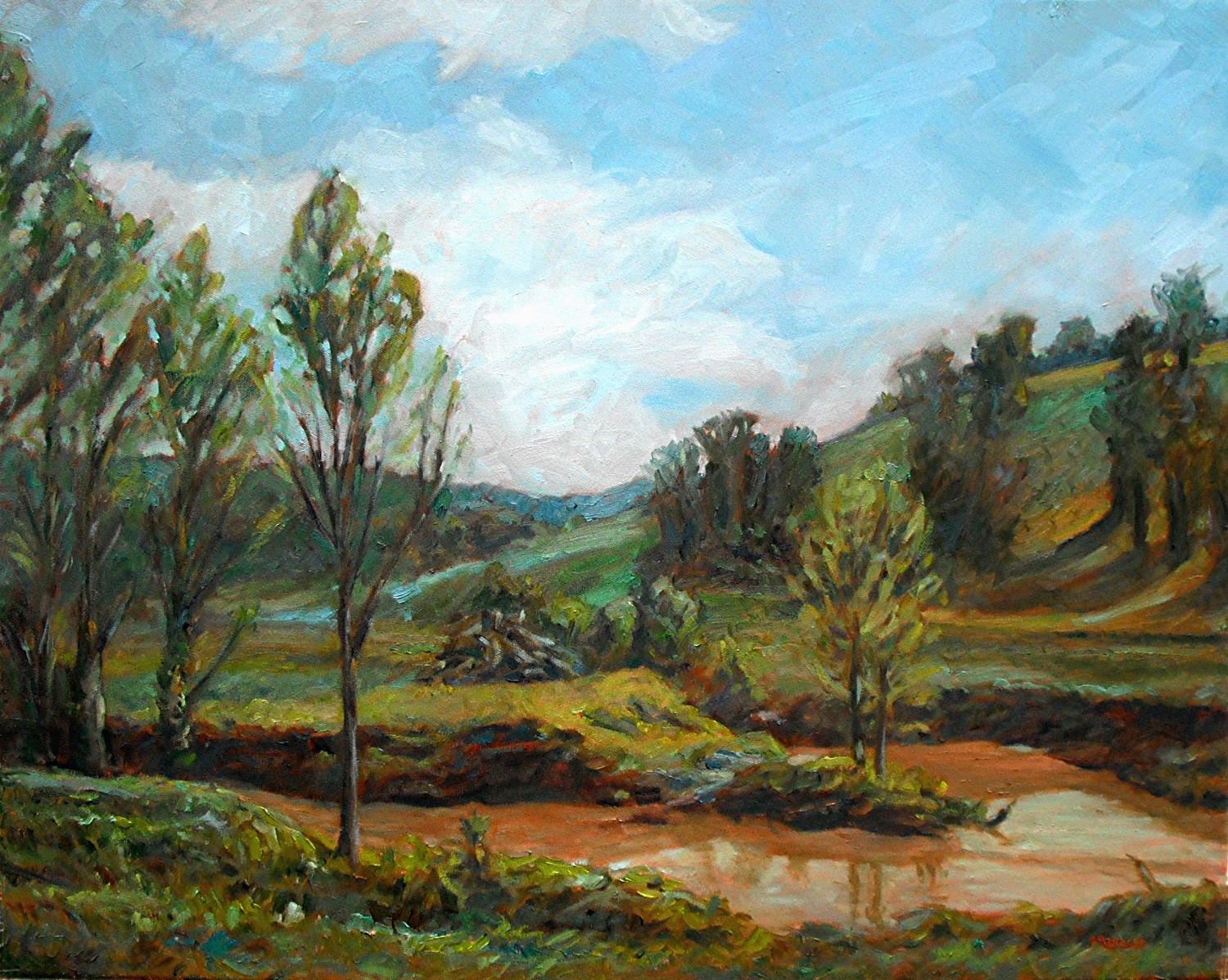
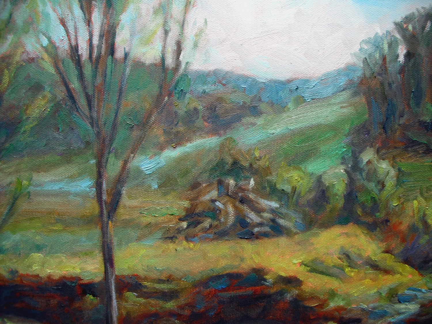
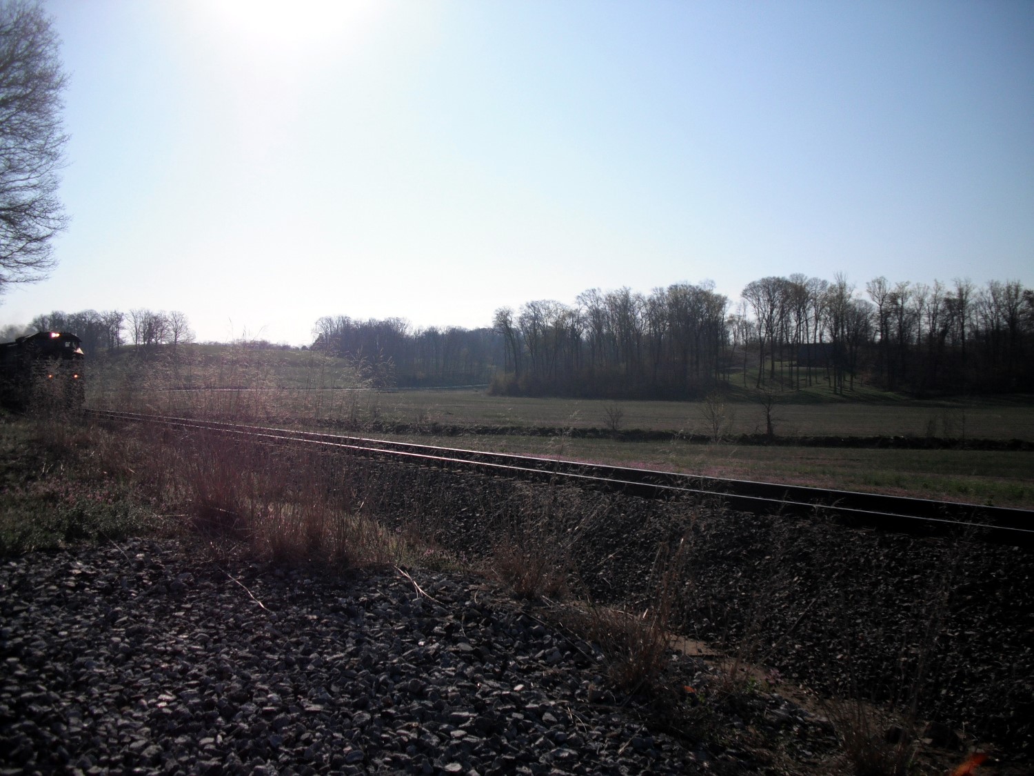
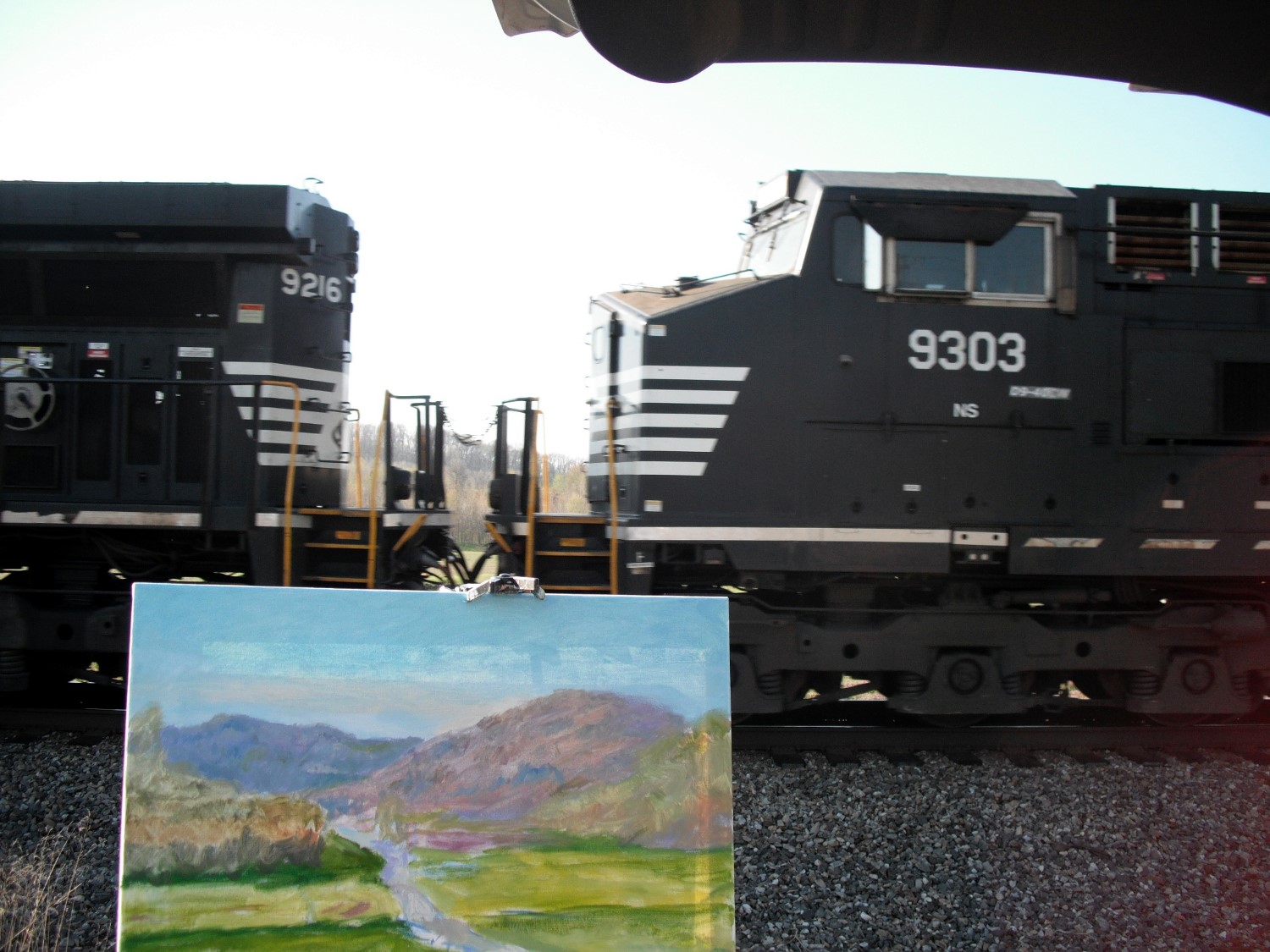
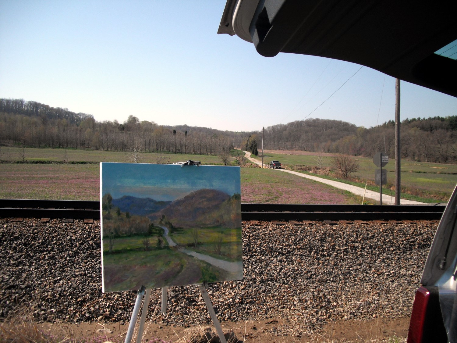
Here’s a photo of the beautiful rolling fields that I was trying to capture.  I find that I really only have two hours to make a go of a painting before I lose the light but this was enough.A sunny early morning photo 1000

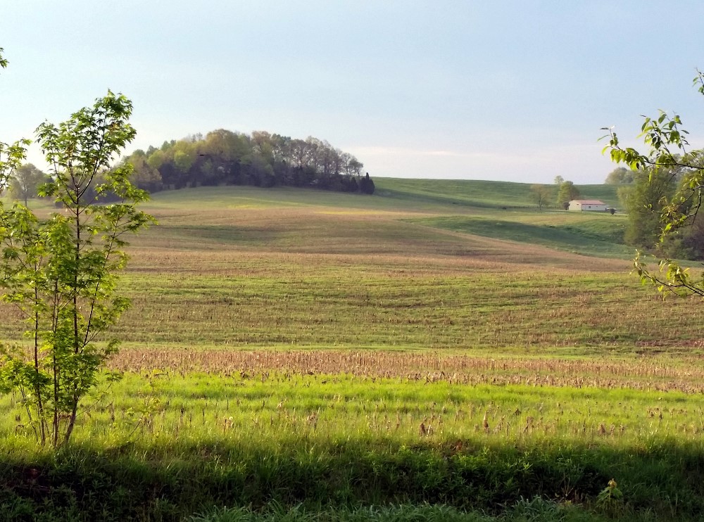
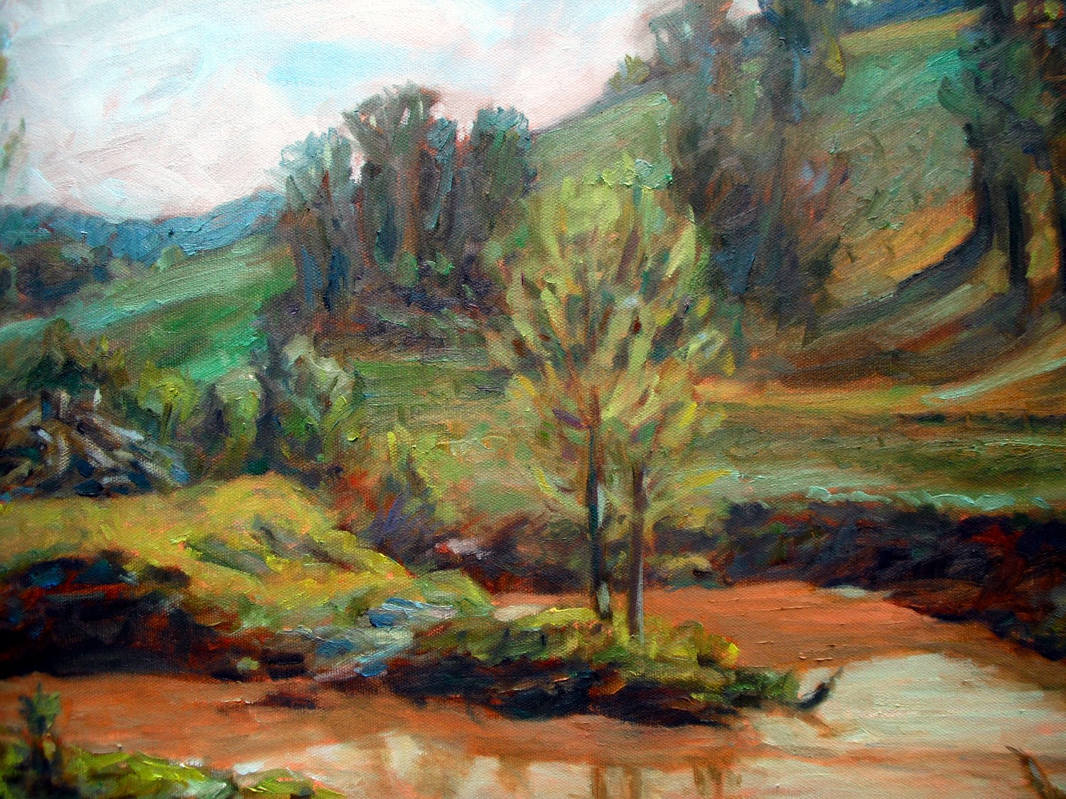
And here’s a photo of the field painting at the time I packed up.A sunny early morning photo - 2-1000

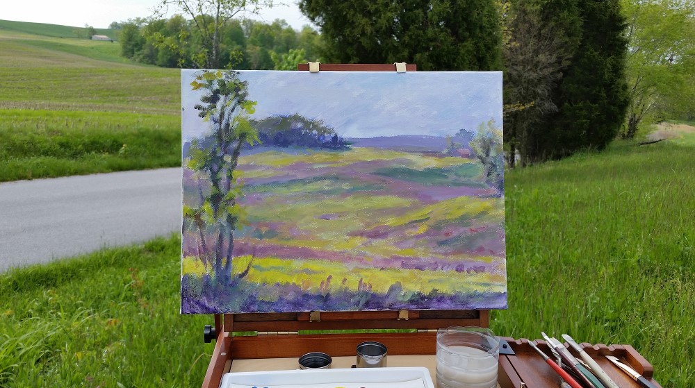
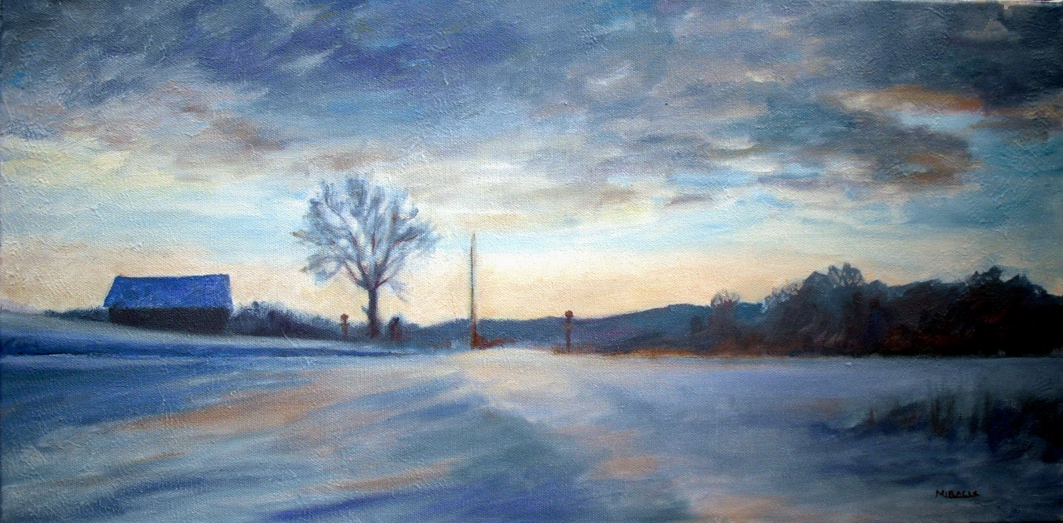
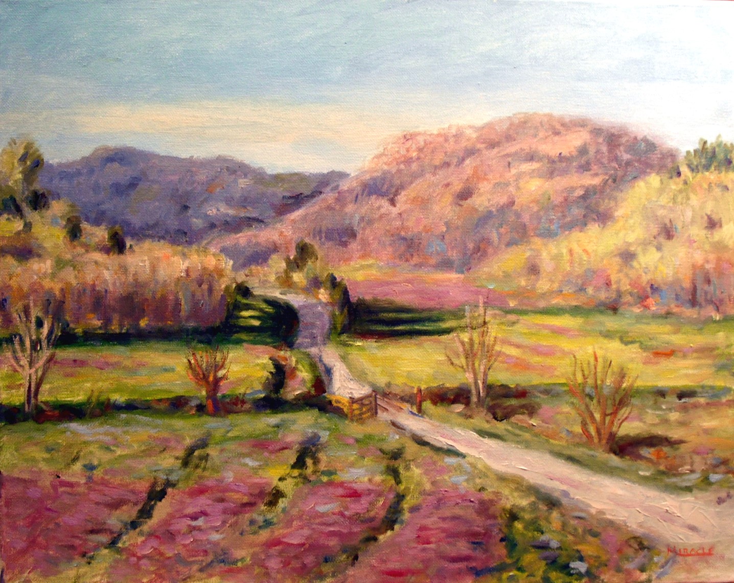
When I got back home, I wasn’t quite satisfied with the colors or composition of the painting so decided to work on it some more.  You can see where I lowered the clouds to emphasize the dawn.  Then I pushed back some hills and brought forth some of the sunny highlights. A sunny early morning painting2-1000 
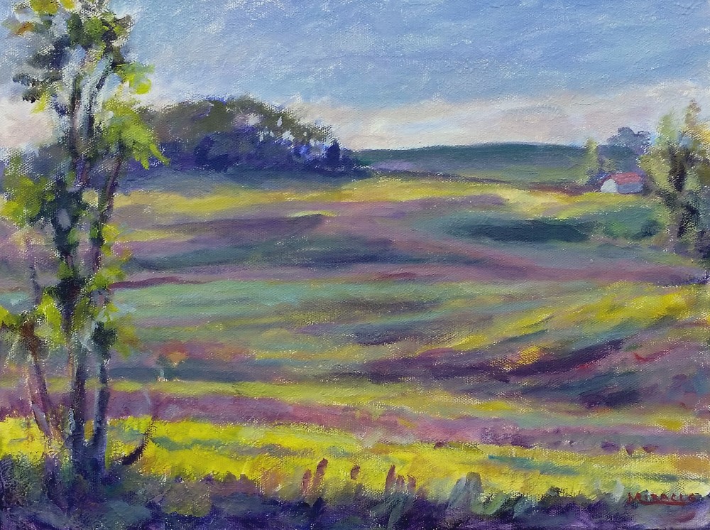
I’m not totally satisfied with the overall painting but I usually have to live with them for a while.  It doesn’t seem to have the personality of the scene I was trying to capture but barring that, isn’t too bad.  What do you think?  Which one do you like best.

So, lessons learned from my first acrylic plein air painting adventure.

  1. Test out new equipment first before you take it into the field.
  2. Be adaptable.
  3. Acrylics are nice in that they dry much quicker than oils but are more opaque than watercolors.
  4. And….don’t sit on your water container!

How to convey a feeling in painting

Winter in Mentor, Final, 12 x 24, oil on Canvas, Kit Miracle

Winter in Mentor, Final, 12 x 24, oil on Canvas, Kit Miracle

Artists usually have some reason that they paint a subject.  This could be a desire to convey beauty, despair, record something historical, or whatever.  In this painting, I wanted to convey the bone-chilling cold one early morning this month.  Check out my step-by-step page.

Painting New York

New York in January, Sunrise

New York in January, Sunrise

Each January I visit New York for conference.  Although I’m officially there for business, I never can seem to turn off my artist’s eye.  I’ve put  sketches up here before which I’ve done in museums, hotel rooms, night clubs.  Even just leaning against a wall in Times Square late at night.  Always interesting to me.  Most do not turn into finished artwork but are just memory notes.

This happens to be a painting that I did based on the view from my hotel room.  I love the early morning light dancing across the buildings with the cool colors of Central Park in the background.  There seemed to be some inversion layer going on which translated into a variety of impressionist colors.

When I create a painting like this, I’m often asked why I didn’t finish off the buildings.  But that wasn’t what attracted me to the scene, I reply.  It was the juxtaposition of hard and soft shapes, early morning light, a light dusting of snow on the roof tops.  I doubt the painting would have been improved if I had included every window, balcony, and detail.  This just leaves the soft feeling of a city wakening to a new morning.  What do you think?

Making friends with green

French Lick Creek, final, oil on canvas, 24x30, Kit Miracle

French Lick Creek, final, oil on canvas, 24×30, Kit Miracle

Green is one of the most difficult colors for most artists to handle.  However, if you’re going to paint landscapes, you’d better make friends with green.  I think the biggest mistake inexperienced artists make is not really looking at the color.  Green comes in many varieties – yellowish, orangey, silver, blue, purple.  Even just looking closely and slightly emphasizing what you see will help you immensely.  To learn more about the painting above and to see a demo, check out the page French Lick Creek, making friends with green, demonstration.

FrenchLickCreek,detail1 FrenchLickCreek,detail2 FrenchLickCreek,detail3 FrenchLickCreek,detail4

Simplify your backgrounds

Often, when we venture into the great outdoors to paint, we are assaulted with visual overload.  There’s just too much out there!  I find that a good way to approach the problem of too much is to simplify my backgrounds.  In this recent plein air painting of June lilies, I could have added a lot of trees and stuff in the background but decided to emphasize the flowers instead.  I chose to do this by painting the background with a muted variety of purples and blues.  As you can see, this really makes the flowers pop.  By the way, the orange day lilies grow wild in great masses along the country roads this time of year.

June Day Lilies, oil on canvas, 12x16, Kit Miracle

June Day Lilies, oil on canvas, 12×16, Kit Miracle

The original area with a busy background.

The original area with a busy background.

Painting Main Street

Main Street House #1, oil on canvas, 12x16, Kit Miracle

Main Street House #1, oil on canvas, 12×16, Kit Miracle

I went out painting this past Sunday morning in town.  Sundays are usually pretty quiet if you’re painting an urban setting.  There is a row of old houses on Main Street which have been renovated and provide some pretty interesting subject matter.  The first house, with all the gingerbread and roses is almost too saccharine but I thought I’d give it a stab.  I was actually planning to paint it from the other side (south) but since I arrived pretty early, I caught this morning light on the north side. There are some who would like to see every little detail but I believe that you should let the viewer’s eye fill in some of the details.  If I tried to paint a photo-realist painting…what IS the point, eh? …then I think the painting would have lost a lot.

Main Street House #1 en plein air, Kit Miracle

Main Street House #1 en plein air, Kit Miracle


Main Street House #2, oil on canvas, 12x16, Kit Miracle

Main Street House #2, oil on canvas, 12×16, Kit Miracle

A friend went with me this morning but she had other obligations and had to leave.  I wasn’t ready to pack up so I turned around and then painted the neighboring house.  I really like the light in both of them.  I could probably find subject matter for several paintings in a few blocks of Main Street, especially if I come back at different times of day.

What does YOUR Main Street look like?

Main Street House #2, en plein air

Main Street House #2, en plein air

Spring flowers

June Roses by the Woodshed, 12x16, oil on canvas, Kit Miracle

June Roses by the Woodshed, 12×16, oil on canvas, Kit Miracle

Spring flowers are almost a cliche.  It’s difficult to paint them without getting too saccharine.  But that is why we love them, isn’t it?  Part of my spring busyness, as mentioned in an earlier post, is that I get carried away when I’m at the nursery.  I always buy too much and then have to plant everything.  This particular flowerbed is out by our woodshed and is probably the oldest one on the property.  I think the rock wall was actually a base for a chicken coop, if I remember correctly what the former owner told us.  The yucca and the weigila were already there but I’ve planted everything else.  It’s always a fight between me and the wild critters who have eaten plenty of expensive perennials over the years.  Since this flowerbed is furthest from the house, it generally gets the least attention so the plants have to be pretty hardy.

I painted this 12 x 16 oil yesterday morning.  I love the strathing light.  There was a nice breeze and low humidity so it was a pleasure to be at the easel again.

Plein air painting from memory and from life

I have a beautiful drive to work every day, through the gently rolling hills of southern Indiana.  This is a valley that I frequently pass which changes throughout the seasons.  About a week ago, I was so taken with the freshly washed sky after a rain and the glancing sunlight through the valley, that I had to paint it when I got home.  This is totally from memory and was painted primarily with palette knife.

Kyana Bottoms from memory, oil on canvas, 12 x 16, Kit Miracle

Kyana Bottoms from memory, oil on canvas, 12 x 16, Kit Miracle

Then this past weekend, I went out early on Saturday morning to paint it from life.  Due to the severe winter, I haven’t been out plein air painting much this winter so I was aching to get outdoors.  Plein air painting poses its own challenges – weather, changing sunlight, where to park.  In this case the people who live back the lane stopped on their way out to town that morning, then later on their way back in.  Also, as you can see, I was really close to the train tracks.  And just when I was concentrating, I heard this noise behind me.  Some neighbor had spotted me from her house but I hadn’t heard her drive up due to the earphones I was wearing to cancel out the traffic noise.  I worked a couple of hours and then finished it up in the studio.

Kyana Bottoms, final, 16 x 20, oil on canvas, Kit Miracle

Kyana Bottoms, final, 16 x 20, oil on canvas, Kit Miracle

So…which do you like best?  The painting from memory or the one that was done on site?

More of the steps below…including the train!

The valley as it looked early in the morning.

The valley as it looked early in the morning.

Working out of the back of my car, initial washes.

Working out of the back of my car, initial washes.

Uh oh, here comes the train!

Uh oh, here comes the train!

And THIS is how close I was to it!

And THIS is how close I was to it!

Last painting step before I packed up for the morning,  The light had changed too much.

Last painting step before I packed up for the morning, The light had changed too much.

Real or illusion?

Many years ago I read that when Andrew Wyeth was complimented on the realism of his paintings that he responded, “All realistic art is an optical illusion.  You’re taking paint, applying it to a two-dimensional surface and tricking the eye into believing that they’re seeing a real object.” Although this didn’t quite sink in at the time, over the years I’ve come to understand what he was saying.

When I paint a subject in a realistic manner, I am literally fooling the eye.  My son was looking at the painting, Lucky Red, and went up close to examine it.  After a while, he commented that there really wasn’t much there.  I just laughed.  “You’re right,” I said.  “It’s all an optical illusion.”

While I admire artists who have the tenacity to paint every little hair on a rabbit, I really wonder why they are doing that.  Isn’t the entire object of the painting to convey the mood and feeling of the artist?  Personally I believe in letting the viewer become part of the painting by bringing their own knowledge and imagination to the work.  The hard edges certainly define some critical points, but soft edges let one area slide into another, creating a cohesiveness that cannot be obtained photo realism.  My personal opinion, anyway.

Go back and look at some of the original paintings that I’ve posted on here – Lucky Red, Grand Canyon at Moran Point, and Blue Bottles with Lemons.  Then look at these close-up.

Detail - Lucky Red.  Notice how abstractly the fish and seaweed are painted in this glass paperweight.

Detail – Lucky Red. Notice how abstractly the fish and seaweed are painted in this glass paperweight.

The golden Buddha is also painted very loosely.  Notice the sparkles of the ribbon, too.

The golden Buddha is also painted very loosely. Notice the sparkles of the ribbon, too.

This Mediterranean glass paperweight is a mash of swirling colors.  Again, the sparkles on the blue ribbon.

This Mediterranean glass paperweight is a mash of swirling colors. Again, the sparkles on the blue ribbon.

Notice the lost edges of this paperweight blending into the folds of the cloth.

Notice the lost edges of this paperweight blending into the folds of the cloth.

This tree in Grand Canyon at Moran Point is very loosely painted when viewed in detail.

This tree in Grand Canyon at Moran Point is very loosely painted when viewed in detail.

Again, the viewer's eye is blending the colors in this yellow lemon.

Again, the viewer’s eye is blending the colors in this yellow lemon.

Lucky Red

I don’t know quite why I started this painting but it’s something that has been rolling around in my head for awhile.  Sometimes I’ll think about a work for years before I get around to painting it.

Lucky Red is a challenge of red on red on red.  Shiny and soft.  Clear objects, reflective, see-through.  Some of the symbols are pretty obvious.  The lucky Buddha, three Chinese coins, a WINNING lottery ticket.  Some are less obvious.  The lucky bamboo plant.  Two of the glass paperweights have fish swimming in them.  Fish are a lucky Chinese symbol.  And swirling throughout the still life is a lucky blue ribbon that I won at a holiday party.  (Thank you, Joan!) Topping the set up off is another glass paperweight called Mediterranean which celebrated the completion of a bike ride through France several years ago.

We all have lucky symbols in our lives.  What are yours?

Lucky Red - the initial still life set up

Lucky Red – the initial still life set up

First step, drawing on the canvas

First step, drawing on the canvas

Second stage, blocking in major shapes

Second stage, blocking in major shapes

Third step, laying in base colors of the objects

Third step, laying in base colors of the objects

Fourth stage.  Almost finished.

Fourth stage. Almost finished.

What my palette looks like with a variety of reds.  Using black to tone some of them down.

What my palette looks like with a variety of reds. Using black to tone some of them down.

The painting compared with the still life.  Notice the gel I have taped over the light.

The painting compared with the still life. Notice the gel I have taped over the light.

Lucky Red, final.  Oil on canvas, 18 x 24, Kit Miracle

Lucky Red, final. Oil on canvas, 18 x 24, Kit Miracle