After so many early summer activities – gardening, hosting company, chores around the house – I’ve finally be able to get back to doing something fun for me. Mostly painting for upcoming exhibits.
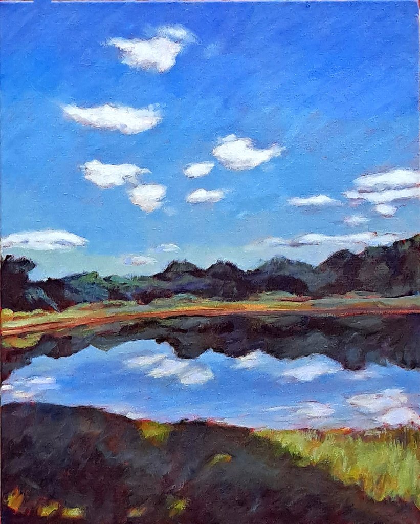
Nick’s Pond, 20 x 16, acrylic on canvas, Kit Miracle
I don’t usually lack for ideas. Quite the opposite – too many ideas. But when I hit a dry spell, I sit with my notepad and just start brainstorming. Sometimes I think of a theme, or a location, or something that’s just a challenge. Not all of the ideas I consider reach fruition. Some turn out quite awful, to be frank, but you don’t see those. Maybe it’s a quick glimpse of a cloud or weather formation. Or maybe I want to try some new materials. I really like to do landscapes and to capture human forms. Not much into capturing ugly (to me) – rusty old implements or derelict buildings. But any of this could change in the future, maybe next week.
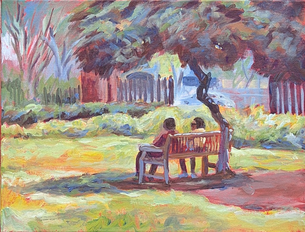
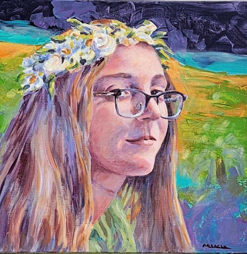
The Conversation, 12 x 16 acrylic on canvas, Kit Miracle
The past few months I’ve been capturing my travels to California this past spring. Totally different landscape for me. I mostly just did simple sketches, watercolor with pen and ink. But this inspired me to try some bigger, more finished paintings in acrylic on canvas. Many of these were challenging, even to the point where I asked myself why I decided to even try them. But I usually finish what I start as I’ve encountered that messy part of working on a painting about 60% of the way through where it all looks like garbage. Funny how that often works itself out.
Here are a few pieces that I’ve done the second half of the summer. And loads more ideas to come. There just aren’t enough hours in a day.
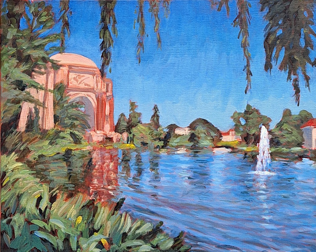
Palace of Fine Arts – Front View, 16 x 20, acrylic on Canvas, Kit MiraclePalace of Fine Arts, Back View, 16 x 20, acrylic on canvas, Kit MiracleThe Visitor, 24 x 24, acrylic on canvas, Kit MiracleRed Lanterns, 16 x 12, acrylic on canvas, Kit Miracle
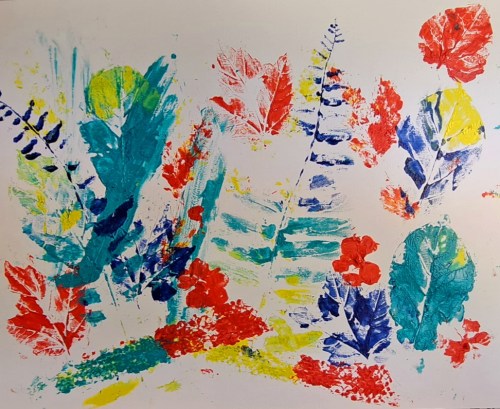
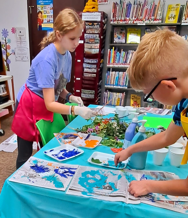
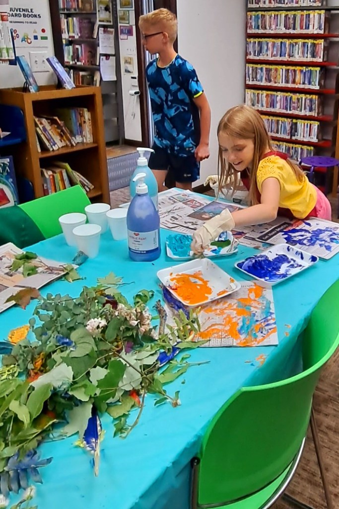
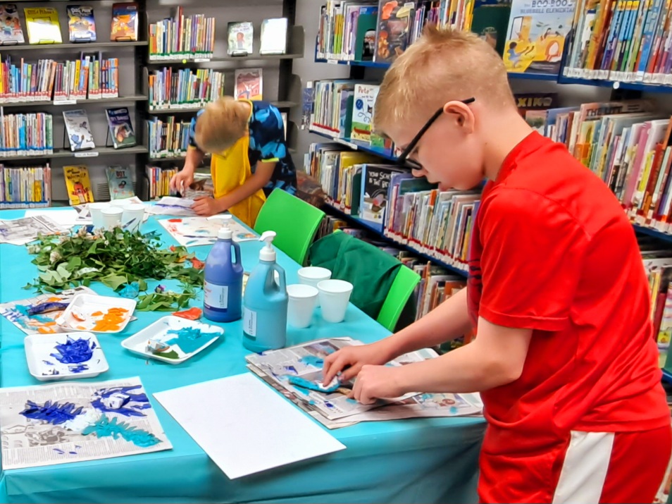
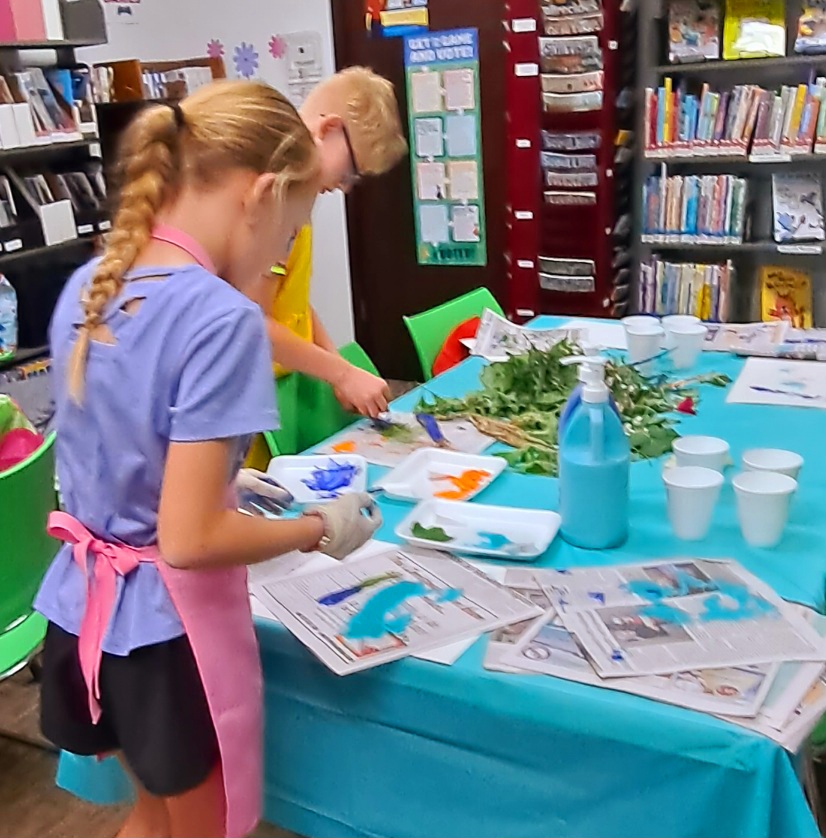
Creating prints from natural materials can be a whole lot of fun for you or your kids. I had an opportunity to conduct another free class at the little library a couple of weeks ago. This was the last of a series of free kids art classes this spring.
The idea was to collect some interesting natural materials, cover them in paint, and use them to make prints. The materials I used were just collected from my yard. Ferns, leaves, flowers, weeds. I also added some feathers and even a snake skin for texture. Maybe you can take a nature walk with your kids to collect the materials.
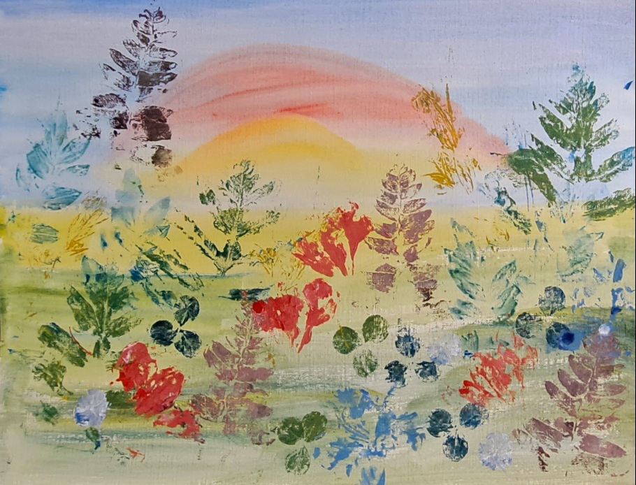
One of my demonstration sample print pieces on top of a painted sunrise.Repetition leaves in a pattern
Some of the kids used artist canvas boards, but we found that paper or cardboard works best as supports for the prints. The paper can be plain white or colored, or even textured. Some of the kids did a pre-print drawing or rainbow on their papers. There are just so many ideas.
This was a pretty messy project so as before, I recommend a disposable table cloth, lots of newspapers, disposable plates for palettes, and disposable cups for water. Actually, after our class was done, nearly everything got wrapped up in the tablecloth and tossed. Easy cleanup.
I also recommend that you AND the kids wear some protective clothing or aprons. An old shirt turned backwards works great, too. Things may (WILL) get messy.
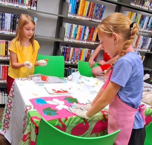
Some of the kids wore gloves but others opted not to.Once they got into it, the prints were flying like mad.
The paint we used was acrylic but tempera or poster paints work pretty good, too. And we used cheap makeup sponges instead of brushes.
Before we started, I showed the kids some of the sheets where I had practiced with some of the materials. Then I demonstrated the process. Afterwards, they painted their leaves or whatever, pressed it into their papers, and used some newspapers to really rub in in. Then they needed to gently lift the leaf or natural materials off. The most difficult part was to judge how much paint was enough and not too much or too little. They caught on very quickly.
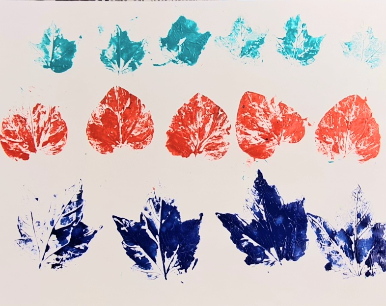
The kids selected from a big pile of natural materials. They had about six colors to select from.
This would be a great project to do outdoors on a summer day. The kids didn’t sit down as they kept moving around, trying new materials. I was so happy to see them having so much fun.
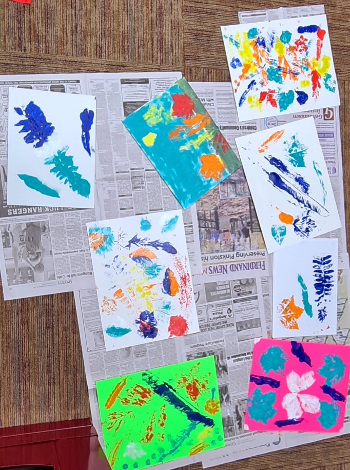
Printing light colors on a darker color paper worked well, too.Just a sample of some of the results of our class.
If you try this out, please let me know how your project turns out.
As I’ve mentioned in a previous post, this little library plays an important role in the community. As small as it is, it hosts a number of activities for patrons of all ages. All of these activities are FREE to attend although attendance may be limited due to space.
I brought in a few of my own sunflower paintings for some inspiration.
Recently I volunteered to teach a few children’s painting classes. The first of these classes was to learn about Vincent Van Gogh and to paint a picture in his style.
Although the class was limited, we had a nice turnout this week. I explained to the children a little about Vincent Van Gogh, who he was and why he was important. Also, they learned about his painting methods. Each table had several vases of sunflowers (faux) which the children were encouraged to choose what and how they wanted to paint. The library supplied all the art materials and even had little aprons just their size. They learned about mixing colors and how Van Gogh was known for his bold brush strokes.
Each child composed his or her own painting.Disposable palettes and tablecloths made clean up a snap.
All in all, it was a great group. I hope the kids had as much fun as I did.
Next month, we’re going to learn about Georgia O’Keeffe and her skull paintings. I’m bringing in a collection of real skulls (cow and deer) for them to use as subject matter.
Many thanks to AmyJo, the library branch manager, and other patrons who make programs like this possible. Public libraries are the best bargain around. What’s happening at your library?
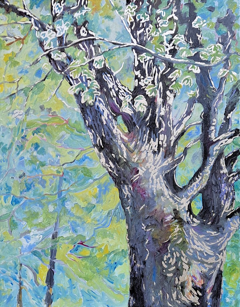
The Singing Tree, acrylic on canvas with sterling silver gilding, 30 x 24, Kit Miracle
I have a singing tree in my front yard. Actually, right next to the house.
Oh, it’s not belting out O Sole Mio or anything like the latest rap. It’s more of a gentle, low key humming, singing really. The first time I heard it was when I was walking around the yard on a windy day. I kept looking around to see if anyone was there. It took me a while to realize that the sound was coming from a tree. The twisted branches were rubbing against each other, creating a sound.
Our house, like so many older homes in this part of the midwest, is surrounded by yard trees. These were planted decades ago to provide shade to houses in the heat of the summer, long before air conditioning. The trees nearest the house are all maples, mostly black or sugar maples. (Lovely colors in autumn.) Although we’ve lost some of the trees over the years, there are still enough to provide some shade.
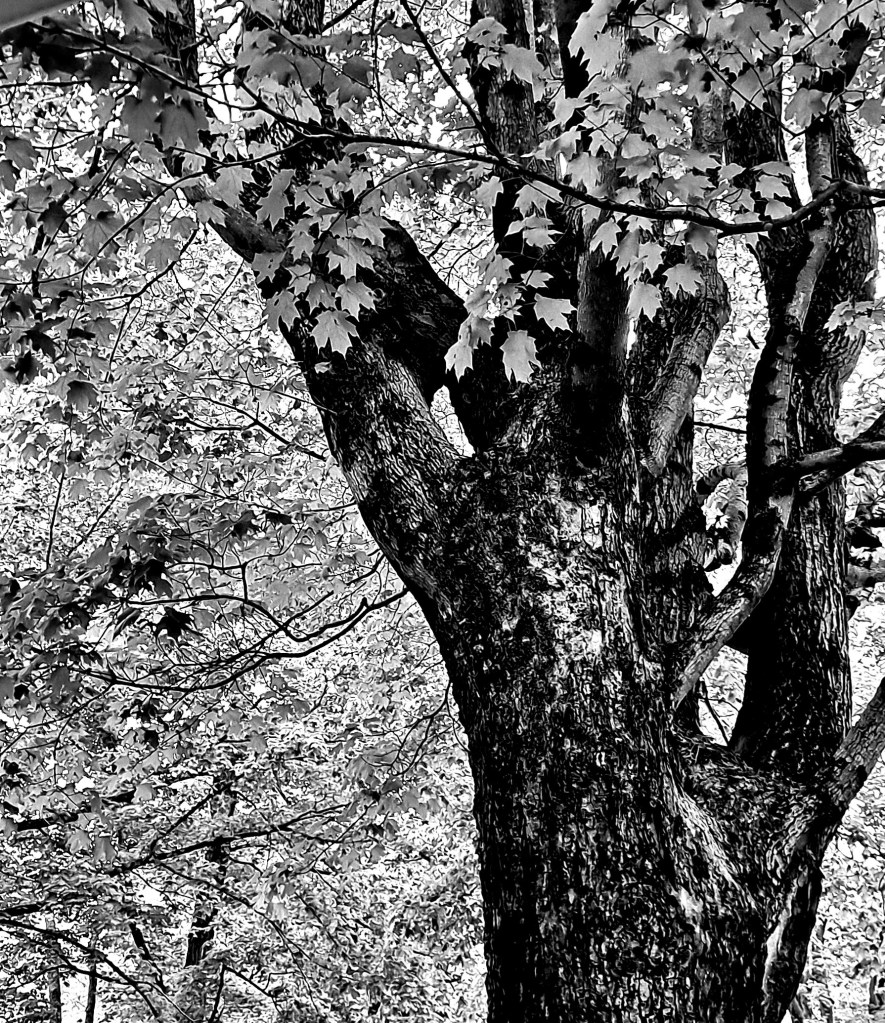
The Singing Tree, original photoThe Singing Tree, black and white photo manipulation
Last spring I took a photography course. I was mostly interested in learning how to use the features of my cameras. Didn’t need much help with composition. One of our weekly assignments was to get out and film nature. The Singing Tree was one of my entries. After some computer manipulation, I did a very striking black and white, almost abstract. I was going to paint is as such, but then reverted to a muted impressionistic painting with added sterling silver gilding. I even added a maple leaf motif to the edges of the painting, in sterling silver, of course.
The Singing Tree, detail 1The singing Tree, detail 2The Singing Tree, edge with leaf motif in sterling silver
The whole painting has been sprayed with clear acrylic which prevents the sterling silver from tarnishing. Adding the gilding adds several more steps to the actual painting which slows the whole process.
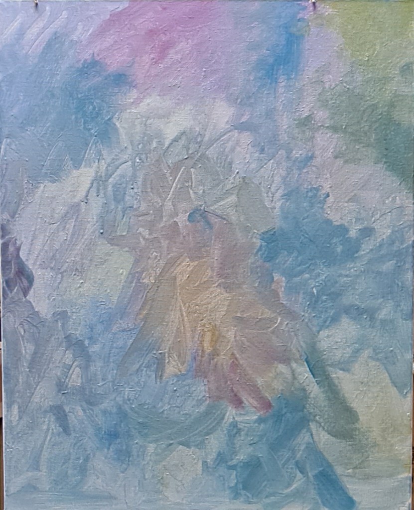
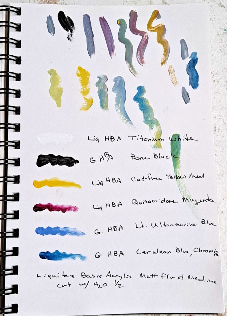
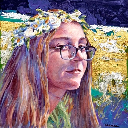
The most recent paintings that I’ve done have been with using a very limited palette which I’ve posted about previously. I’ve now cut the number back to four colors plus black and white. I like the challenge to see if I can adapt the most colors from just a few options. Actually, it works very well.
The original reference photo. I like the dappled light.
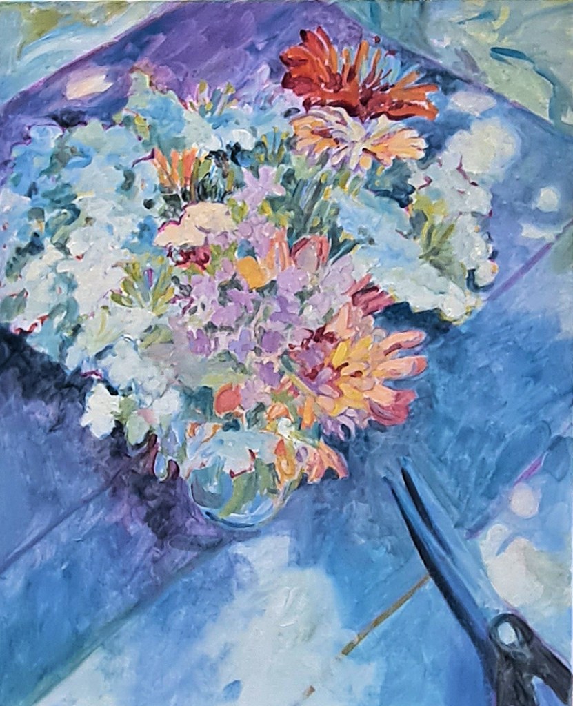
This painting is based on some photos that I took of summer flowers several years ago. Called August Bouquet, it showcases some zinnias and Queen Ann’s lace, plus others. The vase is sitting in the shade on an old wooden table, with dappled sunlight showing through. I’ve added some scissors as a foil for the flowers.
Vertical canvas prepared with thin color washesCanvas with sketches, and colored outlines
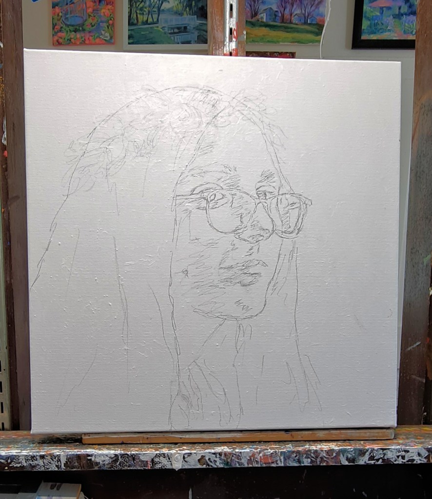
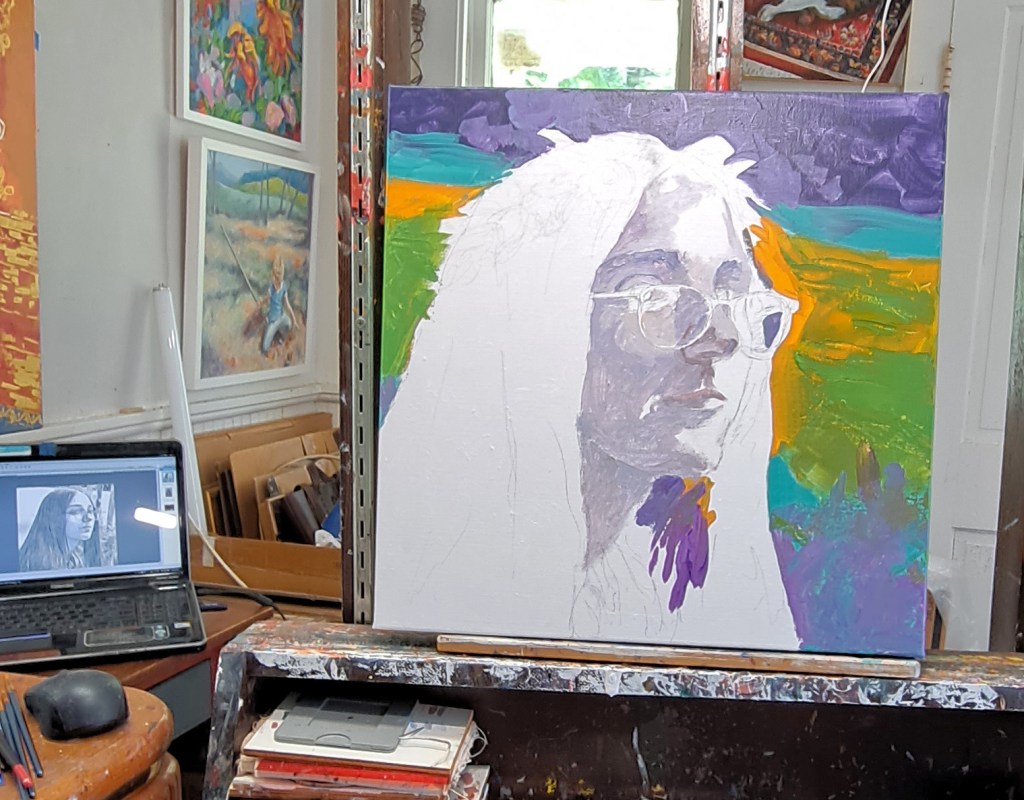
The canvas is a 20 x 16 vertical, 1.5 inches deep. I’ve already sanded and gessoed it and added a little texture. Then I added a thin wash of colors approximately where I anticipated locating the main shapes. After this coat dried (working with acrylics that only takes about twenty minutes), I then made a loose pencil outline of the flowers and other shapes.
The next step was to add color to the outline. I don’t try to make the outline colors match the subject, in this case, flowers. In fact, I often choose what I anticipate are contrasting colors to the final painting.
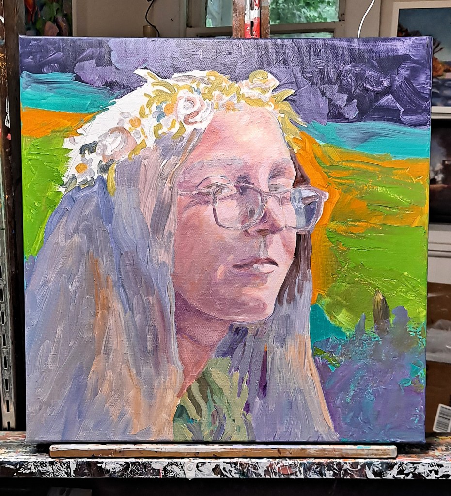
Middle stage with some fill-in color, loosely painted. I actually like this stage best. I think it would look nice in a larger size.August Bouquet, almost finished. I did not stick with the dark brown of the wooden table but kept to a lighter tone. I will tweak it a bit and add some gold or silver leaf details. Maybe.
Then the main shapes began to get filled in. I hesitate to call this the tedious part, but it is much more involved than the previous steps. I just have to stick with it until I’m done. I zone out, listening to music or a recorded book. Sometimes I fill in the background first; sometimes I start with the main subject. There are no hard rules here.
Canvas on my easel. I’ve turned off the painting light to get a better idea of values and colors. You will also notice a couple of shed snakeskins hanging on my easel. Actually, this is ONE snakeskin (about five ft) which my son found in the woodshed. He thought it would be fun to leave it for me in my studio…spread out on the floor. Big joker, eh?
I step away from the canvas often at this point to compare values, colors, shapes. The painting light above my easel can cast light which is too harsh so it’s best to turn it off while I compare values. This is a good point to take a break, perhaps overnight. I’ll often run out to my studio in the morning to see if the painting looks as I thought I left it or what glaring changes I need to make.
Although August Bouquet will be finished with a few more details, plus probably some addition of gold or silver leaf, I actually like one of the middle, less-finished stages best. One doesn’t actually need to put in every detail; in fact, it’s often distracting and doesn’t help convey the message of the painting.
Maybe I’ll paint it again with a less-finished look. What do you think?
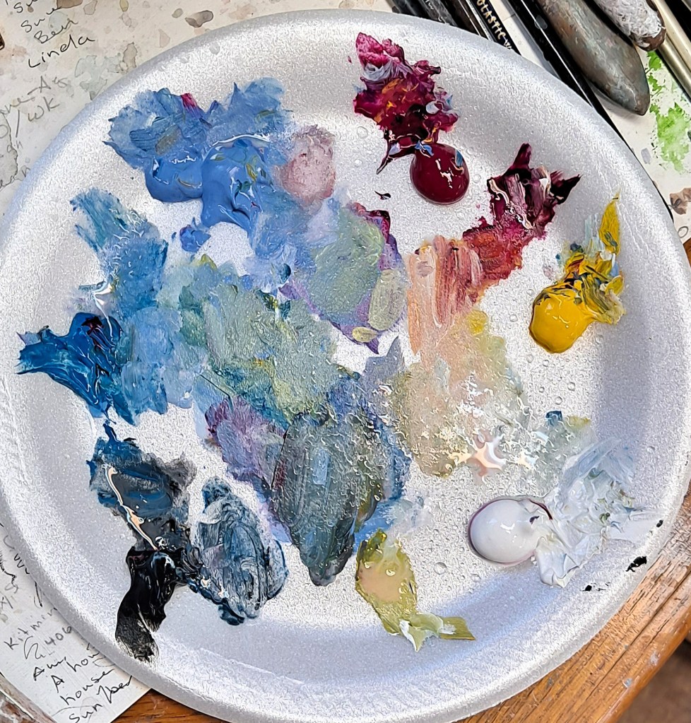
My notes with a list of the colors I’ve used. All Liquitex or Golden Heavy Body Acrylics. These paints are high quality and thicker than standard paints. I can get more texture with them. My disposable palette with the four colors plus black and white.
Posted onSeptember 17, 2023|Comments Off on The Golden Marble – More Gold and Silver Leaf
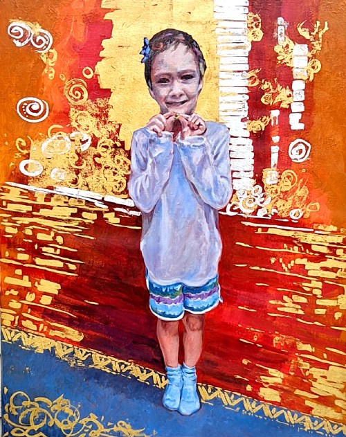
The Golden Marble, acrylic on canvas, 30 x 24. 23K gold leaf and sterling silver leaf. Kit Miracle
This is another painting in the gold and silver leaf series that I’ve been exploring. At 30 x 24, it’s the largest one so far. I also completed this one before Leo’s Muse which I posted last week.
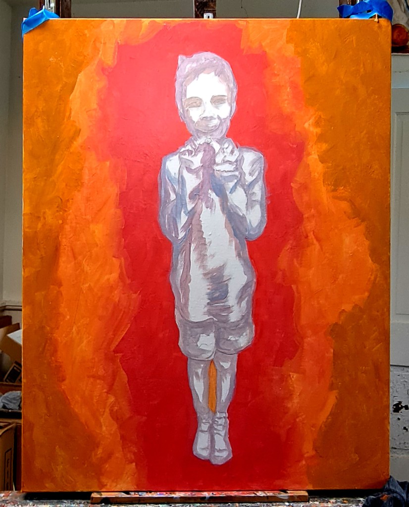
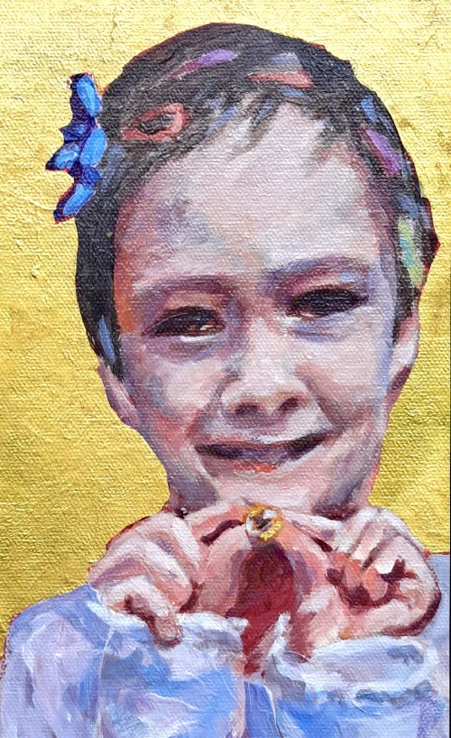
The subject is a young boy who has been playing dress-up with his sister. In a spirit of silliness, she has adorned him with ribbons and hair clips. His smile engages the viewer as he shows off The Golden Marble which is a prized possession.
Although I usually plan my paintings very carefully, I’ll admit that I really wasn’t sure where I was going with this one. I liked the subject. I knew that I wanted some gold and silver. Other than that….well…
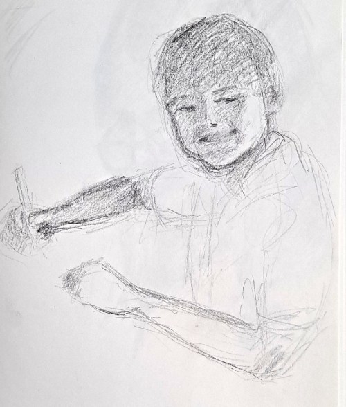
A preliminary sketch of the subject of The Golden Marble
As usual, I did some preliminary drawings of the child. These are just to familiarize myself with the subject. I then sketched him on the canvas, a straight-on shot. Then I began playing with background colors. I elected to use some very bright and warm colors, radiating out of the figure.
Initial lay-in of colors. I did the background warm/hot colors first. The began a grisaille of the figure.Now laying in flesh tones, plus adding some detail to the background.
I then painted the figure in grisaille, those greyish tones. Later working overall with adding some detail to the background. More paint on the primary figure. Although I had some reference photos to work from, this doesn’t really represent the situation. I painted very loosely, adding more to both the figure and the background until I was satisfied.
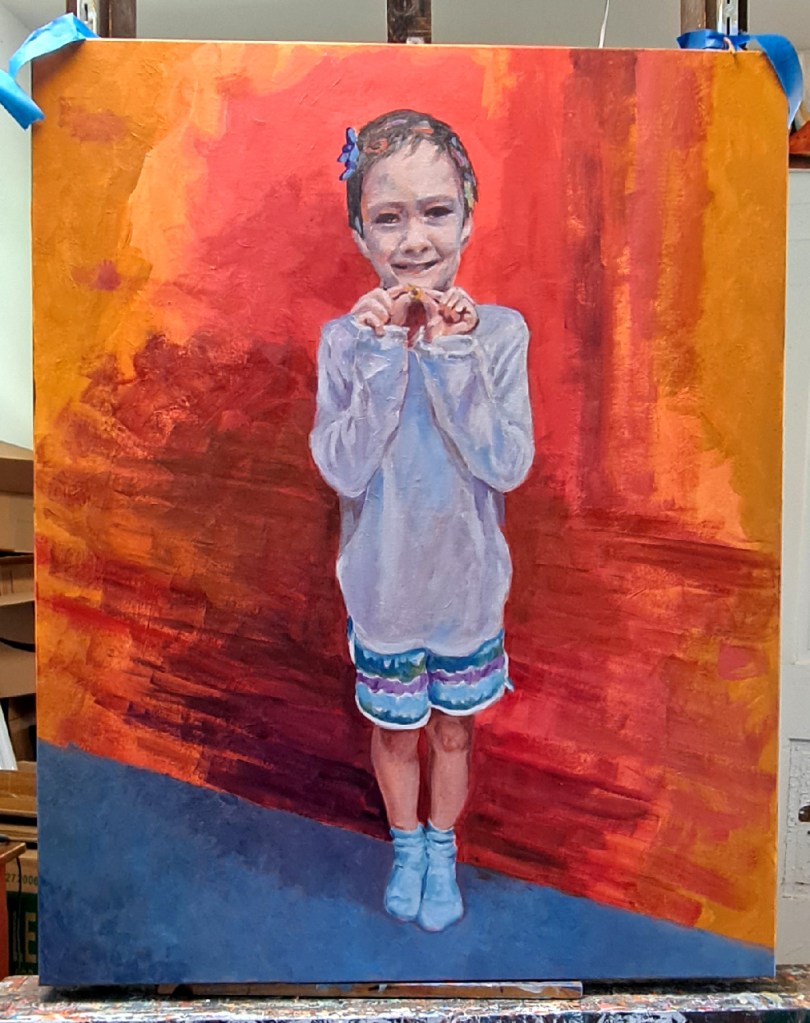
The figure is pretty complete. I decided to add a carpet to part of the floor, leaving the rest as hinting at wood flooring.Applying the gold and silver leaf while working on the floor
Because the canvas is so large, I had to place it on the floor of my studio to work on adding the gold leaf. Again, no fans or air conditioning blowing as the metal leaf is so fragile and blows everywhere. It was pretty challenging to decide where I wanted to place the metal leaf, plus I kept switching back and forth during the process. Sometimes the gold would be on top; other times the silver would be. The fixative is clear so I had to carefully judge where I wanted to place it, and estimate the right amount of tackiness for the metal leaf to stick. Overall, I’m pretty pleased with the result.
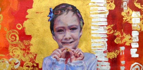
The Golden Marble, detail 1. I left plenty of the warm background colors show through. As you can see, I alternated placing the gold leaf on top of the silver, and the silver on top of the gold. Abstract shapes alternate with more organic circle or bubble shapes. No real planning, just in the flow.The Golden Marble – detail 2 showing the texture of the canvas and close-ups of the hair decorations
The final steps were to go back and touch up the figure here and there. I have learned that it’s difficult to touch up or make changes in the gold and silver leaf as it just doesn’t look the same as when first applied. I may find some way to eventually meet this challenge, but haven’t yet.
The very final step is to spray a protective coat of clear acrylic over the entire painting. This keeps the silver leaf from tarnishing and the gold leaf from flaking off.
Overall, it’s a very striking piece. I want to explore my next subject in this medium.
Leo’s Muse, final, acrylic on canvas, 23K gold leaf, sterling silver leaf, 16 x 16, Kit Miracle
For the past several months, I’ve been experimenting with adding gold and silver leaf to some of my paintings. I don’t know why I decided that this was a path for me, but as with most artists, we get inspired with new ideas and techniques. I posted on here earlier about some glam cat paintings and some others, but the most recent sparkly paintings have been both challenging and rewarding.
Leo’s Muse, several sample preliminary sketches
In Leo’s Muse, I began with some ideas rolling around. I took a few dozen photos of my model in different lighting and poses. Then began the difficult part of winnowing down all my options to a few good poses. It may seem like an unnecessary step, but I have found that it helps to do a number of sketches even before I get to the final idea. This allows me to familiarize myself with the model and the lighting until I reach my final idea.
Leo’s Muse, initial canvas sketchLeo’s Muse, step 2, blocking in color
I then sketched the outline of the pose on a prepared canvas (gesso and a couple of coats of acrylic paint.) Then I basically start…somewhere. For a portrait, it will be with the head or body. Then I lay in some loose background colors. In this particular painting, I painted the flesh in grisaille (grey undertones) before I began adding color to the face. After I have the basic face laid in, I just keep working on the painting as I would a normal painting until I reach a point where I am satisfied.
Leo’s Muse, adding more color, grisaille grey under tones on canvasStep 4, adding color over the grisaille
Another challenge with this painting is the added wreath of flowers. That is entirely imaginary as I didn’t really think of it while I was planning the painting. That is often the way of the creative process. Surprises pop up.
Leo’s Muse, nearly finished. Last step before gold and silver leaf is added
The canvas is two inches deep so the painting is carried around the sides.
Leo’s Muse, adding the metal leaf
After letting the painting dry for awhile, I then began to add the gold and silver leaf. I was a bit conflicted about this step as I really liked the painting without the added touch. But the design in my head called for it so, what the heck? I took the leap.
If you have never used gold or silver leaf, let me tell you, it is challenging. This is not a paint but actual sheets of real 23K gold and real sterling silver which have to be applied to the painting. The sheets of precious metal are so thin (.003 microns, whatever that is), that I can’t have a breath of air in the studio. No fan. No air conditioner. Hold my own breath while I’m applying the metal. And the little flakes get everywhere! On me, my clothes, other parts of the painting, all around my studio.
A fixative must first be applied to the surface that you wish to apply the metal. Then you have to wait until it has the right amount of tackiness. Then gently apply the metal, transferring from the tissue paper leaves to the painting, then gently press it into the fixative, and then remove the tissue paper all the while praying that the gold will actually adhere to where you have placed it. The fixative is clear as it dries, so that’s another dimension of challenge. Where did you paint it? Ha!
After I’ve let it dry, then I can take a somewhat stiffer clean brush and brush it off the rest of the painting. More challenges with flying gold and silver flakes. If you’ve never tried this before, you might want to experiment with the fake gold until you get the hang of it. When possible, I collect the extra flakes and put them in labeled jars for use on backgrounds or other areas.
After the paintings have had time to “set”, I will spray them with a clear coat of acrylic. This prevents the sterling silver from tarnishing, and the gold from flaking more or rubbing off. Or so I am told. I haven’t used it enough to be absolutely certain but we’ll see.
Leo’s Muse, final, acrylic on canvas, 23K gold leaf, sterling silver leaf, 16 x 16, Kit Miracle
By the way, the title of the painting, “Leo’s Muse” is actually short for Leonardo’s Muse. The model’s direct gaze and Mona Lisa smile of that other famous lady with the knowing look.
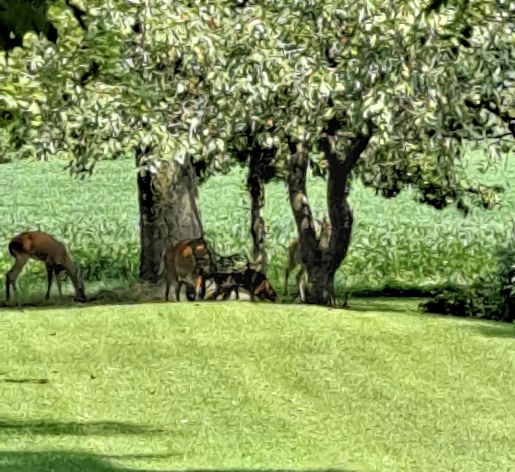
Afternoon visitors. They’re eating fallen fruit from the orchard.
If you’ve been wondering where I’ve been, maybe imagining some exotic vacation, nothing could be further from reality. Mostly just hanging around here tackling one thing after another.
Although we had a week or two of pretty hot weather, last week was marvelously cool with temps in the 70s. We also have managed to have pretty even rain – not too much, not too little. All good.
My little raised bed garden has been producing better than I thought. Tomatoes, peppers, eggplant. Note to self: plant less squash next year and more beans. And I just planted a fall crop of spinach and lettuce.
Unfortunately, all this produce came at an unlucky time when our 35 year old freezer elected to die. This involved a lot of hassle with the local big box store (HD) on delivery dates. But mostly the fact that the huge truck they decided to deliver the freezer – the same one that they delivered the washing machine two months ago – suddenly couldn’t make it down our drive. Lots of unhelpful phone calls until we cancelled the order and went with the local appliance store. Spent a little more but the service was great. I like supporting local businesses, too.
The second half of this misadventure is that the freezer resides in the back of my studio. Which meant, of course. hauling out most of the paintings that have been stored back there. Might as well clean it out while I’m at it. None of this was on my schedule. Anyway, it’s all fixed up now. On to other things.
The Golden Marble (detail), acrylic, real gold and silver leaf, 30 x 24. Kit Miracle
I’ve been experimenting with more applications of gold and silver leaf to my paintings as discussed earlier. I really like this but it is so tricky to work with. This is 23K gold and sterling silver on the thinnest of metallic sheets. Even a breath of air will mess it up while applying it to the canvases. Here is a detail shot of one of the largest paintings that I’ve done using this technique. I’ll post more about it later.
Deer in the bean field
And, the deer seem to be out in abundance. Although we rent our fields out, it’s sure a shame to see how much these visitors eat. The beans are high enough now that we mostly only see their heads. And they don’t seem to be skittish at all with the noises coming from the house and yard. Well, another couple of months it will be a different story when hunting season starts. Meanwhile, I love watching the twins playing in the yard just as any youngsters might do.
I hope to post a bit more regularly in the future. And I also hope that you’ve all been managing the weather – heat, drought, hurricanes. Autumn is coming and the leaves are even beginning to change. Can’t wait!
Waving Glory, original painting, acrylic, sterling silver gilt, canvas board, K Miracle
I always get a little thrill when I hear a band playing and see the marchers, whether musicians or military. Something about the big booms of the drums. But particularly the waving of the stars and stripes.
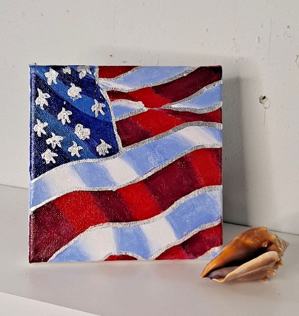
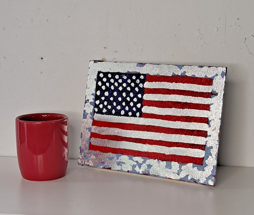
Stars and Stripes, original painting, acrylic, silver gilt, stretched canvas. K Miracle
With several patriotic holidays coming up – Memorial Day, Flag Day and July 4th – I felt impelled to create a few small flag paintings. Just some stars and stripes, waving, as you might see anywhere this time of year. The unique thing with these paintings is that I’ve added some real sterling silver gilt to them. Yes, really! Let me tell you another time how challenging it is to work with the sheets of gold and silver.
Flay Day, 5 x 7, acrylic, silver gilt, K Miracle
Anyway, all the paintings have been coated with clear acrylic so the silver won’t tarnish over time.
I couldn’t add the neat videos for these paintings to my blog but you can check out my shop to see the videos of the flags on a turntable which really shows off the shine of the silver. Just because I wanted to, you might say.
Posted onFebruary 27, 2022|Comments Off on Spring will arrive – eventually
My last post earlier this month was about Snomagedden. The weather in the midwest has been all over the place – ice, sleet, fog, freezing rain. Later this week we are expecting temps up to the 60s. I’ll be watching for spring flowers as the daffodils are already up several inches.
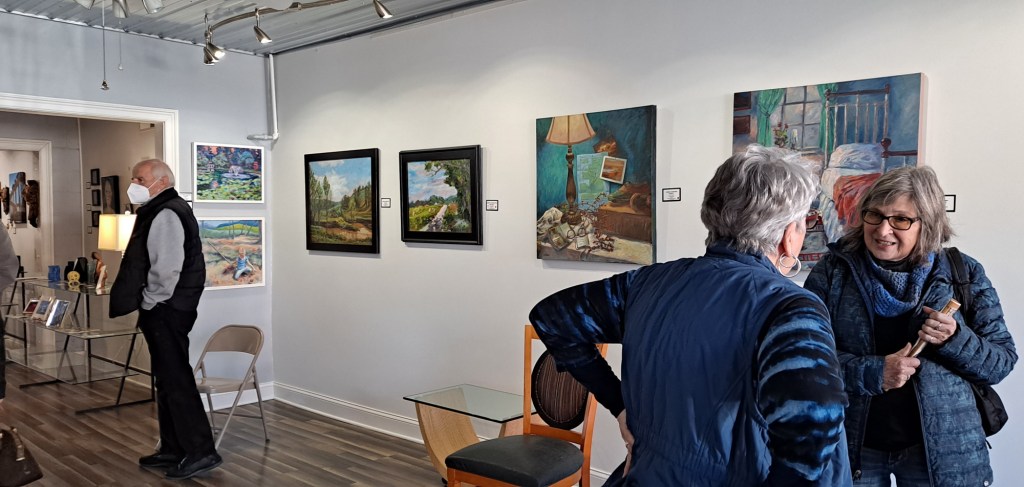
After the gallery talk this month.
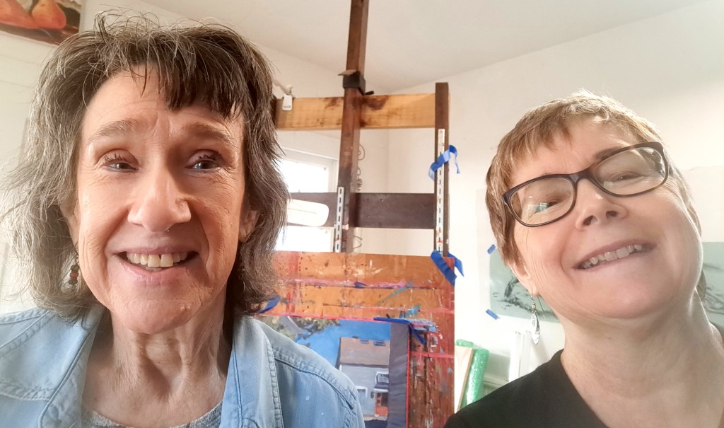
My show at the Harrison County Arts in Corydon has been very successful. Last week I gave a gallery talk which was well-received. The reporter Judy Cato came out twice. Once to interview me and another time to bring her friend Lorraine, the photographer. And then this coming week I get to pick it up the show.
Judy Cato (reporter for Southern Indiana Living) and me.
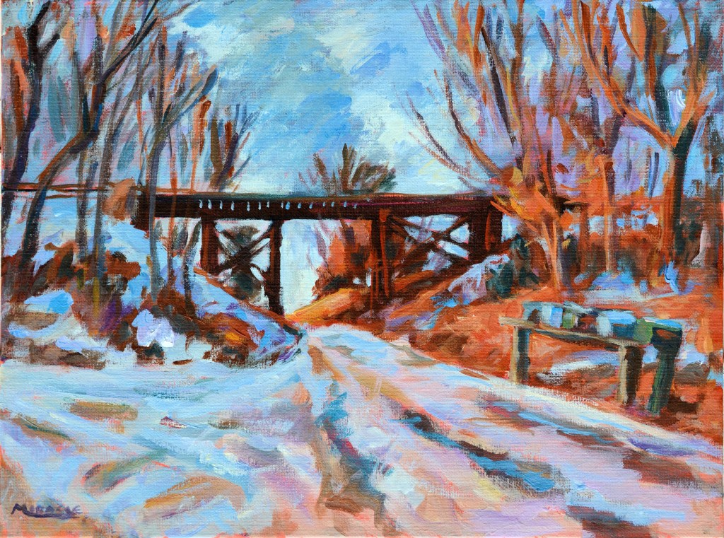
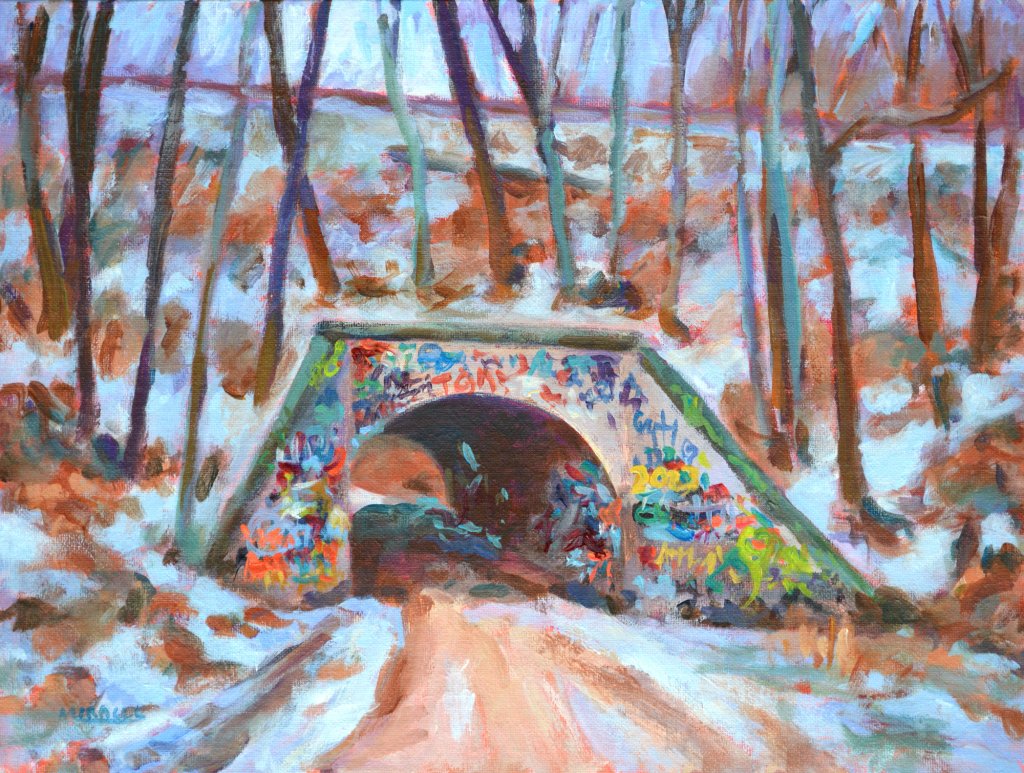
But I am already on to the next thing. I’ve decided to paint some bridges and started with some train trestles and tunnel bridges, graffiti and all. It’s been fun so far. I’ll let you know how that goes.
Stay tuned for the next thing. Happy spring until we meet again.
Train Trestle Riceville RdTunnel bridge on Schnellville Road, complete with graffiti.
I'm a professional artist, retired director of a performing arts center, bona fide book addict, and enjoy the quiet life...most of the time. I'd love to hear from you or get your ideas for future posts. Come back soon!