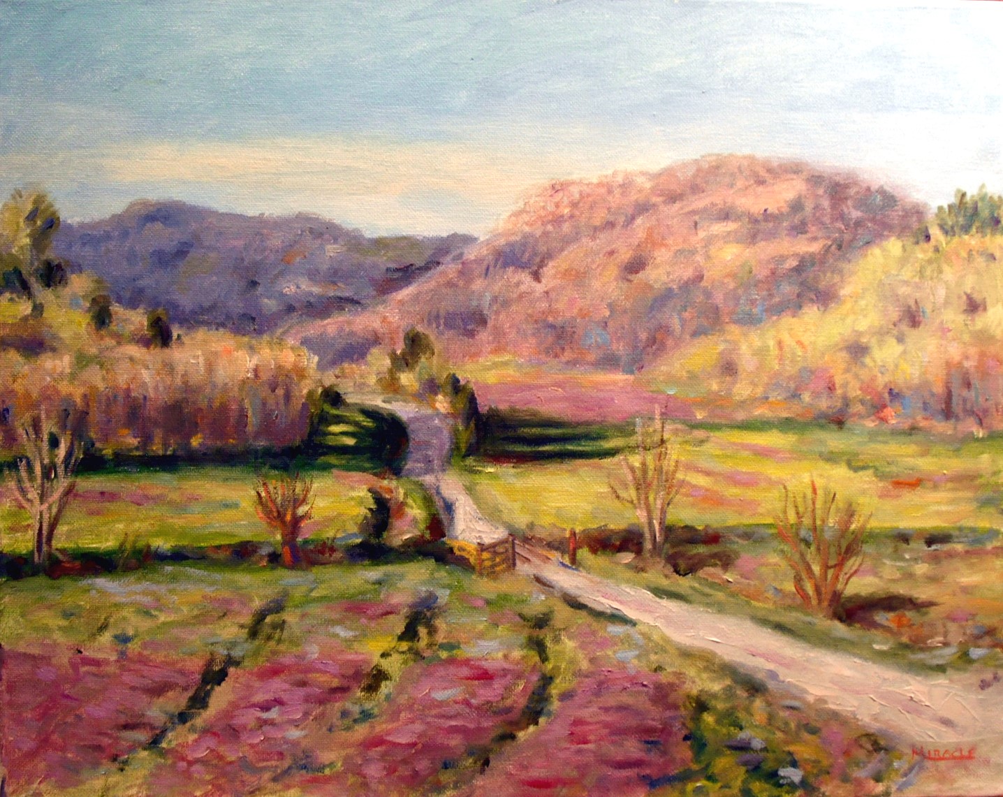
Many years ago I read that when Andrew Wyeth was complimented on the realism of his paintings that he responded, “All realistic art is an optical illusion. You’re taking paint, applying it to a two-dimensional surface and tricking the eye into believing that they’re seeing a real object.” Although this didn’t quite sink in at the time, over the years I’ve come to understand what he was saying.
When I paint a subject in a realistic manner, I am literally fooling the eye. My son was looking at the painting, Lucky Red, and went up close to examine it. After a while, he commented that there really wasn’t much there. I just laughed. “You’re right,” I said. “It’s all an optical illusion.”
While I admire artists who have the tenacity to paint every little hair on a rabbit, I really wonder why they are doing that. Isn’t the entire object of the painting to convey the mood and feeling of the artist? Personally I believe in letting the viewer become part of the painting by bringing their own knowledge and imagination to the work. The hard edges certainly define some critical points, but soft edges let one area slide into another, creating a cohesiveness that cannot be obtained photo realism. My personal opinion, anyway.
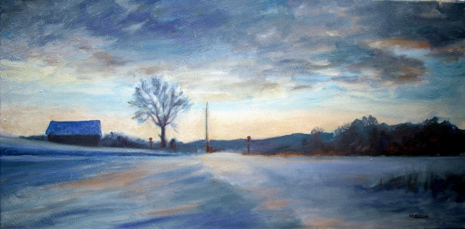
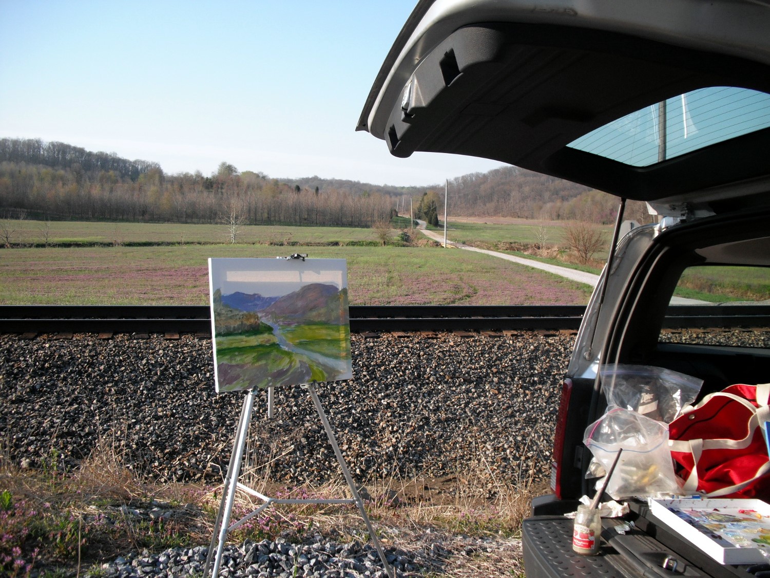
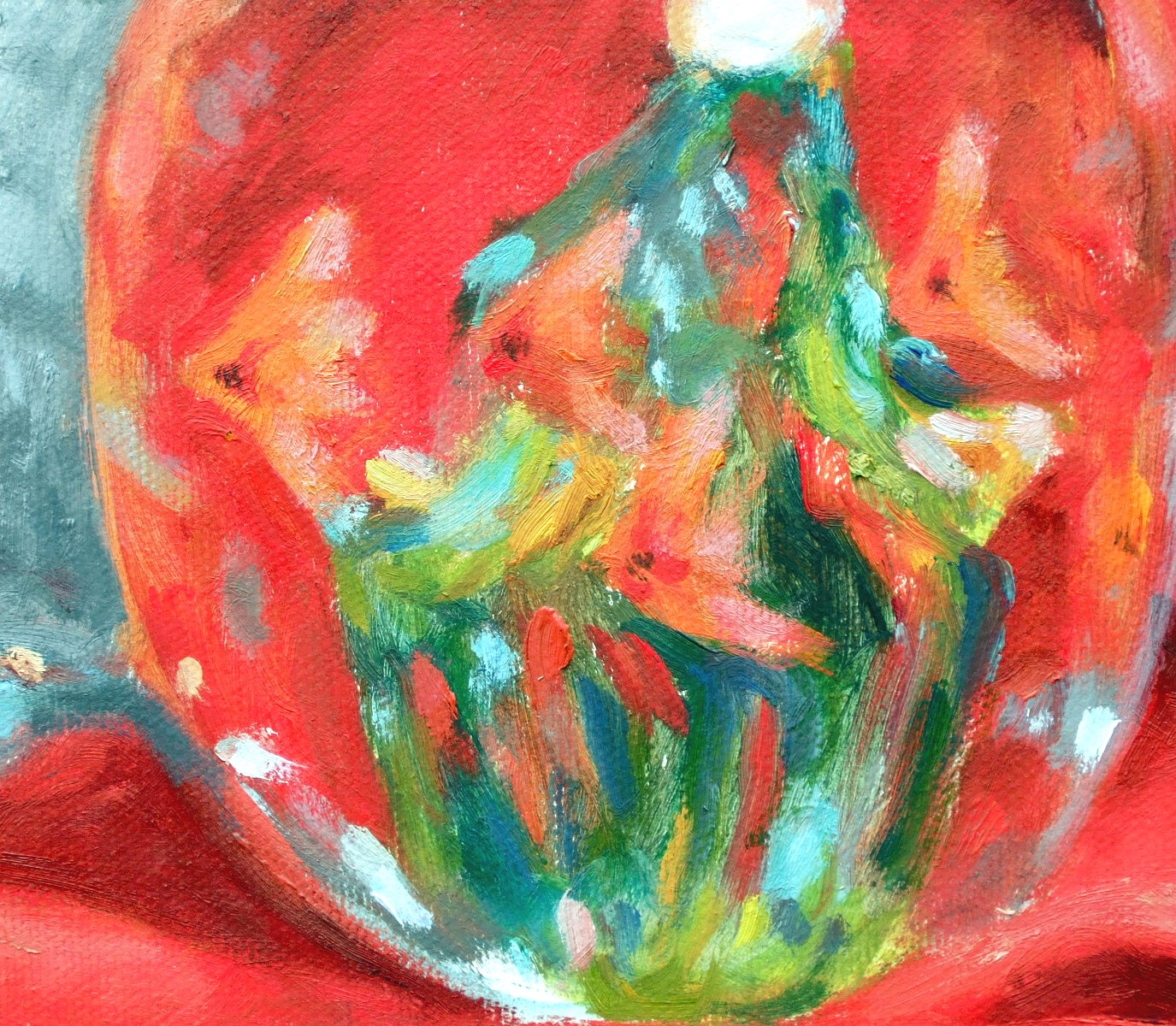
Go back and look at some of the original paintings that I’ve posted on here – Lucky Red, Grand Canyon at Moran Point, and Blue Bottles with Lemons. Then look at these close-up.

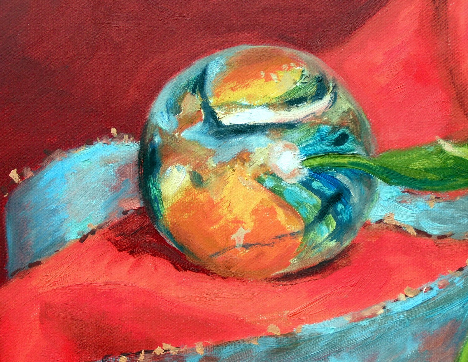
Detail – Lucky Red. Notice how abstractly the fish and seaweed are painted in this glass paperweight.

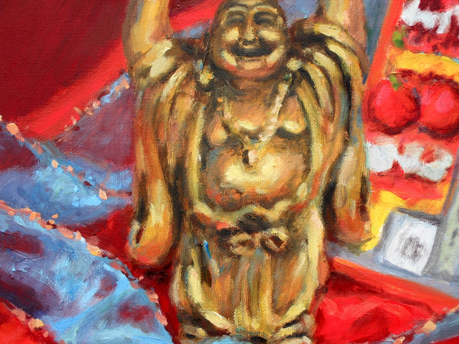
The golden Buddha is also painted very loosely. Notice the sparkles of the ribbon, too.

This Mediterranean glass paperweight is a mash of swirling colors. Again, the sparkles on the blue ribbon.

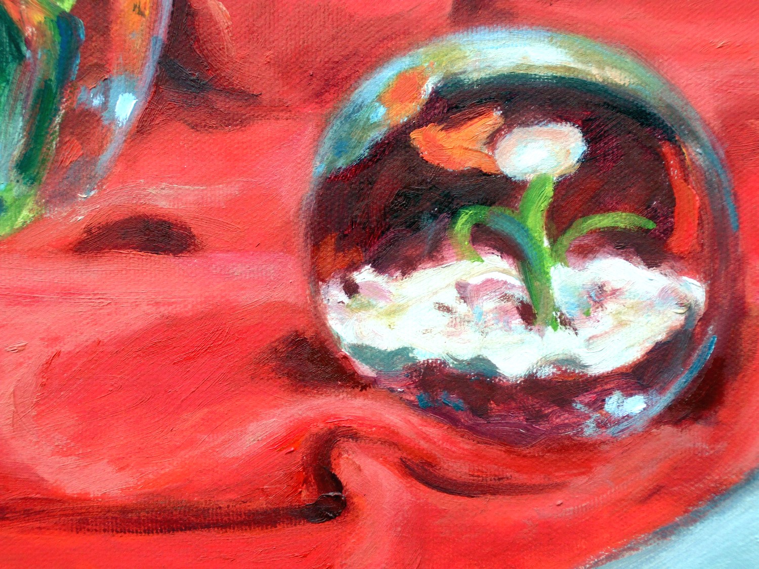
Notice the lost edges of this paperweight blending into the folds of the cloth.

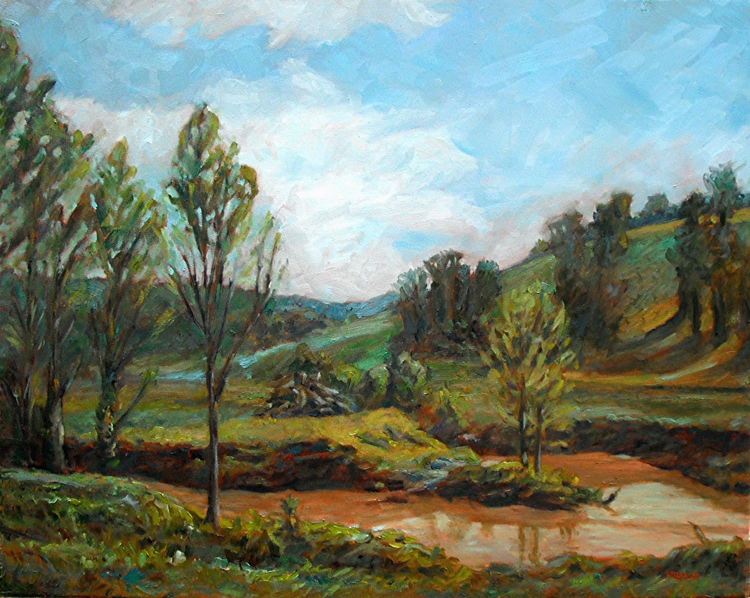
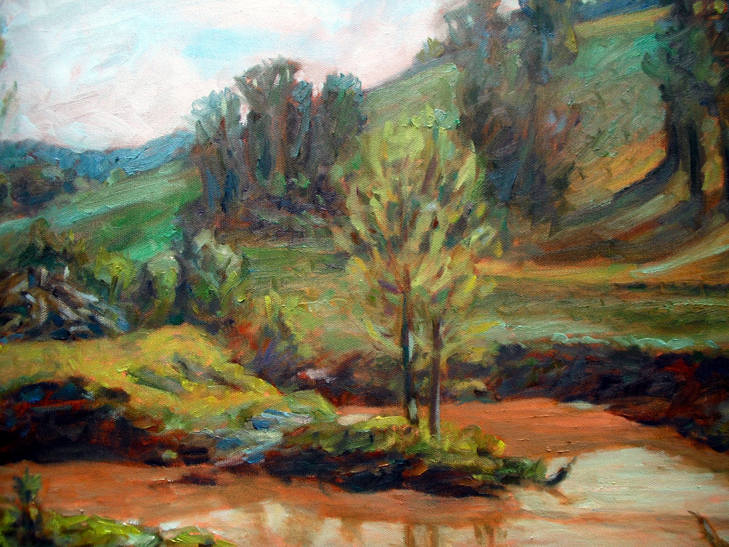
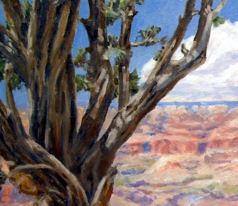
This tree in Grand Canyon at Moran Point is very loosely painted when viewed in detail.

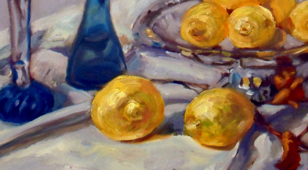
Again, the viewer’s eye is blending the colors in this yellow lemon.