Tag Archives: art

Good Framing Makes A Difference

Times Square at Night, professional framing, Kit Miracle

Recently I posted about how to frame your artwork on a budget.  This post is about how professional framing and presentation can bring out the best in your artwork.

This is also a follow up to a post I made in May about something different, a watercolor and India ink painting I created of Times Square at Night.  An acquaintance saw the post and was thrilled.  She and her husband had lived in the Theatre district near Times Square for nearly 30 years before moving to New Jersey.  She bought the painting as a surprise for her husband’s birthday.

When I mailed it to her, I told her that I had planned on framing it with a white mat and black frame.  This is what she and her framer came up with.  SO much better than anything I had imagined.  Professional framing really brings out the colors of the painting while displaying it to its best.

So, framing on a budget or professional framing, you choose.

Studies in Red – Oil Paintings with Heart

I’ve always liked red paintings.  When I did art fairs for many years, they seemed to be very popular with my patrons, too.  Everyone has room for a red painting to brighten up that special spot.

The four paintings that I completed this week are predominantly red or at least in the red/orange family.

The Birdcage, oil on canvas. 12 x 16, Kit Miracle

The first one, The Birdcage, features the antique birdcage that I bought at a flea market earlier this summer.  I paired it with some bright red fabric printed with beautiful little birds.  Then I decided to do a tea theme with a teacup and small teapot, along with some luscious lemons.  Although the painting is a little busy, especially after the simplicity of the others that I’ve been working on lately, I think it works.  Boy, that birdcage was difficult to paint!  The other challenge was to depict the birds on the fabric without letting them take over the composition.

The Conversation, oil painting, 10 x 10, Kit Miracle

The second painting I did this week is called The Conversation.  I can just imagine two friends having a lovely talk in the afternoon sunshine.  It looks as if they just left, doesn’t it?

Lamplight, oil painting, 10 x 10, Kit Miracle

Then I painted this bright interior painting called Lamplight.  This depicts an interior scene, perhaps an entry hall, with a lamp and a simple bouquet of red flowers.  The gold frame of the mirror helps connect the objects on the table.

A Sunny Corner, oil painting, 10 x 10, Kit Miracle

My final painting this week I call The Sunny Corner.  I’ve always loved the play of sunlight and shadows on interior walls and floors.  The effects are often fleeting but beautiful, nonetheless.  The chair just invites the viewer to take a rest and enjoy the sunshine.

Visit my Etsy shop, KitMiracleArt, to see many more painting details.

Onions and Garlic, a step-by-step demonstration

Onions and Garlic, 12 x 16, oil on canvas, final- Kit Miracle

I’ve been painting a lot of still lifes lately.  This one was inspired when my husband came home recently with a bag of big, beautiful garlic bulbs.  I quickly grabbed them before he could put them in a sauce or plant them in the garden.  Then I went “shopping” through the house and refrigerator, and even my prop closet for the rest of the items I needed for a still life.  This one reminds me of something by Cezanne or Renoir.  The impressionists were known for beautiful paintings featuring simple household items.

If you would like to see a demo of this painting step-by-step, click here for the demo page.  The painting is for sale on my Etsy shop, KitMiracleArt.  Paint has to dry though!

How to save money by using standard size canvases and frames

A selection of frames from Michaels. There are MANY MANY to choose from.

I am often asked, “You mention standard sizes in your painting and framing, but what does that mean exactly?”

Good question.

For many centuries, artists have been unrestricted to the size of their wood panels, paper or canvases, so their wonderful creations could be all over the place with regard to size.  This is fine for creativity, but it gets expensive to frame paintings.  The reason is that unusual sizes call for custom frames, thus the expense.  Yes, one gets many more options, but if you’re on a budget, you may wish to stick with artwork which conforms to standard sizes.

Canvas sizes and frame sizes.

In my work, I buy boxes of canvases and canvas panels (wood or heavy cardboard covered with canvas), and even use custom wood panels cut to standard sizes.  This saves me money by purchasing in quantity which, in turn, I can pass along the savings to my customers.  Yes, I still will stretch linen or cotton canvas on stretcher bars if I want a certain size which is not readily available, but that is my choice and is usually for larger paintings.

Since watercolors (and other works on paper) require a mat to separate the painting from the glass, I am cognizant of of the sizes of ready-made mats and frames.  For instance, most of the watercolor/pen and ink paintings on my My90Acres Etsy shop are 4 x 5 inches, which I mat to 8 x 10.  All the mats are museum-grade rag mats in a soft white color which I purchase in bulk directly from the manufacturer.  This allows the buyer to purchase an 8 x 10 frame and have the painting hung in minutes.  Many of the larger watercolor paintings on my KitMiracleArt Etsy shop will also fit standard frames with mats (my bigger works don’t come with mats).  Where the store-bought mat says that it will fit an 11 x 14 inch painting or photo, the mat opening is usually cut to 10.5 by 13.5 inches but you can measure them in the store.

A selection of frames from the big box store. Some come with mats and some without. You can also toss the glass if you don’t need it.


So where can you buy frames and mats to save money?

There are many wonderful stores online where you can buy frames and mats of standard sizes.  Some of my favorites are:  PictureFrames.com, Jerry’s Artarama, Dick Blick, and even Amazon.  Some websites even allow you to upload a photo to try it out in the frame you are considering. Also, oil paintings are not usually framed under glass.

If you prefer to see the frames in person, there are plenty of stores which can meet your needs.  Michaels and Target come to mind.  Many of the big box stores have a good selection of ready made frames, with or without mats. I have even been known to buy a frame with a cheap print in it and throw away the print!  Hey, whatever works.

One word of caution if you are framing a painting on canvas, is to consider the depth of the frame, i.e., the rabbet.  A thicker canvas will require a frame with a thicker depth.  You will probably need some special clips to keep the canvas in the frame, but many of these are sold with the frame or can be added for a very small charge.

Attaching a canvas into a frame with canvas clips. These come in various sizes depending upon the depth of the frame.

Reading other blogs

I always enjoy reading other blogs.  Some I check daily, some are just weekly.  Many are about or by other artists.  It always makes the artist seem so approachable when I read what they have to say in their own words.  Plus, there is so much to learn!

Dinotopia by James Gurney

One of my favorite artists and blogger is James Gurney.  He is the author of the famous Dinotopia series of books.  His own artwork is wonderful.  He works in plein air much of the time but not always.  His plein air paintings are usually done in smallish art notebooks (5 x 8) and are usually in gouache.

Color and Light by James Gurney

I was first introduced to his work through his book Color and Light.  Later I ordered a used copy of his drawing book The Artist’s Guide to Sketching where he and his college roommate, Thomas Kinkade, bummed across America in the 80s.  Wow!  What company!  They also both worked at a movie studio for a time doing background cells for space animations.  And, he’s just seems to be a really nice person.

The Artist’s Guide to Sketching by James Gurney and Thomas Kinkade

Gurney also includes videos of his work, reviews favorite books, museum exhibits and many other artists.  Certainly work checking out.

http://gurneyjourney.blogspot.com/

http://jamesgurney.com/site/

Painting Marathon – Trying Something New

About a week ago, I decided to see how quickly I could paint ten paintings.  I’m not quite sure what the spark was.  Maybe I was bored, tired of the old style. Something I saw that reminded me of some yellow and blue paintings that I had done years ago.  Anyway, I decided to challenge myself, not only with the number of paintings, but stretching to a slightly different style.  In this case, my aim was to paint looser, faster, and more colorful.

Apple Jack, oil on board, 16 x 12, Kit Miracle

I chose my subject matter by going “shopping” through my house and refrigerator, and, of course, my prop cupboard in the back of my studio.  Hey, I didn’t even remember that I had martini glasses until I spotted them in the back of that cupboard!  And a shaker, too.  Must have been from a resale shop.

Two Lemons and a Martini Glass, oil on canvas board, 12 x 9, Kit Miracle

It was really great fun.  The miserable and damp weather meant that I didn’t feel any guilt at all about holing up in the studio instead of going outside for some fresh air.  I didn’t even want to come into the house to eat.  (And that never happens!)

Wait for Me!, cherry tomatoes in a dish, oil on canvas, 8 x 10, Kit Miracle

Although I wasn’t deliberately trying to emulate any particular style, I can see a lot of Cezanne and Janet Fish in these paintings.  And I’m really eager to try some more, perhaps larger or some landscapes in this style.  What do you think?  Thanks for stopping by.  Your feedback and comments are always welcome.

Oh, yes, all of these paintings are available at my Etsy shop, KitMiracleArt.  Check them out.

Three Tomatoes on a White Plate, oil on canvas, 8 x 10, Kit Miracle

Three Lemons in a Blue Bowl, oil on canvas, 8 x 10, Kit Miracle

Pine Sprigs in Antique Blue Bowl, Weller pottery, oil on board, 12 x 16, Kit Miracle

Lucky Four, green apples, oil on canvas, 12 x 16, Kit Miracle

Lemons on Blue Plate, oil on board, 12 x 16, Kit Miracle

Green Apples and Cut Glass Dish, oil on canvas board, 9 x 12, Kit Miracle

Adam and Eve, red apple and green apple, oil on board, 8 x 10, Kit Miracle

The Huntress I and II, oil on canvas

The Huntress I – oil on canvas, 20 x 20, Kit Miracle

The Huntress II – oil on canvas, 20 x 20, Kit Miracle

The Huntress I and II are two paintings that I created earlier this year.  Although I have often created a series of paintings, this is the first time that I created a pair of paintings.  They each stand alone from a design view, but work better as a pair.

My aim here was to create a bit of mystery, to simplify the background and the figure, and to play off the high intensity light without adding a harshness to the scene

Check out the step-by-step page to learn more about how I made these beautiful pair. https://my90acres.com/artwork/the-huntress-i-and-ii-step-by-step/

Painting wildflowers

Swamp Mallow – wildflower, watercolor, pen and ink, Kit Miracle

After almost four months into retirement, I’ve been able to devote a lot more time to my creative side.  This means time spent in the studio as well as venturing out for plein air painting.

One thing that I’ve been having fun with this summer is painting wildflowers.  With 90 acres, plus the many streams, country roads, fields and forests in the area, there is plenty of subject matter. In a ten minute walk in almost any direction I can snag a handful of different wildflowers.  And the variety keeps changing throughout the season.

Joe Pye Weed – wildflower, watercolor pen and ink, Kit Miracle

My love for wildflowers was born in college when I took a couple of terms of field botany.  (Please don’t ask me to categorize any plant through Gray’s Botany; I have totally forgotten how.)  But I spent one summer doing an independent study of wildflowers with my amazing professor, Lucky Ward.  We would travel together on dusty back roads, collecting samples for the college museum and to press.  What an experience!

Goldenrod – wildflower, watercolor pen and ink, Kit Miracle

Wildflowers have always remained beloved friends even though they are often overlooked by many, or just considered “weeds.”  Too bad.

Trumpet vine – wildflower, watercolor, pen and ink, Kit Miracle

So this summer I’ve tackled identifying and painting a lot of local flowers.  These are not botanical drawings but merely simple watercolor with pen and ink sketches.  My aim is to capture the beauty that surrounds us in the small bits of color that we pass so blythely by.

Evening Primrose – wildflower, watercolor pen and ink, Kit Miracle

So, what to do with all these little paintings?  I decided to start an Etsy shop called, of course, My90Acres to sell them.  No sales so far but I’m hopeful.

Queen Ann’s Lace, wildflower, watercolor, pen and ink, Kit Miracle

Meanwhile, I’ll still be hiking through the weeds, chiggers and all, to see what is blooming this week.

Red clover or purple clover, watercolor pen and ink, Kit Miracle

Jewel Weed – wildflower, watercolor pen and ink, Kit Miracle

Toadflax – wildflower, watercolor, pen and ink, Kit Miracle

Studio visit – where the magic happens!

My studio is the old summer kitchen surrounded by herbs, flowers and giant maple trees.

I love to visit the studios of other artists, to nose around and see how they work, what materials they use, how they store materials and artwork.  Sometimes I get great ideas but it’s just wonderful to see what the other artists do.

So I’m inviting you to visit my studio.

Over thirty years ago, my husband and I decided to leave the corporate world and purchased a small farm in Southern Indiana.  This was always a dream of mine so he mostly came along for the ride.  If you are not familiar with this part of the country, it is totally beautiful with woods and fields, gently rolling hills, lakes and streams. And not too many people.  I like to say it’s like New England without the crowds.

We live in a 150 year old farm house with a large garden, a couple of orchards, and plenty of the aforementioned woods and fields and streams.  We raised two sons here and have enjoyed living in a county that doesn’t even have one stoplight…and we’re proud of it.

My studio is the old summer kitchen so my commute is about 30 feet from the back door.  For those of you who are not familiar with this term, summer kitchens were popular in the days of wood-fired stoves to keep the heat out of the house…in the summer!  They are very common on old homesteads in the midwest and south.  And it’s very nice for me to have an area to keep my art separate both physically and mentally from the rest of the house.

Thanks so much for stopping by.  Don’t forget to visit my art website at kgmiracle.com  or my Etsy shop.

My Blue Door Studio,the old summer kitchen is about 30 feet from my back door. The blue is Electric Blue, a lucky southwest color. Hey, why not?

View from the front door through the studio. It is a two-room space.

View from my artist chair to the front door of the studio.

A broader view of the front room of the studio. This used to be the dining room for the field hands during the summer.

It may looks a bit haphazard but I know where everything is…usually.

Broader view from the back room into the front room.

This large pantry in the back room of the studio is where I store many objects for still lifes. The old wood cook stove was back here, too. I can’t imagine how many meals were fixed here, as well as all the canning that was done.

Storage is always a premium for artists. Where does one PUT all this art?

This is where the magic happens. The easel for oil painting. The flat table for watercolor and some drawing. Everything I need within a hand’s reach.

Will your artwork last?

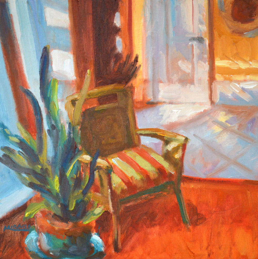
One thing that has concerned me since I first became a professional painter (over 35 years now) is the quality of the materials that I use and how to make sure my art lasts.  This is important to me not because of my ego but to ensure that my customers can expect a painting to last for years, even decades or centuries with proper handling.  I educated myself early on about the greatest causes for deteriorating artwork, especially works on paper.

Some of the greatest causes for paintings to fade or change are:

  • Sunlight! Yes, while the sun is great for so many things, it is not good for paints or papers.  Even over a long period of time, it will fade the colors and break down the fibers of the paper or canvas.  Sun will even fade wood over time.
  • Damp enviroments invite mold and organic changes to the supports.
  • Insect damage. Those little silverfish love to eat paper.
  • Using cheap materials. This is my personal pet peeve.  Why put all the time and effort into creating a work of art and use cheap materials?  Doesn’t make any sense to me.

What can you do as an artist or art owner?

  • Always choose the best materials you can afford. For instance, if you’re an artist, use artist-grade paints rather than studio or student-grade paints.  The artist-grade paints contain more pigment and better quality.
  • If you’re creating works on paper, use 100% rag, linen, or cotton fiber. These will hold up decades longer than  pulp papers.  Wood pulp contains chemicals which deteriorate almost immediately.  Remember that pile of yellowed newspapers in the garage?
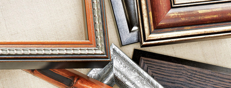
  • Ensure that the matting and framing is archival or museum-grade. I always use museum rag mats and archival backing.  If the work is under glass, you can help prevent sun damage by using UV filtering glass.

So, if you are an artist, take pride in your work and make it with the best materials you can afford.  If you are an art collector, ask the artist or gallery about the materials or framing.  If it isn’t framed, have your framing shop frame it archivally.

My personal experiment.

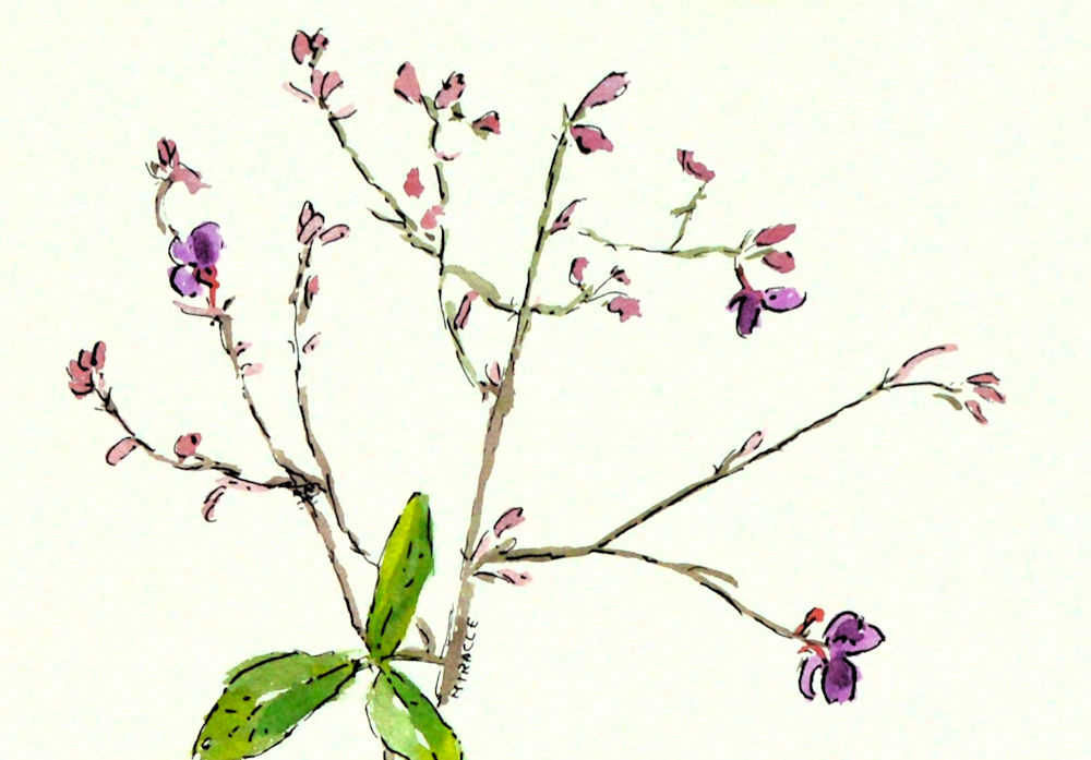
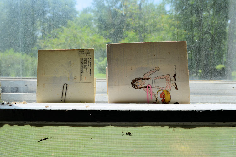
Many years ago I decided to test my materials by putting samples in a south-facing window of my studio.  Both of the samples shown are on 100% cotton rag paper.

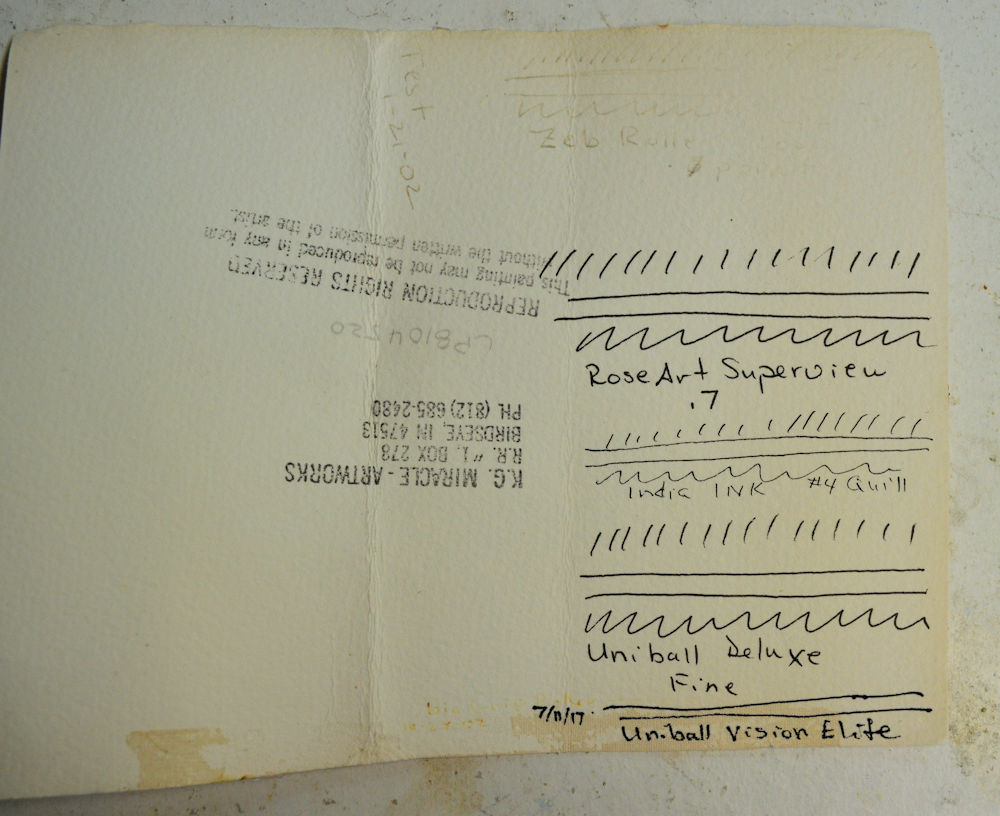
This was the test. Two pieces of Arches 100% cotton rag with ink and paint samples in a south facing window

I was testing four things.

  • How well the paper withstood the direct sunlight.
  • How the watercolor paints held up.
  • If there was fading to the computer printed color paints.
  • If any of the commercially available inks and ink pens held up to the sun.

The time frame for this experiment has been about fifteen years.  I folded the art pieces over and they have just been sitting in the window for that long.

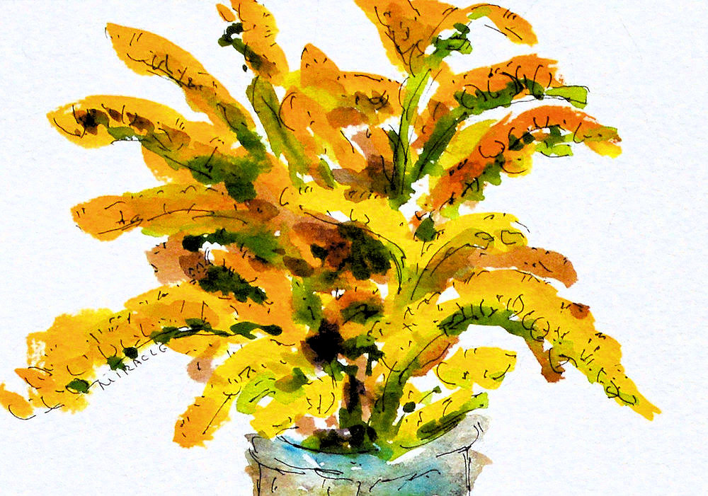
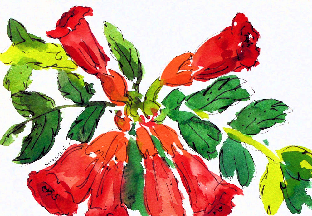
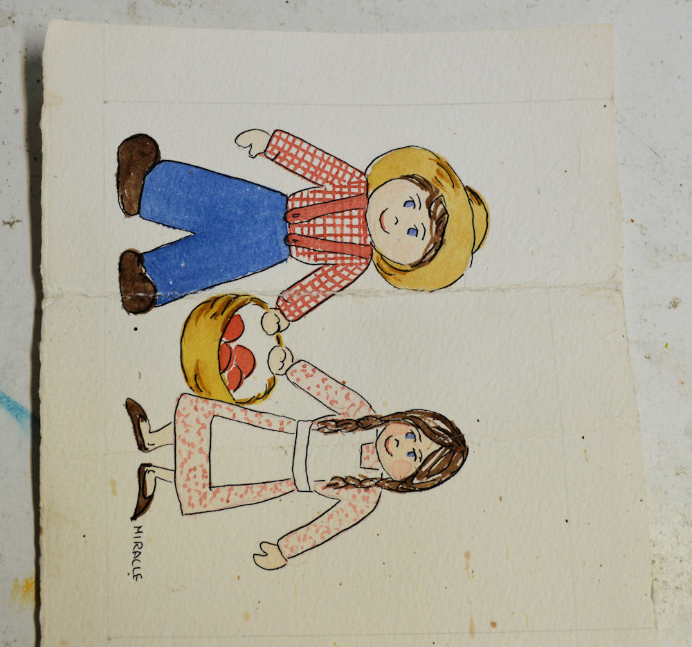
This is the outside of the mini watercolor painting. I was surprised that the red didn’t fade over 15 years. It is usually pretty fugitive.

Each piece was folded over with part of the experiment covered by the fold. In this case, it was an old mini painting. As you can see, the actual watercolor paint held up pretty well.

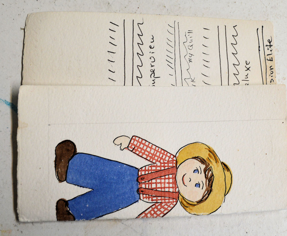
On the inside of this piece, I tested several commercially available pens as well as the standard India ink. Some faded totally away while some others held up surprisingly well.

As you can see, there is some small damage to the paper along the edges.  I attribute this mostly due to water damage from condensation of the window, not to direct sun.

The watercolor paints (Winsor and Newton) held up surprisingly well.  I was somewhat surprised that the reds held because that is a color that has a great tendency to fade.

And the pen inks.  What can I say?  Some, like the Zeb Roller Ink totally faded.  But others, like the old standby India ink and newer Vision Elite haven’t changed at all.  That is good news.  I’m now testing a carbon ink from Japan and have high expectations for that.

In this test piece, I printed color ink from my computer onto rag paper. Pretty faded, eh?

The fading is even more noticeable when the covered part is revealed. Note to self: don’t use standard office printers for original artwork.

The computer printed paper totally faded. So much for archival inks. My experience has been that the black computer ink will last but not the colors, however, inks may have changed over the years.  And I’m sure that commercial-grade printers and ink will fare better.  But best to ask if you are purchasing a print.

The takeaway is to use or buy quality art materials and frame them in a way that will prevent damage, particularly from sunlight.

Please note:  I am not a scientist so this was just a personal experiment.  Use your own judgement in the end.  Check out this article from scientists who are actually fixing old artwork.  https://www.livescience.com/13536-winslow-homer-van-gogh-fugitive-art.html