Category Archives: portrait

The Golden Marble – More Gold and Silver Leaf

The Golden Marble, acrylic on canvas, 30 x 24. 23K gold leaf and sterling silver leaf. Kit Miracle

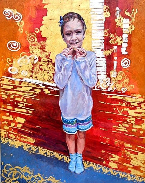
This is another painting in the gold and silver leaf series that I’ve been exploring.  At 30 x 24, it’s the largest one so far.  I also completed this one before Leo’s Muse which I posted last week.

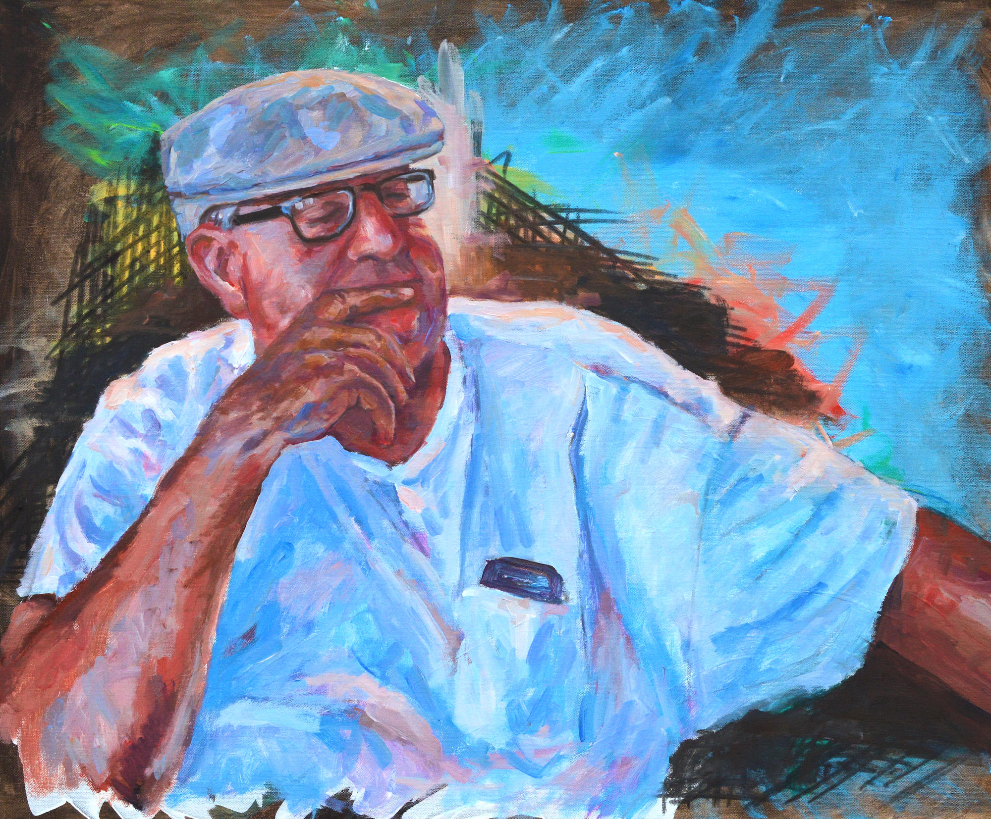
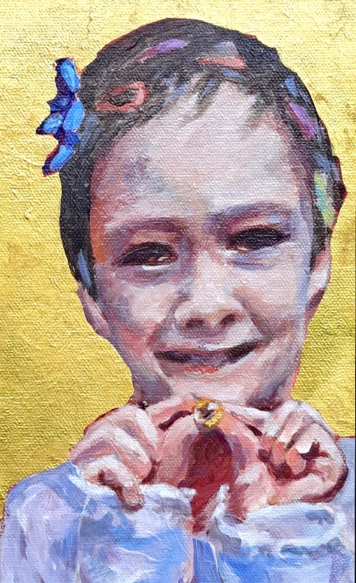
The subject is a young boy who has been playing dress-up with his sister.  In a spirit of silliness, she has adorned him with ribbons and hair clips.  His smile engages the viewer as he shows off The Golden Marble which is a prized possession.

Although I usually plan my paintings very carefully, I’ll admit that I really wasn’t sure where I was going with this one.  I liked the subject.  I knew that I wanted some gold and silver.  Other than that….well…

A preliminary sketch of the subject of The Golden Marble

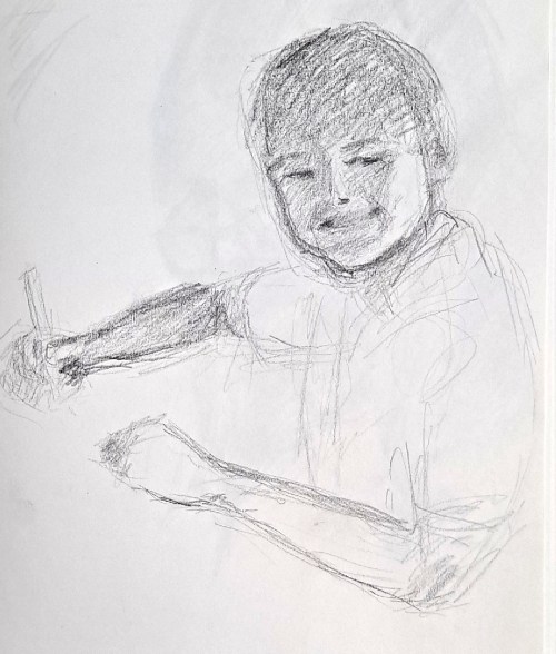
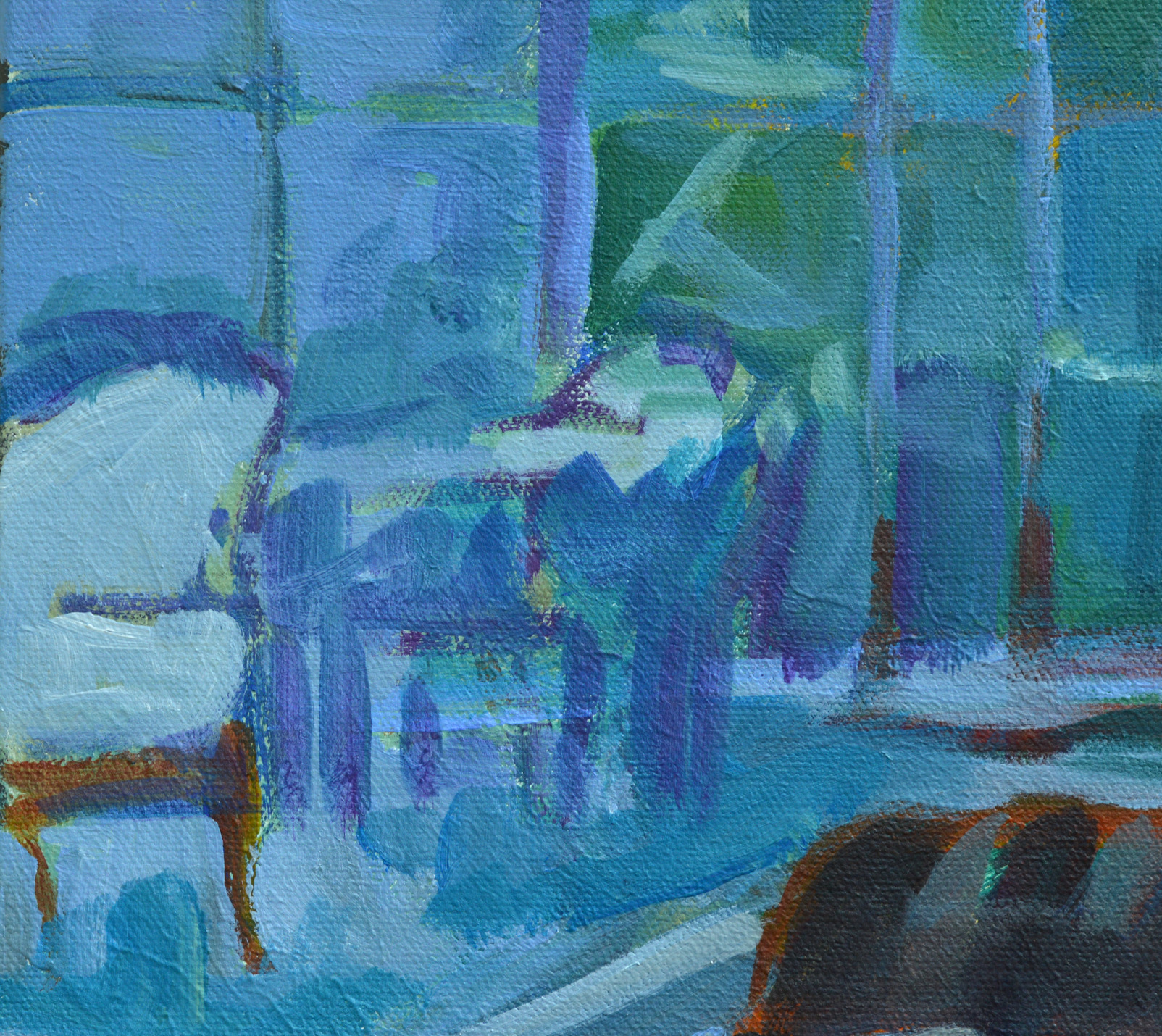
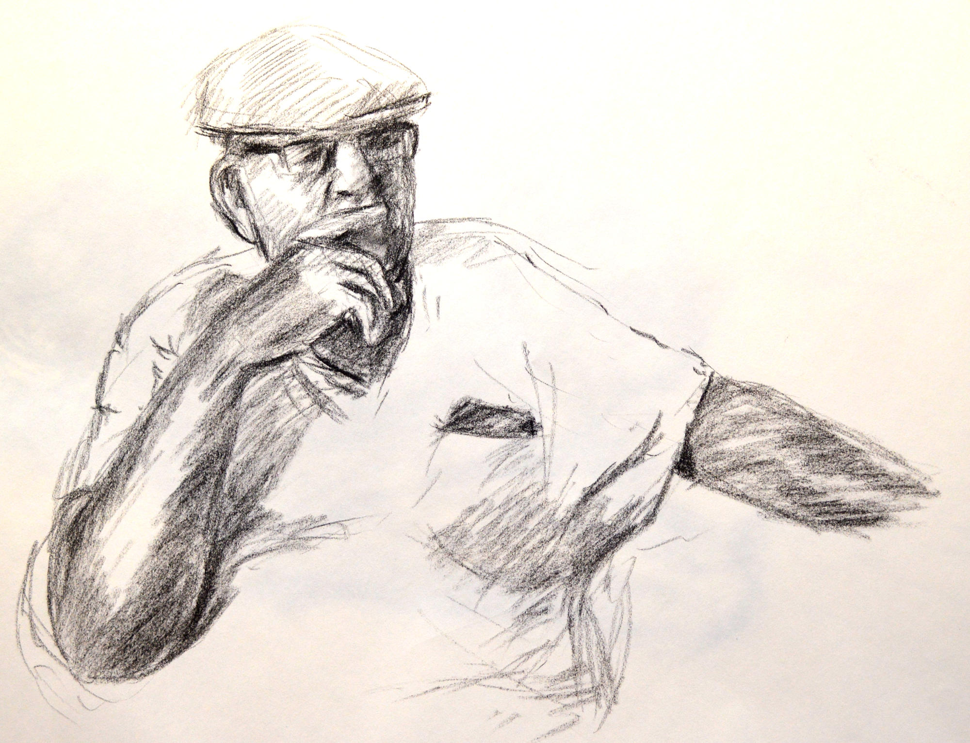
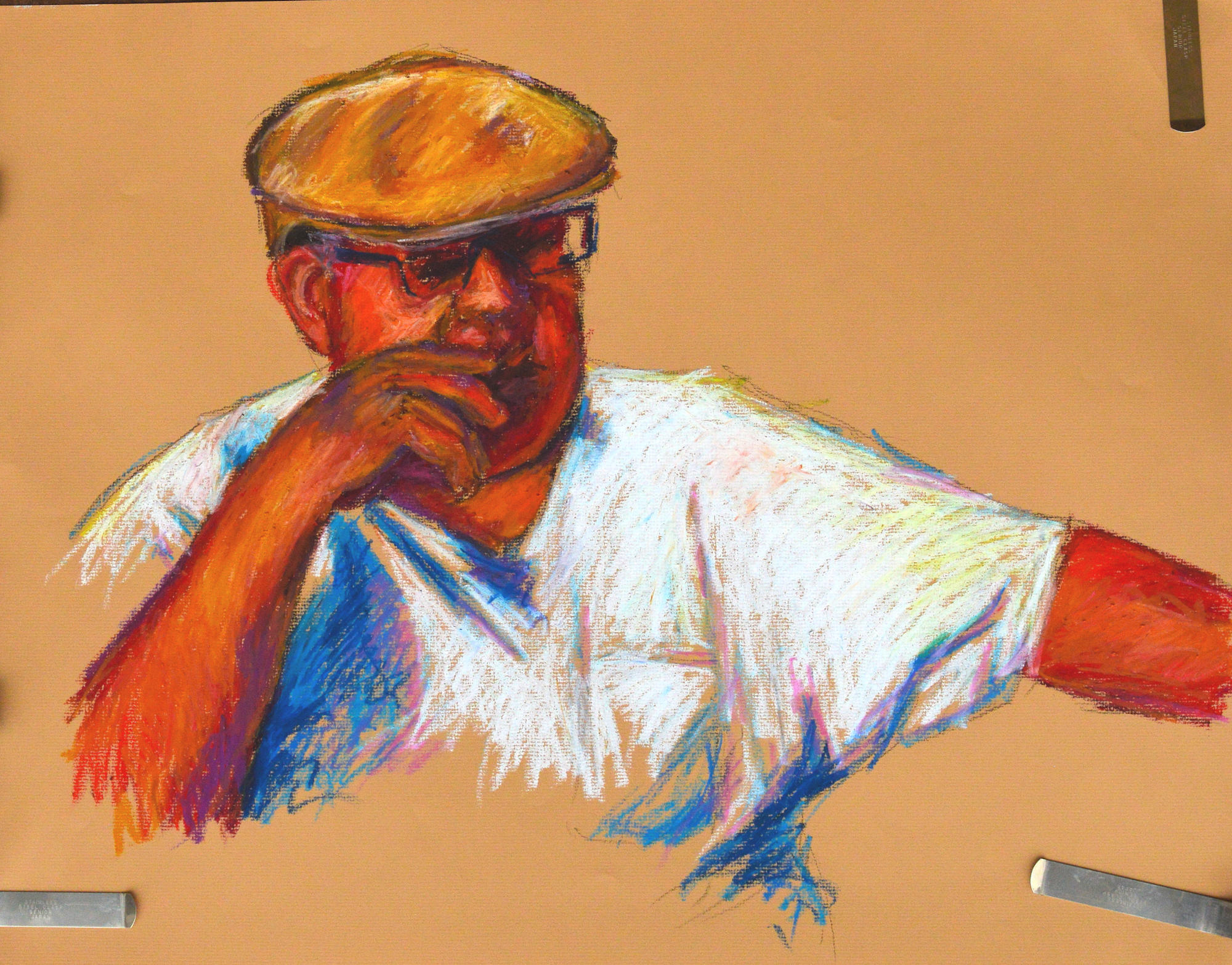
As usual, I did some preliminary drawings of the child.  These are just to familiarize myself with the subject.  I then sketched him on the canvas, a straight-on shot.  Then I began playing with background colors.  I elected to use some very bright and warm colors, radiating out of the figure.

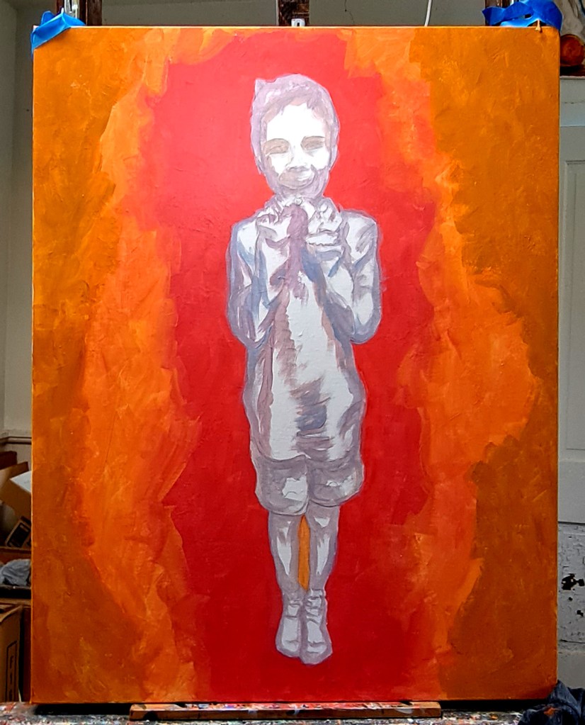
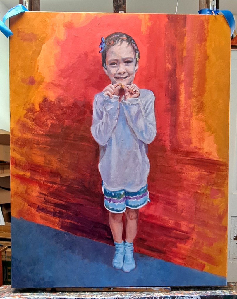
I then painted the figure in grisaille, those greyish tones.  Later working overall with adding some detail to the background.  More paint on the primary figure.  Although I had some reference photos to work from, this doesn’t really represent the situation.  I painted very loosely, adding more to both the figure and the background until I was satisfied.

Because the canvas is so large, I had to place it on the floor of my studio to work on adding the gold leaf.  Again, no fans or air conditioning blowing as the metal leaf is so fragile and blows everywhere.  It was pretty challenging to decide where I wanted to place the metal leaf, plus I kept switching back and forth during the process.  Sometimes the gold would be on top; other times the silver would be.  The fixative is clear so I had to carefully judge where I wanted to place it, and estimate the right amount of tackiness for the metal leaf to stick.  Overall, I’m pretty pleased with the result.

The Golden Marble, detail 1. I left plenty of the warm background colors show through. As you can see, I alternated placing the gold leaf on top of the silver, and the silver on top of the gold. Abstract shapes alternate with more organic circle or bubble shapes. No real planning, just in the flow.
The Golden Marble – detail 2 showing the texture of the canvas and close-ups of the hair decorations

The final steps were to go back and touch up the figure here and there.  I have learned that it’s difficult to touch up or make changes in the gold and silver leaf as it just doesn’t look the same as when first applied.  I may find some way to eventually meet this challenge, but haven’t yet.

The very final step is to spray a protective coat of clear acrylic over the entire painting.  This keeps the silver leaf from tarnishing and the gold leaf from flaking off. 

Overall, it’s a very striking piece.  I want to explore my next subject in this medium.

Generosity

A couple of weeks ago I jokingly claimed that people around here had to keep their car doors locked in the summer to prevent good-intentioned neighbors from leaving bags of zucchini in them. Zucchini are prolific, in case you don’t know.

But a few days later, I found myself foisting off some fresh-picked tomatoes on a visiting neighbor. He wasn’t unhappy about it as he doesn’t have a garden this year, but it gave me pause. This is what gardeners do. What we love to do, i.e., share our bounty. Although our garden area is much reduced this year, I still love to share.

A few years ago, I did a painting of my grandmother who so generously shared her garden bounty, too. You never left her house empty-handed.

Generosity, 24 x 18, oil on canvas, Kit Miracle artist

The painting depicts her holding an armful of, what? Probably turnips but it could have been tomatoes or peppers or just about anything. The original photo was black and white. The dress was typical summer attire, homemade with no pattern. She just laid out an old dress on the fabric and cut around it. Something I would never be confident enough to try, but grandma worked in an underwear factory during WWII, cutting out fifty layers of long johns at a time. A simple housedress could be whipped up in no time. On her Singer peddle sewing machine. Which I now use as a bedside table. Memories.

Anyway, if someone offers you an armful of fresh garden produce this summer, take it. Even if you don’t like turnips, you’ll be perpetuating the nearly lost act of sharing what we have with fellow human beings. It’s worth reminding ourselves that caring for others reflects well on all of us eventually.

Spring follow-up

One of many beautiful peonies. The scent is so lovely.

We have been so busy with spring activities here on the ninety acres.  The temperatures have exploded from the frost predictions earlier this month to near 90s this week.  No rain so we’re doing lots of watering.  Everything I planted last weekend – the entire garden pretty much – is up and looking healthy.  I’ll post photos later when there’s more to see.

The air is a flood of beautiful scents, roses and peonies, honeysuckle, too.  The locusts are about done.  The strong perfume seems to be the only redeeming value of the multiflora roses and the wild honeysuckle, both which are fighting it out in the scent category. 

Top: Tame climbing roses vs wild multi-flora roses. Bottom: Tame honeysuckle bush vs wild honeysuckle vine.

The farmer who rents some of our fields has been working until way after dark these days.  You can see by this monster disk how much time it takes to prepare the ground.  Not counting that “other” natural odor that was spread on the fields.  Well, that’s called soil improvement. 

Disking the fields. That is some big piece of equipment.

And the cicadas have emerged in ever-increasing numbers.  They don’t bite or sting, just climb out of the ground and then hang onto anything they can while they emerge from their shells.  They can’t climb on vinyl or metal but they do like wood or just about anything else they can attach to.  My husband uses the leaf blower to blow them off the porch.  I use the broom.  And now they’re starting to sing to attracts mates.  Not as loud as it will be but it’s already beginning to sound like that weird alien noise in a sci-fi movie. The birds and frogs and toads seem sated but I watched two little lizards stalking the same bug today.  I think they both missed. 

The Reader, acrylic on canvas, 24 x 18, Kit Miracle

Of necessity due to the heat, studio time has been limited to afternoons.  I did manage to finish the painting which I started as a demo a couple of weeks ago.  The Reader is a lovely piece, not in any series of paintings but just because I like the subject.  I’m already scouting around for the next topic.

Lunch at the Museum

Lunch at the Museum, Kit Miracle, acrylic on canvas, 30 x 24.

This is the seventh painting in my Intimate Spaces: Breaking Bread series.  A bold, vertical portrait, this painting certainly grabs attention.  I’ve been noticing that in addition to telling a story, my portraits often include a wry sense of irony.  Yeah, I just now figured that out but looking back at much of my work, I can see what often attracted me to the scenes initially.  Maybe it’s my quirky sense of humor but hey, it’s my work and I can do what I want.

Anyway, this scene was when I took my granddaughter to the Carnegie Museum complex in Pittsburgh a few years ago.  All that walking around to see dinosaurs and artwork and more is hard work.  We stopped for lunch in the museum restaurant.

I guess that the first thing that strikes the viewer is, “What are those things coming out of her head?”  This, of course, as any photographer will tell you is a definite no no in composition.  You don’t want trees sprouting from your subject’s head.  But here with those globe-shaped lights, it works.  Some rules are made to be broken.

Lunch – detail 1. A sweet portrait but not saccharine.

There is a lot of vertical in this painting.  Not only the canvas but the stripes, the lights, the straw for the girl, the wood on the table.  The head is not quite in the center but everything leads to the face.

Lunch detail 5. Those squiggles become chairs and tables on the outdoor patio, viewed through the window of the restaurant.

Lunch detail 4. Up close, the people in the background look like beans, but again, from a distance, they come together.

I particularly like the balance between the warm and cool colors.  Even within the cool areas, you can see quite a bit of color if you look closely.  It’s about one third to two thirds ratio of warm to cool.

Lunch, detail 2. I captured this little still life even in a portrait.

Another little still life. The loosely painted silverware and napkin come together when viewed at a distance.

Some people like to see a photo realistic finish on paintings but that is not my style. (Been there, done that.)  As a contemporary impressionist, I look to convey the message with as few strokes as possible.  Looking at my paintings up close often reveals a jumble of bold brush strokes.  But stepping back about six to eight feet, it all comes together.  This is done to deliberately allow the viewer to become a participant in the experience by filling in the details with their own eyes where there may actually be none.

Canvas prep and under painting. This abstract painting doesn’t necessarily follow the composition of the painting but is designed to give a little guidance. Look closely to see my initial sketch of the subject before I begin to paint.

I also like to paint on a toned canvas, often with a rough gesso base to add texture.  One of my favorite colors is a reddish tone which adds sparkle where it peeks between the brush strokes.  This is particularly good for landscapes that have lots of green.  However, the tones on this series of paintings are more somber, greys with some splashes of color.  The subject is then drawn on top before I start painting.  When my husband saw all the prepped canvasses in my studio, he thought I was switching to abstract painting.  Well….not yet.

Evolution of a painting

Barry, portrait in acrylic on linen, 28 x 34. Kit Miracle

Except for plein air painting and sketching, it’s pretty rare that I create a painting by just diving in and slapping some paint on canvas.  Yes, I know, movies and biopics of artists give that impression.  But really, it’s hard work and, for me at least, requires a lot of preliminary work.

When I’m doing a portrait, which is to me the most difficult to achieve, I always begin with some preliminary sketches.  Generally I begin with some charcoal sketches.  Sometimes one is enough but more often it’s several.

Barry, preliminary charcoal sketch. Kit Miracle

After that, I may try some color sketches on canvas paper or panels.

In this case, I had recently been gifted with some art supplies by a friend who was moving so I proceeded to a conte crayon study on pastel paper.

Barry, conte crayon. on pastel paper.

The next step was to do a larger oil stick pastel, also on pastel paper.

Barry, oil stick pastel on pastel paper. Kit Miracle

The final painting was created on a large stretched linen canvas 28 x 34.  I had already primed it some time ago with a dark neutral background and some splashes of color in the center.

I sketched in the main figure with charcoal.  Then, sanded the primary area and gessoed it again.  Then sketched over that again with charcoal.  A little spray fixative set the charcoal so the painting process would not pick it up.  I decided to leave the background unfinished with just the initial undercoats of paint.

The figure is painted in acrylic very loosely but with attention to detail in the face and hand.  The primary difference with painting a human portrait as opposed to painting a building or landscape is that if you’re off a brick or leaf in the landscape, no one will know. But if you’re off a quarter of an inch on a nose, you have totally missed the mark in capturing a portrait.   At least in my opinion.

What do you think?

How do you know when your painting is finished?

How do I know when my painting is finished?

That is a question I often ask myself.  For me, the answer is when I can’t think of one more thing to add.  Then STOP!

I’ve noticed that when I’ve taught a class, particularly a watercolor class, that sometimes the participants keep messing with their paintings until …well, they’re a mess.  Stop!  In the case of watercolors, leave some white space.  Leave some space, period.  When I’m working in oils, that is a little more difficult but I always try to avoid the overworked look.  With oils, I stand back and just LOOK.  It seems the closer I get to the final product, the more time I spend looking.  Sometimes it is even best to put it away for a while.  That advice is often offered to young artists but it’s true.  Sometimes after you’ve come back to your work with a few weeks off, the errors will jump out at you.  Other times, you’ll realize that you’ve nailed it.

I ask myself, what am I aiming for?  What is my message?  Despite painting in a realistic style most of the time, I am not aiming for anything approaching photo realism.  If you want it to look like a photo, then take a damn picture!  I’m looking for the message.  What struck me most about this subject?  What am I really trying to convey?  When is enough enough?

Wolf Eyes, detail, oil on canvas

This is a close-up view of a painting that I’m working on right now entitled Wolf Eyes.  I’m just about at the point where…there’s nothing left to add.  Time to set it aside for a while.  I’ll put it on my website when do finish it.  The message that I’m shooting for is the young man in his prime, he is oozing with virility and he knows it.  Wolf Eyes.