Category Archives: painting instruction

Pecos River Valley, Step-by-Step

Pecos River Valley, final, oil on canvas,  18 x 24,  Kit Miracle

Pecos River Valley, final, oil on canvas, 18 x 24, Kit Miracle

As much as I loved Arizona, I was also enamored with New Mexico and the Pecos River Valley.  I spent one day at the ruins of the Pecos Indians which are preserved as a national park now.  From the top of the area, I could see for miles.  This is one view of the Pecos River Valley. https://my90acres.com/artwork/pecos-river-valley-step-by-step/


Sedona Hills at Sunset

Sedona, final, oil on canvas, 15 x 27, Kit Miracle

Sedona, final, oil on canvas, 15 x 27, Kit Miracle

I fell in love with the red hills in Sedona, Arizona on my recent visit there.  This is a long painting, 15 x 27, which represents the landscape at sunset.  Just north of Bell Rock at sunset.  Check out the link for a step-by-step. https://my90acres.com/artwork/sedona-hills-at-sunset-step-by-step/

Junipers at Grand Canyon – Demonstration

Junipers at Grand Canyon, final, oil on canvas, 24 x 30

Junipers at Grand Canyon, final, oil on canvas, 24 x 30

I just completed this 24 x 30 oil painting of Junipers at the Grand Canyon.  I love their gnarly trunks and timeless quality.  Check out my demonstration at https://my90acres.com/artwork/junipers-at-grand-canyon-demonstration/


Grand Canyon – Moran Point

Grand Canyon Moran Point - Final  18 x 24 oil on canvas

Grand Canyon Moran Point – Final 18 x 24 oil on canvas

I visited the Grand Canyon last month for the first time and fell in love with the place.  I could paint there for a hundred years and still not run out of subject matter.  What I loved most…and which was most challenging to me as a painter…is how the view changes constantly, depending upon the time of day and weather.

This demonstration is from the famous Moran Point, named after Thomas Moran.  I sat under this tree and painted a nice little watercolor but the actual painting was completed in the studio.  For once, not on a toned canvas.  Check out the demo at the link below.  https://my90acres.com/artwork/grand-canyon-moran-point-demonstration/

Improving a Painting

Blessinger Farm revised.  Oil on canvas, 16x20

Blessinger Farm revised. Oil on canvas, 16×20

The first pass at the Blessinger farm painting.

The first pass at the Blessinger farm painting.

Sometimes when I finish a painting it seems OK, but….something is not quite right. That’s when I let it sit on the easel for a while. Such is the case with the one that I posted here a few weeks ago, Blessinger’s Farm. After examining it for several days, I realized that several improvements could be made.

First of all, the tree was right in the middle of the painting. This is very poor composition as it divides the canvas in half. It was also a weird looking tree but that may have more to do with the fact that a tornado blew through the farm a few years ago wiping out 80 year old maples. Nevertheless, I decided to move it closer to the barn (easy to do in paint, right?) and to juice up the colors. I also decided to push the background way back. Too much green. And to clarify some of the focal points. What do you think?

A Little Blue (on a Rainy Day) demo

A Little Blue (on a Rainy Day) Final, oil on canvas, 24 x36

A Little Blue (on a Rainy Day) Final, oil on canvas, 24 x36

This is a very complex still life that I recently completed. Check out the demo on the linked page. https://my90acres.com/?page_id=330&preview=true

How to tone a canvas

TonedcanvasIn an earlier how-to post, I told you about the why of using a toned canvas but I thought I’d review that again.

Using a toned canvas takes away the fear and indecision of painting for many artists. You already HAVE something on the canvas. Mostly when you’re painting, you’re using push-pull. That is, pushing the background into the back, and pulling the foreground up front. You see this more often with artists drawing on toned paper, such as, pastel artists. This is a very old technique, maybe centuries old.

I like it because it seems as if the tone color (whatever I may have chosen) fills in the broken spaces of my paintings. A search on the internet will turn up quite a few artists who use this technique.

Most of the time, I will take leftover paint at the end of a session and tone a bunch of canvases just to have them on hand. Although I do not use this technique all the time, it’s great to be able to grab a few canvases as I’m heading out for some plein air painting. I just seem to be able to get a head start on getting the basics down. However, you can do this on location with just rubbing in some local colors with a rag. It’s entirely up to you.

My preference is for warm colors or even some very dark colors but I have used many – burnt sienna, dark brown/grey, blues, greens and even purples (yuck). One artist I know, Caroline Jasper, uses red for her canvases which adds an element of sparkle, and Wyatt LeGrand uses some very dark tones which also works well for him.

If you haven’t tried this technique, just try it for a few times to see how you like it.

Stilllifesetupbluebottles150step1

Tonedcanvas4

Tonedcanvas3

Tonedcanvas2

5 Tips for Getting into A Juried Show

At some point in their careers, most artists want to see where they stack up next to other artists. Competition seems to be a common human trait. One way for artists to do that is to enter juried shows. Some artists do this to add another line to their resume, some to win prize money, and some just for the spirit of the thing.

I have been on both sides of that fence, from entering shows across the nation to judging shows individually or as part of my job as Director of the Jasper Arts Center and have reviewed thousands of slides and photographs. (No one uses slides anymore so that’s how old I am.)

So here is some of the best advice I can give you for getting into a juried exhibit.

1. Read the prospectus carefully. Does your work fit the guidelines? Are they looking for abstract expressionists and you paint landscapes with puppies? Is it a watercolor exhibit and you only do oils? How about the size and weight limitations? Did you check the schedule for entry, delivery, exhibit and return? Will your work be available for that period of time? A small oversight in paying attention to the details will cost you money and time as well as being just plain aggravating to both you and the show organizers.

2. Check out the jurors. Will the show be selected by one person or a panel? Will the images be projected or reviewed online? Can the judge be impartial enough to select work based on its merits and not just because it is in the same style as his/her own? It is an unfortunate fact that I have seen some exhibits selected all in the same style as the judge (shame on them). Most of the judges we have had here at the gallery spend quite a bit of time going through the images, usually reviewing them several times before winnowing the show down. They take great pains to have a mixed variety of media and subject matter and are especially pained at the final rounds when they have to cut out some really great pieces. They care.

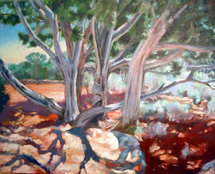
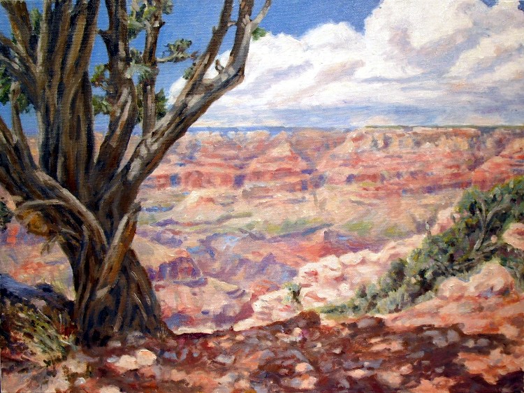
3. Review your work with an objective eye. (Don’t listen to your family and friends because they love everything you do.) Is the work you are planning to submit the best you have? Is it cohesive? Will it stand out against the competition? What is the quality of workmanship? Would someone notice it across the room? Is it your own work and not copied from someone else’s design? What makes your work special? (Please, no more barns, flying ducks or Norman Rockwell look-alikes!)

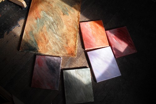
4. Will the work be judged on site or by photos? This can really make a difference for some pieces, especially those involving texture or size. If you’ve ever seen a real Van Gogh in person, you realize that he “carved” the paint on the canvas and that texture is as important as the subject matter. All work looks the same size when projected which may cause advantages or disadvantages. A wall-sized impact piece will appear the same size as a miniature even though the sizes are stated; it’s still the first perception that counts.

If you are taking photos, make sure that your painting is level, no hot spots, no glares or reflections, no frames, no hands holding the piece. With today’s digital cameras and easy-to-use software, there is absolutely no excuse for sending bad images. This is the most important thing you will submit with your application so it had better be the best you can make it.

5. Finally, relax. After you send your application and images off, it is out of your hands. Any two jurors will choose a different show from the same selection of work. Not getting into a show is not the end of the world. You are creating for yourself, right? That’s what is really important. Keep creating!

Choosing a painting subject

A simple spring subject.  Oil on canvas, 11x14

A simple spring subject. Oil on canvas, 11×14

I’ve often been asked how I decide what to paint.  To me, the answer is obvious.  Just as writers are advised to “paint what you know,” so, too, should painters.  What interests you?  Do you have a passion or special message?  For me, just walking out the door will often suggest a subject.  In fact, I once had an exhibit which was solely painted from “my 90 acres,” i.e., everything and everyone was from the home place.  That was a little challenging as I do get out and about, but it was a good exhibit.

This painting that I completed yesterday is a scene just out my studio door.  The dog and some spring bushes.  Pretty simple.  However, if you look back at some of the famous painters of the past century, regional artists or French Impressionists, some of their best work was of ordinary daily scenes.  I don’t live near the ocean or the Rocky Mountains, so my usual subjects are the soft hills here in southern Indiana, small villages, flower gardens, vegetables, my favorite people and places.  Try taking a look around your own home town with new eyes.  You’ll be surprised at subjects which suggest themselves.  Good luck!

Chalk Horse, a study in complementary colors

Chalk Horse, final, oil on canvas, 16x20

Chalk Horse, final, oil on canvas, 16×20


This painting was a study in complementary colors.  Check out the step-by-step on the pages.  https://my90acres.com/artwork/chalk-horse-step-by-step/