
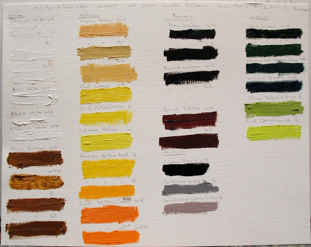
I was taking inventory of my paints in my studio recently and it dawned on me that I have a LOT of paint. As I was sorting my paints into categories by color, I realized that I didn’t really know all of the various nuances of the paints I was using. Yes, of course, I often to return to favorites and use them frequently. But I decided it would be helpful to have a chart of samples of each hue.
As you can see by the charts below, there can be many slight variances by manufacturer. Some qualities you cannot actually see but you know in the “feel” of the paint, i.e., creamier, richer, stiffer, etc. Although I generally use Artist grade paints, I had accidentally ordered some Student grade paint. You can see by the sample comparing the various Raw Sienna varieties that one is much thinner, meaning there are more fillers and less actual pigments. It always pays to buy the best you can afford. Oh, and I had 58 different colors or brands of oil paints.
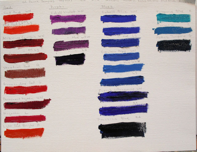
Color sample chart #1
Color sample chart #2
Other variations include how the pigments behave over time. Some yellow or change color. Others thin, particularly something like Titanium White, which means if they are applied over a darker ground, you may find the background bleeding through over time.
While I had all my paints out, I also decided to create a few charts of the pigments that I use most frequently. My top ten oil paints are:
- Titanium White
- Cadmium Lemon
- Raw Sienna
- Burnt Sienna
- Sap Green
- Winsor Green
- Cobalt Blue
- Cerulean Blue
- French Ultramarine
- Prussian Blue
- Cadmium Red
- Alizarin Crimson
- Cobalt Violet
- Ivory Black
Although it is rare that I would incorporate all of these colors into the same painting, I often try to have a cool red and a hot red, a cool blue and a hot blue, etc. Usually just one green and no black. My favorite brand is Winsor Newton but I try some others, too. For instance, I love Richeson’s Hansa Yellow Medium because it’s so creamy. There are no hard and fast rules about how many paints you need, except that generally fewer colors will result in the artist creating more colors by mixing, resulting in greater harmony in the long run.
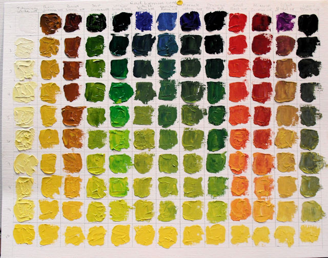
Color samples made with Cadmium Lemon
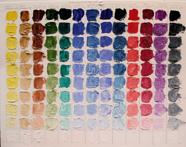
Color samples made with Titanium White
