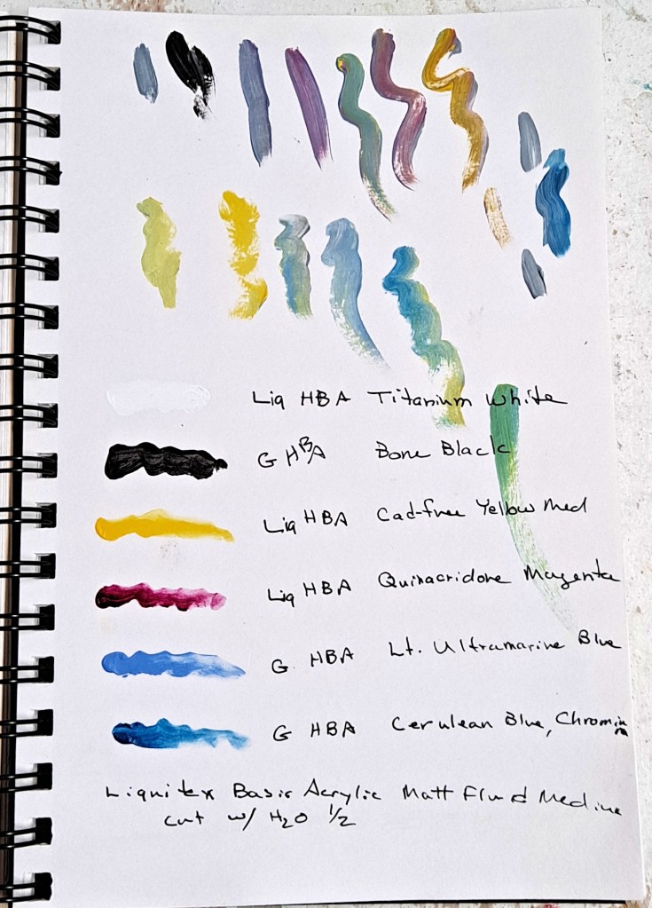
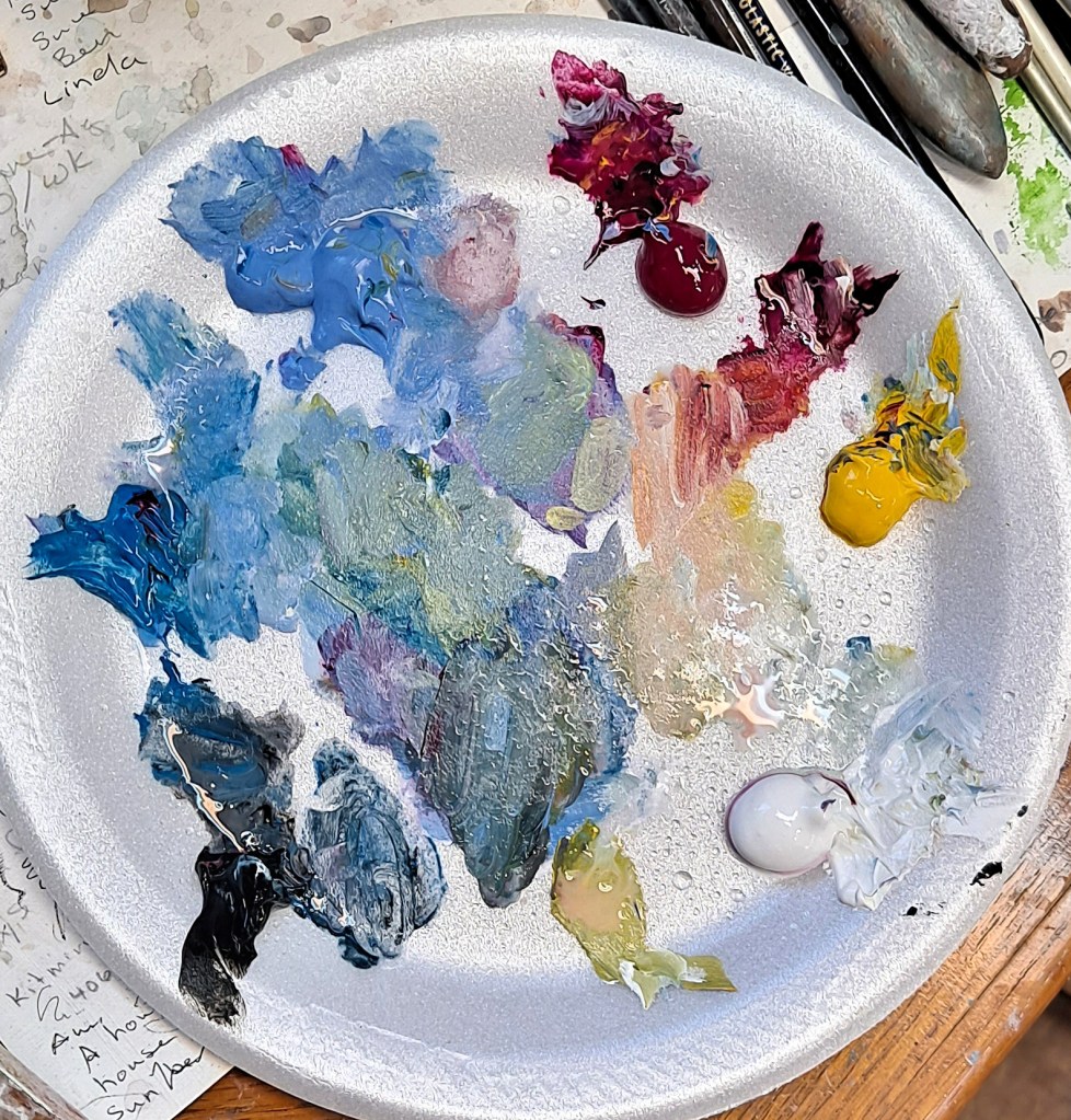
The most recent paintings that I’ve done have been with using a very limited palette which I’ve posted about previously. I’ve now cut the number back to four colors plus black and white. I like the challenge to see if I can adapt the most colors from just a few options. Actually, it works very well.

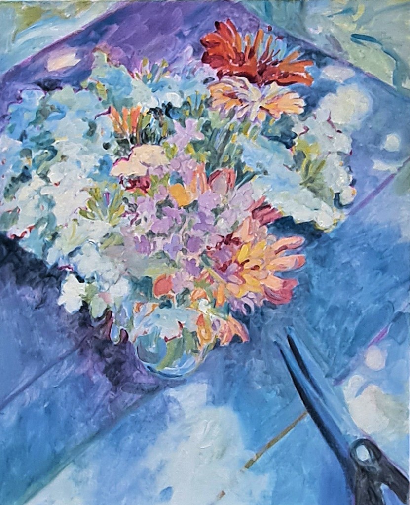
This painting is based on some photos that I took of summer flowers several years ago. Called August Bouquet, it showcases some zinnias and Queen Ann’s lace, plus others. The vase is sitting in the shade on an old wooden table, with dappled sunlight showing through. I’ve added some scissors as a foil for the flowers.

The canvas is a 20 x 16 vertical, 1.5 inches deep. I’ve already sanded and gessoed it and added a little texture. Then I added a thin wash of colors approximately where I anticipated locating the main shapes. After this coat dried (working with acrylics that only takes about twenty minutes), I then made a loose pencil outline of the flowers and other shapes.
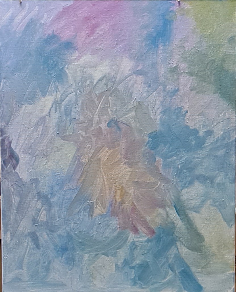
The next step was to add color to the outline. I don’t try to make the outline colors match the subject, in this case, flowers. In fact, I often choose what I anticipate are contrasting colors to the final painting.

Then the main shapes began to get filled in. I hesitate to call this the tedious part, but it is much more involved than the previous steps. I just have to stick with it until I’m done. I zone out, listening to music or a recorded book. Sometimes I fill in the background first; sometimes I start with the main subject. There are no hard rules here.

I step away from the canvas often at this point to compare values, colors, shapes. The painting light above my easel can cast light which is too harsh so it’s best to turn it off while I compare values. This is a good point to take a break, perhaps overnight. I’ll often run out to my studio in the morning to see if the painting looks as I thought I left it or what glaring changes I need to make.
Although August Bouquet will be finished with a few more details, plus probably some addition of gold or silver leaf, I actually like one of the middle, less-finished stages best. One doesn’t actually need to put in every detail; in fact, it’s often distracting and doesn’t help convey the message of the painting.
Maybe I’ll paint it again with a less-finished look. What do you think?